IOPE XMD STEM III Design Renewal
아이오페 엑스엠디 스템3 디자인 리뉴얼
Summary
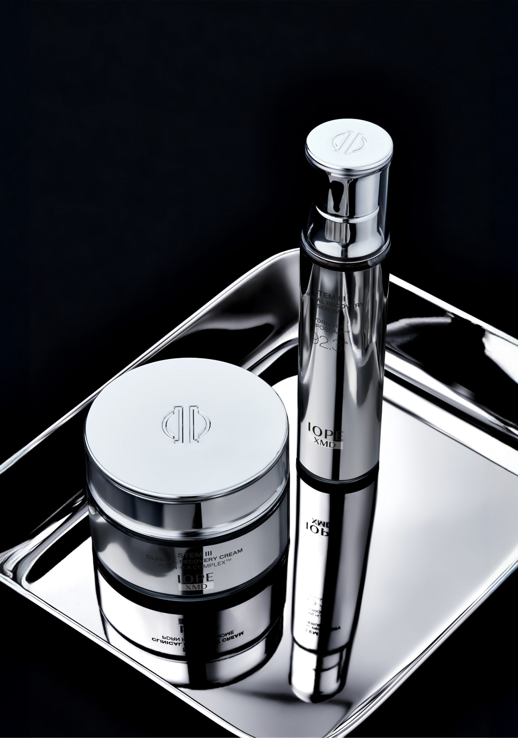
IOPE는 ‘Clinical Grade IOPE’라는 새로운 브랜드 철학 아래, 눈에 보이는 피부 변화를 선사하는 고기능 스킨케어를 지향합니다. 이러한 비전을 구체화하기 위해 의료 기술과의 접점을 강화한 신규 카테고리 ‘IOPE XMD’를 런칭하고, 그 첫 번째 프로젝트로 STEM III 라인을 리뉴얼했습니다. 시술 도구에서 영감을 받은 구조와 소재를 적용해 기능성과 감성의 균형을 잡았으며, 사용성과 지속 가능성까지 고려한 디자인을 구현했습니다.
This article has been translated by an AI.
At IOPE, our new brand philosophy, “Clinical Grade IOPE,” is all about delivering visible skin transformation through high-performance skincare. To bring this vision to life, we launched a new category, “IOPE XMD,” which deepens our connection with medical technology. Our first project under this new umbrella was the renewal of the STEM III line. We’ve balanced functionality with emotional appeal by incorporating structures and materials inspired by medical tools, all while prioritizing user experience and sustainability in our design.
At IOPE, our new brand philosophy, “Clinical Grade IOPE,” is all about delivering visible skin transformation through high-performance skincare. To bring this vision to life, we launched a new category, “IOPE XMD,” which deepens our connection with medical technology. Our first project under this new umbrella was the renewal of the STEM III line. We’ve balanced functionality with emotional appeal by incorporating structures and materials inspired by medical tools, all while prioritizing user experience and sustainability in our design.
The Origin of STEM III
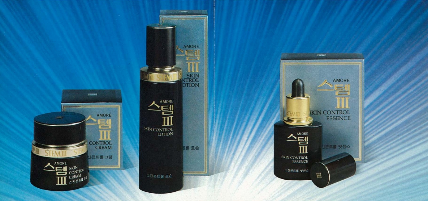
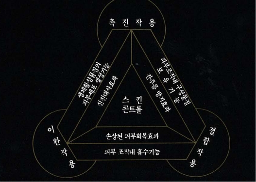
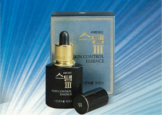
디자인 리뉴얼을 준비하면서 가장 먼저 궁금했던 점은 바로 ‘STEM III’라는 이름이 어디서 왔고, 어떤 의미를 담고 있는지였습니다. 미술관 아카이브 팀의 도움을 받아 최초의 STEM III가 등장했던 1980년대의 기록을 확인할 수 있었습니다. ‘스템(STEM)’은 식물의 줄기처럼 피부 미용의 근본이 되겠다는 의지를 담고 있으며, 여기에 붙은 ‘III’는 피부 노화를 막기 위해 필요한 세 가지 핵심 요소(3작용, 3기능, 3효과)를 의미했습니다. 당시에는 아이오페와는 별개의 독자 브랜드로 존재했지만, 피부 노화의 원인을 과학적으로 분석하고 해결하려 했다는 점에서 두 브랜드는 놀랍도록 닮아 있었습니다.
As we began preparing for the design renewal, my first curiosity was the origin of the name “STEM III” and its deeper meaning. With the help of the museum’s archive team, we were able to review records from the 1980s, when the very first STEM III appeared. “STEM” symbolized the brand’s commitment to becoming the root of skin beauty, much like a plant’s stem, while “III” represented the three core elements (3 actions, 3 functions, 3 effects) necessary to prevent skin aging. At the time, “STEM III” existed as an independent brand, separate from IOPE, yet both brands shared a remarkable similarity: their scientific approach to analyzing and resolving the causes of skin aging.
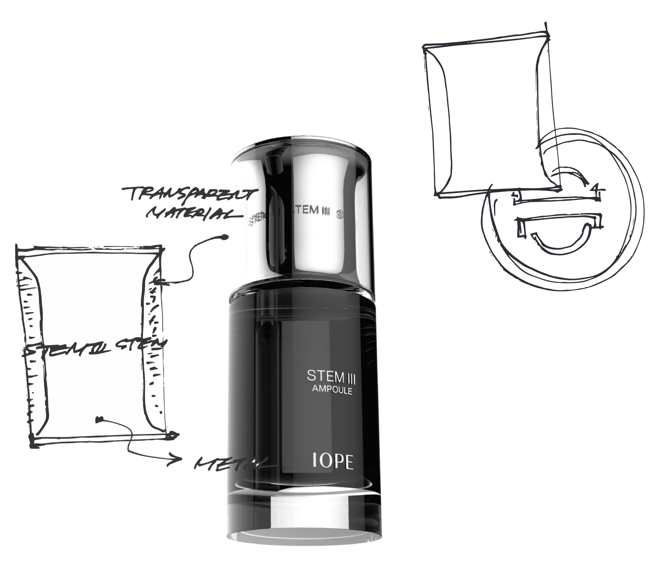
Idea Sketch & Form
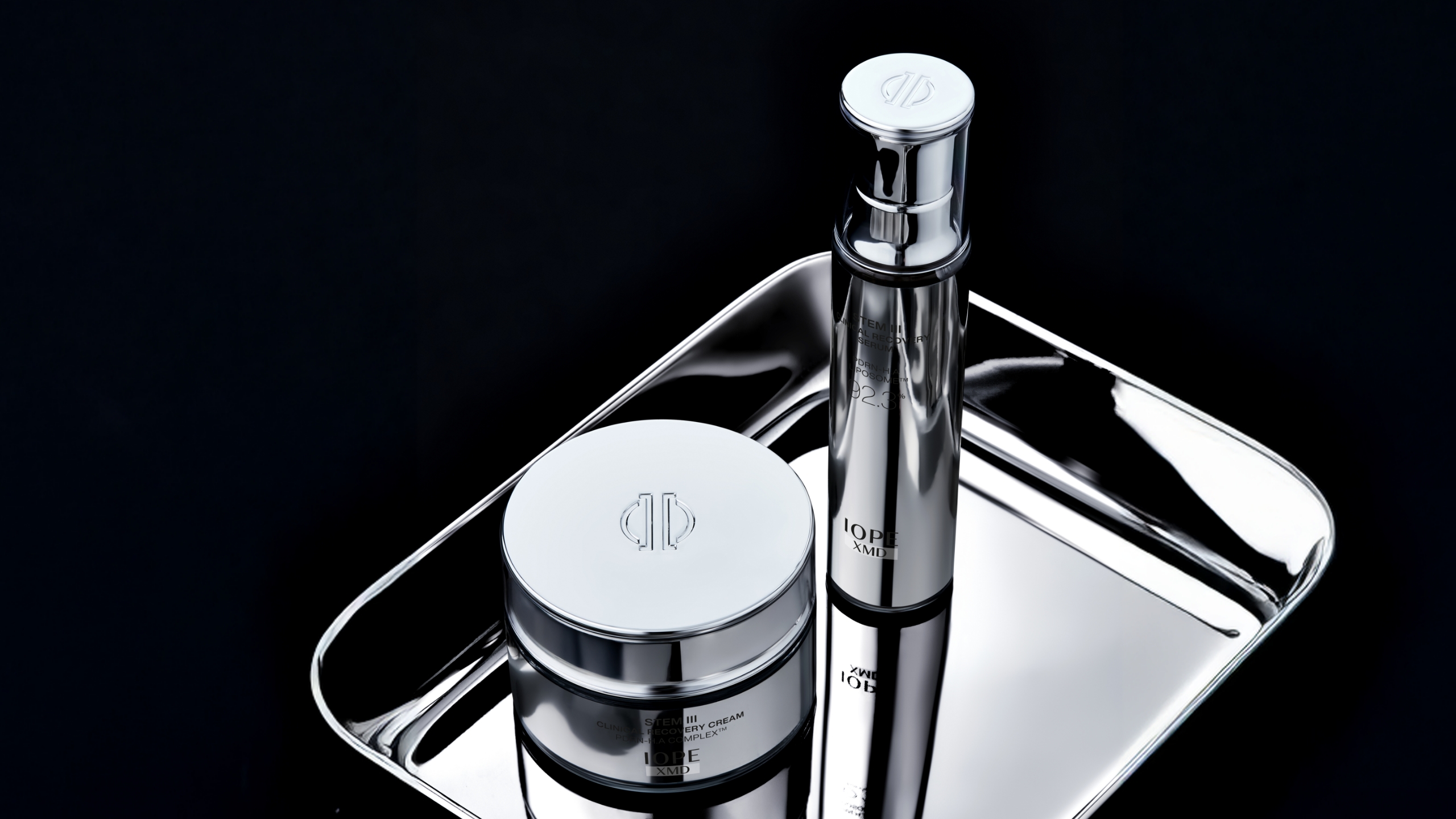
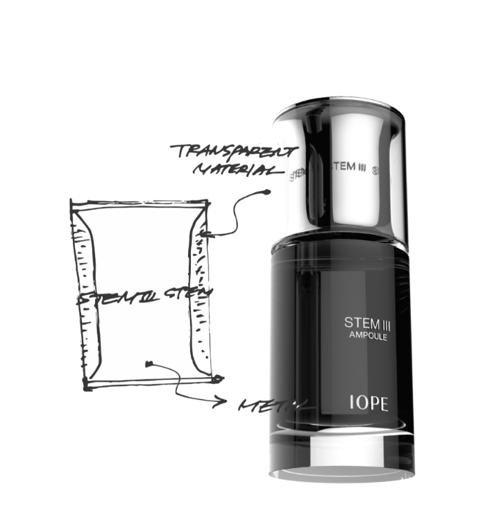
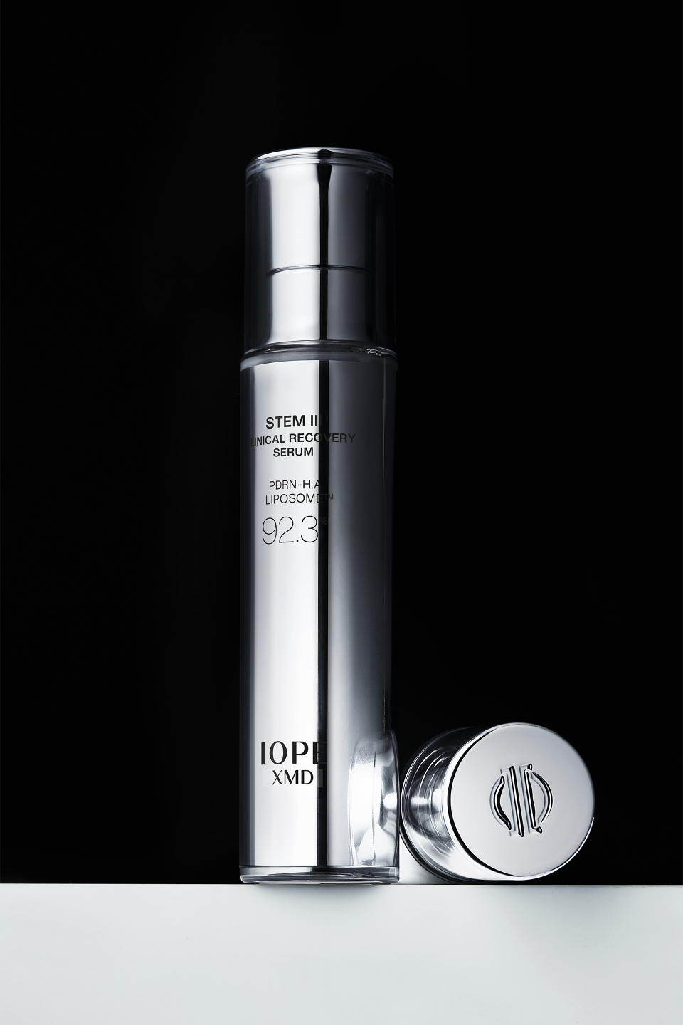
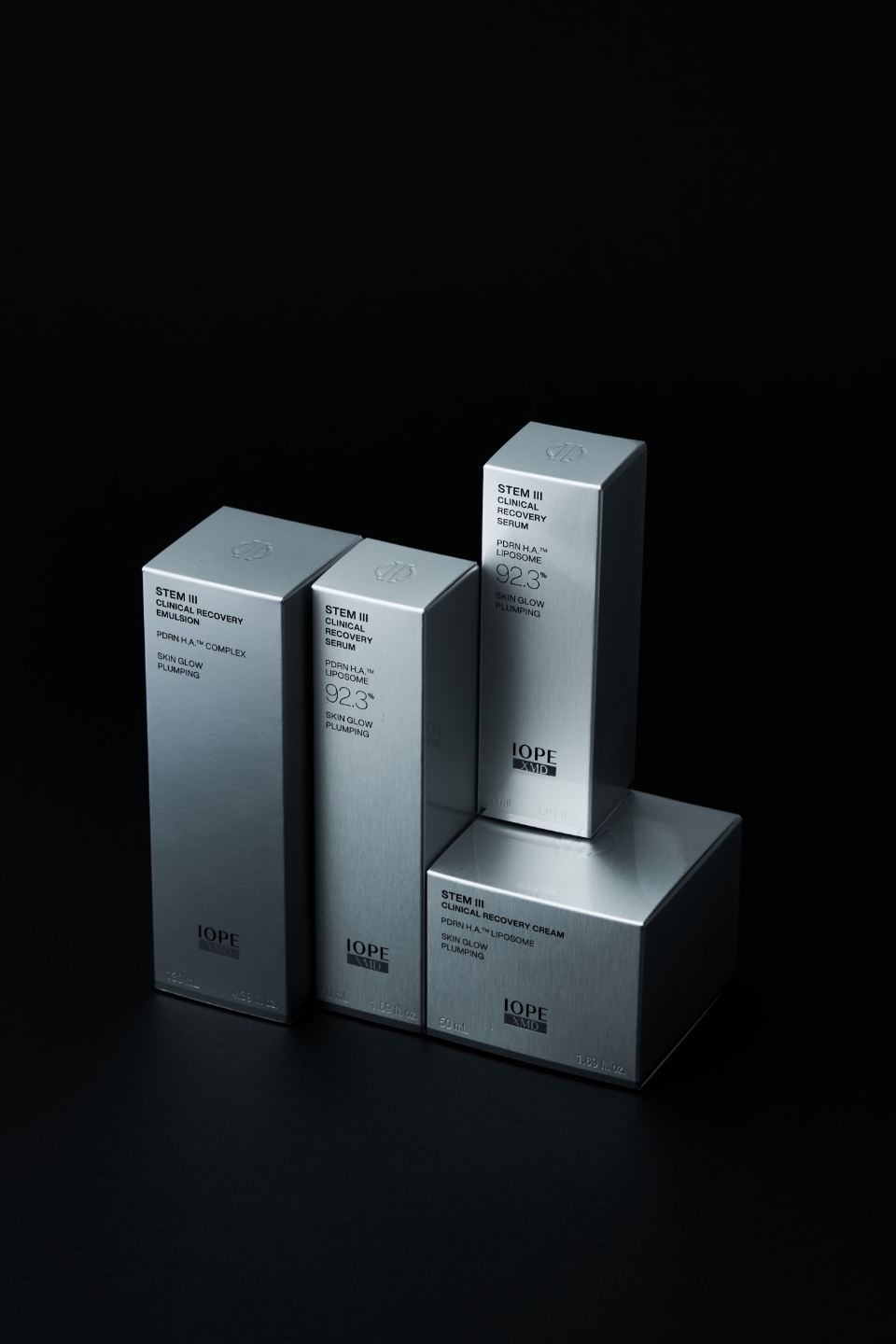
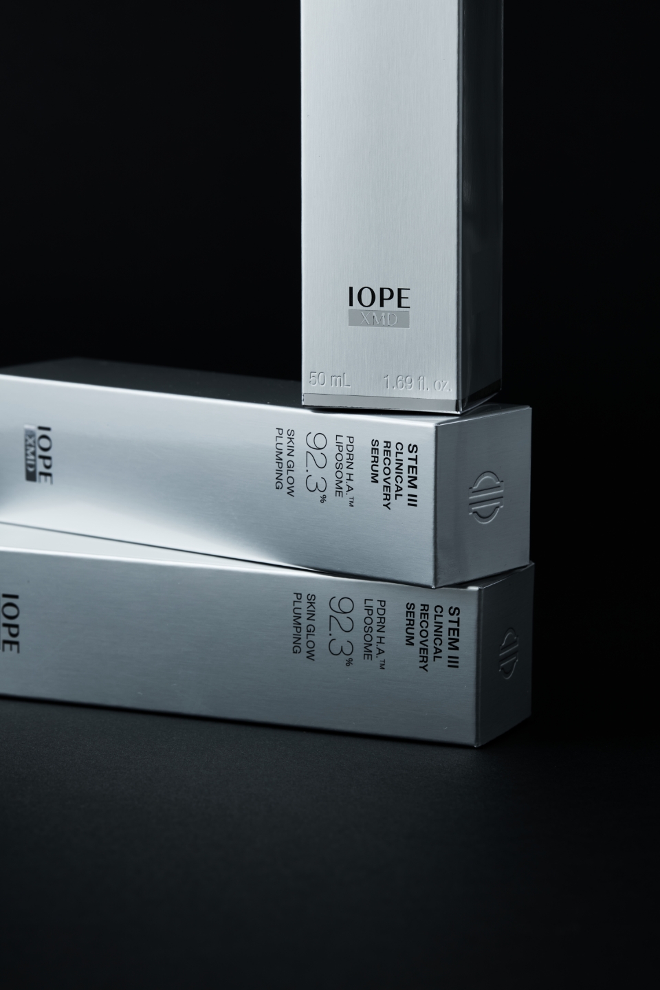
STEM III라는 이름을 계승하는 만큼, STEM III의 초기 철학에 아이오페의 새로운 철학인 ‘Clinical Grade IOPE’를 녹여내는 것을 하나의 디자인 방향성으로 삼았습니다. 결과적으로 이 방향성이 최종 디자인으로 이어졌습니다. 식물의 줄기에서 시작된 개념을 확장하여 에너지의 흐름과 균형, 그리고 의료적 효능에 대한 은유를 담는 방식으로 아이디어를 발전시켰습니다. 식물의 줄기가 수분과 영양을 운반하는 통로인 것처럼, STEM III가 피부에 에너지를 전달하는 채널로서의 상징성을 가질 수 있는 형태를 고민했습니다. 이를 위해 공간감이 느껴지는 레이어드 구조를 활용했으며, 아이오페만의 클리니컬 아이덴티티를 강화하기 위해 유기적인 실루엣 안에 시술 도구에서 착안한 금속성 소재와 비례감을 녹여냈습니다. 이는 제품의 효능과 신뢰도를 동시에 시각적으로 전달하는 디자인으로 완성되었습니다.
Given that we were inheriting the name STEM III, one of our key design directions was to infuse IOPE’s new philosophy, “Clinical Grade IOPE,” into STEM III’s original ethos. This direction ultimately guided our final design. We expanded on the concept of a plant’s stem, developing ideas that metaphorically conveyed energy flow and balance, alongside medical efficacy. Just as a plant’s stem acts as a conduit for water and nutrients, we pondered a form that could symbolize STEM III as a channel for delivering energy to the skin. To achieve this, we utilized a layered structure that evokes a sense of depth. To further strengthen IOPE’s clinical identity, we integrated metallic materials and specific proportions inspired by medical tools within organic silhouettes. This resulted in a design that visually communicates both efficacy and trustworthiness.
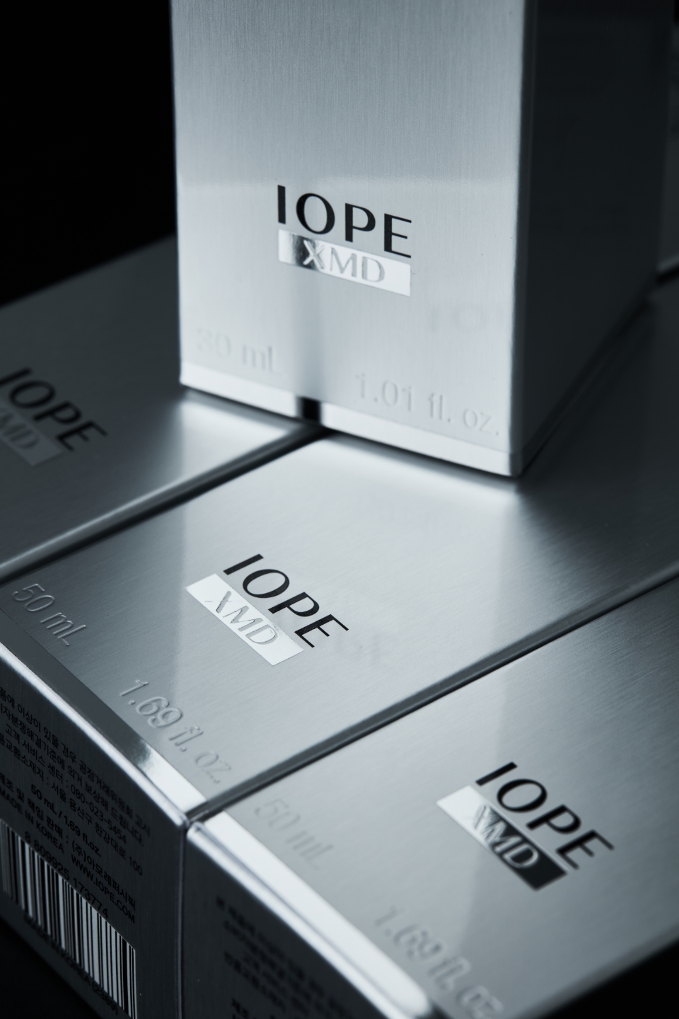
IOPE XMD LOGO
로고 또한 이번 프로젝트에서 중요한 변화를 맞았습니다. IOPE는 스킨케어와 특수 관리의 경계를 넘어 보다 전문적인 기능성 브랜드로 도약하기 위해 XMD 카테고리를 신설했습니다. IOPE XMD는 IOPE와 Medical의 만남을 상징합니다. 기존 워드마크와 동일한 서체를 사용해 브랜드의 연속성을 유지하면서도, 박스 그래픽과 시각적 후가공을 통해 XMD만의 차별화된 정체성을 표현하고자 했습니다. 이번 리뉴얼은 제품과 그래픽 전반에 걸쳐 IOPE의 진보된 시술급 효능을 시각적으로 표현하는 데 중점을 두었습니다.
The logo also underwent a significant transformation in this project. IOPE established the XMD category to advance as a more specialized, high-performance brand, moving beyond the boundaries of general skincare and special treatments. IOPE XMD symbolizes the convergence of IOPE and Medical. We maintained brand continuity by using the same typeface as the existing wordmark, but sought to define XMD’s unique identity through box graphics and visual finishing touches. This renewal focused on visually expressing IOPE’s advanced, clinical-grade efficacy across both the product and its graphics.
Sustainability
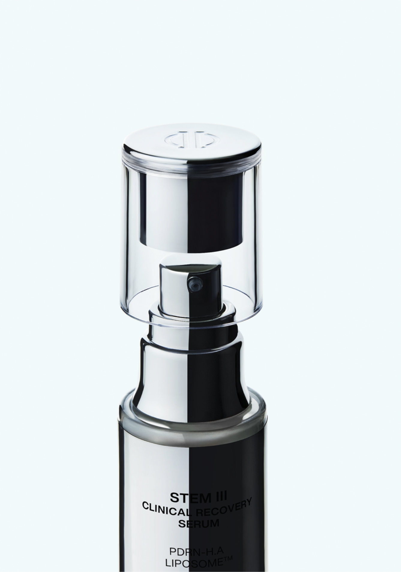
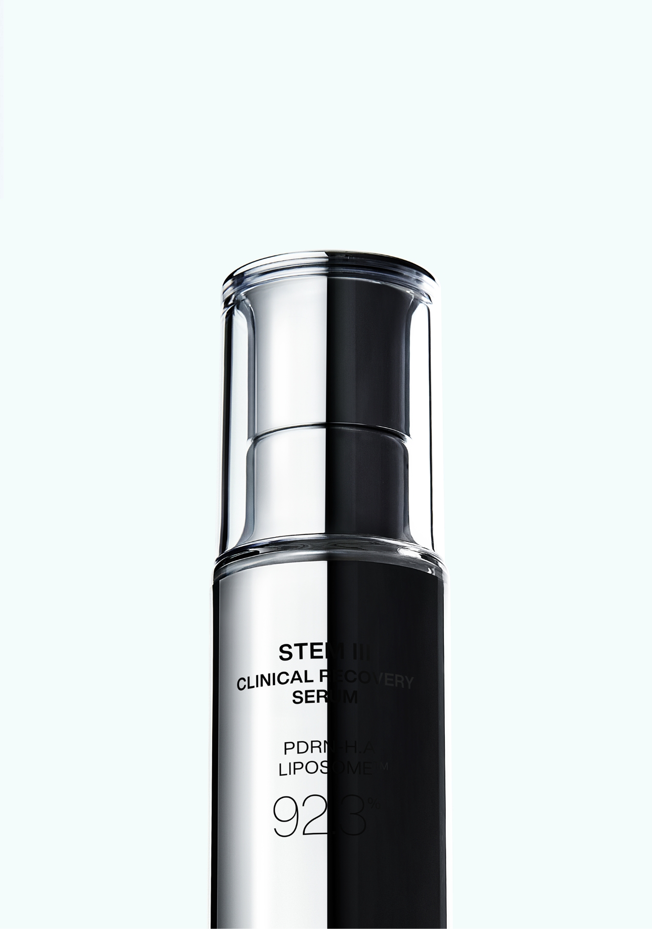
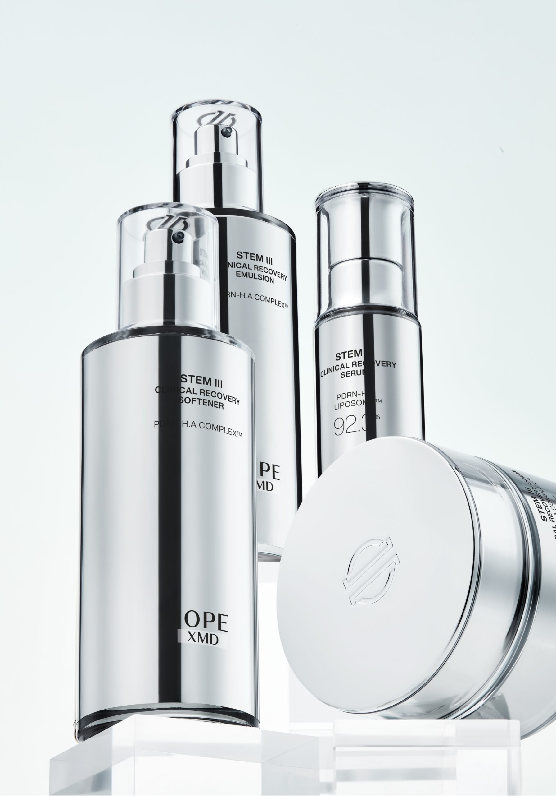
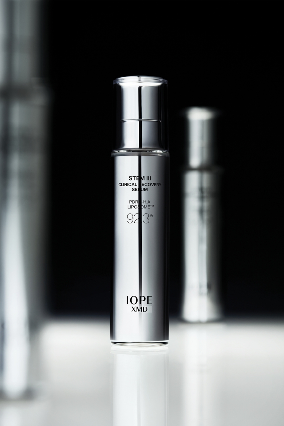
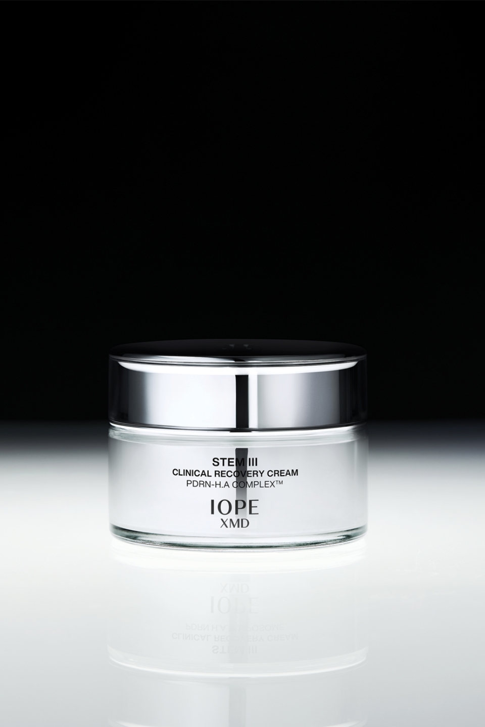
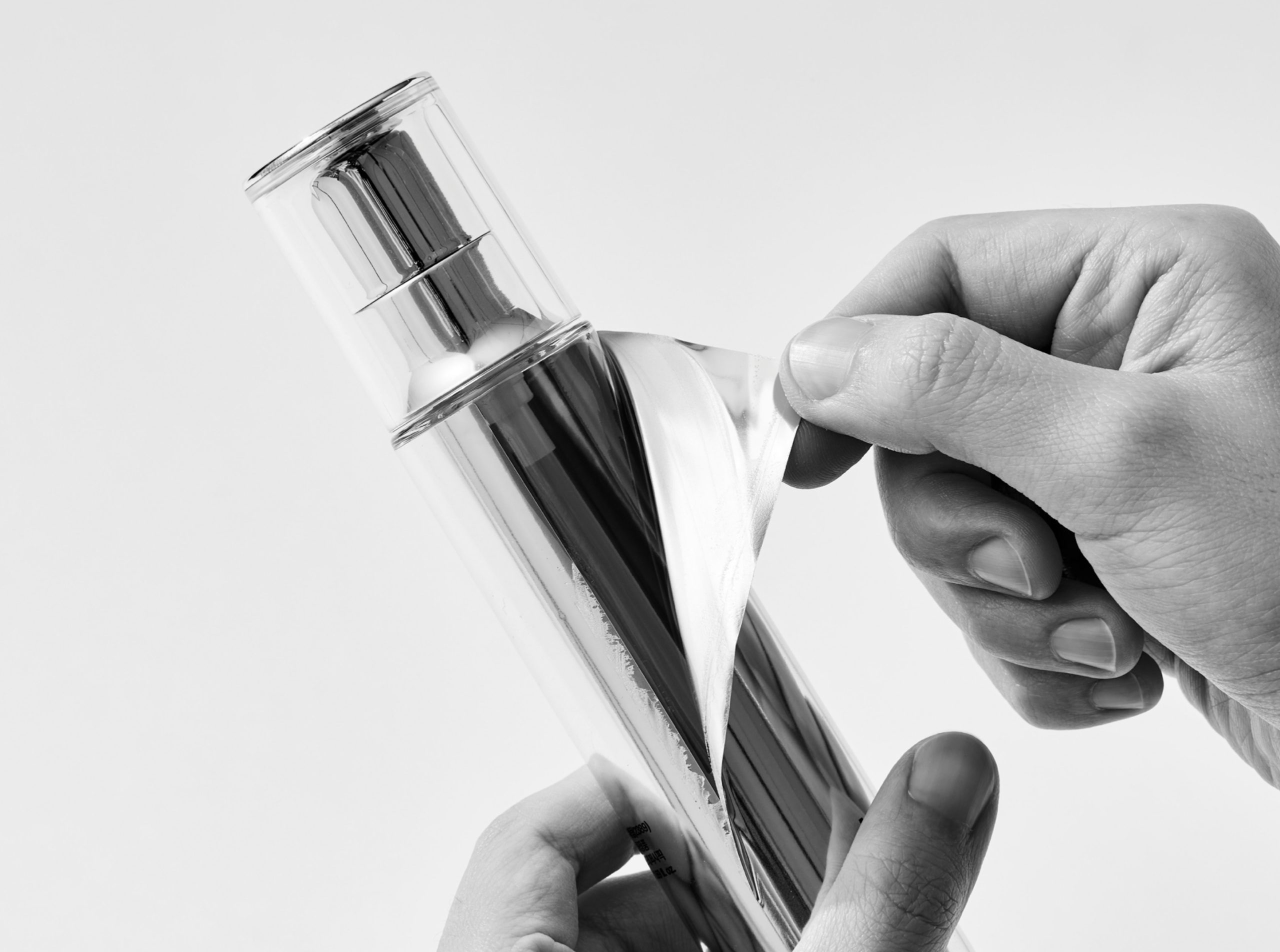
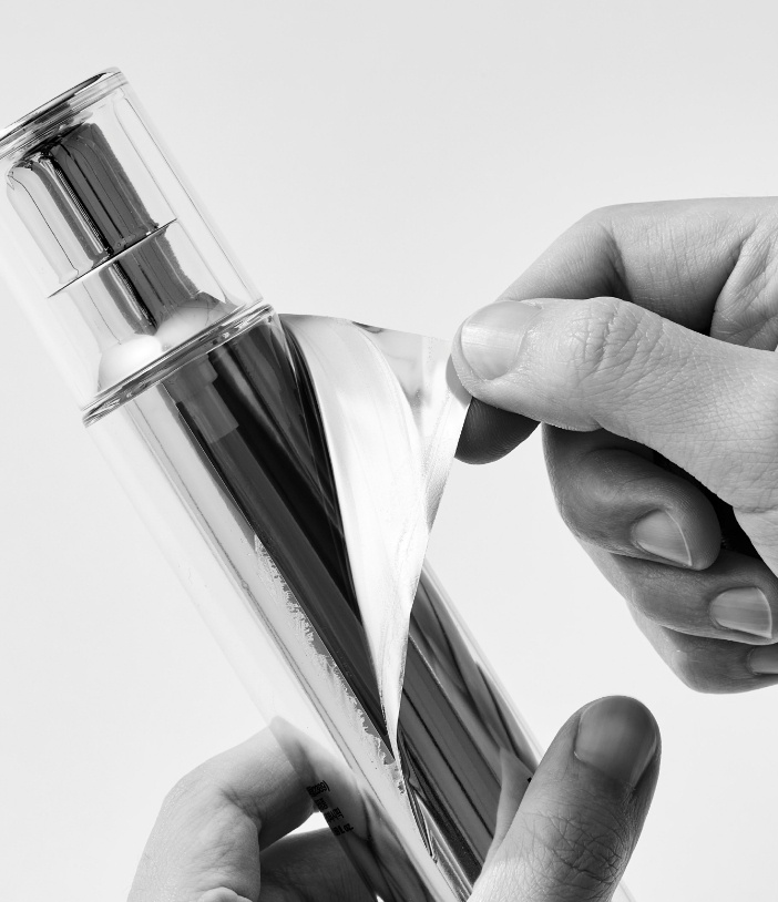
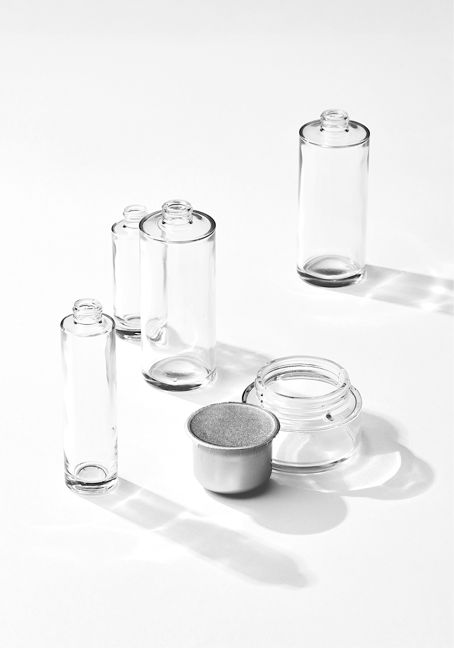
IOPE는 지속 가능성 또한 핵심 디자인 가치로 삼고 있습니다. STEM III 라인의 모든 용기(내용물이 담기는 부위)가 유리로 제작된 것도 이와 같은 이유 때문이었습니다. 클리니컬한 이미지를 위해 용기 라벨에 실버 컬러를 적용했지만, 유리 용기에는 어떠한 후가공이나 인쇄도 적용하지 않았습니다. 덕분에 라벨만 제거하면 투명한 유리 용기만 남아 재활용이 용이하도록 설계되었습니다. 크림 내용기는 리필이 가능한 구조로 제작하여 자원 순환성을 높였으며, 플라스틱 사용 시에는 신재 사용을 최소화하고 PCR(재활용 플라스틱)을 적극 활용하고 있습니다. 2차 포장재에는 FSC 인증 종이와 콩기름 기반 친환경 잉크를 사용하여 브랜드의 환경에 대한 철학을 제품 전반에 반영했습니다.
IOPE also considers sustainability a core design value. This is why all containers (the parts holding the product) in the STEM III line are made of glass. Although we applied silver-colored labels to the glass containers to convey a clinical image, we intentionally avoided any post-processing or printing directly on the glass itself. This design ensures that once the label is removed, only clear glass remains, making recycling straightforward. The cream jars are designed with a refillable structure to enhance resource circularity. When plastic is used, we minimize the use of virgin plastic and actively incorporate PCR (Post-Consumer Recycled plastic). For secondary packaging, we use FSC-certified paper and soy-based eco-friendly ink, reflecting the brand’s environmental philosophy throughout the entire product.
이번 리뉴얼은 오랜 헤리티지를 존중하면서 동시에 변화하는 소비자의 기대에 부합하기 위해 새로운 브랜드 철학과 기준을 세워나가는 특별한 여정이었습니다. 그 시작점에 디자이너로서 함께할 수 있어 무척 의미 있었습니다. 새롭게 변화해 나갈 IOPE의 모습에 앞으로도 많은 관심 부탁드립니다.
This renewal journey was particularly meaningful as it allowed us to set new brand philosophies and standards, honoring our long heritage while simultaneously meeting evolving consumer expectations. As a designer, it was incredibly significant to be part of this beginning. We hope you’ll continue to show great interest in the evolving face of IOPE.
- Amorepacific Creatives
- Product Design
- 김예솔, 김지현, 성유진
- 박경미
- BM
- 신보미
- MC
- 박세례, 김연진
- Development
- 홍서희, 김관섭, 강경희
- GTM
- 서강준, 조재범, 연태화
- 윤호정, 윤석준, 박수진
- 강성훈, 박한진
- Visual Directing & Logo Design
- 김예솔
- Photography
- 이윤진