2022 Mise en scene Hello Bubble
Summary
Hello Bubble underwent an AD revamp to reflect the evolving brand image of its main model, BLACKPINK, and the shifting demands of the hair
dye market. Instead of focusing solely on showcasing hair color, the package design emphasizes the model’s unique charm by adopting a refined
magazine cover aesthetic and sensuous model cuts. This approach transforms the package into a compelling visual scene that conveys the brand’s
emotional tone and draws attention when displayed on store shelves. From a practical standpoint, both front-facing sides of the box are designed
to optimize shelf visibility. The dyeing accessories were also designed with a minimalist, number-based system to enhance user intuitiveness,
while consistently reinforcing the renewed Hello Bubble vibe across every touchpoint.

Concept
The aim was to move beyond presenting hair color as just a shade by pairing each color with complementary styling and mood, enhancing consumer appeal.
A modern, refined visual direction was applied to match the now more mature image of the main model. This created a magazine-inspired look and feel
when the product is displayed. Each hair color was assigned a persona, and styled photo shoots were conducted accordingly—much like fashion editorials.
The selected images were then used in a photography-driven layout that captured the essence of each color and mood.


In the past, hair dye packaging primarily focused on vividly and realistically showcasing hair color. In contrast, the renewed Hello Bubble repositions
hair color as a medium to express the individuality and artistic character of each of the four BLACKPINK members. This approach aligns with the current
generation’s mindset, which sees hair color as a form of self-expression and values the overall mood of a look more than its individual styling components.
As a result, the key model images featured on the packaging were designed to resemble scenes from an editorial photo shoot.
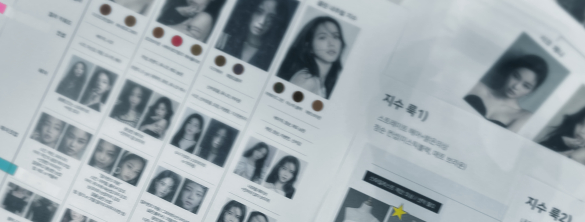
In close collaboration with the marketing team, we carefully selected hair colors that suited each BLACKPINK member and meticulously planned the shooting mood
and concept for each shade. For each color, we defined a persona we wanted the member to embody and thoughtfully coordinated elements such as color palette,
hairstyle, wardrobe, pose, and overall atmosphere. These details were thoroughly applied during the shoot and in post-production.
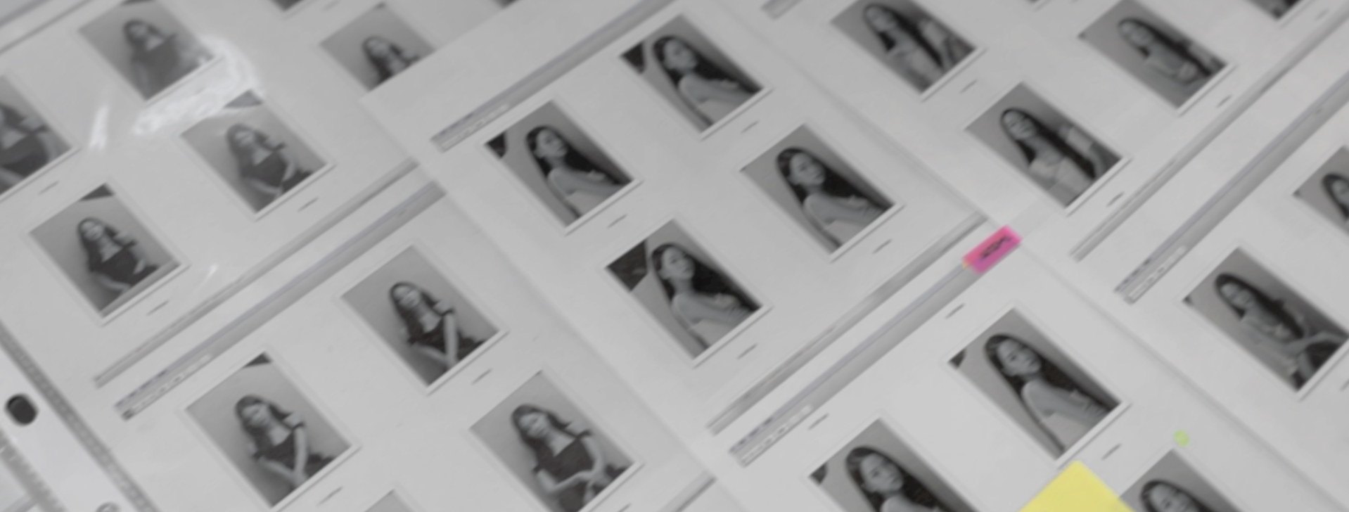
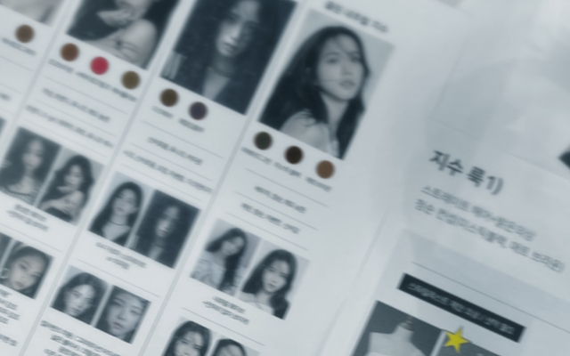
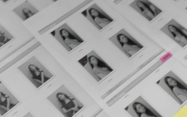
Out of thousands of photos, 24 were selected that best captured the distinctive charm of each BLACKPINK member, with YG participating in the selection process.
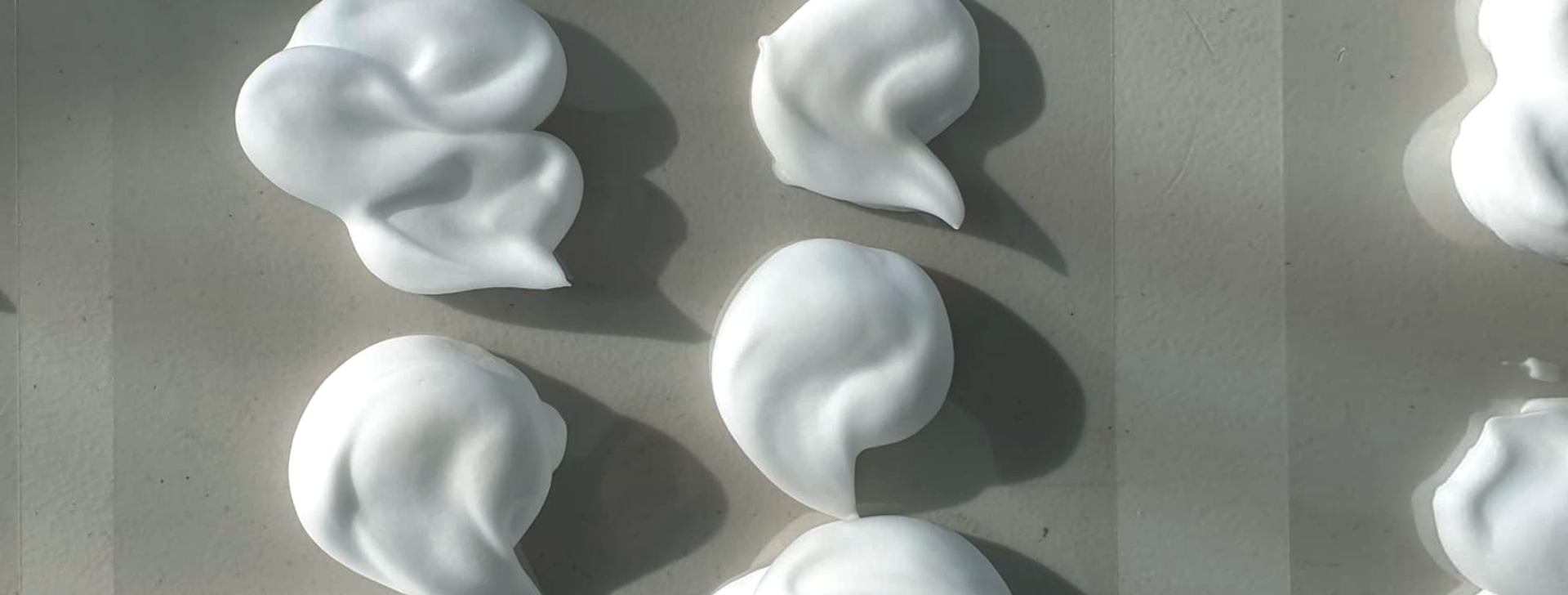
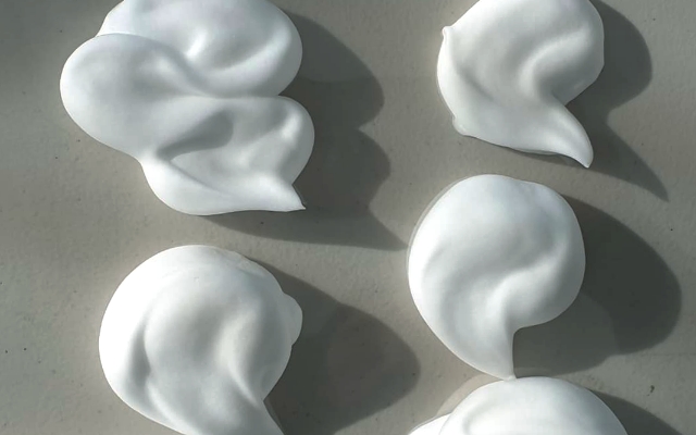
In addition, for the key imagery representing Hello Bubble’s new formula, the goal was to create a clean, refined, and professional aesthetic that aligned with the sophisticated tone of the design. Various bubble shapes and styles were tested to arrive at the final image featured on the packaging as Hello Bubble’s signature visual.
In addition, for the key imagery representing Hello Bubble’s new formula, the goal was to create a clean, refined, and professional aesthetic that aligned with the sophisticated tone of the design. Various bubble shapes and styles were tested to arrive at the final image featured on the packaging as Hello Bubble’s signature visual.

To accommodate situations where front-facing display may be limited depending on the size of offline stores such as drugstores,
a dual design was adopted that allows both the front and side panels to function as the main display surfaces. This approach not
only serves practical merchandising needs but also enhances the product’s appeal by offering a more dynamic presentation of hair
colors and showcasing a wider range of the model’s personality.

Hair dye products typically require a large amount of mandatory information, which can make it difficult for consumers to focus on what truly
matters. To address this, the back of the package was designed to highlight only the most essential points. These include: how the hair color
will change after use, what has been updated in the reformulated product for existing users, and safety warnings directly related to user
health. All other information was presented in a way that allows consumers to refer to it only if needed.

The renewed Hello Bubble features a QR code on the top of the packaging that links to hellomycolor.com, a mobile hair color simulation
program co-developed with KAIST’s Color Research Lab. By scanning the QR code, users can use their smartphones in-store to experience
how the dye would look on their current hair color through AR.


For the bleaching agent Hello Bleach, a white base color with an inverted design was used to
intuitively convey the product’s function while maintaining a cohesive look across the lineup.

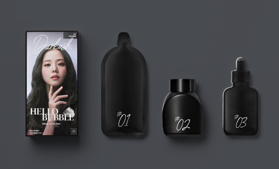
The hair dye, oxidizing agent, and damage-prevention ampoule included in the product are labeled solely by their order of use, rather than
with complex names. This makes the product more intuitive and easier to use, while also conveying a fashionable image. The sleek black
color and minimalist packaging design allow consumers to experience the renewed sensibility of Hello Bubble at every moment of use.


- Amorepacific Creatives
- Design
- Kim Bitnuri, Kim Soyoung
- BM
- Lee Yewon
- MC
- Ko Eunbi
