PRIMERA OLIVE YOUNG SET PACKAGE & VMD DESIGN RENEWAL PROJECT
프리메라 올리브영 세트 패키지&VMD 디자인 리뉴얼 프로젝트
Summary
프리메라의 올리브영 세트 패키지 및 VMD 디자인 리뉴얼 작업을 소개합니다. 올리브영은 프리메라의 온·오프라인 판매 경로 중 핵심 채널로, 전체 매출에서 상당한 비중을 차지하고 있습니다.
이번 프로젝트의 목표는 프리메라의 브랜드 아이덴티티를 강화하면서도, 제품이 전달하고자 하는 메시지를 어떤 환경에서도 명확하고 효율적으로 소구하여 매출에 긍정적인 영향을 주는 것이었습니다.
이를 위해 디자인팀은 현황을 면밀히 진단하고, 세트 구조, 배치 전략, 이미지 스타일 등 시각적 요소 전반을 검토하여 현재 시장 환경에 적합하도록 개선 작업을 진행했습니다.
This article has been translated by an AI.
We are pleased to introduce the renewal of Primera’s Olive Young set package and VMD (Visual Merchandising Design). Olive Young is a key distribution channel for Primera, both online and offline, contributing significantly to overall sales. The goal of this project was to strengthen Primera’s brand identity while effectively and clearly communicating the product’s core message in any given context—ultimately contributing positively to sales performance. To achieve this, the design team conducted a thorough analysis of the current situation and worked on improving visual elements such as the set structure, layout strategy, and image style to better align with the current market environment.
We are pleased to introduce the renewal of Primera’s Olive Young set package and VMD (Visual Merchandising Design). Olive Young is a key distribution channel for Primera, both online and offline, contributing significantly to overall sales. The goal of this project was to strengthen Primera’s brand identity while effectively and clearly communicating the product’s core message in any given context—ultimately contributing positively to sales performance. To achieve this, the design team conducted a thorough analysis of the current situation and worked on improving visual elements such as the set structure, layout strategy, and image style to better align with the current market environment.
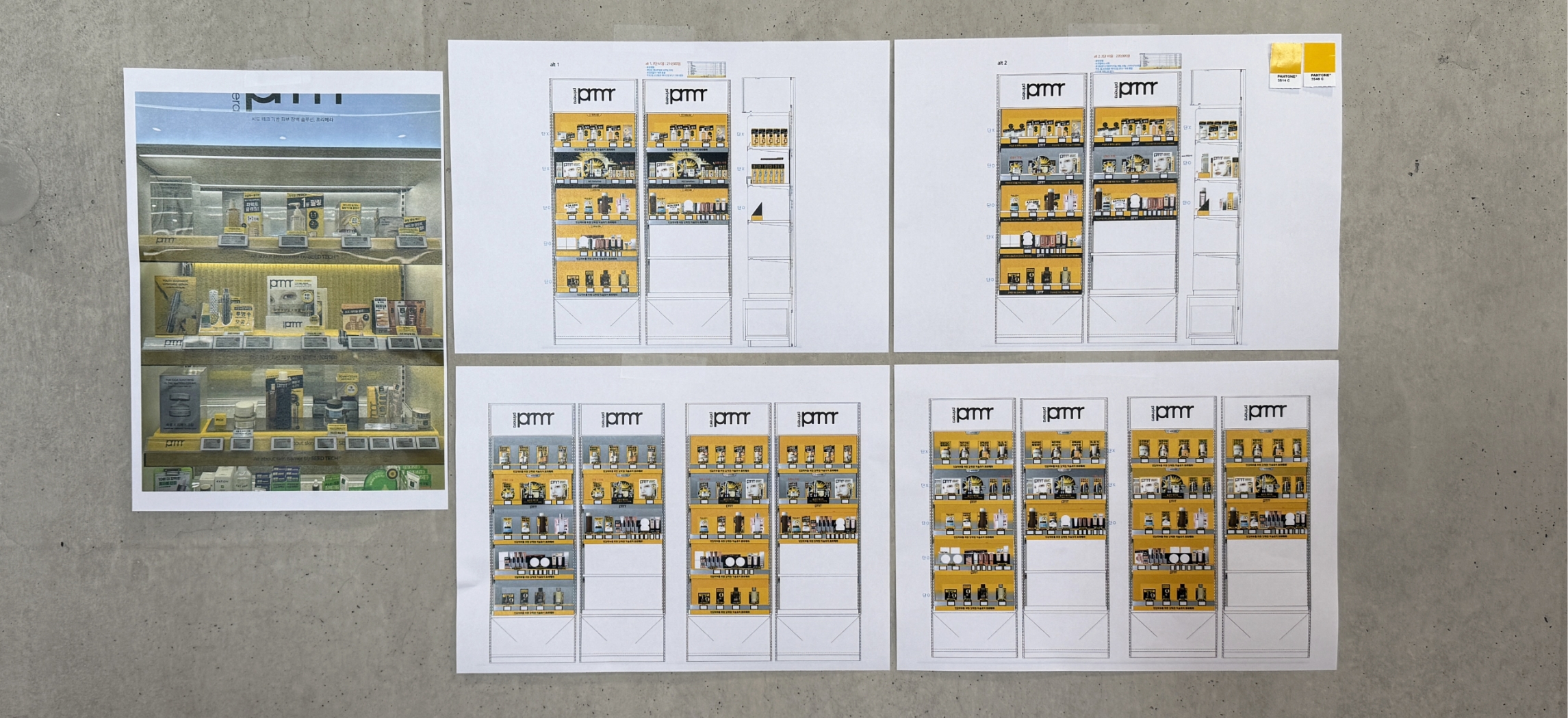
현황분석 및 개선안 제안
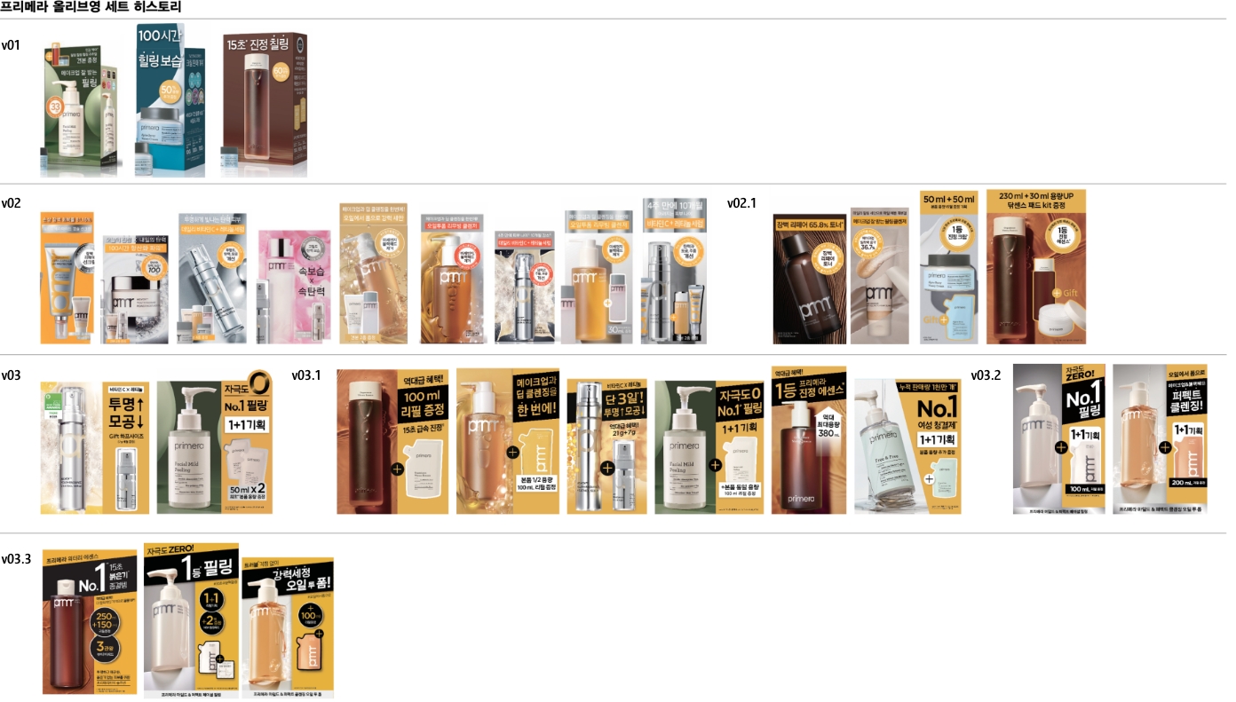
프리메라가 백화점에서 올리브영으로 점차 판매채널을 전환해나가면서 그 동안의 세트 디자인은 통일성보다는 제품 각각의 특성을 강하게 소구하는 방식으로 진행되어 왔습니다. 그러나, 올리브영 진출이 본격적으로
진행되고 판매 제품의 종류가 늘어나면서 해당 전략이 걸림돌이 되는 경우가 발생하기 시작했습니다. 이를 개선하기 위해 구체적으로 어떠한 문제들이 있는지 진단했습니다.
Current Status Analysis and Proposed Improvements
As Primera gradually shifts its sales channels from department stores to Olive Young, its set design strategy has focused more on emphasizing the unique characteristics
of each product rather than maintaining consistency. However, as the brand’s presence in Olive Young expands and the number of products increases, this strategy has begun
to present obstacles. To address this, we have diagnosed the specific issues that need improvement.
요소 간 통일성이 떨어지며, 문안 가독성과 가시성이 부족했습니다. 제품-패키지-비주얼-VMD의 일관성이 부족했고, VMD 배치에 따른 제품 디자인 계획도 부재한 상황이었습니다.
그리하여 다음과 같은 해결책을 제안하기로 했습니다. 1) 연출컷-제품-VMD에 사용되는 비주얼 로직을 통일한다. 2) 제품과 라인을 받처줄 수 있는 제품-단상자-기획-VMD 컬러와 톤을 설정한다.
3) VMD 요소와 제품 디자인의 요소가 서로 시각적으로 충돌하지 않도록 조정한다. 4) VMD 단 높이와 배치 위치를 고려한 세트 디자인 제안한다. 5) 패키지 사이즈를 최대한 통일한다.
6) 주요 문안으로 쏠리는 시선의 흐름이 끊기지 않도록 디자인 한다. 7) 유지관리측면을 고려한 손쉬운 교체형 디자인과 합리적인 VMD 소재를 반영한다.
There was a lack of consistency among elements, and the readability and visibility of key messages were insufficient. There was no coherent
alignment between the product, packaging, visuals, and VMD, and no design planning that considered VMD placement. Therefore, we decided to
propose the following solutions: 1) unify the visual logic used across editorial cuts, products, and VMD, 2) establish consistent colors
and tones for products, unit boxes, promotional materials, and VMD to support each product line, 3) adjust design elements to prevent
visual clashes between VMD components and product designs, 4) suggest set designs that take into account the height and placement of VMD
displays, 5) standardize package sizes as much as possible, 6) ensure that the flow of attention toward key messages is not interrupted
7) incorporate easily replaceable designs and cost-effective VMD materials with maintenance in mind.
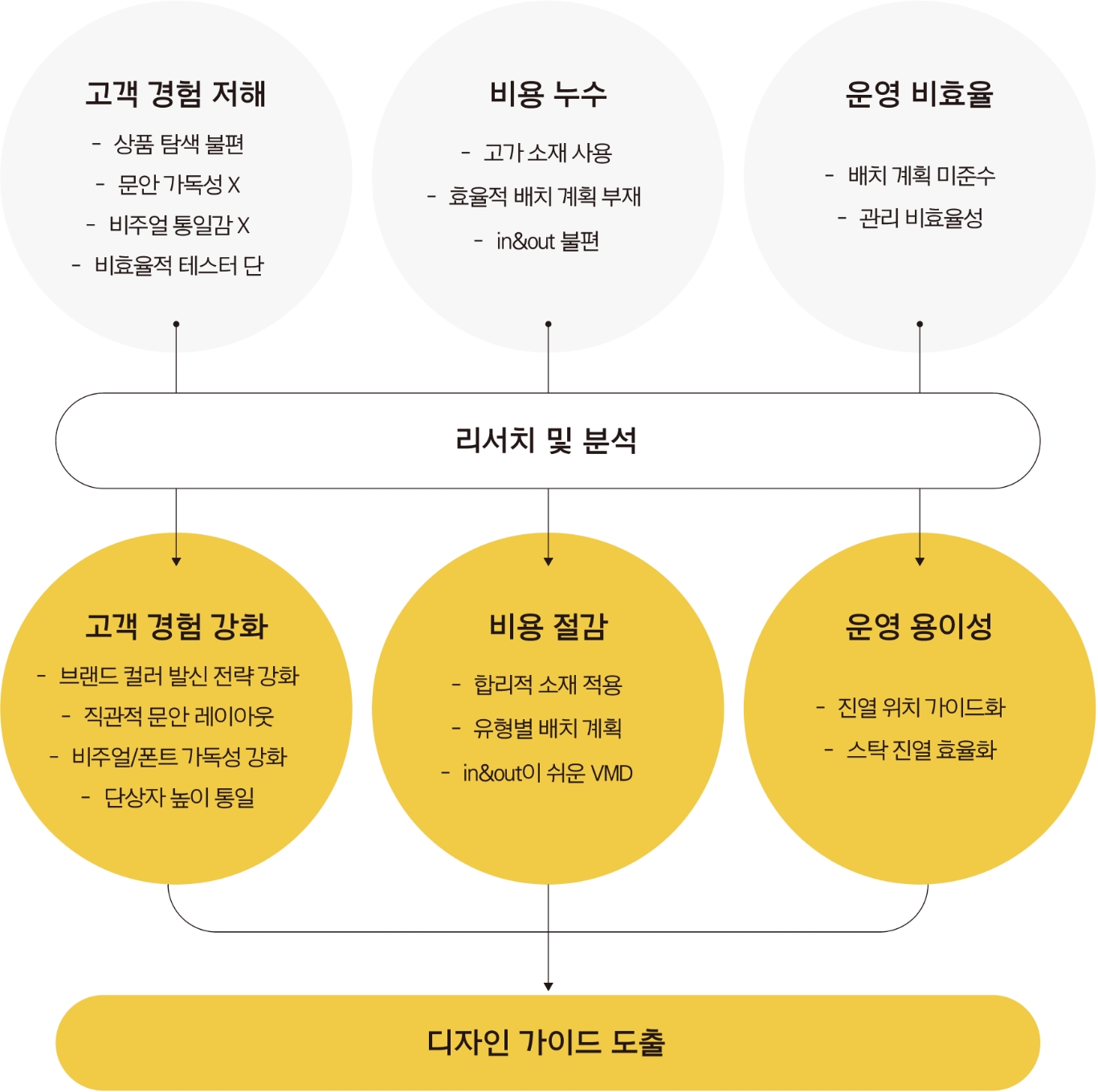
위의 문제점들을 종합하여 시각적으로 정리되어 보이도록 개선 작업을 진행했습니다.
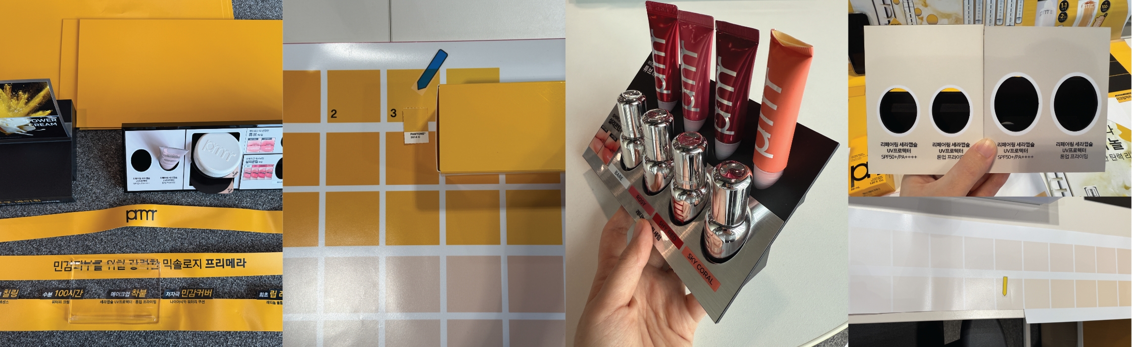
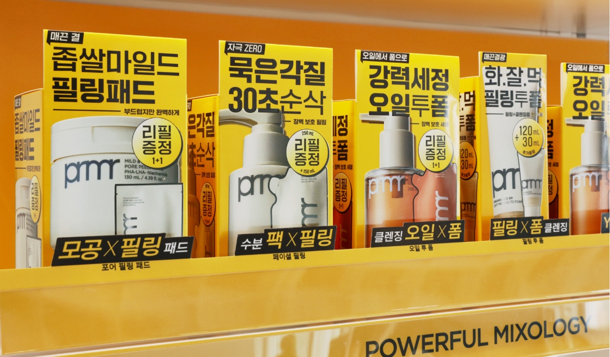
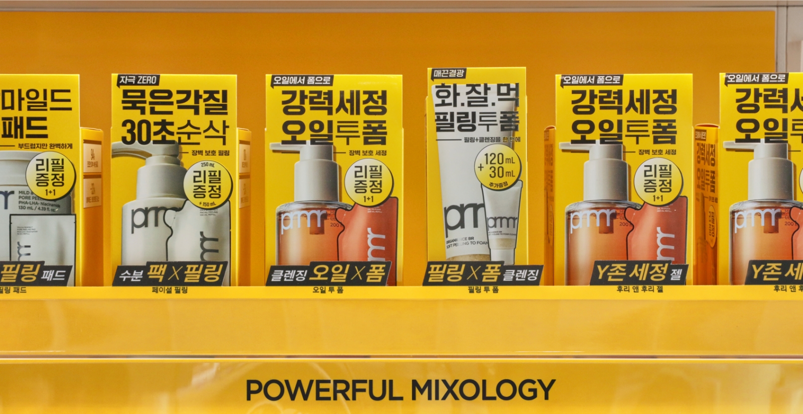
우선 제품 패키지는 1) 제품 이미지 스타일을 통일하고, 왜곡이나 장식은 배제하는 방향으로 적용했습니다. 2) 최소한의 장식과 색상 사용으로 패키지 자체의 가독성을 높였습니다. 3) 제품 패키지의
높이를 통일하여 군집시 시선이 자연스럽게 메시지로 흐르도록 유도했습니다. 4) 측면 배치시에도 전면과 최대한 동일하도록 패키지의 도면 형식을 통일했습니다.
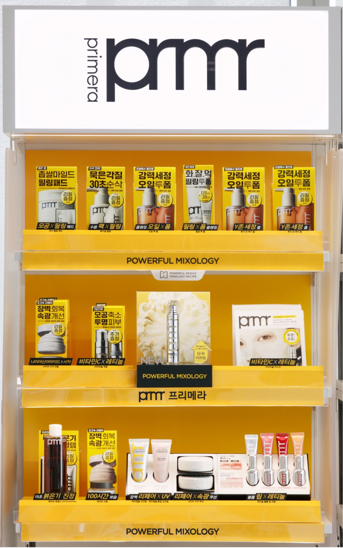
VMD는 1) 브랜드 컬러를 적극 노출하고 2) 대표상품 프로모션존의 주목도를 높이는 돌출형태 집기로 핵심상품을 적극 노출시켰습니다. 3) 띠지는 최대한 축약된 원포인트 문구로 특징을 강조하고 제품별 낱장으로 삽입했던 기존 방식 대신 유지관리가 쉽도록 한장에 적용하여 제품진열을 위한 가이드 역할도 할 수 있도록 하였으며 , 4) 클렌징류 등 테스터 제품을 비치할 수 없는 존의 불필요한 테스터 단은 삭제했습니다. 5) 메이크업 제품 거치대는 통합하고, 교체형 유닛으로 적용했습니다.
VMD는 1) 브랜드 컬러를 적극 노출하고 2) 대표상품 프로모션존의 주목도를 높이는 돌출형태 집기로 핵심상품을 적극 노출시켰습니다. 3) 띠지는 최대한 축약된 원포인트 문구로 특징을 강조하고 제품별 낱장으로 삽입했던 기존 방식 대신 유지관리가 쉽도록 한장에 적용하여 제품진열을 위한 가이드 역할도 할 수 있도록 하였으며 , 4) 클렌징류 등 테스터 제품을 비치할 수 없는 존의 불필요한 테스터 단은 삭제했습니다. 5) 메이크업 제품 거치대는 통합하고, 교체형 유닛으로 적용했습니다.
Based on the issues identified above, we proceeded with visual refinements to enhance clarity and consistency.
For the product packaging, 1)unified the product image style, eliminating distortion and decorative elements, 2) improved readability by minimizing
the use of decorations and colors 3) standardized the height of product packages to guide the viewer’s eye naturally toward the message when grouped,
4) aligned the layout format so that side placements appear as consistent as front-facing ones.
For the VMD, 1) actively utilized the brand color for stronger visual identity, 2) introduced protruding display units in promotional zones to highlight
key products and increase visibility, 3) simplified the messaging on belly bands to concise, one-point phrases, and replaced the previous method of inserting
individual sheets per product with a single unified sheet that also serves as a display guide, 4) removed unnecessary tester stands in zones where tester
products like cleansing items cannot be placed, 5) consolidated makeup product holders and applied modular, replaceable units for easier maintenance and updates.
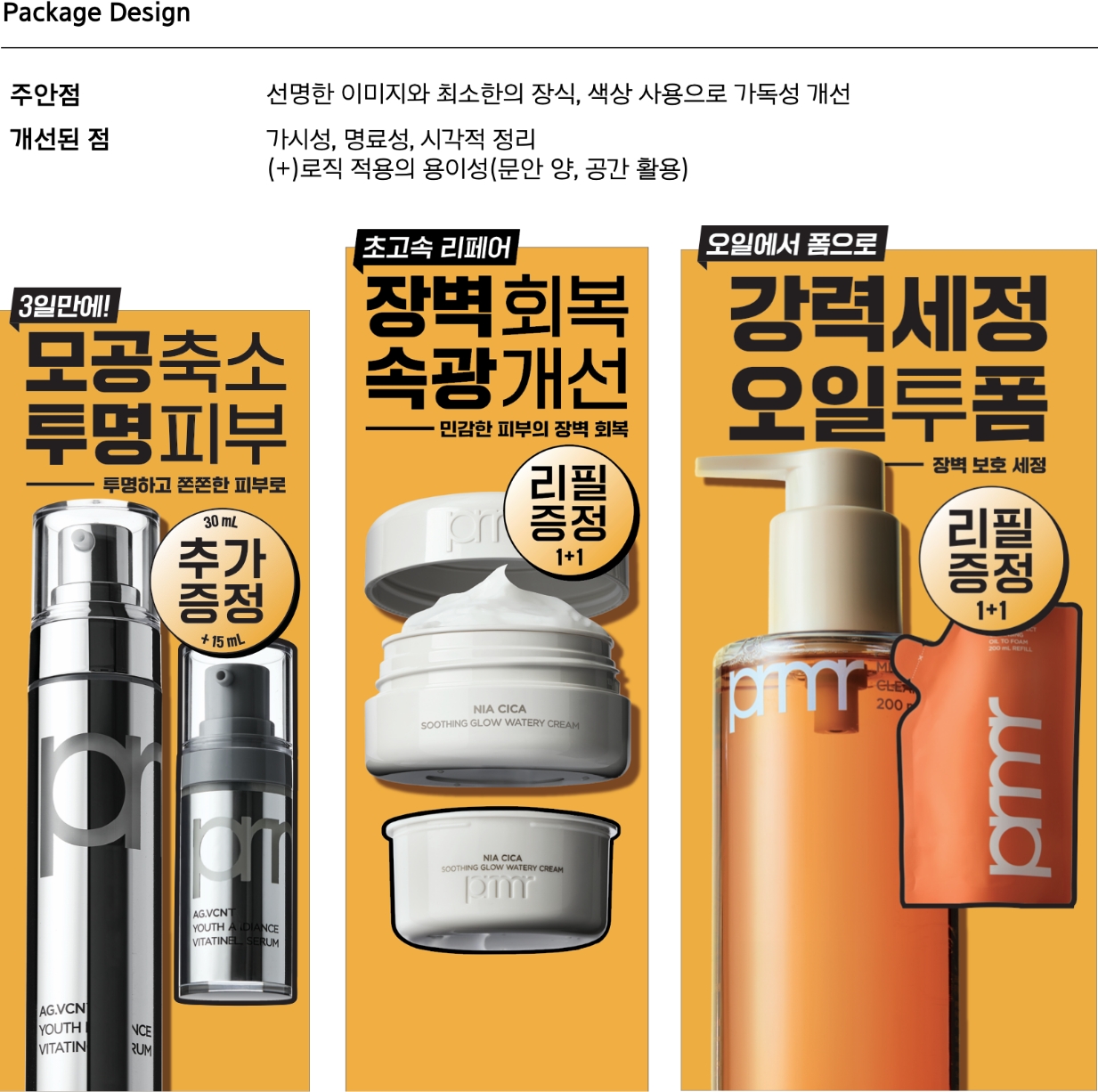
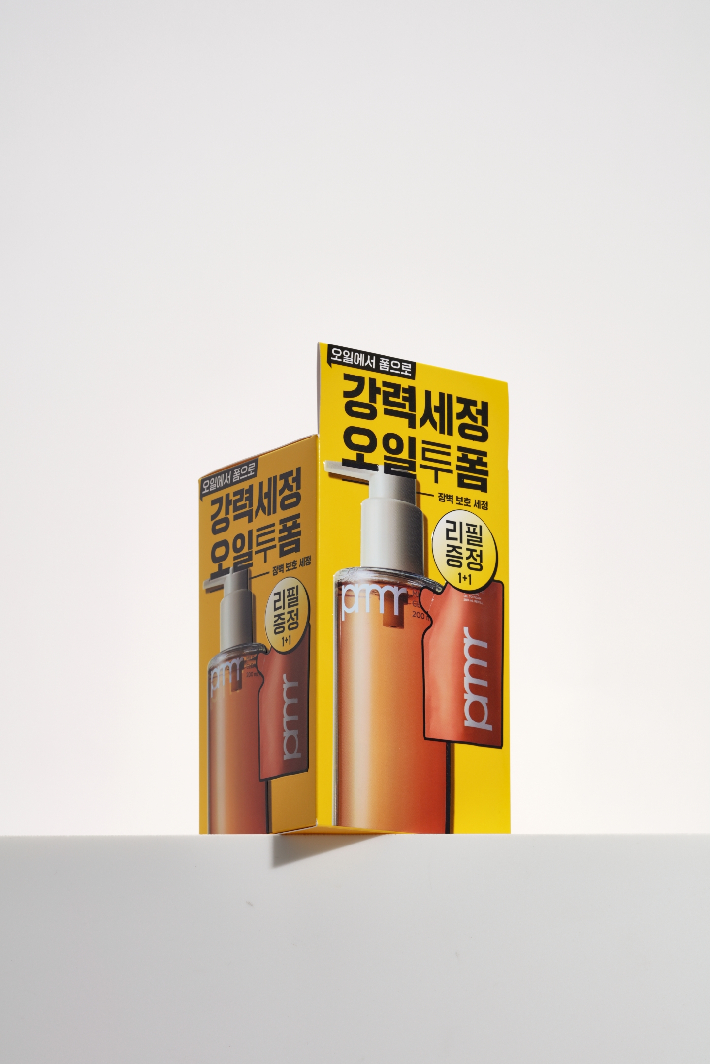
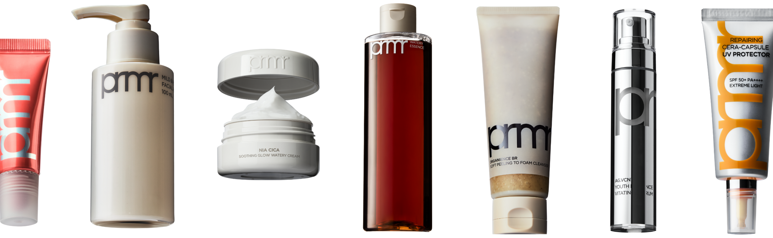
패키지에 적용되는 제품 이미지들은 동일한 조건하에 촬영하여, 최대한 통일돼 보이도록 했습니다. 제품의 실루엣이 명확히 보이도록 강한 명암을 적용했고, 제품이 왜곡되어
보이지 않도록 약간의 각도만 주어 입체감이 느껴지면서도 실물과 거의 동일하게 보이도록 했습니다. 테스터가 없을 경우, 테스터 대신 제품이 한 눈에 설명이 되도록 의도했습니다.
Product images applied to the packaging were photographed under consistent conditions to ensure maximum visual uniformity. Strong contrast
was used to clearly define the product silhouette, and a slight angle was applied to avoid distortion while maintaining a realistic,
three-dimensional appearance that closely resembles the actual product. In cases where testers are not available, the product image was
designed to clearly convey the product’s features at a glance.
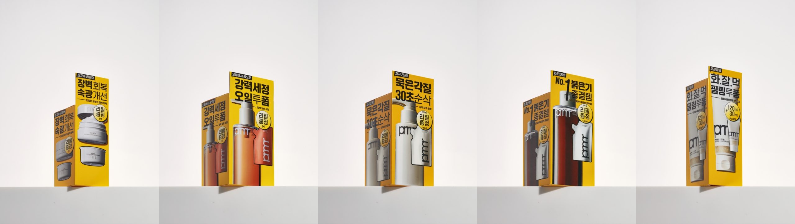
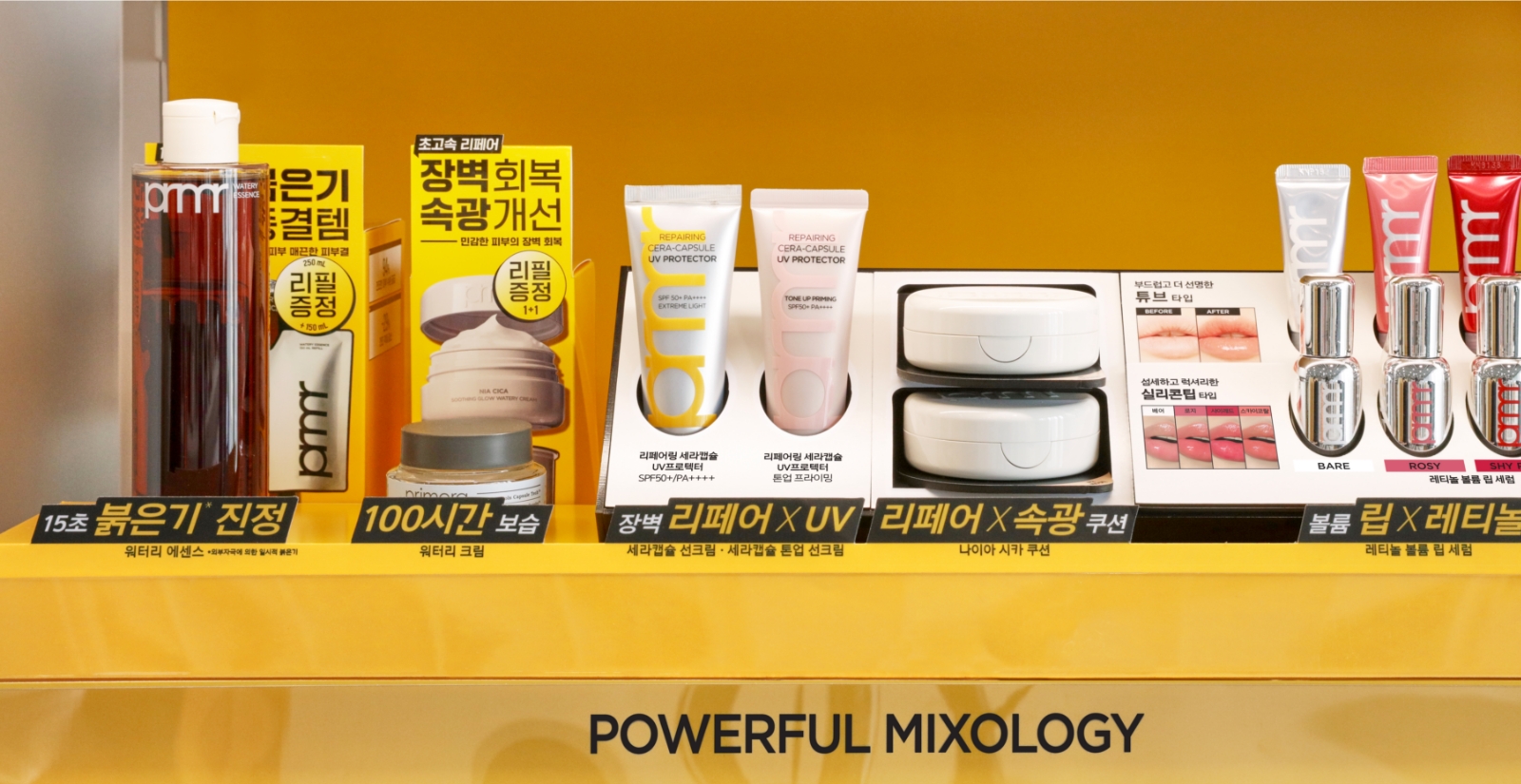
단상자의 높이를 최대한 통일하여 효율적인 시선 흐름을 유도했습니다. 간결한 메시지와 제품 이미지들이 동일한 높이에 배치되어, 짧은 시간 안에 정보를 파악할 수 있도록 설계했습니다.
We standardized the height of unit boxes as much as possible to guide the viewer’s eye efficiently. Concise messages and product
images were placed at a consistent height, allowing users to quickly grasp key information at a glance.
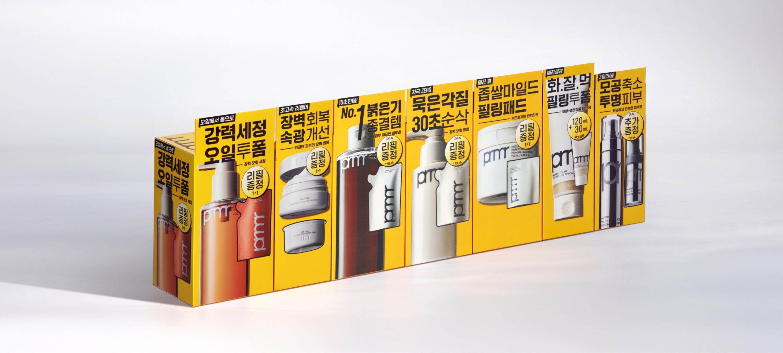
높이를 통일한 단상자는 오프라인 매장에서 제품 유형에 따라 높이가 낮은 제품들이 마치 진열되지 않은 것처럼 인식되는 문제를 보완해줍니다. 또한 전체적으로 더 정돈된 인상을 주며, 제품이 군집되어 진열될 때 볼륨감 있는 효과를 연출할 수 있습니다.
Unit boxes with standardized heights help address display issues in offline environments, where products with lower packaging heights may be perceived
as missing. This approach also creates a more organized appearance and allows for a fuller, more impactful display effect when products are grouped together.
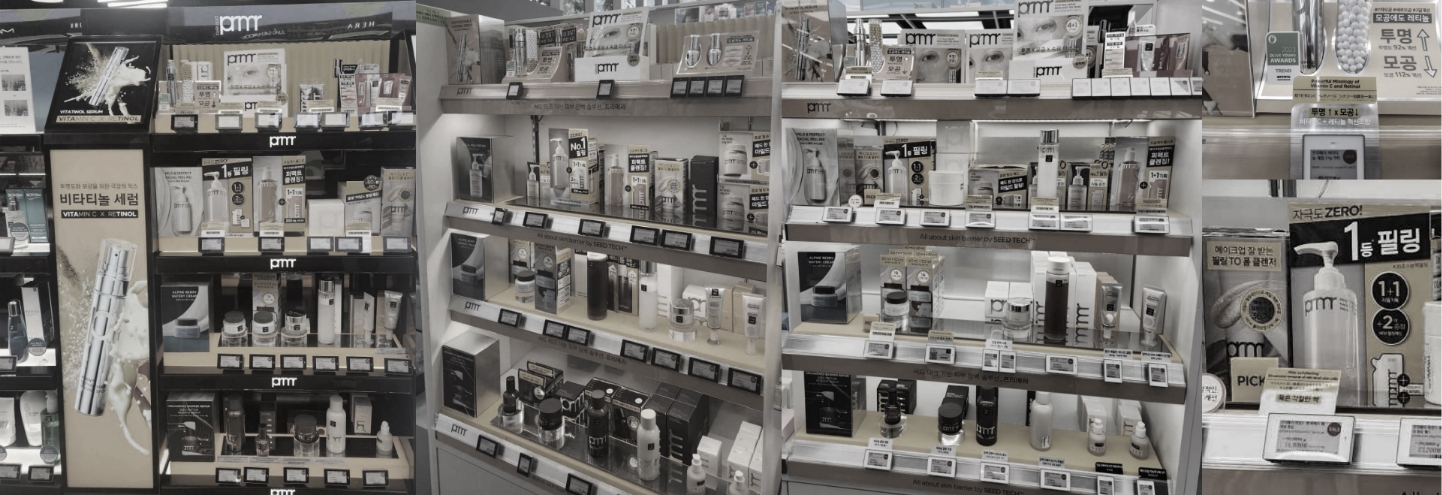
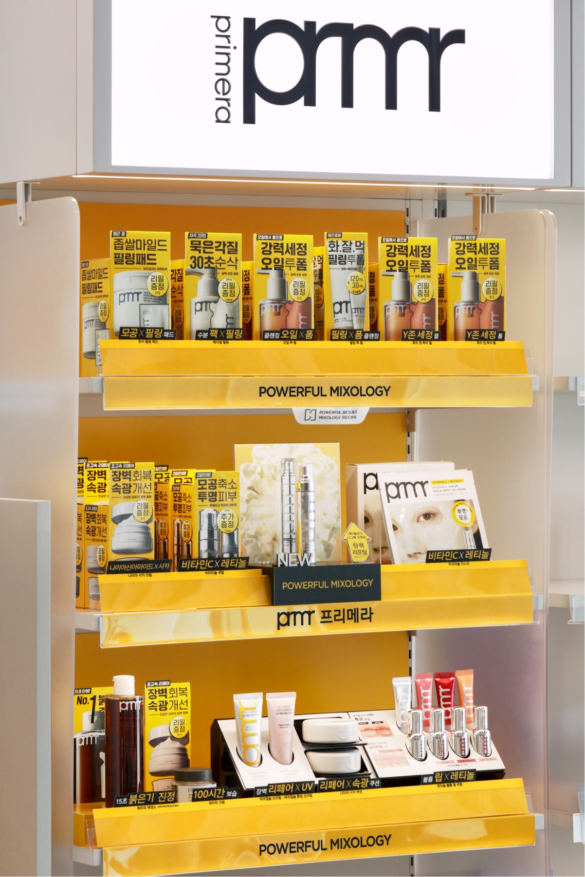
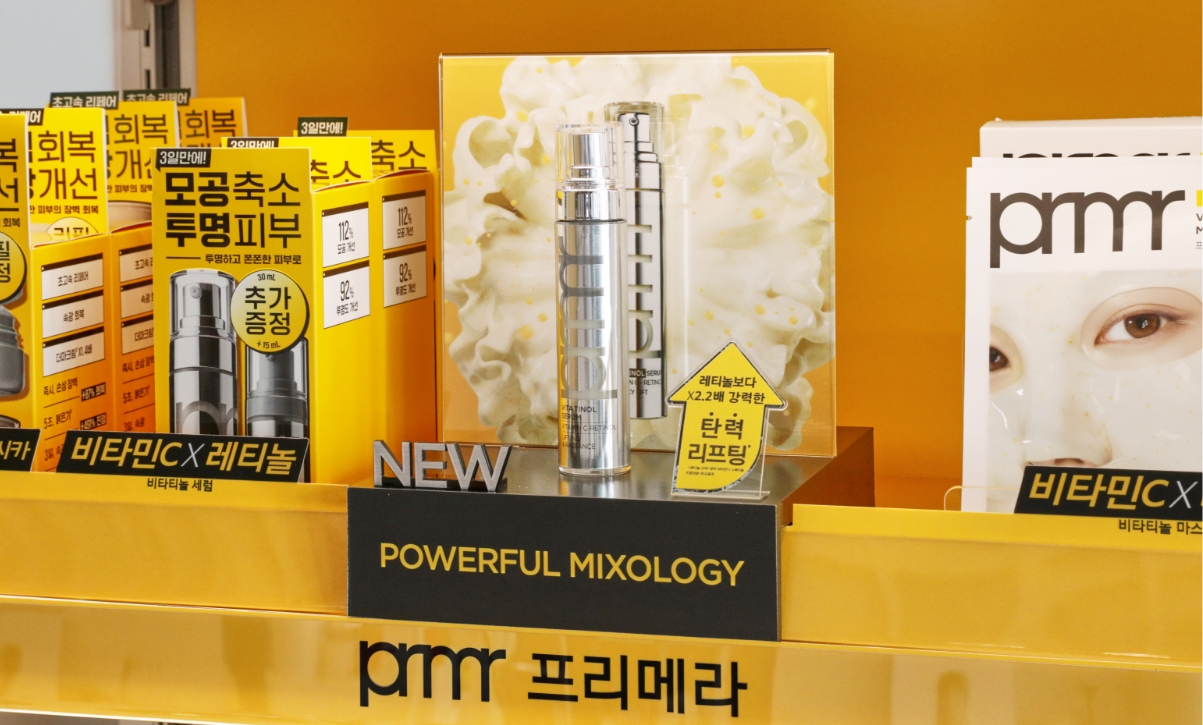
오프라인 환경에서 새로운 패키지 디자인과 상품 베네핏을 돋보이게하며 더불어 브랜드를 빠르게 각인 시킬 수 있도록 VMD 영역에서 다양한 시안 작업과 스터디를 진행하였습니다. 여러번의 샘플링 과정을 거쳐 최종적으로 정리된 디자인은 아래와 같습니다.
In an offline environment, we conducted various design mockups and studies within the VMD domain to highlight the new package design and product benefit,
while also reinforcing quick brand recognition. After numerous sampling processes, the final refined design is shown below.
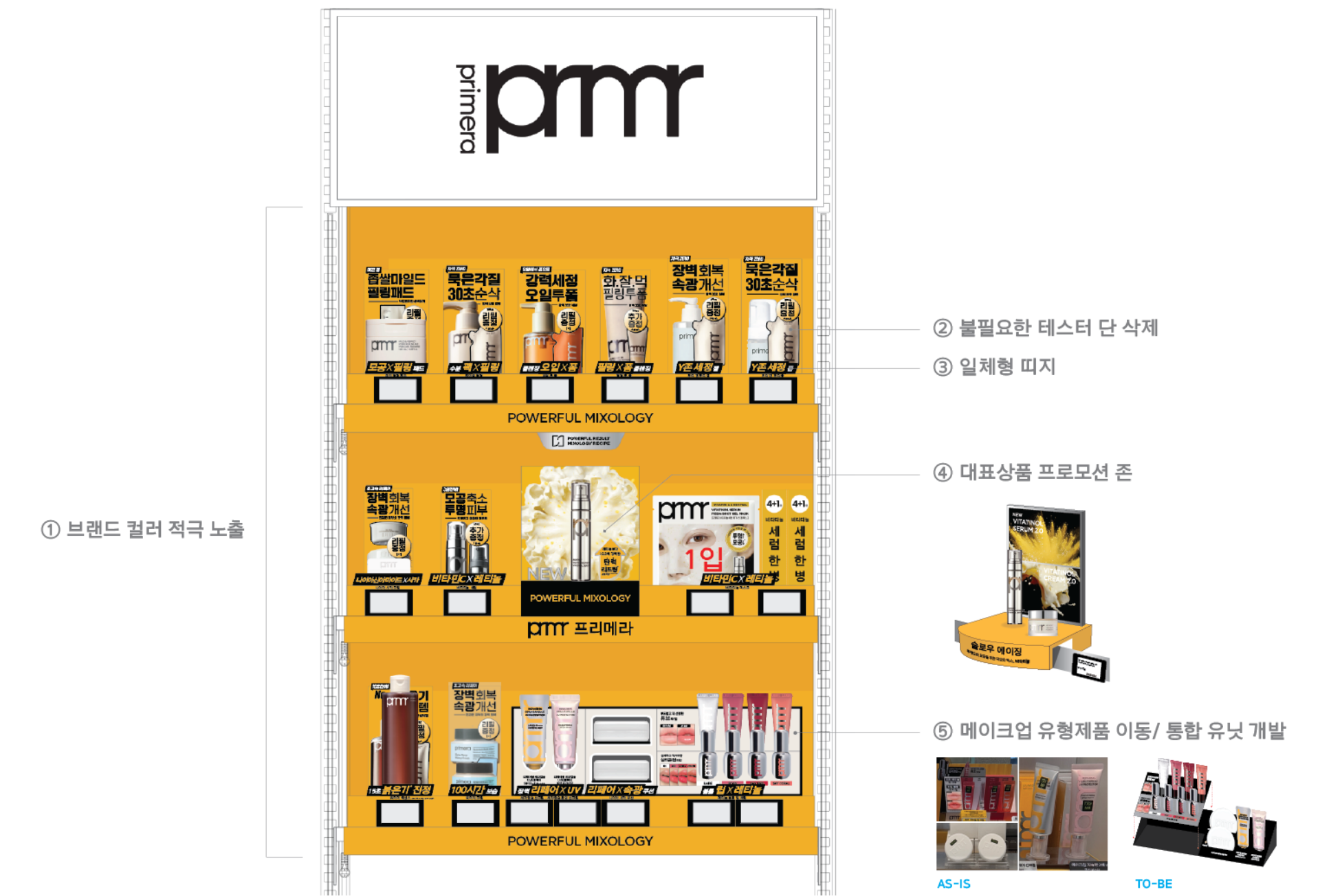
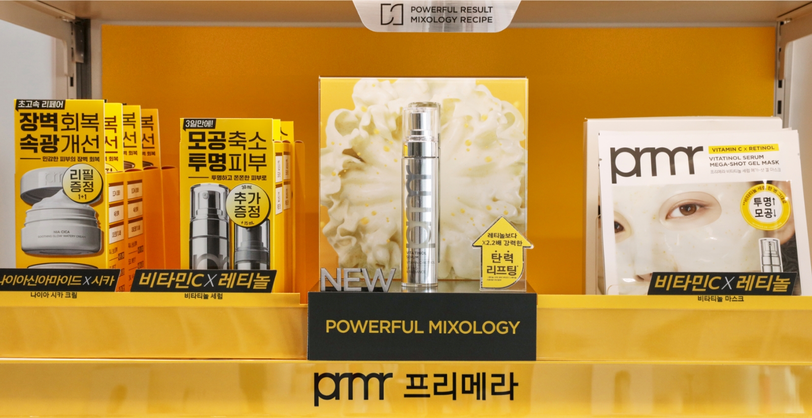
브랜드의 메인컬러인 옐로우와 서브컬러인 실버를 혼합했던 기존 디자인에서 메인 컬러인 옐로우 색상을 보다 적극적으로 노출하여 원거리에서도 시각적으로 인지될 수 있도록 브랜드 정번의 주목도를 높였고, 불필요한 테스터 단을 삭제하여 제품 단상자가 전면에 배치될 수 있도록 유도하였습니다.
클렌징 라인의 경우, 테스터 단을 없애면서 셀프 픽업이 용이해졌고, 제품 자체가 POP 역할을 하도록 구성하여 직관적인 정보 전달이 가능하도록 개선하였습니다.
또한 기획세트의 주목도를 높이고자 패키지디자인의 그래픽 모티프를 반영한 띠지 디자인으로 제품과 VMD 모두 일관된 디자인 코드를 보여주고 제품마다 개별로 분할하여 삽입했던 구조에서 일체형 띠지로 변경하여 제작물의 분실 위험을 낮추고자 하였습니다.
정번의 가장 골든존에는 프리메라의 대표상품을 강조하기위한 요소로 돌출형 프로모션존을 배치하여 대표상품인 비타티놀 제품을 하이라이팅 해주었고 기존에는 라인으로 묶여 분산되어있던 메이크업 제품군을 유형으로 묶어 통합된 메이크업 유닛을 개발하였습니다.
또한 기획세트의 주목도를 높이고자 패키지디자인의 그래픽 모티프를 반영한 띠지 디자인으로 제품과 VMD 모두 일관된 디자인 코드를 보여주고 제품마다 개별로 분할하여 삽입했던 구조에서 일체형 띠지로 변경하여 제작물의 분실 위험을 낮추고자 하였습니다.
정번의 가장 골든존에는 프리메라의 대표상품을 강조하기위한 요소로 돌출형 프로모션존을 배치하여 대표상품인 비타티놀 제품을 하이라이팅 해주었고 기존에는 라인으로 묶여 분산되어있던 메이크업 제품군을 유형으로 묶어 통합된 메이크업 유닛을 개발하였습니다.
In the previous design, the brand’s main color (yellow) was mixed with the secondary color (silver). In the new design, we increased the visibility of the main yellow color to enhance brand recognition even from a distance. Additionally, by removing unnecessary tester shelves, we enabled the main product boxes to be displayed more prominently at the front.
For the cleansing line, eliminating the tester shelf made self-pickup easier, while the product itself now functions as a POP display, improving intuitive communication of product information.
To enhance the visibility of promotional sets, we introduced a belly band design that incorporates graphic motifs from the package design, ensuring a consistent visual language across both product and VMD. Instead of inserting separate bands for each product, we switched to an integrated band design to reduce the risk of individual components getting lost.
In the brand’s primary golden zone, we created a standout promotional area to highlight Primera’s hero product, the Vitatinol line. Additionally, makeup items that were previously scattered by line were restructured and unified into a cohesive makeup unit based on product type, improving organization and customer navigation.
성분의 결합(스킨케어), 제형의 결합(클렌징), 유형의 결합(메이크업)을 쉽고 직접적으로 보여주는 간결한 문안으로 상품 네비게이팅 유도하고자 하였습니다.
Guide product navigation with clear and straightforward copy that directly communicates the MIX of ingredients(skincare), textures (cleansing), and formulation(makeup).
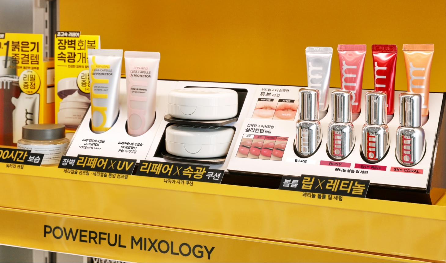
스킨케어 제품에 비해 상대적으로 크기가 작아 진열 시 정돈되지 않아 보였던 메이크업 제품들은 컬러칩과 함께 노출될 수 있도록 유닛형 거치대로 구성하여 테스트 고객의 편의성을 높였습니다.
또한 IN&OUT을 고려해 최소 비용으로 부분 교체가 가능한 모듈형 구조로 개발하여 운영 효율성을 강화했습니다.
Compared to skincare products, makeup items are relatively smaller in size and often appear cluttered when displayed. To improve this, we designed
unit-type holders that allow makeup products to be presented alongside color chips, enhancing convenience for customers testing the products.
Additionally, considering IN&OUT operations, the display was developed as a modular structure that allows partial replacements at minimal cost.
- Amorepacific Creatives
- Design Directing
- 한정민
- Product Design
- 김빛누리, 홍다미
- VMD Design
- 류미림, 심미정
- BM
- 박성연
- GTM
- 김한나
- Development
- 변지영
- Photography
- 신상우