HAPPY BATH_FEEL SO GOOD
Happy Bath, true to its name, embraces the feeling of happiness.
Our projects always begin with one key question: How can we translate the experience of a “happy shower” into design?
The newly launched Feel So Good line was created with this idea at its core.
Through vibrant colors, intuitive layouts, and subtle graphic details, the line aims to bring small moments of joy into everyday life.
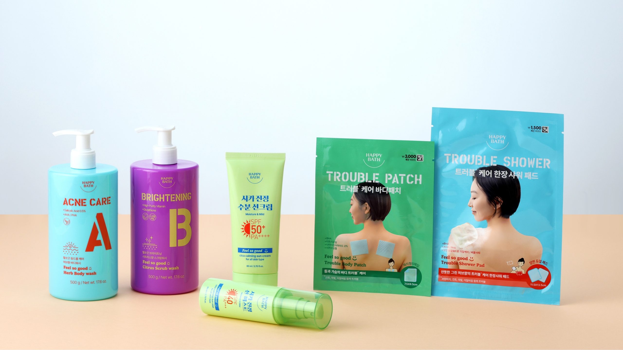
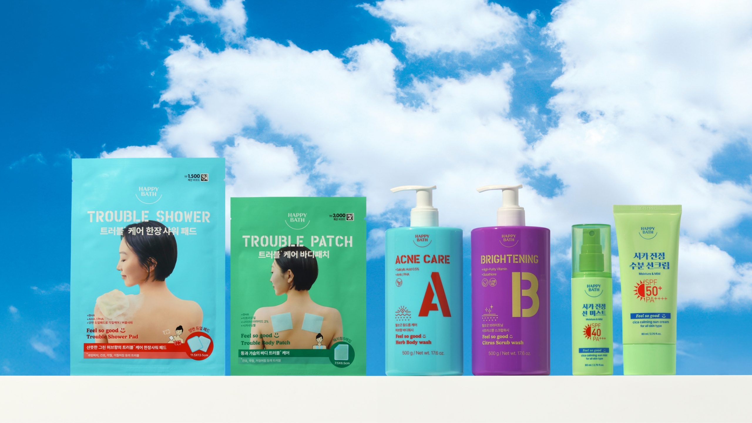
Centered around our signature body wash, the range extends to include UV care, trouble care patches, and single-use shower pads—each offering a unique solution to everyday skin needs.
We translated this product diversity into a cheerful and casual visual language, combining pop-colored bottles with bold, color-accented typography to create packaging that lifts the mood at a glance.
Our projects always begin with one key question: How can we translate the experience of a “happy shower” into design?
The newly launched Feel So Good line was created with this idea at its core.
Through vibrant colors, intuitive layouts, and subtle graphic details, the line aims to bring small moments of joy into everyday life.
Centered around our signature body wash, the range extends to include UV care, trouble care patches, and single-use shower pads—each offering a unique solution to everyday skin needs.
We translated this product diversity into a cheerful and casual visual language, combining pop-colored bottles with bold, color-accented typography to create packaging that lifts the mood at a glance.
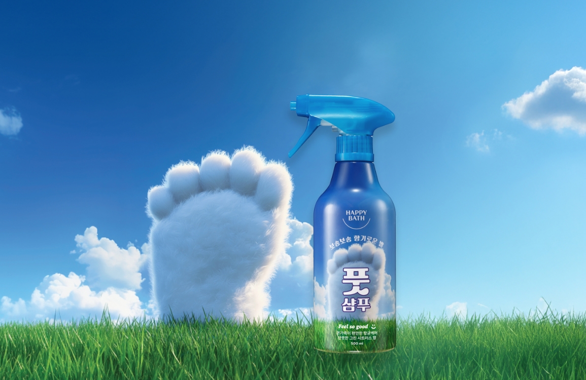
Design Study_1. Sun care
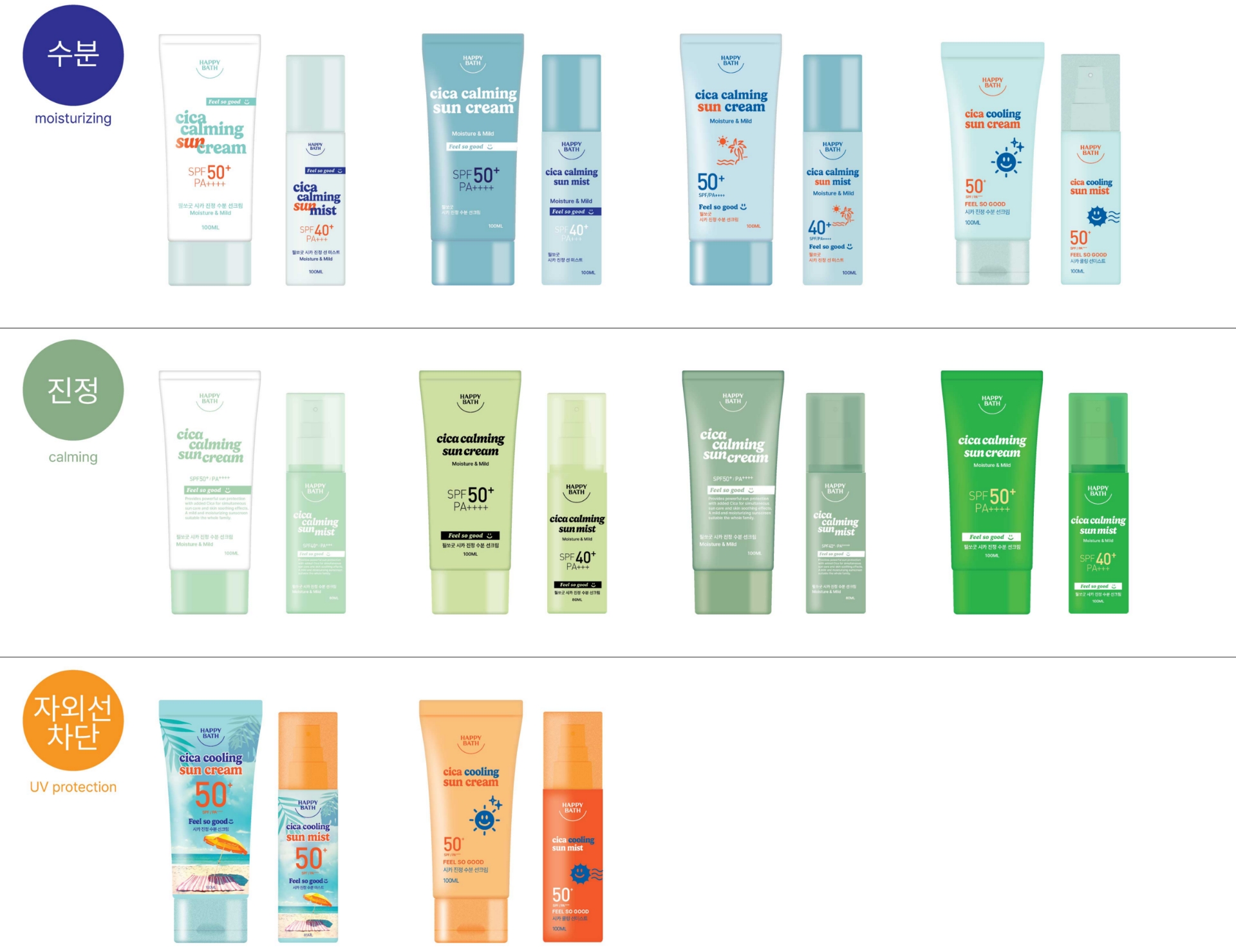
When it comes to sun care, consumers already associate specific colors with key functions:
Blue for moisture care / Green for soothing / Pink for tone-up / Orange for UV protection
Choosing the right main color was therefore a crucial part of the design process.
Since the product was still in development and a clear RTB (Reason to Buy) had not yet been finalized, we explored a range of color directions to find the most persuasive and visually effective combination for communicating the product’s benefits.
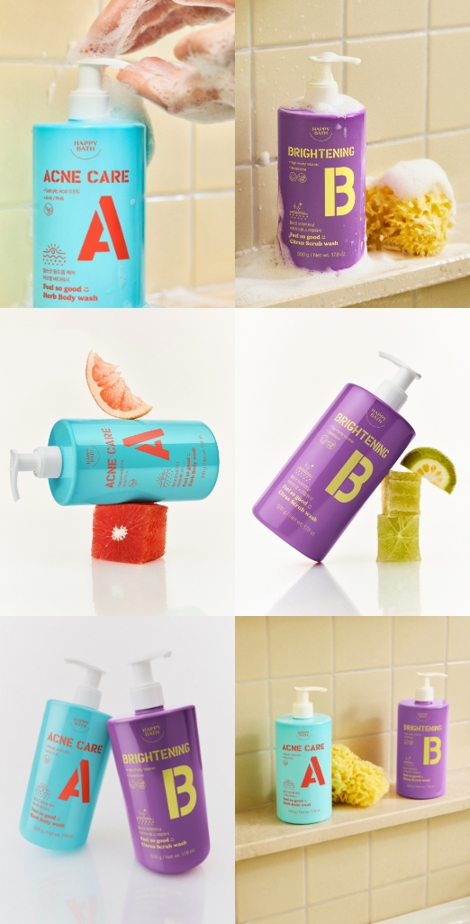
Design Study_2. Body wash
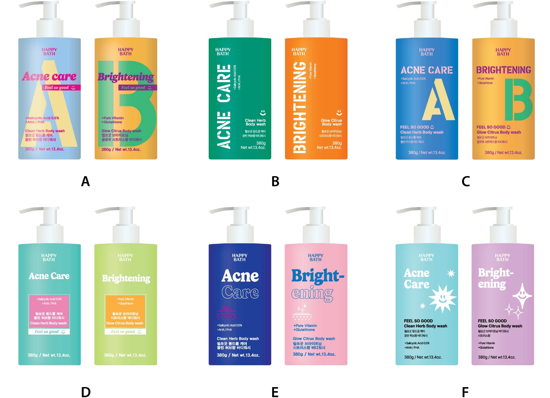
This body wash was designed exclusively for DAISO, which meant understanding the unique in-store display and shopper behavior was ess-ential.
Mild colors tend to blend into the background on Daiso shelves, so we opted for high-saturation bottle colors that would stand out more prom-inently.
We also enlarged key typography on the packaging to ensure quick readability and strong visual impact even in a crowded retail setting.
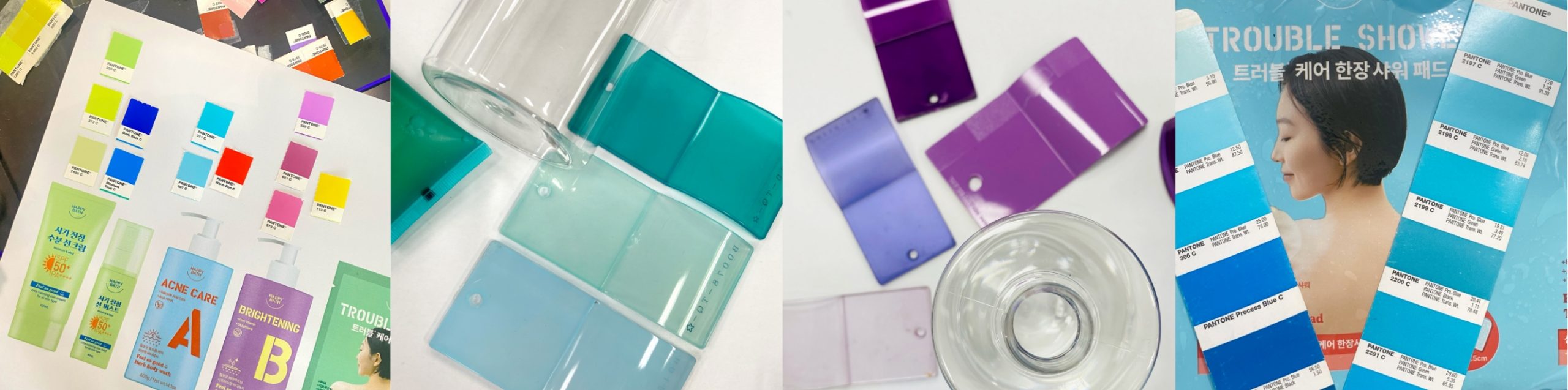
We focused on selecting colors that not only highlight the unique charm of each product’s function individually,
but also harmonize well when displayed together as a complete lineup.
but also harmonize well when displayed together as a complete lineup.
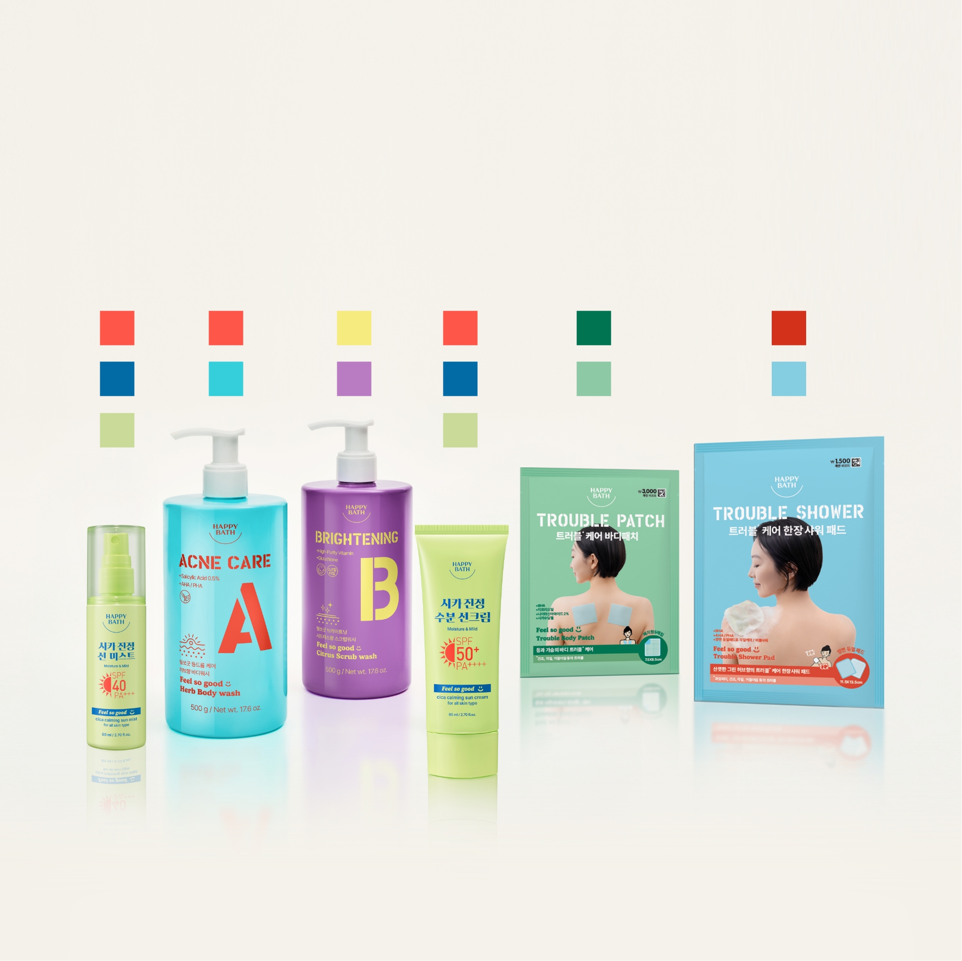
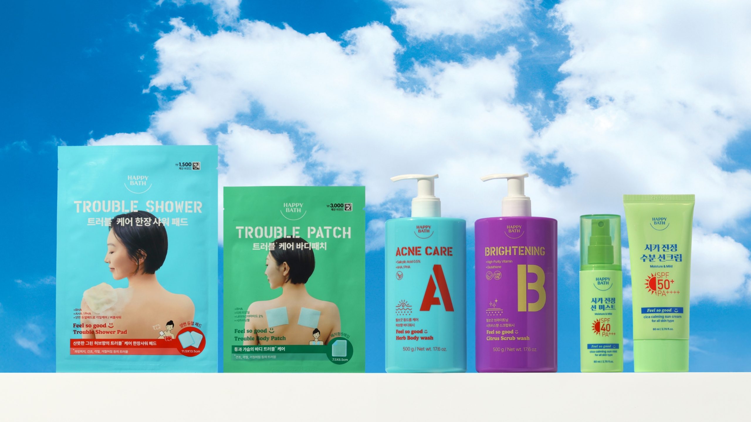
FEEL SO GOOD_Final Design
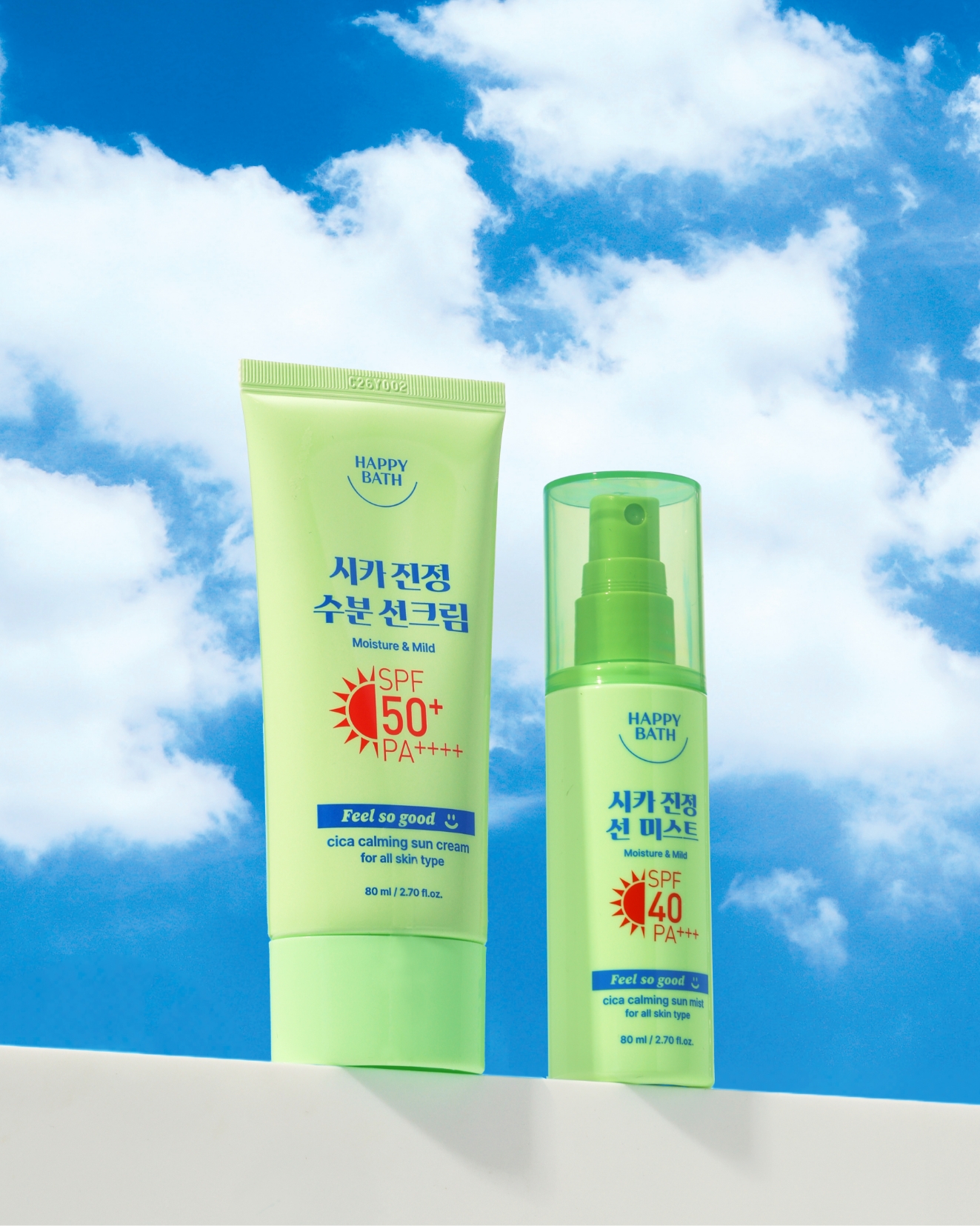
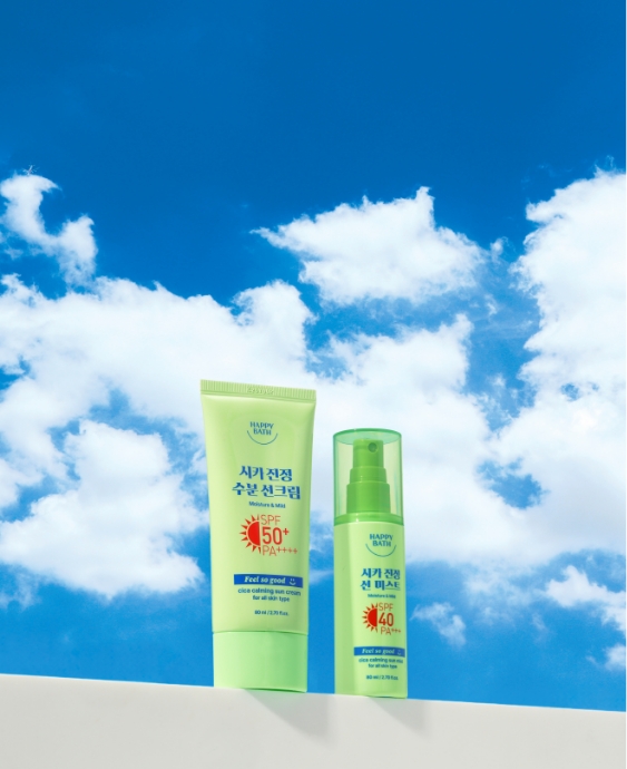
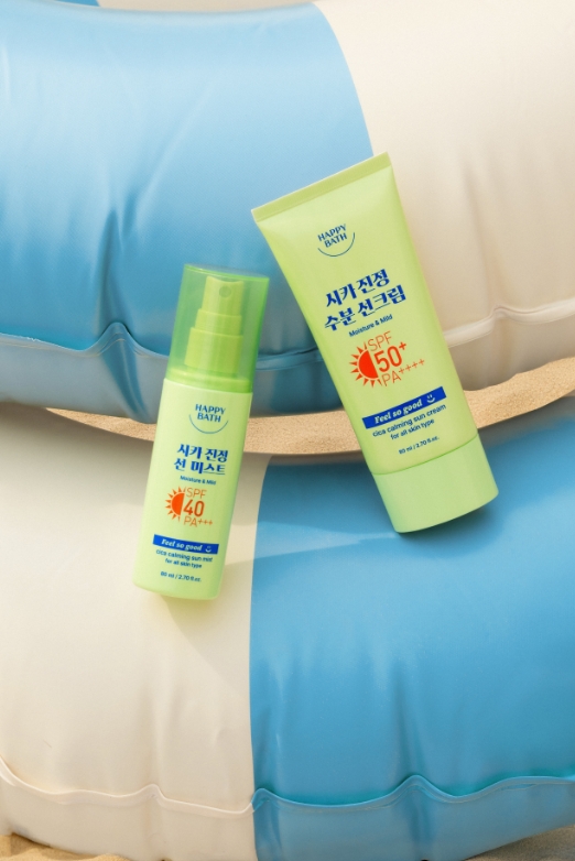
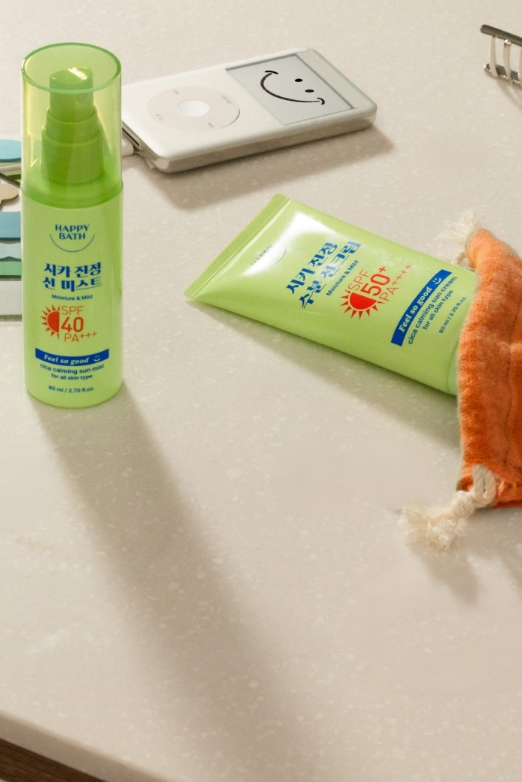
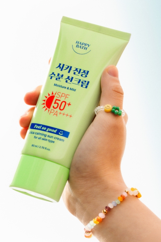
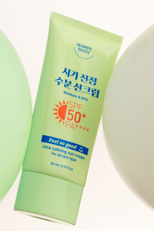
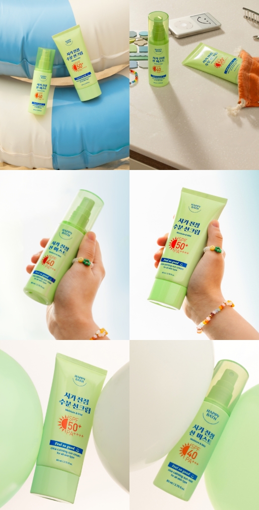
FEEL SO GOOD CICA CALMING SUN CREAM
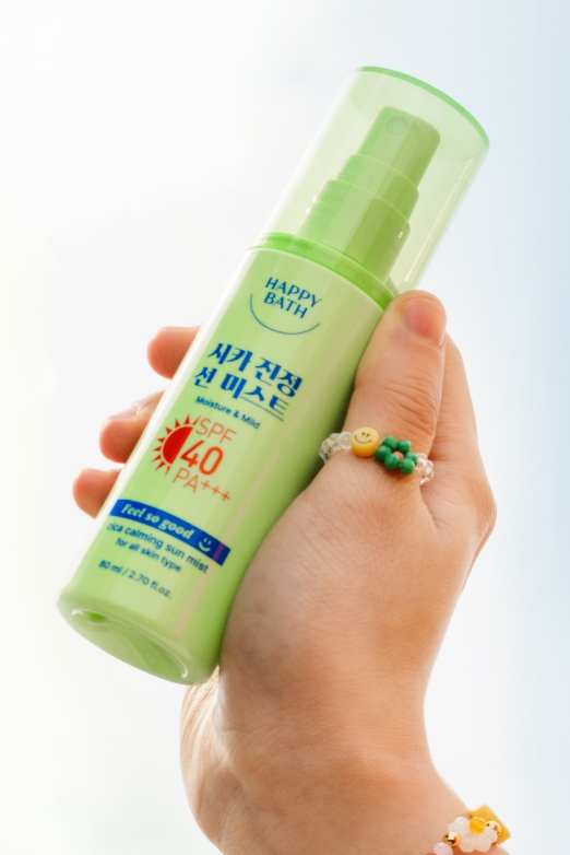
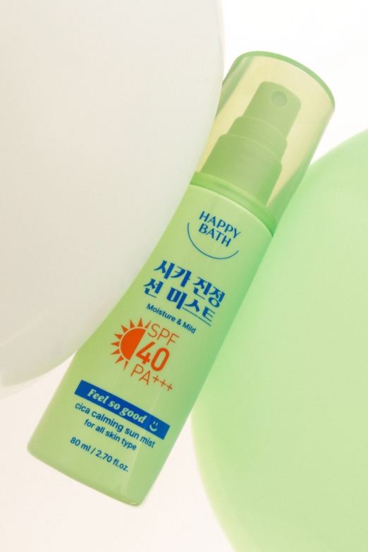
& CICA CALMING SUN MIST
& CICA CALMING SUN MIST
For the Feel So Good sun cream and sun mist,
we chose a soft, creamy green as the main color—rather than a deep shade— to visually convey the product’s soothing properties.
To emphasize its hydrating benefits, we applied a vivid blue accent to the typography as a color point.
we chose a soft, creamy green as the main color—rather than a deep shade— to visually convey the product’s soothing properties.
To emphasize its hydrating benefits, we applied a vivid blue accent to the typography as a color point.
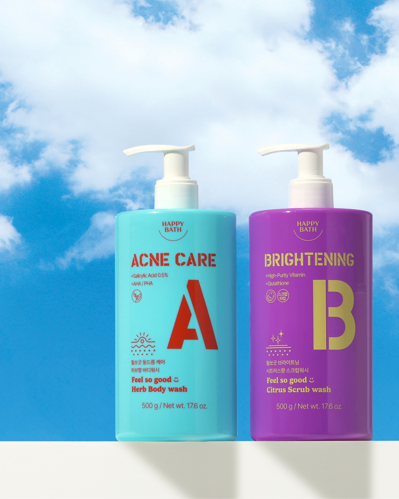
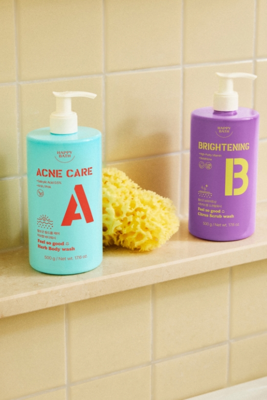
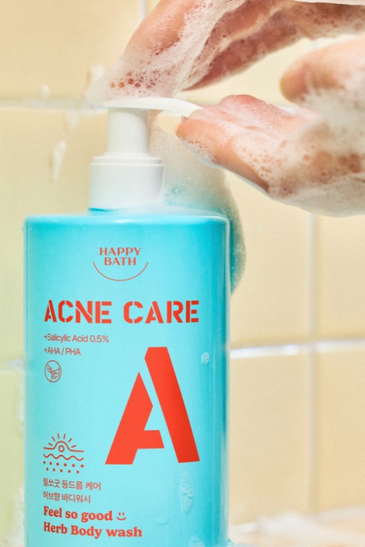
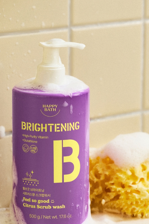
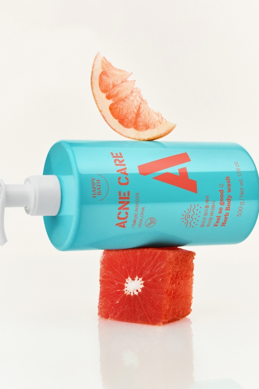
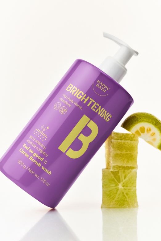
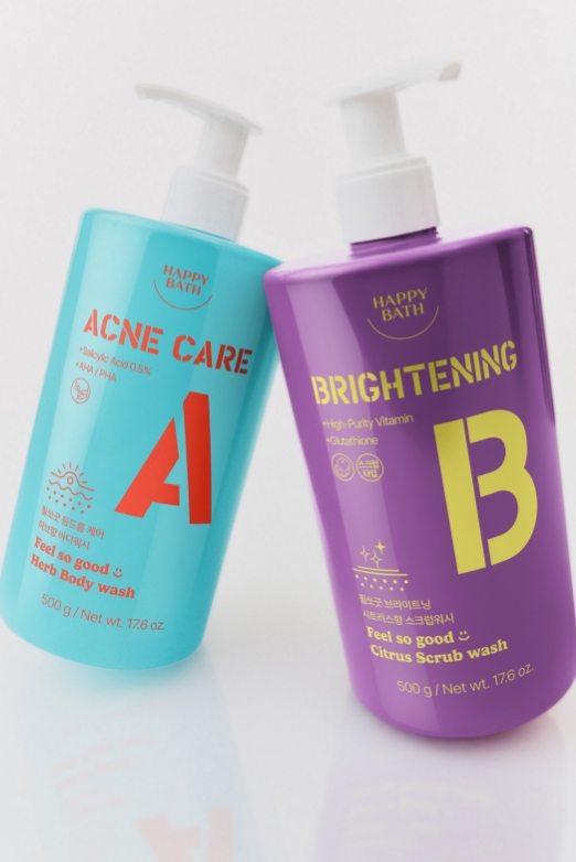
FEEL SO GOOD ACNE CARE BODY WASH
& BRIGHTENING BODY WASH
& BRIGHTENING BODY WASH
We aimed to deliver an instant boost of visual energy
by combining pop-colored containers with contrasting typography that brightens your mood at first glance.
Simple, bold letter elements like A and B not only help clearly distinguish each product’s function,but also convey a youthful and casual tone throughout the lineup.
by combining pop-colored containers with contrasting typography that brightens your mood at first glance.
Simple, bold letter elements like A and B not only help clearly distinguish each product’s function,but also convey a youthful and casual tone throughout the lineup.
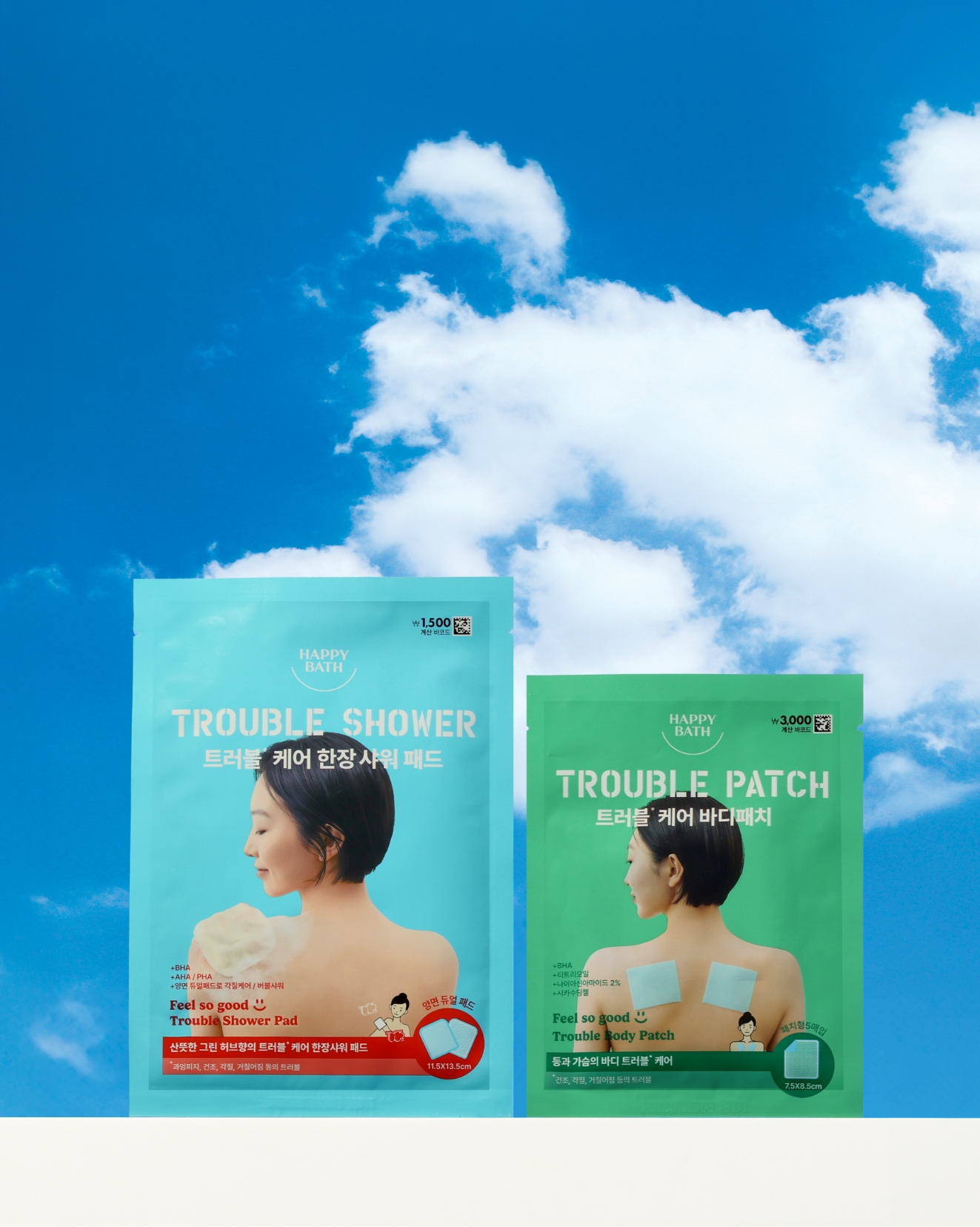
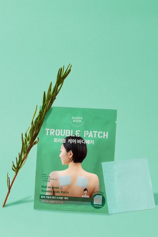
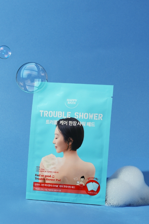
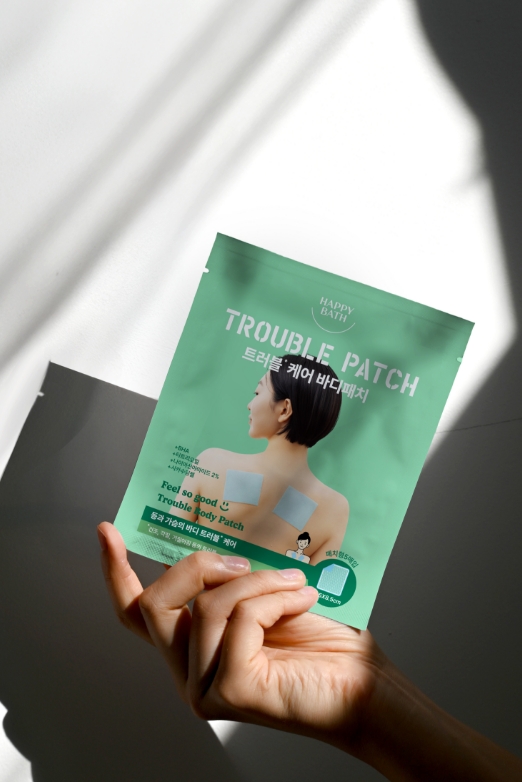
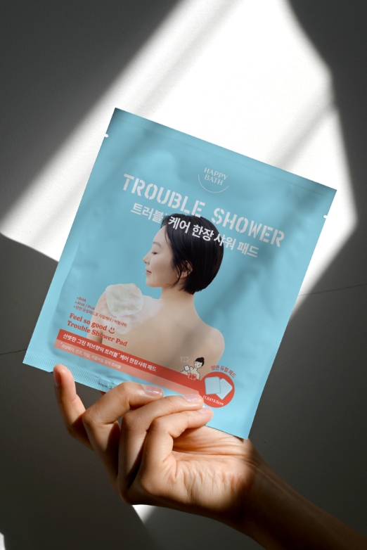
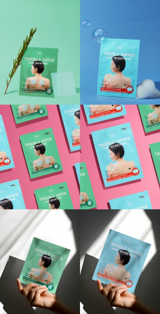
FEEL SO GOOD TROUBLE SHOWER PAD
& TROUBLE BODY PATCH
& TROUBLE BODY PATCH
The Feel So Good Trouble Care Shower Pad and Body Patch were designed to maintain the line’s signature pop colors,
while placing a strong focus on communicating how to use the product.
Since these items may be unfamiliar to some customers,
we dedicated ample space on the packaging to clearly display usage visuals,
making the instructions more intuitive and approachable.
while placing a strong focus on communicating how to use the product.
Since these items may be unfamiliar to some customers,
we dedicated ample space on the packaging to clearly display usage visuals,
making the instructions more intuitive and approachable.
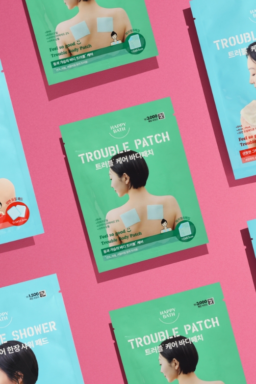
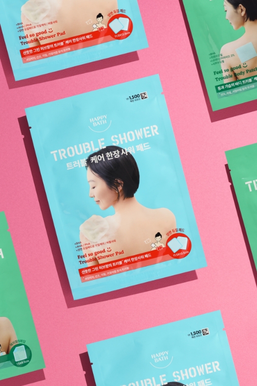
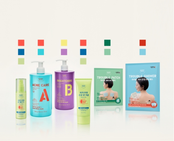
FEEL SO GOOD LINE UP
- Amorepacific Creatives
- Design
- Kim Yujung
- Photography
- Kim Yujung, Shin Sangwoo, Woo Sia
- Kim Yujung, Shin Sangwoo,
- Woo Sia
- BM
- Yu Hongzhe