PURE ESSENTIAL
SUMMARY
‘EDITION BY AMOREPACIFIC’ is a brand that curates Amorepacific’s hair, body, and dental care products, reintroducing them with a fresh, concept-driven edition. The first project, ‘PURE ESSENTIAL’, brings together best-selling products made with natural ingredients, reimagined through a new design sensibility.
CONCEPT
PURE ESSENTIAL
Curated with the purest and cleanest ingredients, this sensory lifestyle edition features essential daily care items—like shampoo, body wash, hand wash, and toothpaste—formulated with safe ingredients suitable for all ages and genders. Minimalist design enhances the emotional experience of everyday essentials, highlighting their mildness and making them a thoughtful gift for anyone.
Curated with the purest and cleanest ingredients, this sensory lifestyle edition features essential daily care items—like shampoo, body wash, hand wash, and toothpaste—formulated with safe ingredients suitable for all ages and genders. Minimalist design enhances the emotional experience of everyday essentials, highlighting their mildness and making them a thoughtful gift for anyone.

BACKGROUND
“What if we could bring together a variety
of functional, everyday beauty staples…
into a unified, cohesive look?”
Pure Essential began with the idea of curating only the mildest, non-irritating products from a wide range of daily essentials
and offering them to consumers as a thoughtful selection.
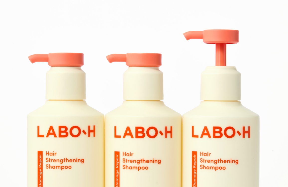
During the development process, we focused primarily on two things: design and ingredients. We trusted the proven mildness and purity of brands like LABO-H, ILLIYOON, and Pleasia, and aimed to create a design that would visually express the purity of these ingredients in the most effective way.
During the development process, we focused primarily on two things: design and ingredients. We trusted the proven mildness and purity of brands like LABO-H, ILLIYOON, and Pleasia, and aimed to create a design that would visually express the purity of these ingredients in the most effective way.
Developing Products for the Gifting Market
Unlike the conventional product development process, Pure Essential began as a reverse proposal from the design team,
who initiated the concept and planning before presenting it to the marketing team.
Building on the concept and design we proposed, the marketing team refined the direction by adding the idea of “gift-exclusive products” and restructured the SKU lineup around truly essential items—ultimately enhancing the product’s overall completeness.
Building on the concept and design we proposed, the marketing team refined the direction by adding the idea of “gift-exclusive products” and restructured the SKU lineup around truly essential items—ultimately enhancing the product’s overall completeness.


SHAMPOO – LABO-H Scalp Strengthening Shampoo

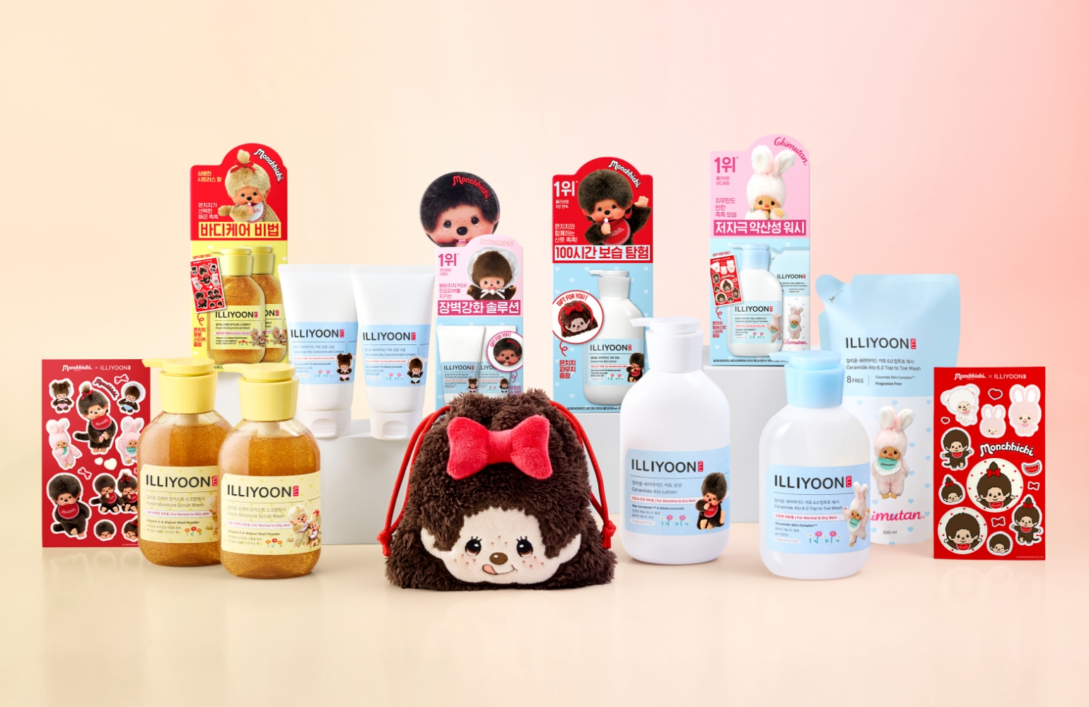
BODY WASH – ILLIYOON Ceramide Ato 6.0 Top to Toe Wash

HAND WASH – HAPPYBATH Zero Percent Bubble Wash

BODY LOTION – ILLIYOON Ceramide Ato Body Lotion

HAND CREAM – ILLIYOON Cera Hand Cream

TOOTHPASTE – Pleasia Green Tea Toothpaste

TOOTHBRUSH – Pleasia Toothbrush
PRODUCT
The semi-transparent containers highlight the gentle ingredients inside, paired with pure white labels and clean typography to emphasize the purity and clarity of the products.
Using a three-tier layout — product name – key features – original brand & function — the design expresses functionality through text, while the combination of serif
and sans-serif fonts creates a sophisticated yet approachable look, well-suited for bathroom environments.
A simple straight line, symbolizing ingredient purity, was used as a core design element across not only the product itself but also its website and secondary packaging,
presenting a unified visual identity.


CONCEPT SHOTS
Reflecting the concept of mild ingredients and the nature of the “Gifting” channel, the visuals follow a clean, minimal direction.
Each item was shot individually and by set to highlight the product clearly and help consumers recognize the full set. Natural lighting was used,
along with sculpted clay, stone textures, and even sand-mixed clay to add subtle tactility — capturing the essence of the Pure Essential mood.
Foam and textures were also styled to reflect each product’s key formulation visually.


VIDEO
An unboxing video was produced specifically for product promotion on the Kakao Gift platform.
Optimized for vertical formats such as Instagram Stories, Reels, and social posts, the video features:
Eye-catching opening scenes, Quick, engaging edits, Short 15-second runtime. Two versions were created to match different product packaging and set configurations.


PURE ESSEMTIAL SET DESIGN
Designed with thoughtfulness in mind — the care of the giver and the gratitude of the receiver.
Cards featuring messages like “Thank You” and “Congratulations” accompany the gift sets.
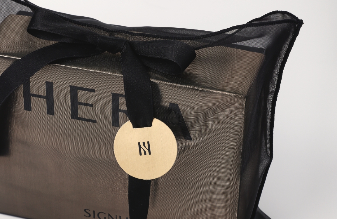
The 5-piece Total Gift Set is presented in a box with a matching shopping bag. Other sets are wrapped in sheer drawstring pouches using the same organza material.
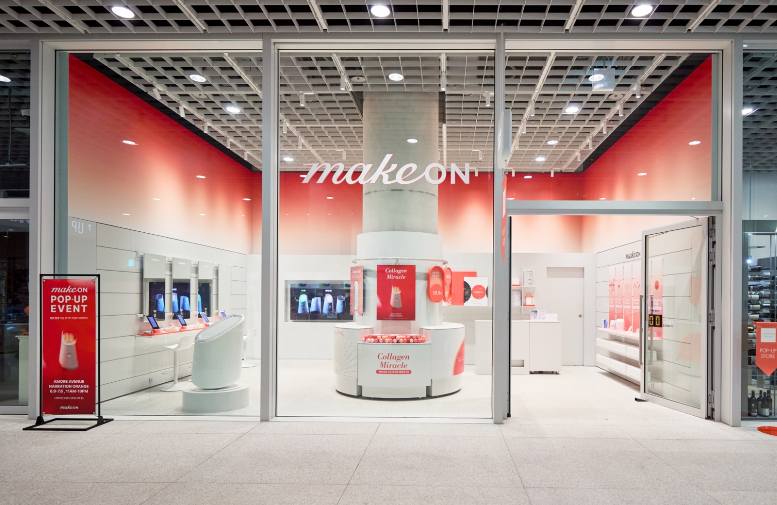
Amore Seongsu
Following the launch, a month-long pop-up was held at Amore Seongsu and the Amore Store on the 2nd floor of the global headquarters.
To bring the Pure Essential mood to life — clean yet sensorial, minimal yet emotional — we used white-toned furniture, fabric, ceramics, and mobile-like decor.
These elements emphasized the “object” quality of the products and blended seamlessly into a bath-inspired space.


Amore Seongsu

Amore Store_Amorepacific Headquarters 2F


Amore Seongsu
The reception area visible upon entry, the inner cleansing room, and the beauty library area form a triangular zone, with three distinct zones created.
The same fabric used for product gift packaging was utilized to naturally drape the walls and table spaces, alleviating the monotony of a display dominated by white tones.

Amore Store
A dedicated corner was set up for Pure Essential on the 2nd floor of Amorepacific’s global headquarters.
To evoke a “home-like” feeling, shelves were styled with framed visuals and signage, creating the impression that this elegant brand could sit beautifully on any shelf at home — delivering both utility and emotional value.
- Amorepacific Creatives
- Product Design
- Yoon Minhae, Kim Yeonseo,
Koo Hyewon - BM
- Chang Yoonkyung, Jung Sangin
- Visual Directing
- Kim Dooyeon
- Photography
- Shin Sangwoo
- Film
- Park Yeongjoo
- Spatial Design
- Ko Eunyoung, Han Suae


![Exhibition [The House of Beauty Scientists] 's work list thumbnail](https://cdn-design.amorepacific.com/contents/2024/08/02172154/24_88_list_thumb.jpg)