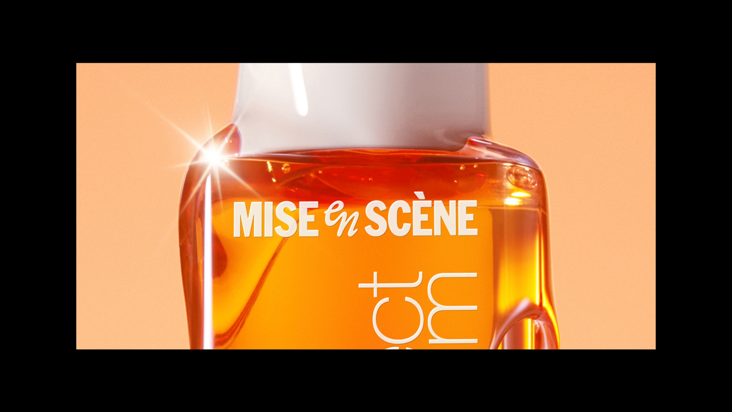
Mise-en-Scène New BI - Mise-en-scène Perfect Serum Update
Summary
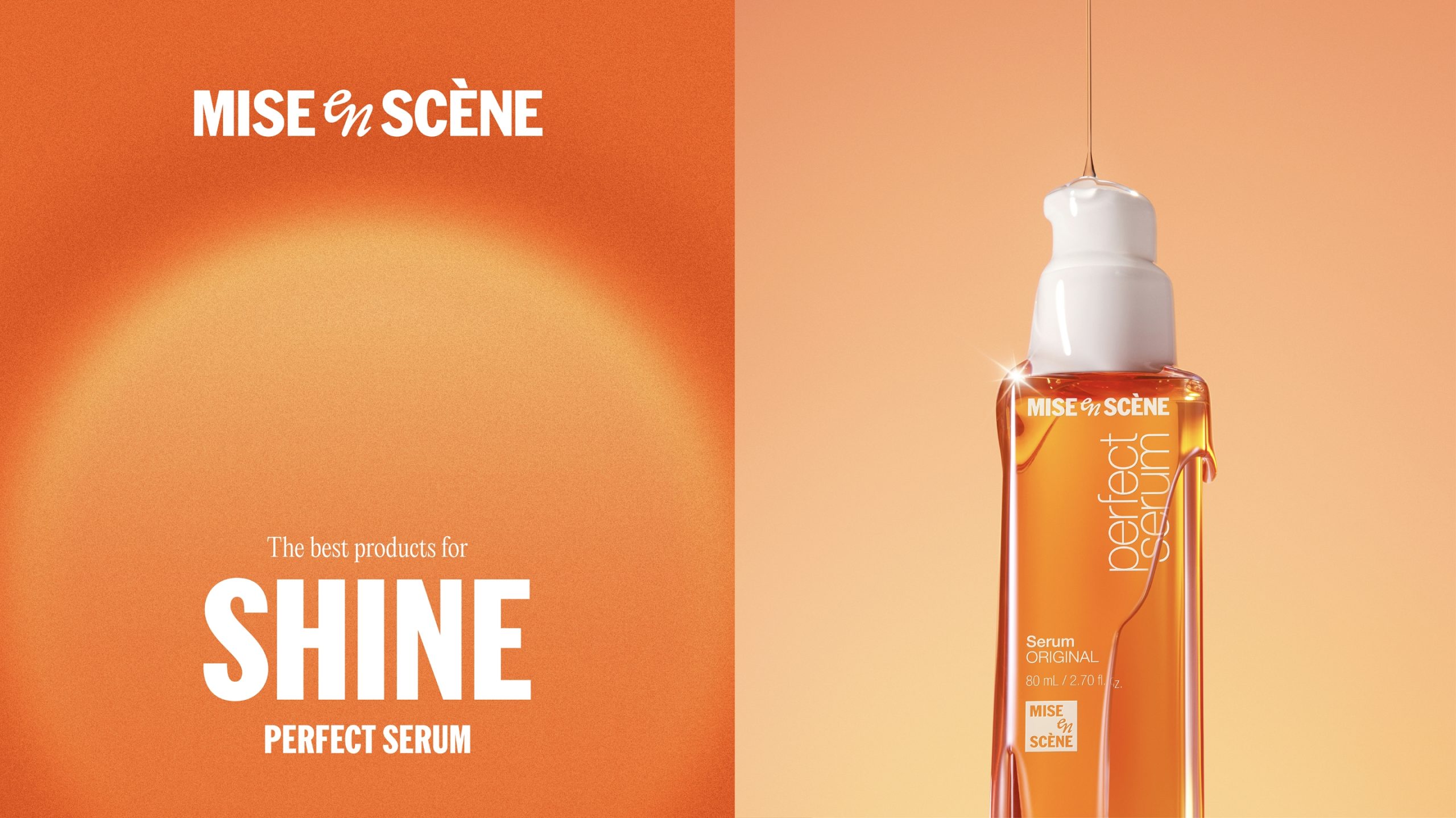
Mise-en-scène has reached a pivotal moment in refining its global branding by restructuring its brand identity system, centered on a new wordmark
and symbol. (Mise-en-scène New BI development story: link) The first implementation of this renewed BI system was applied to the brand’s flagship
lineup, Perfect Serum. More than just a logo replacement, the project aimed to maintain the equity of the sub-brand while reinforcing the visibility
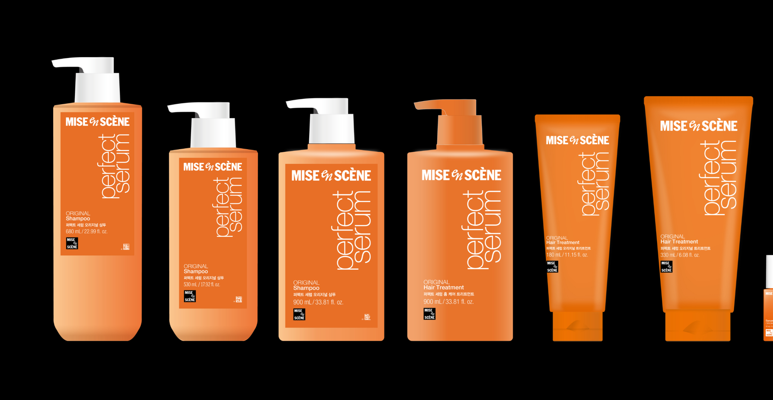
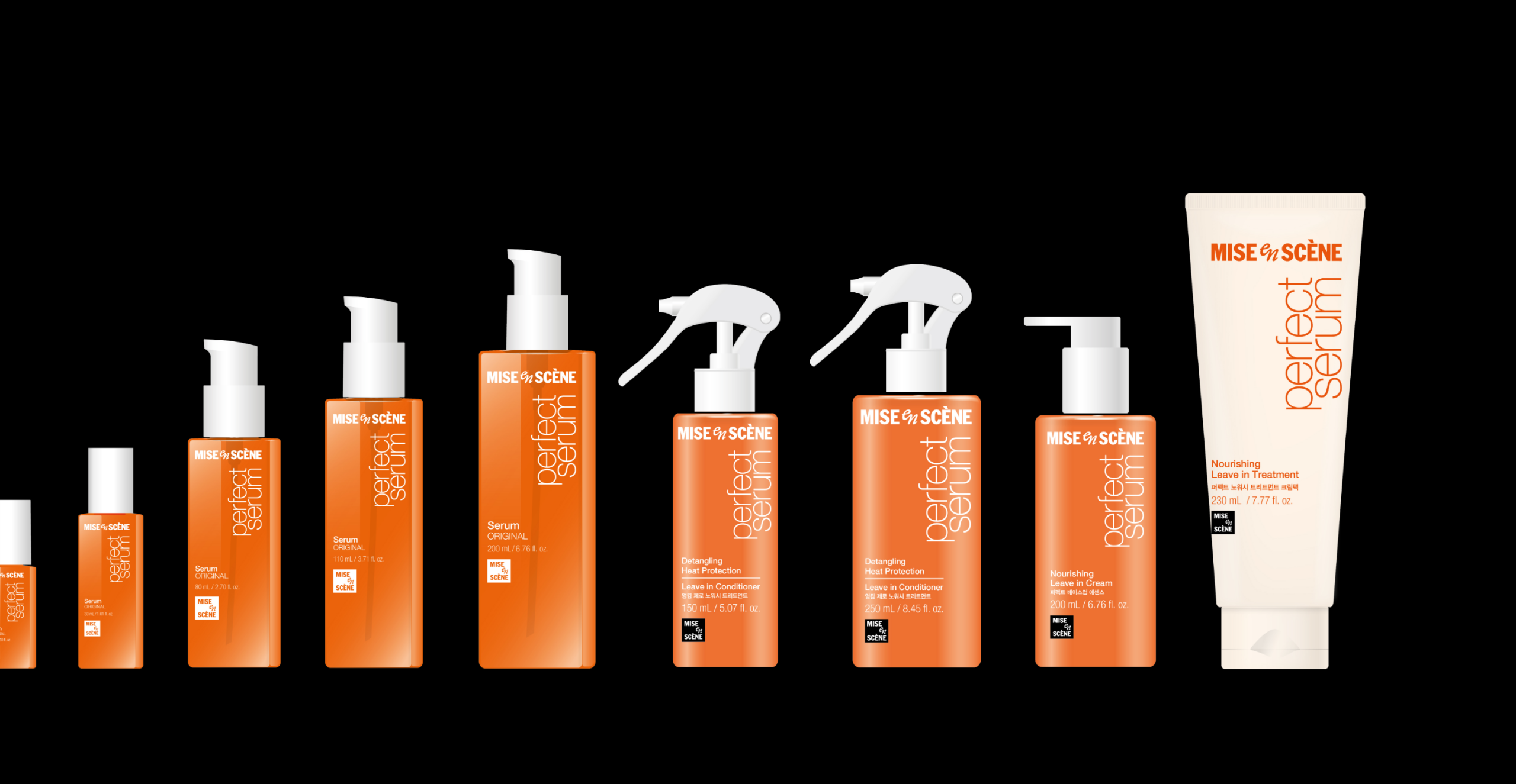
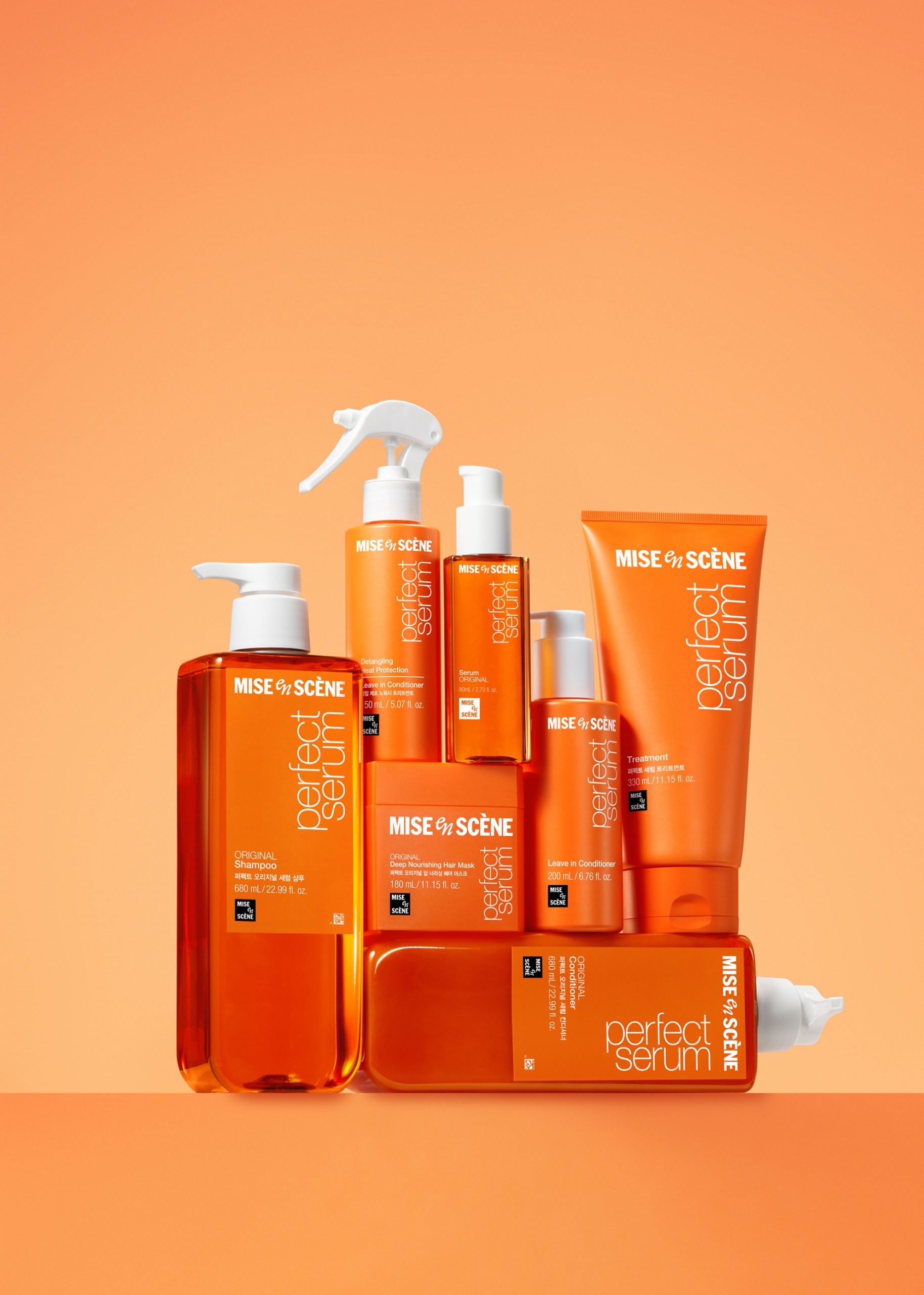
and recognition of the master brand, Mise-en-scène. Built around the new wordmark and symbol, the BI structure was applied across all 75 SKUs—including
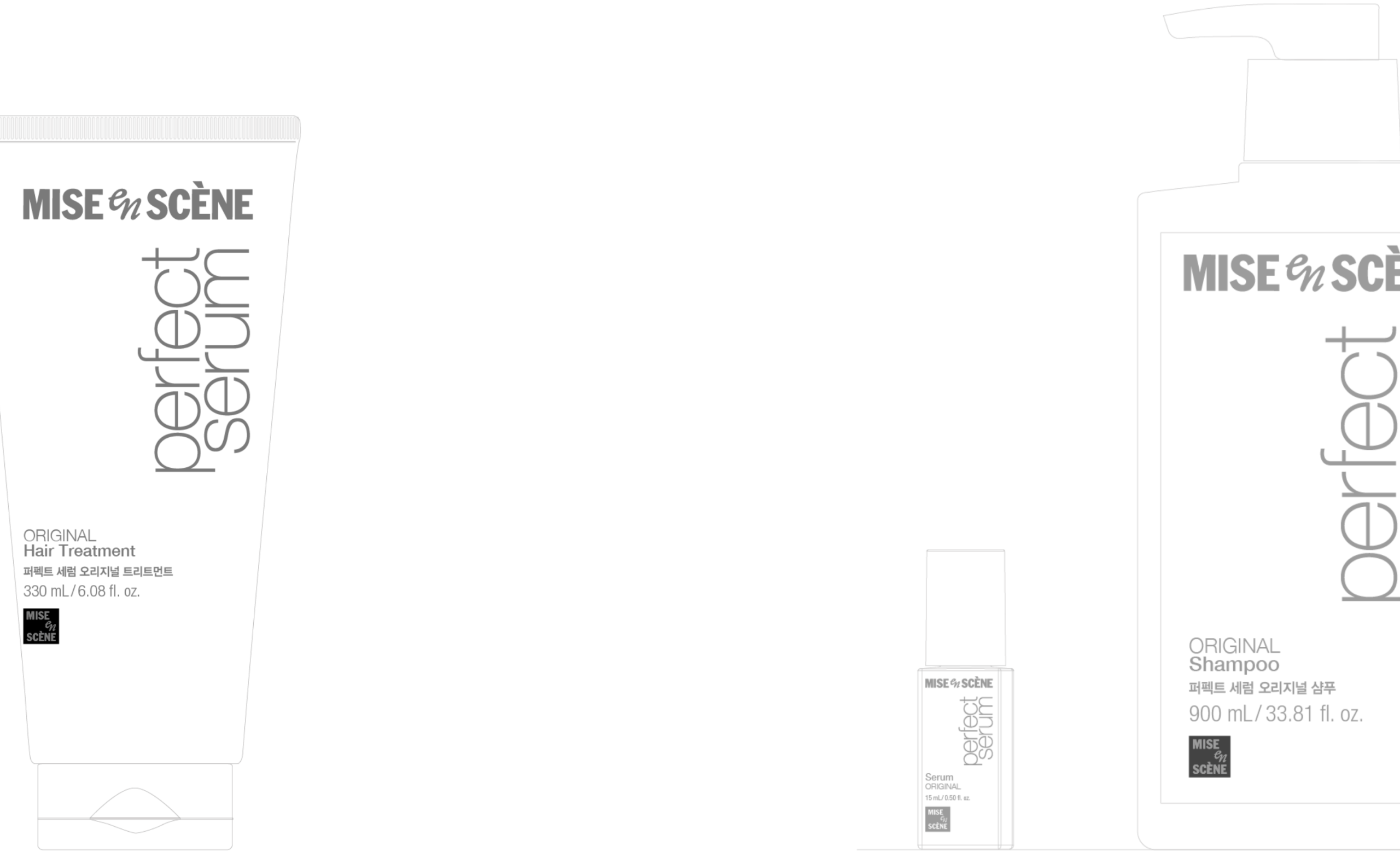
leave-on, wash-off, cleansing, and hair-loss care types—spanning a wide range of molds, volumes, packaging formats, and product structures. The project
sought to meticulously embed the tone and structure of the renewed BI throughout the entire Perfect Serum line, striking a balance between brand unification and product differentiation.
History
Perfect Serum
2000
2004
2014
2016
2022 –
Background
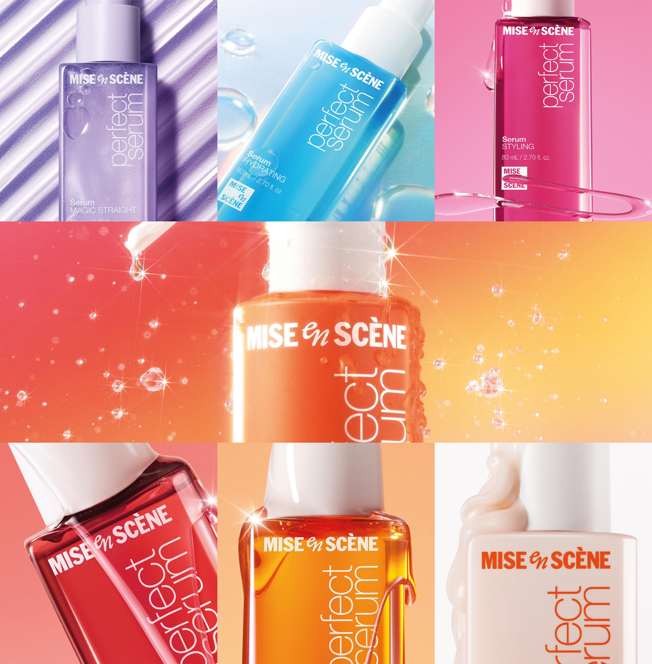
Perfect Serum is a signature steady-seller line for Mise-en-scène, expanding beyond hair serums to include cleansing, wash-off treatments, and leave-on haircare products.
The line spans a wide range of volumes—from 3ml to 990ml—and diverse container types, making it especially vulnerable to inconsistencies in brand design application.
As of 2025, with cumulative sales approaching 100 million bottles, it was essential to apply the new BI in a way that reorganizes the brand’s recognition structure while maintaining familiarity for long-time users.
2024
New BI Applied
Design Approach
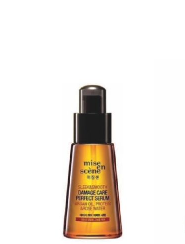
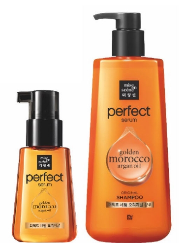
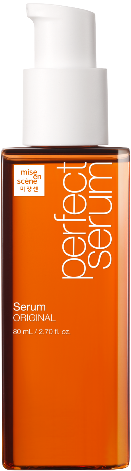
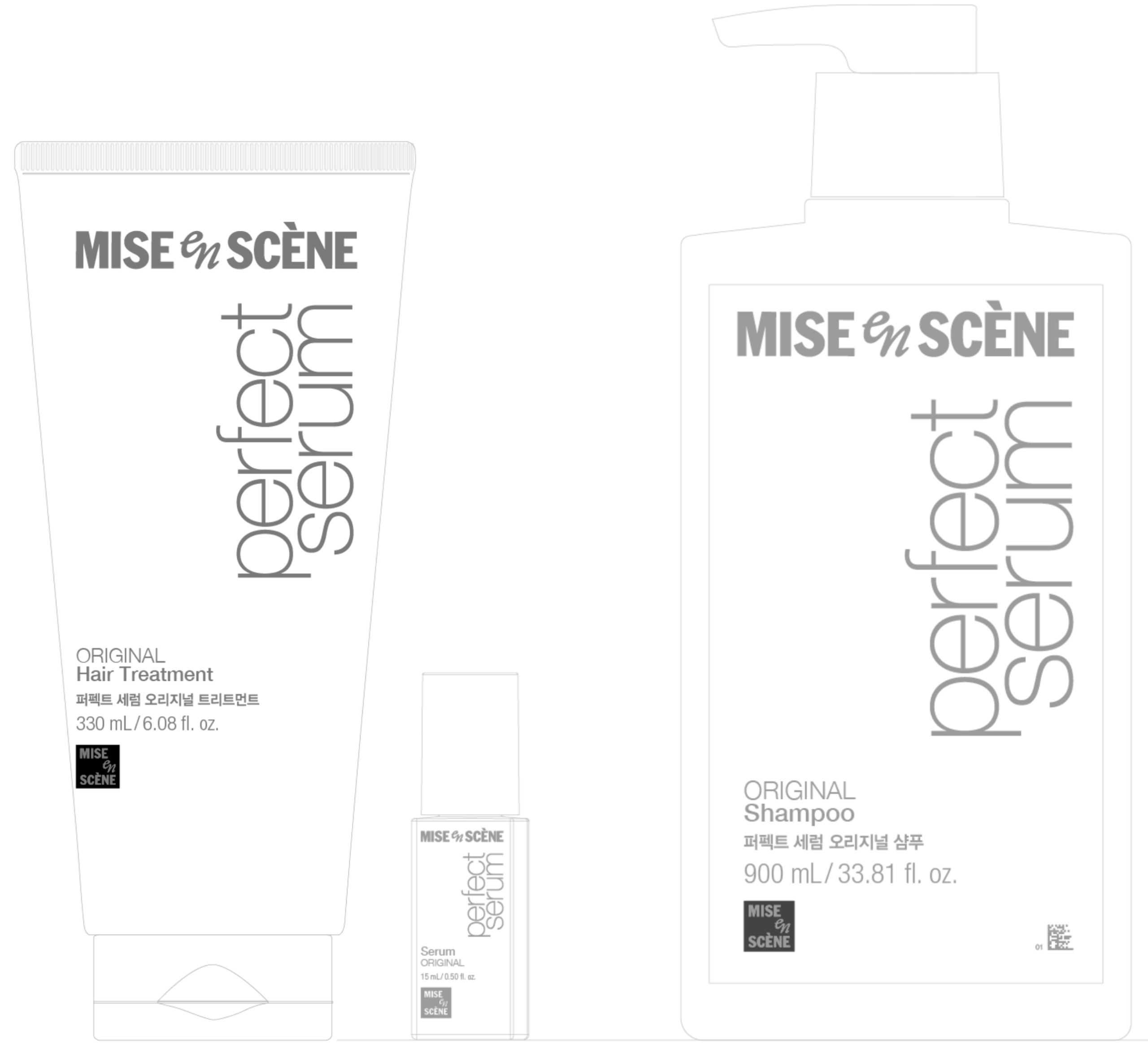
Perfect Serum had long maintained an iconic brand presence through its Helvetica-based typography and square logo combination.
However, the square BI format showed limitations in readability and versatility, particularly in global communication.
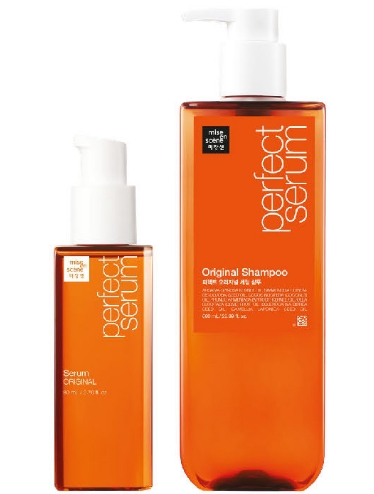
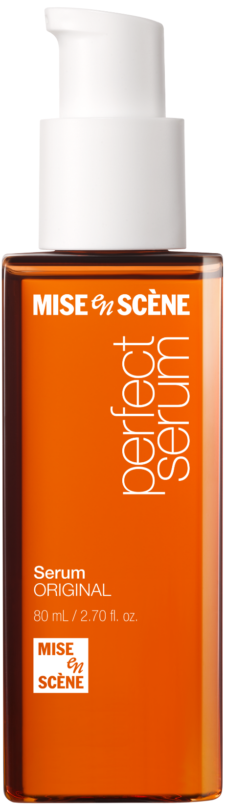
In response, the new BI was restructured using a horizontal wordmark paired with a square symbol, forming a refined “top wordmark – bottom symbol” composition.
This structure respects the existing visual equity while simultaneously addressing two major challenges: global adaptability and strong shelf presence.
The design approach was to retain the familiar impression of Perfect Serum while incorporating the newly rebranded BI structure.
Mise en Scéne BI design principle
Before applying the new BI to Perfect Serum, it was crucial to establish a brand-wide design guide that could be extended to all Mise-en-scène products.
A unified application strategy was created and used as the foundation for redesign.
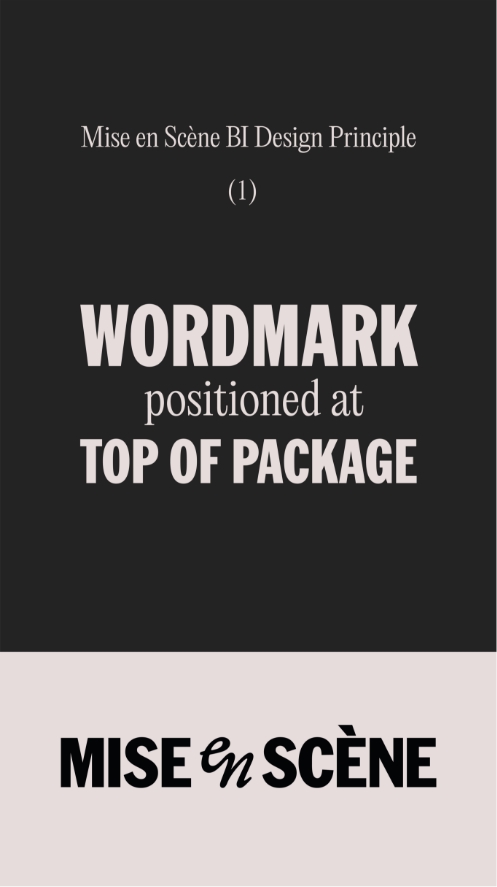
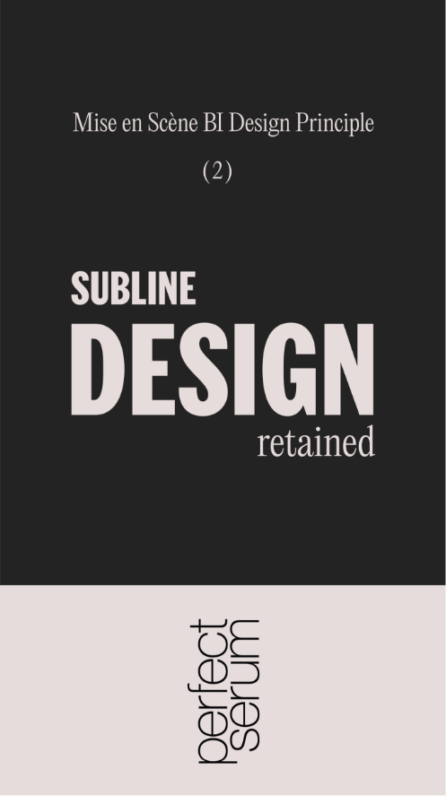
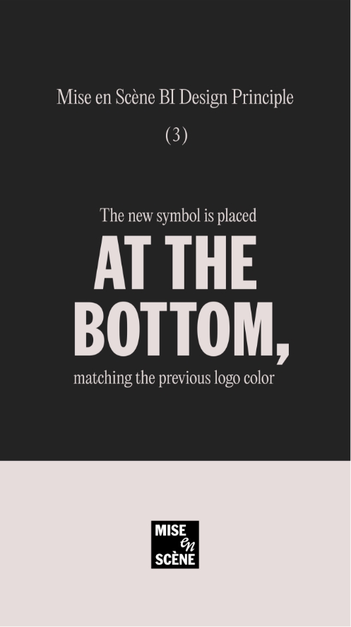
Mise en Scène BI Design Principle
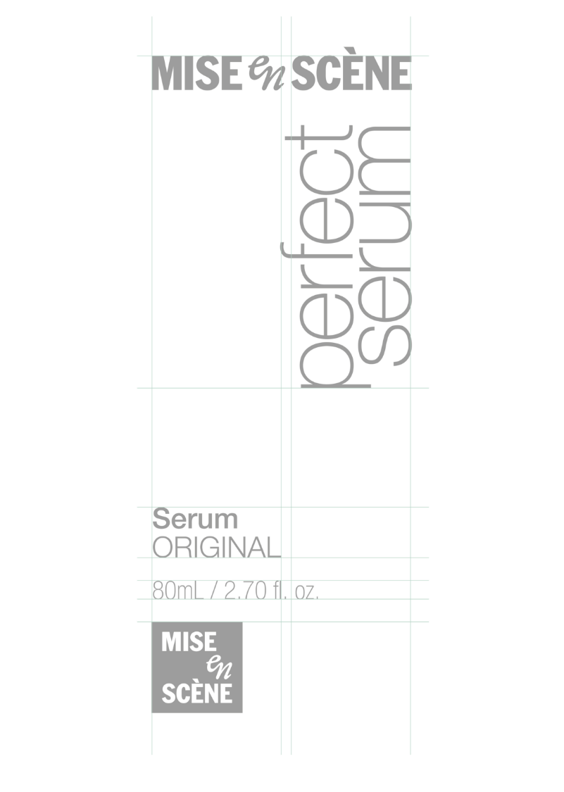
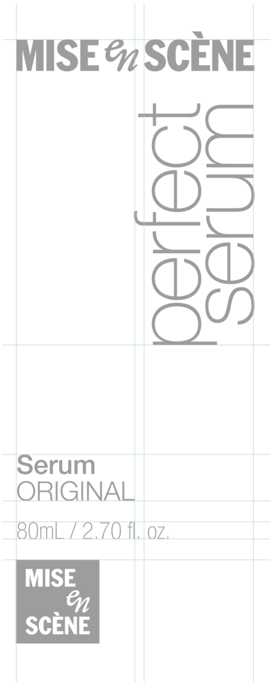
1. The Mise-en-Scène wordmark is positioned at top of package.
2. The unique design identity of each sub-line is retained.
3. The Mise-en-Scène symbol is positioned at the bottom, matching the previous logo color
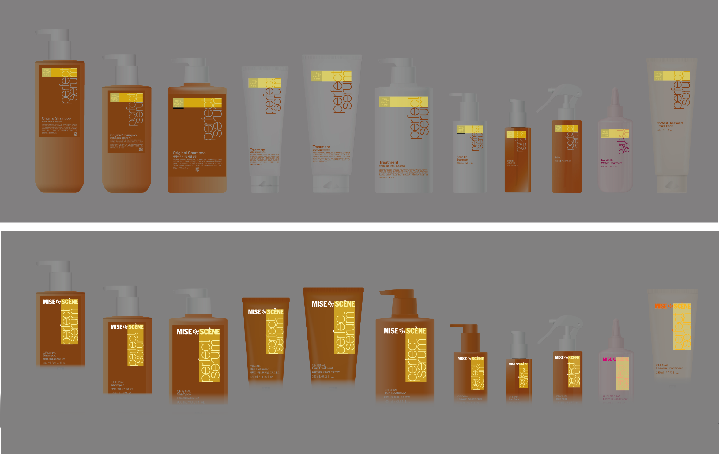
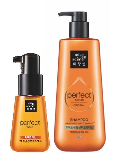
Based on these principles, a consistent structural system was designed across all SKUs.
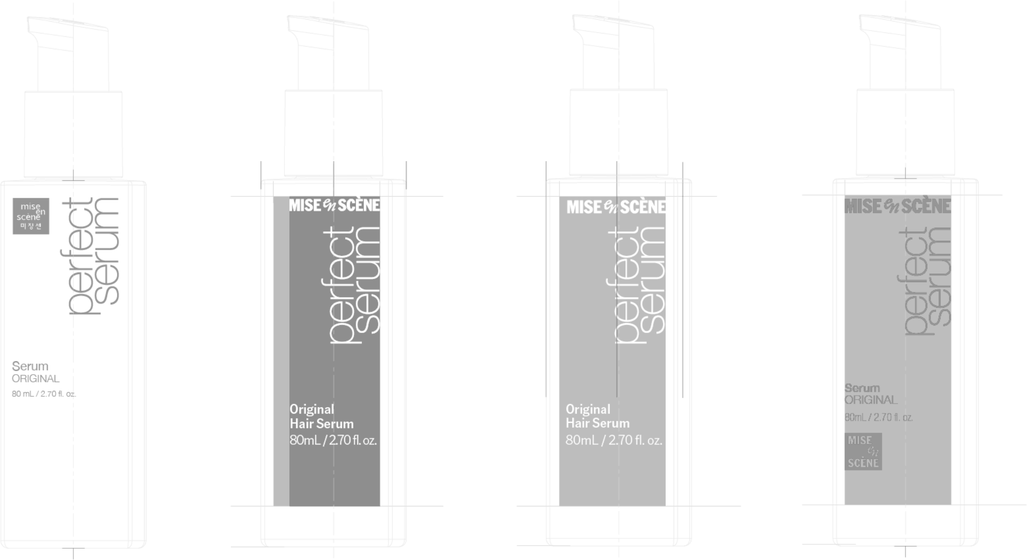
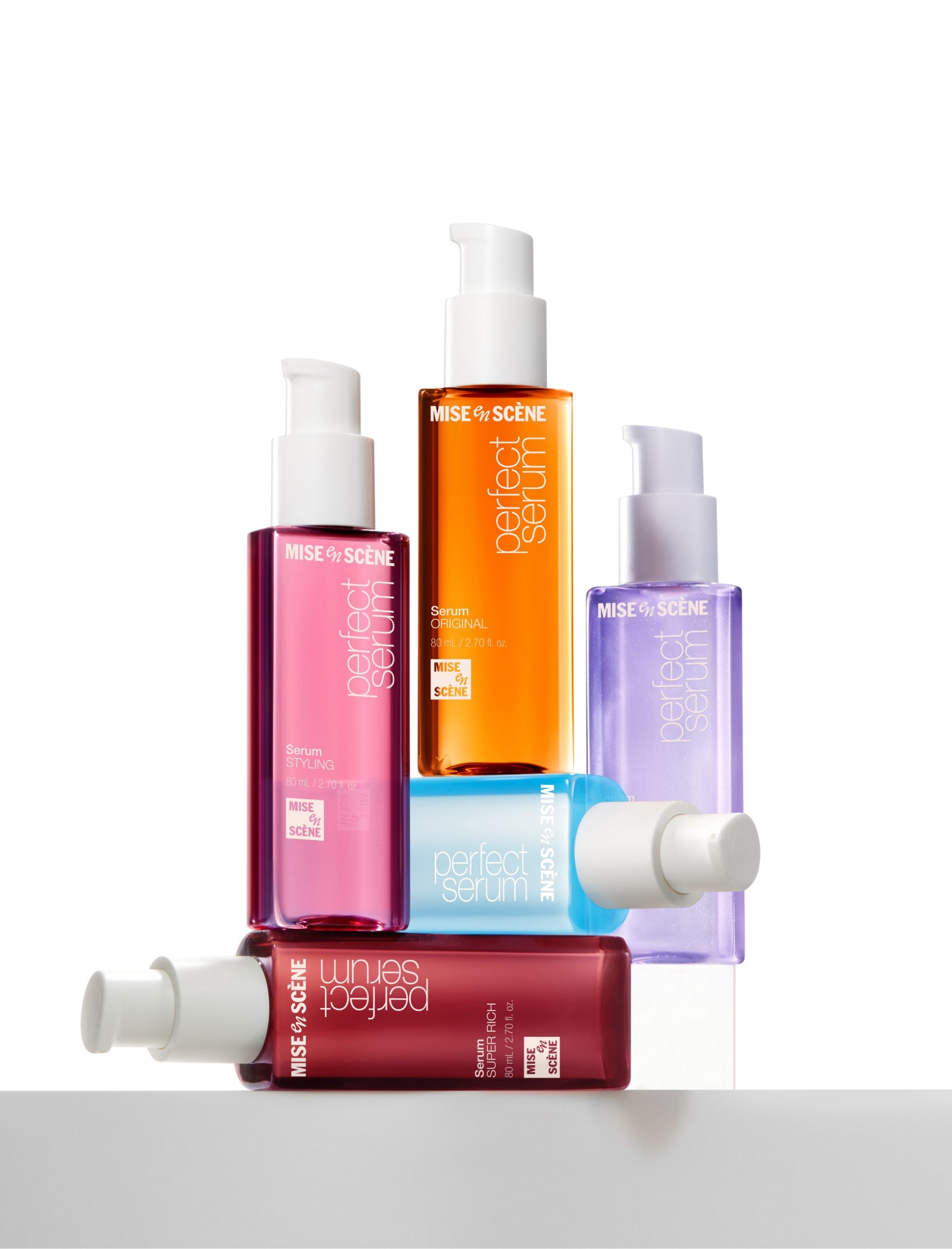
The proportion between the new wordmark and the existing ‘perfect serum’ typography was adjusted to form a cohesive visual flow.
This proportional system was finely tuned to ensure balanced visual weight across container sizes ranging from 15ml to 990ml.
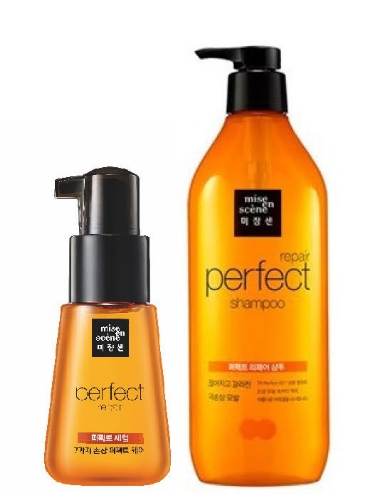
Additionally, the treatment product group, which had previously used white packaging, was updated to a
pearl-orange tone to visually align with the line’s flagship product, the hair serum.
Layout & System Structure
The front layout of all packaging followed a unified information structure:
“Product benefit – Product type – (Korean product name) – Volume – Symbol.”
This hierarchy was designed to clarify product recognition while maintaining balance so that brand elements do not overpower the overall composition.
In consideration of global distribution, domestic and export packaging were unified under a single design layout. The layout incorporates legal labeling requirements from various countries, creating a flexible and compliant global standard.
In consideration of global distribution, domestic and export packaging were unified under a single design layout. The layout incorporates legal labeling requirements from various countries, creating a flexible and compliant global standard.
Design Execution
During mass production adaptation, challenges arose with the horizontal wordmark’s alignment against the asymmetric front edge of Perfect Serum containers.
To resolve this, a new visual center was defined based on the container’s print area. Proportions, spacing, and negative space between the wordmark and
product typography were carefully recalibrated.
This allowed a consistent impression to be maintained across all sizes—from small 15ml samples to large 990ml pump bottles.
The new structure was applied to a total of 75 items across both primary and secondary packaging. It now functions as a flexible lock-up system that supports the full Perfect Serum range, serving as a scalable and cohesive design solution for the brand.
The new structure was applied to a total of 75 items across both primary and secondary packaging. It now functions as a flexible lock-up system that supports the full Perfect Serum range, serving as a scalable and cohesive design solution for the brand.
- Amorepacific Creatives
- Design
- Kang Minhee, Baek Inwoo, Lee Sungyub
- Kang Minhee, Baek Inwoo,
- Lee Sungyub
- BM
- Byun Jongwook, Yoo Inhoon, Lee Yoonju
- Byun Jongwook, Yoo Inhoon,
- Lee Yoonju
- Development
- Lee Seonghyun
- Visual
- Motiv Ideas, Kang Minhee, Lee Sungyub
- Motiv Ideas, Kang Minhee,
- Lee Sungyub
- Photography
- Shin Sangwoo, seongyoun.vhae Studio