Amorepacific HONGKONG Lane Crawford
아모레퍼시픽 홍콩 레인 크로포드
Summary
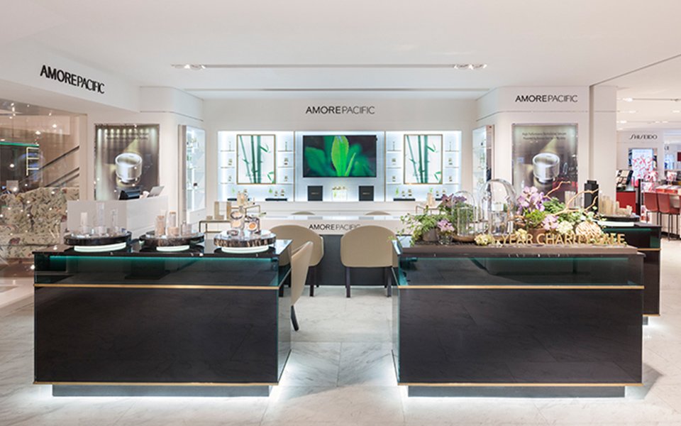
브랜드 ‘아모레퍼시픽(AMOREPACIFIC)’이 홍콩 럭셔리 편집 백화점 레인 크로포드(Lane Crawford) 침사추이 하버시티(Harbour City)점과 IFC몰(IFC mall)점을 통해 홍콩에서 첫 선을 보입니다.
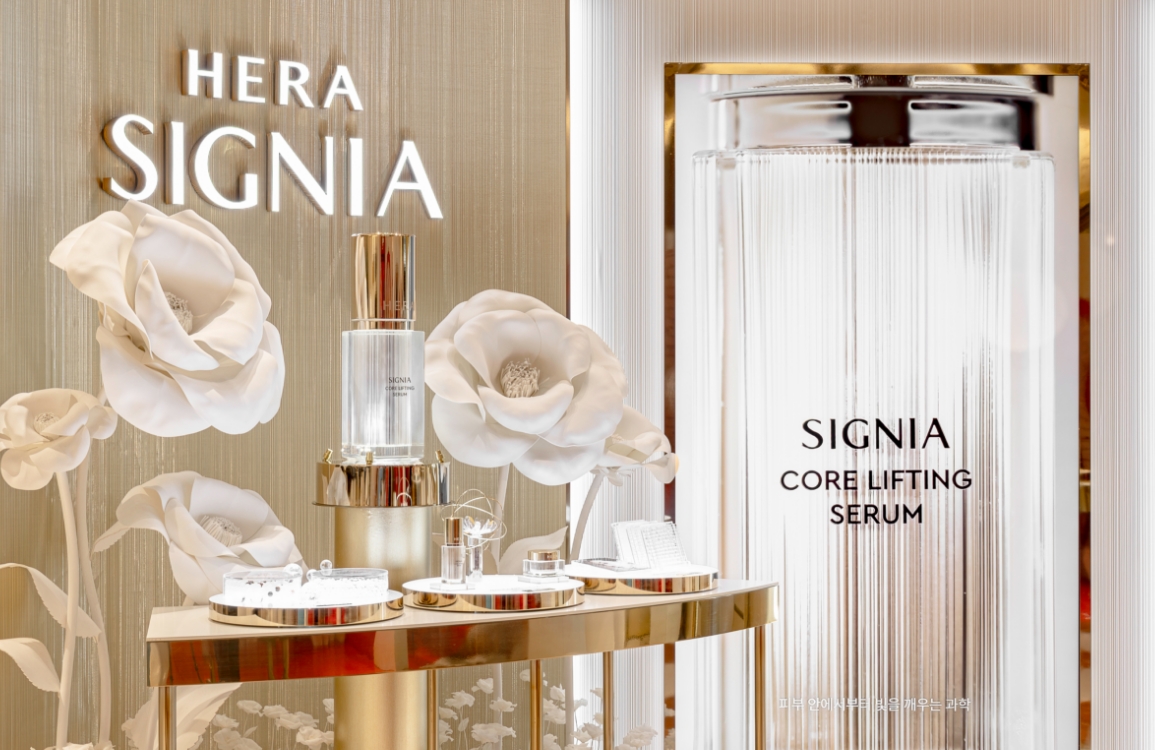
아모레퍼시픽 홍콩 매장은 브랜드 아이덴티티인 ‘High Performance Skincare from Botanical science’와 더불어 최고급 원료와 제품의 가치를 보여줄 수 있는 디스플레이와 가구에 초점을 맞추어 디자인하였습니다.
아모레퍼시픽 홍콩 매장은 브랜드 아이덴티티인 ‘High Performance Skincare from Botanical science’와 더불어 최고급 원료와 제품의 가치를 보여줄 수 있는 디스플레이와 가구에 초점을 맞추어 디자인하였습니다.
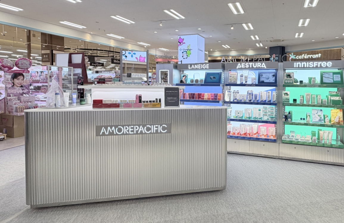
The “AMOREPACIFIC” brand will be launched in Hong Kong through the Harbour City branch in Tsim Sha Tsui and IFC mall branch of Lane Crawford, a luxury department store.
AMOREPACIFIC’s shops in Hong Kong are designed by concentrating on displays and furniture in order to present effectively the value of products and best-quality ingredients as well as the brand identity “High-Performance Skincare from Botanical Science.”
AMOREPACIFIC’s shops in Hong Kong are designed by concentrating on displays and furniture in order to present effectively the value of products and best-quality ingredients as well as the brand identity “High-Performance Skincare from Botanical Science.”
Concept
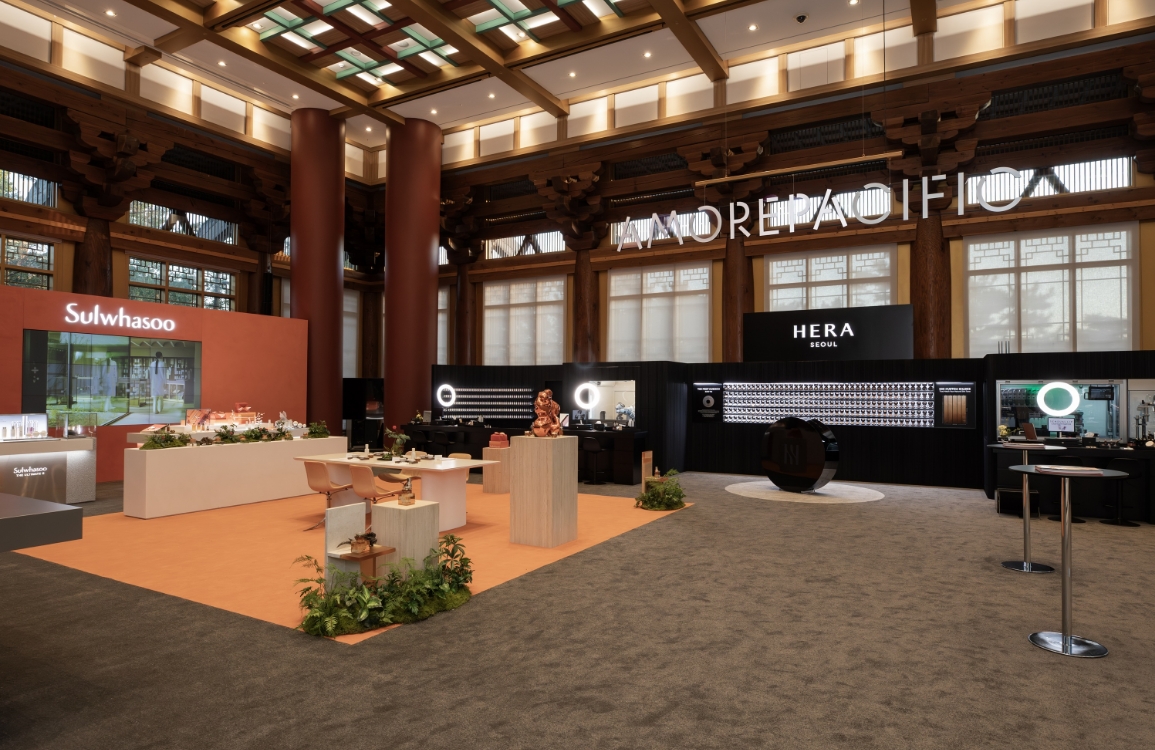
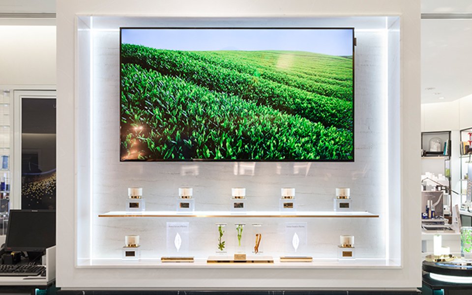
아모레퍼시픽은 럭셔리 브랜드 이미지를 효과적으로 표현하기 위해 브랜드 메인 컬러를 깊이감과 고급스러움이 느껴지는 보태니컬 그린 (Botanical green)으로 정하였습니다. 매장에서 보태니컬 그린을 다른 브랜드와 차별화된 방식으로 보여주기 위해, 아모레퍼시픽 제품 디자인에서 컬러 표현 방법에 대한 영감을 얻었습니다. 제품을 보면 메탈 컬러로 용기를 둘러싸고 그 위를 반투명 재질이 감싸고 있어 간결하면서도 고급스러운 느낌을 줍니다. 매장 역시 단순히 컬러만을 보여주는 게 아니라 빛과 집기의 소재를 통해 깊은 공간감과 무게감, 입체감을 동시에 느낄 수 있도록 보태니컬 그린을 표현하였습니다. 이로써 그린을 메인 컬러로 사용하는 많은 자연주의 브랜드와 차별화를 꾀할 수 있었습니다.
In expressing the image of a luxury brand, AMOREPACIFIC has decided to use botanical green to make the main color of the brand look deep and high-quality. It put great effort to make the botanical green color look luxurious and to differentiate it from other brands. The method of expressing the main color is inspired by AMOREPACIFIC’s product design. The metallic color encircling the product container provides a simple yet high-quality impression since a semi-transparent material wraps the container. The shops are also inspired by such expressions, so they are designed with botanical green such that deep space, weight, and multi-dimensionality could be perceived through lightings and furnishings instead of simply showing colors within the shops. This way, the brand can be differentiated from other brands that use nature as their product motif and green as their main color.
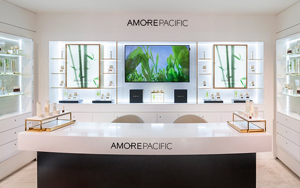
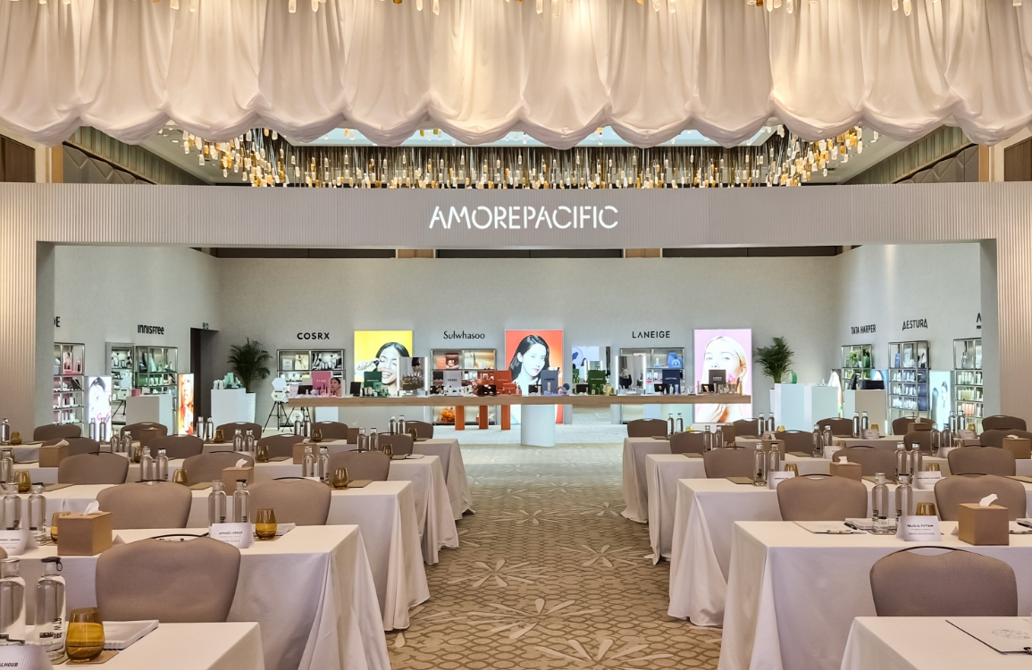
또한 ‘High Performance Skincare from Botanical science’라는 브랜드 아이덴티티를 매장 곳곳에서 체험하고 느낄 수 있도록 이미지, 패키지, 디스플레이 집기 하나하나 세심히 기획하였습니다. 최고급 원료의 모습을 고귀하게 표현해 촬영한 이미지와 고급스럽고 무게감 있는 디스플레이 집기를 배치하여 고객이 매장 내에서 다양한 체험을 통해 아모레퍼시픽의 브랜드 가치를 느낄 수 있도록 하였습니다.
In addition, image, package, and display furnishings are planned with great care in order for consumers to experience and feel the brand identity of AMOREPACIFIC — “High-Performance Skincare from Botanical Science” — across the shops. The image of high-quality ingredients and high-quality display furnishings are placed within the shops so that customers can sense the brand value of AMOREPACIFIC through the various experiences offered within the shops.
- Amorepacific Creatives


![Exhibition [The House of Beauty Scientists] 's work list thumbnail](https://cdn-design.amorepacific.com/contents/2024/08/02172154/24_88_list_thumb.jpg)