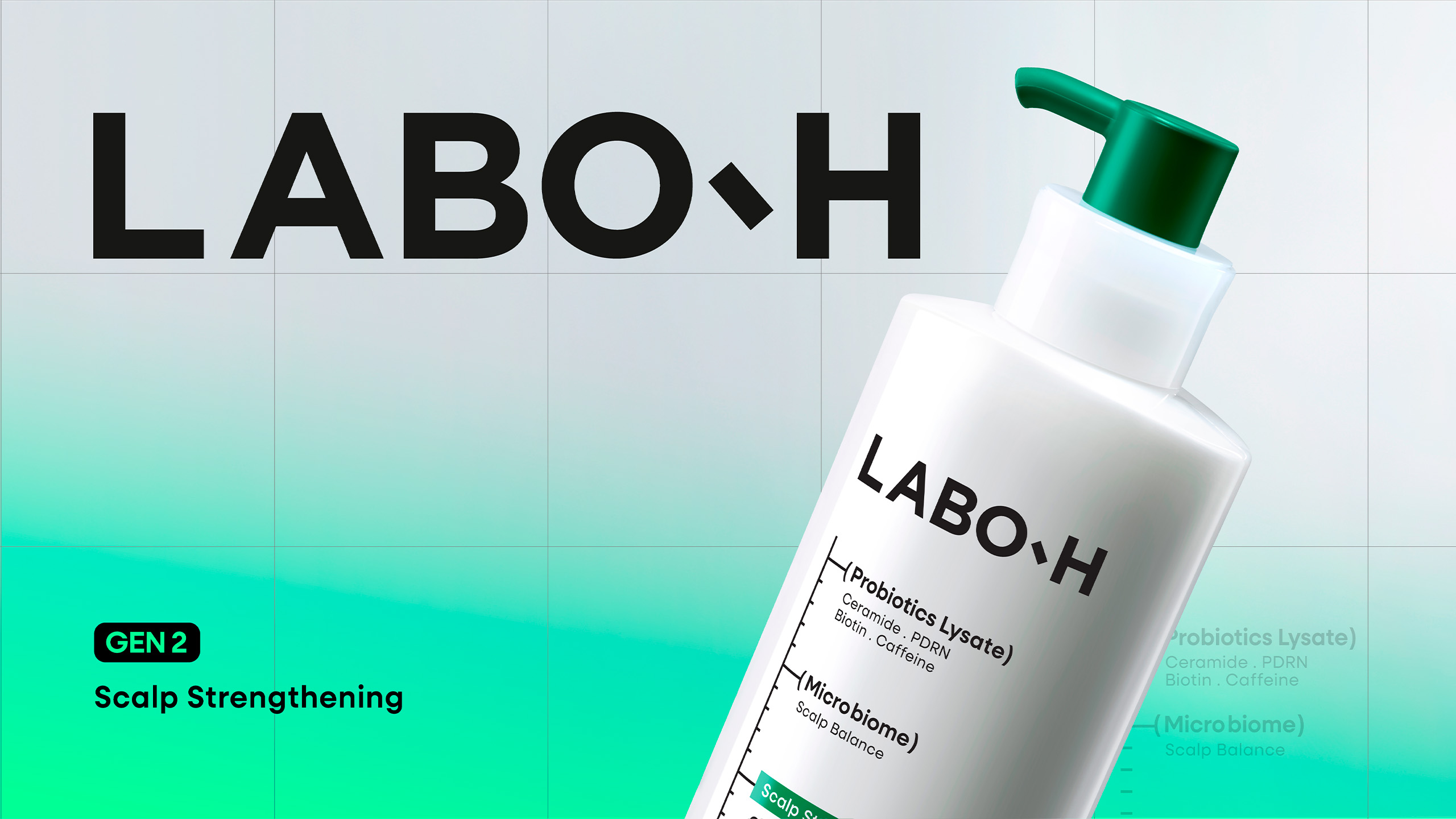
LABO-H Scalp Strengthening Line Design Advance
Summary
We carried out a design renewal for LABO-H’s Scalp Strengthening Line, the brand’s signature scalp care range. As the brand continued to grow and prepared for further global expansion, there was a need for a comprehensive renewal that could communicate the brand experience more effectively.
This renewal focused on refining and advancing the brand assets that had been built over many years. While preserving the brand experience that consumers had come to recognize, the project aimed to reflect upgraded formulations and respond to the evolving market by reorganizing every brand touchpoint under a unified perspective. To achieve this, every design element of the Scalp Strengthening Line was carefully analyzed, distinguishing the elements to be preserved from those that required further development.
The renewal established a foundation for LABO-H to evolve into a more contemporary and refined scalp care brand, while maintaining the familiar brand experience that consumers have come to trust.
This renewal focused on refining and advancing the brand assets that had been built over many years. While preserving the brand experience that consumers had come to recognize, the project aimed to reflect upgraded formulations and respond to the evolving market by reorganizing every brand touchpoint under a unified perspective. To achieve this, every design element of the Scalp Strengthening Line was carefully analyzed, distinguishing the elements to be preserved from those that required further development.
The renewal established a foundation for LABO-H to evolve into a more contemporary and refined scalp care brand, while maintaining the familiar brand experience that consumers have come to trust.
Background
Since its launch in 2020, the LABO-H Scalp Strengthening Line has continued to grow, establishing itself as the brand’s signature range and a leading line within the scalp skincare category. Over the past five years, the product line has expanded through a series of incremental updates focused on color and graphic elements. However, with the brand preparing for further global expansion, a more comprehensive design renewal became necessary.
As the brand’s flagship line, the key challenge was to preserve the accumulated brand equity that consumers had built over time while effectively communicating the upgraded formulations and the brand’s evolving direction. At the same time, the renewal sought to create a softer, more refined brand experience that could naturally resonate with global consumers.
Through consumer research, global benchmark analysis, and internal evaluation, clear principles were established to determine which elements should be preserved and which should evolve. Based on these insights, every aspect of the brand experience—from product design, graphics, and packaging to key visuals and PDP—was comprehensively refined under a unified design perspective.
As the brand’s flagship line, the key challenge was to preserve the accumulated brand equity that consumers had built over time while effectively communicating the upgraded formulations and the brand’s evolving direction. At the same time, the renewal sought to create a softer, more refined brand experience that could naturally resonate with global consumers.
Through consumer research, global benchmark analysis, and internal evaluation, clear principles were established to determine which elements should be preserved and which should evolve. Based on these insights, every aspect of the brand experience—from product design, graphics, and packaging to key visuals and PDP—was comprehensively refined under a unified design perspective.
Design Direction : Laboratory v1.5
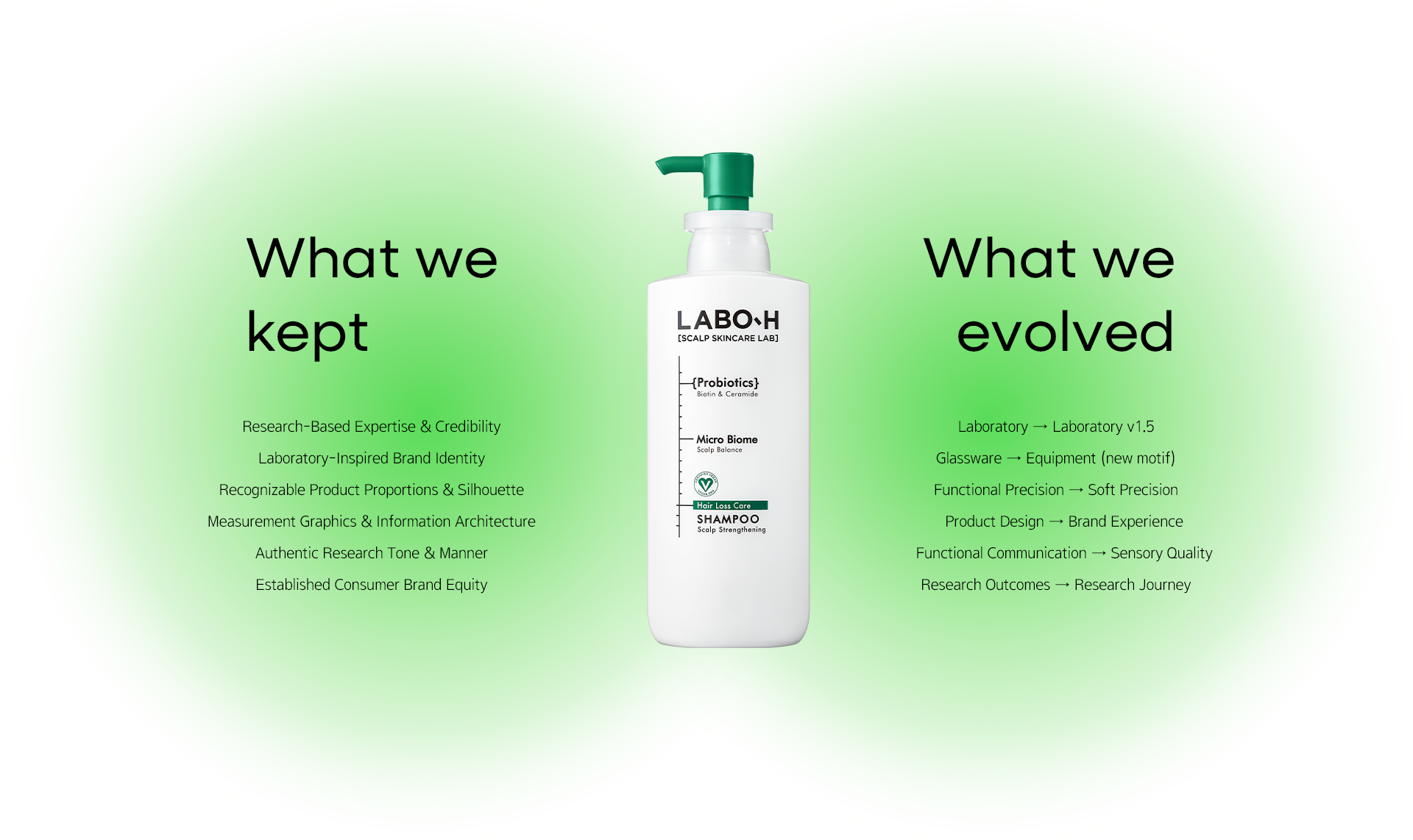
LABO-H has built its brand identity as a research-based scalp care brand, centered around a laboratory-inspired design motif. While the original laboratory concept primarily emphasized expertise and functional performance, this renewal focused on communicating the upgraded formulations and evolved brand experience with greater refinement. To achieve this, it was essential to preserve the brand assets that had been cultivated over time while thoughtfully advancing the elements that required change.
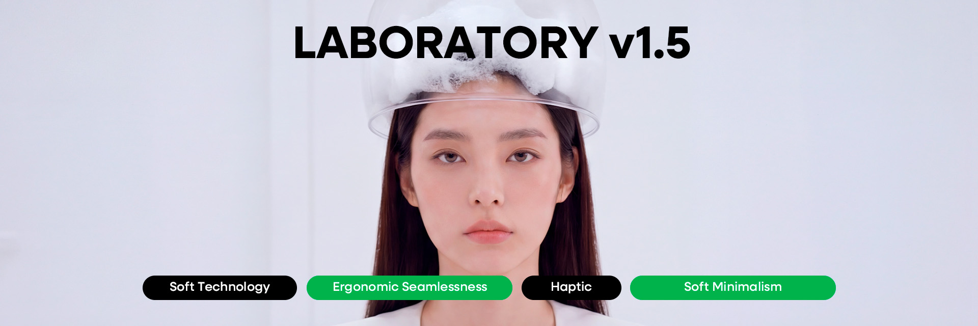
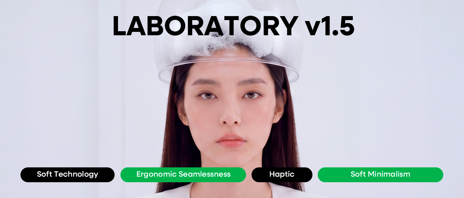
For this renewal, “Laboratory v1.5” was established as the core design direction. By inheriting the trust and professionalism of the original Laboratory concept while evolving it into a more contemporary and sophisticated expression, the renewal was designed to ensure that the brand’s evolution could be experienced naturally across every touchpoint.
For this renewal, “Laboratory v1.5” was established as the core design direction. By inheriting the trust and professionalism of the original Laboratory concept while evolving it into a more contemporary and sophisticated expression, the renewal was designed to ensure that the brand’s evolution could be experienced naturally across every touchpoint.
Vessel Design
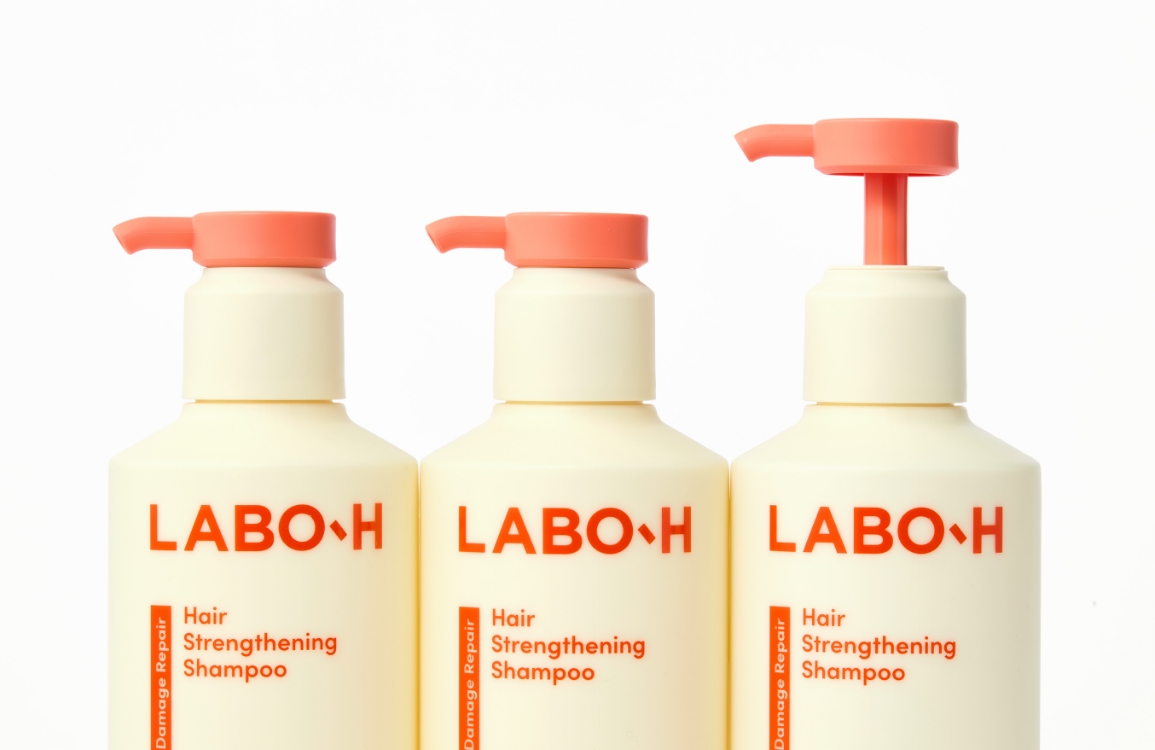
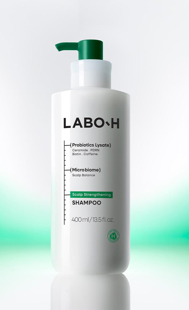
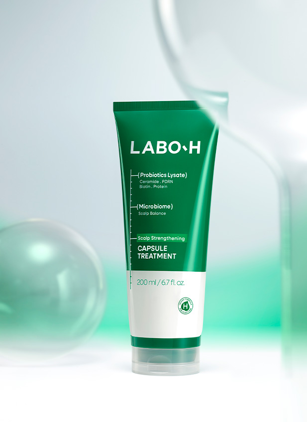
The original LABO-H Scalp Strengthening Line containers were designed with inspiration from laboratory glassware, intuitively expressing the expertise of a research-based brand. The key objective of this renewal was to preserve this strength while introducing a more contemporary and refined expression.
To maintain the brand’s accumulated equity, the original proportions and distinctive silhouette of the containers were retained. Rather than creating an entirely new form, we believed it was more important to preserve the brand experience that consumers had built over time. Based on this foundation, elements that required change were carefully identified and selectively refined.
To maintain the brand’s accumulated equity, the original proportions and distinctive silhouette of the containers were retained. Rather than creating an entirely new form, we believed it was more important to preserve the brand experience that consumers had built over time. Based on this foundation, elements that required change were carefully identified and selectively refined.
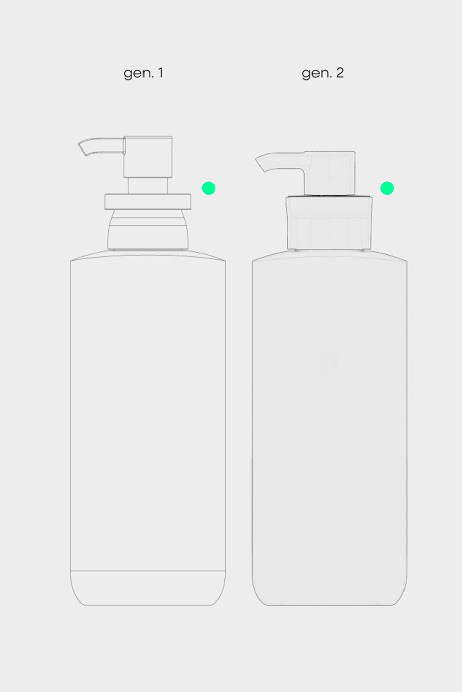
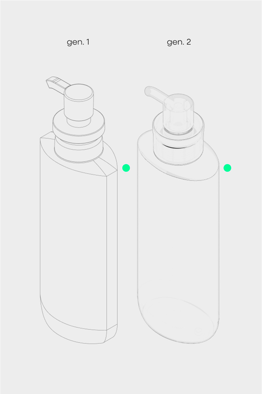
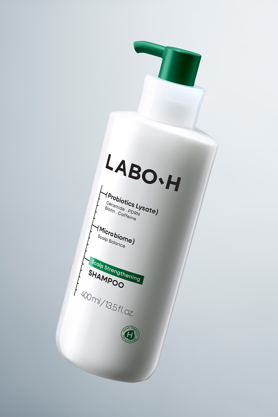
To express a more evolved research environment beyond the original laboratory glassware motif, we introduced the ergonomic and restrained lines of laboratory equipment as a new formal inspiration. This approach was intended to convey a research setting that had advanced to the next level. By translating the precision and ergonomic qualities of laboratory equipment into the product form, we sought to enhance not only its visual impression but also the tactile experience of holding and using it. The angular character of the original container was softened, while refined mechanical details were added to reinterpret the precision of a research-based brand through a more contemporary and sophisticated design language.
Gently connected curves and carefully calibrated details enhance the product’s visual and tactile quality, while conveying a level of refinement that reflects the upgraded formulation. Through these changes, consumers can experience the brand’s expertise and credibility in a more natural and sophisticated way throughout their interaction with the product.
Gently connected curves and carefully calibrated details enhance the product’s visual and tactile quality, while conveying a level of refinement that reflects the upgraded formulation. Through these changes, consumers can experience the brand’s expertise and credibility in a more natural and sophisticated way throughout their interaction with the product.
Pump Design
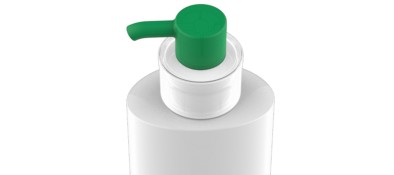
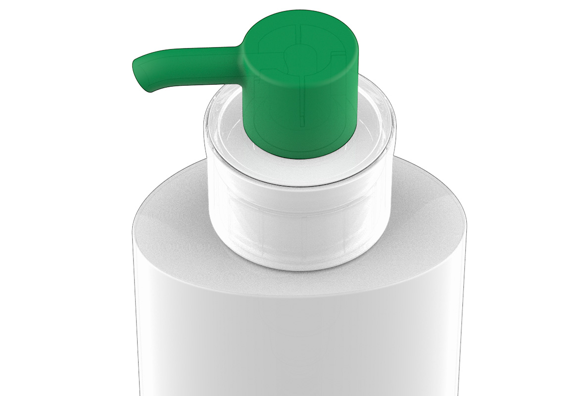
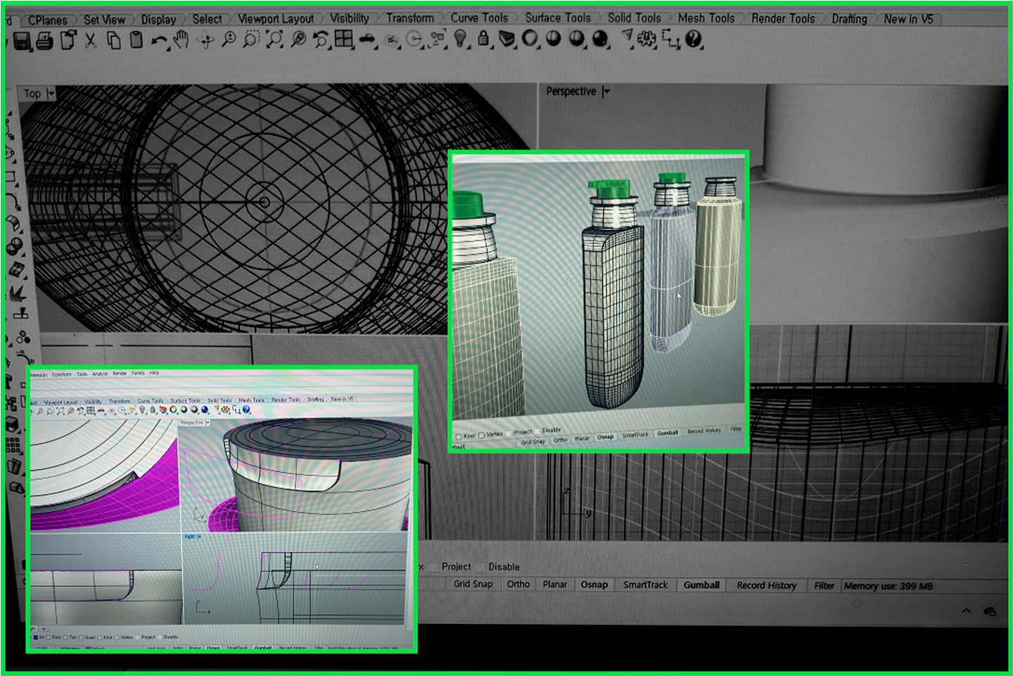
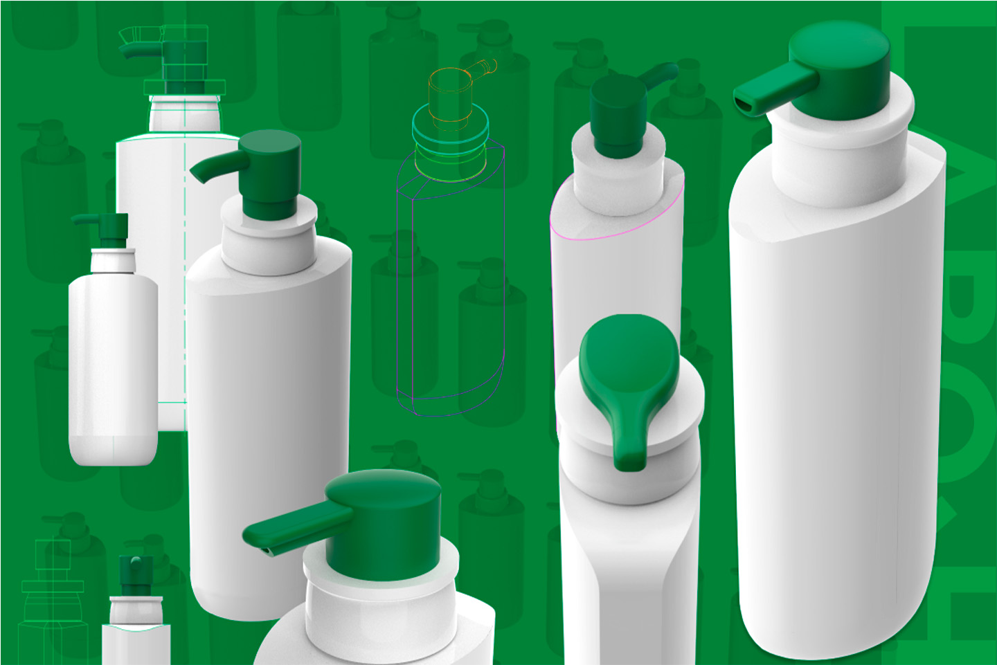
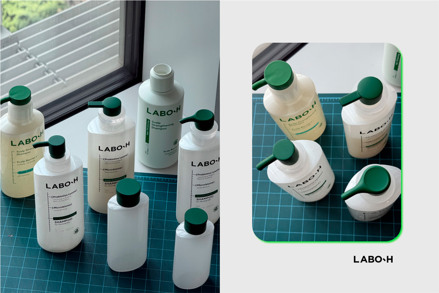
The pump is one of the defining formal elements of the LABO-H Scalp Strengthening Line, intuitively expressing the identity of a laboratory-based brand. At the same time, as it includes the dispensing point through which the formula is delivered, it is also the area users engage with most directly during use. For this renewal, we determined that the most appropriate design solution was not to explain or persuade consumers of the formula’s evolution, but to allow it to be experienced naturally through interaction with the product. With this in mind, the entire pump area—the part most closely connected to the actual user experience—was carefully redesigned.
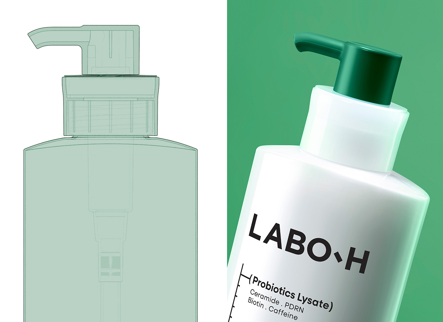
The layers of the pump cap and button were simplified, and unnecessary formal elements were removed to create a cleaner, more unified appearance. This refinement allows users to naturally perceive the upgraded formulation through the product experience itself.
At the same time, the design focused on achieving a simpler and more sophisticated form while meeting the structural requirements of the pump module. The connection between the container and the pump cap was refined to create a more seamless transition, allowing them to be perceived as a single object. Rather than leaving the assembly lines between the outer cap, chaplet, and other components as purely functional details, they were intentionally designed to express the mechanical precision characteristic of laboratory equipment. In addition, the radius of the transition leading to the pump nozzle was carefully adjusted to preserve the product’s distinctive visual identity while improving durability.
At the same time, the design focused on achieving a simpler and more sophisticated form while meeting the structural requirements of the pump module. The connection between the container and the pump cap was refined to create a more seamless transition, allowing them to be perceived as a single object. Rather than leaving the assembly lines between the outer cap, chaplet, and other components as purely functional details, they were intentionally designed to express the mechanical precision characteristic of laboratory equipment. In addition, the radius of the transition leading to the pump nozzle was carefully adjusted to preserve the product’s distinctive visual identity while improving durability.
One-touch Cap Design
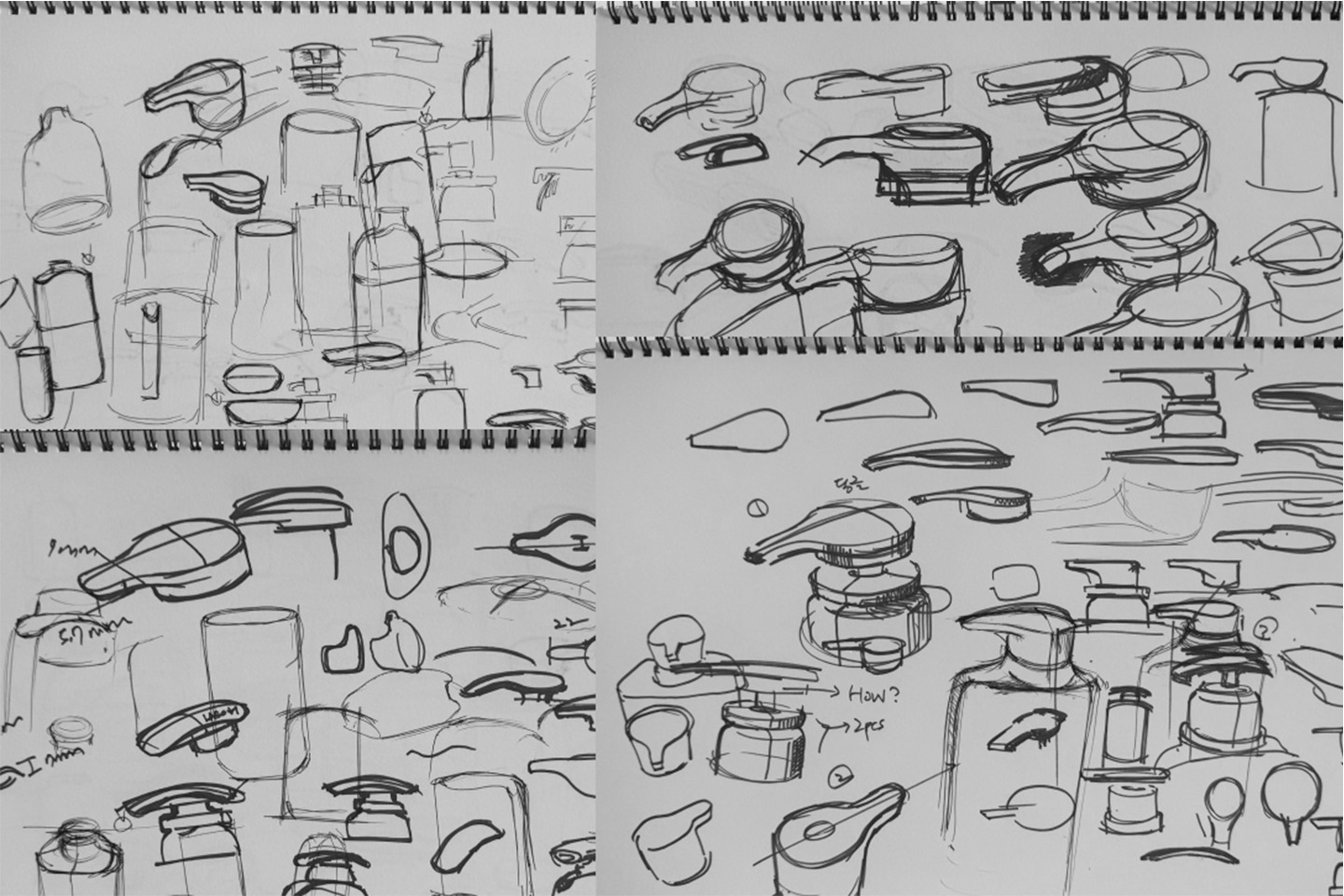
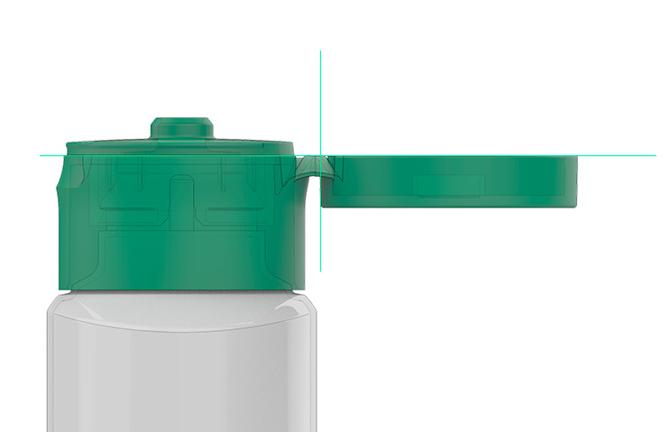
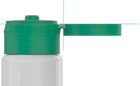
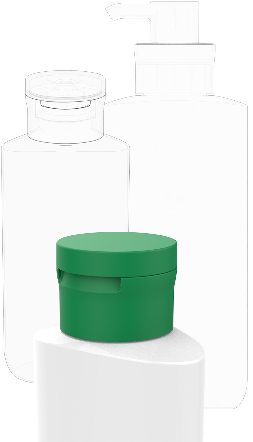
The one-touch cap used for smaller-sized products was designed to consistently carry forward the newly defined formal language of the pump. Just as the previous LABO-H design had extended the pump’s distinctive form to the one-touch cap, this renewal sought to maintain the same visual continuity across both components.
From the earliest stages of development, the one-touch cap was approached with both manufacturability and structural integrity in mind. Rather than defining the form first and reviewing production feasibility afterward, the mold structure was established as the starting point of the design. This allowed the form to be developed in a way that satisfied both production requirements and aesthetic refinement.
Based on this approach, the detailed structure was carefully coordinated through close collaboration with the development team to ensure stable implementation in mass production. The result is a design that maintains a consistent formal language with the main product and delivers a unified brand experience.
From the earliest stages of development, the one-touch cap was approached with both manufacturability and structural integrity in mind. Rather than defining the form first and reviewing production feasibility afterward, the mold structure was established as the starting point of the design. This allowed the form to be developed in a way that satisfied both production requirements and aesthetic refinement.
Based on this approach, the detailed structure was carefully coordinated through close collaboration with the development team to ensure stable implementation in mass production. The result is a design that maintains a consistent formal language with the main product and delivers a unified brand experience.
Graphic Design
The graphic design aimed not only to reflect the product upgrade and support the brand’s global expansion, but also to make LABO-H’s research-driven mindset and expertise visually tangible. By ensuring that information is communicated in a structured and consistent way at every moment—from reading and comparing products to using them—the design translates the brand’s research-based expertise and precision into a cohesive user experience.
Graphic Design System
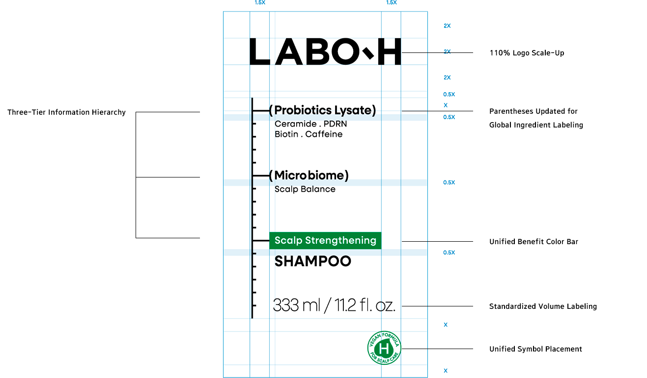
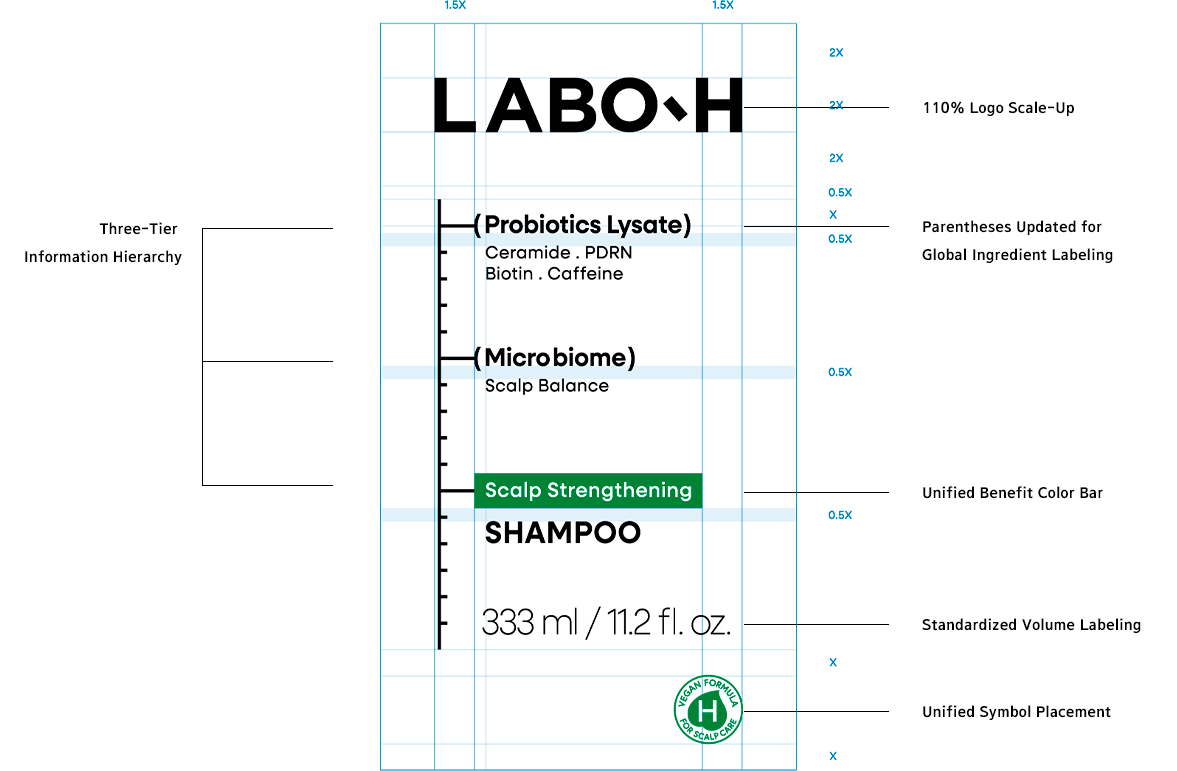
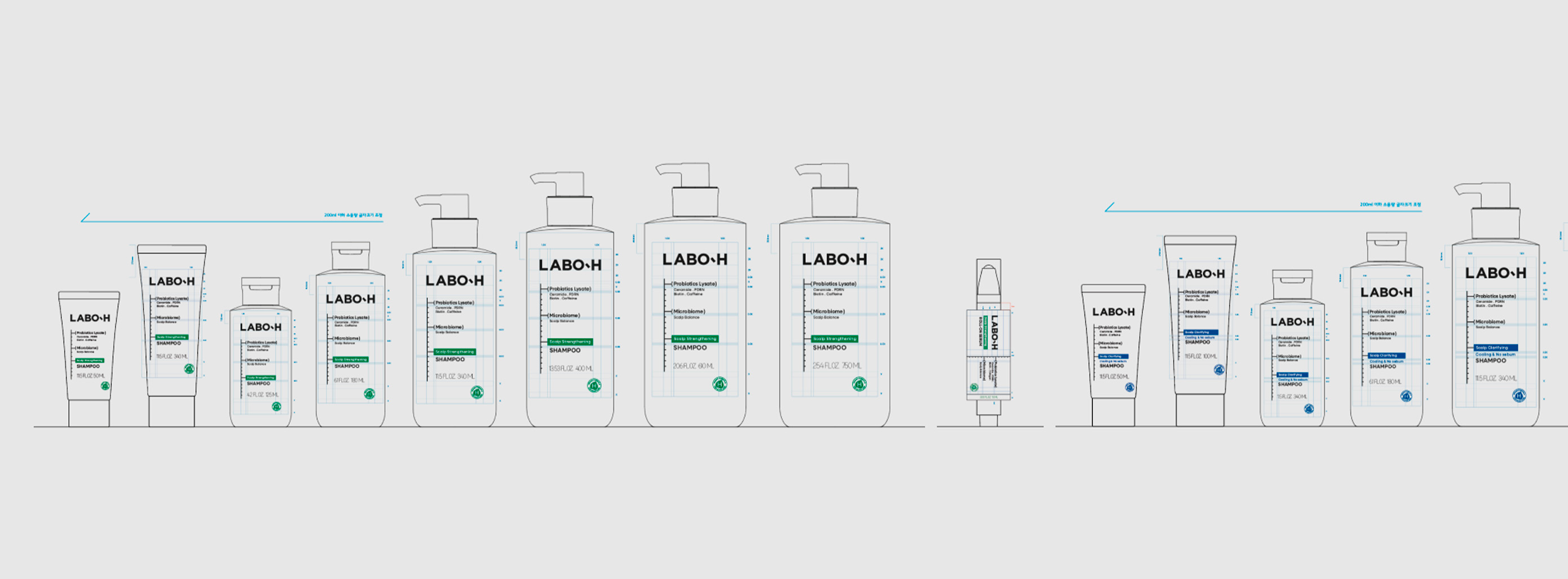
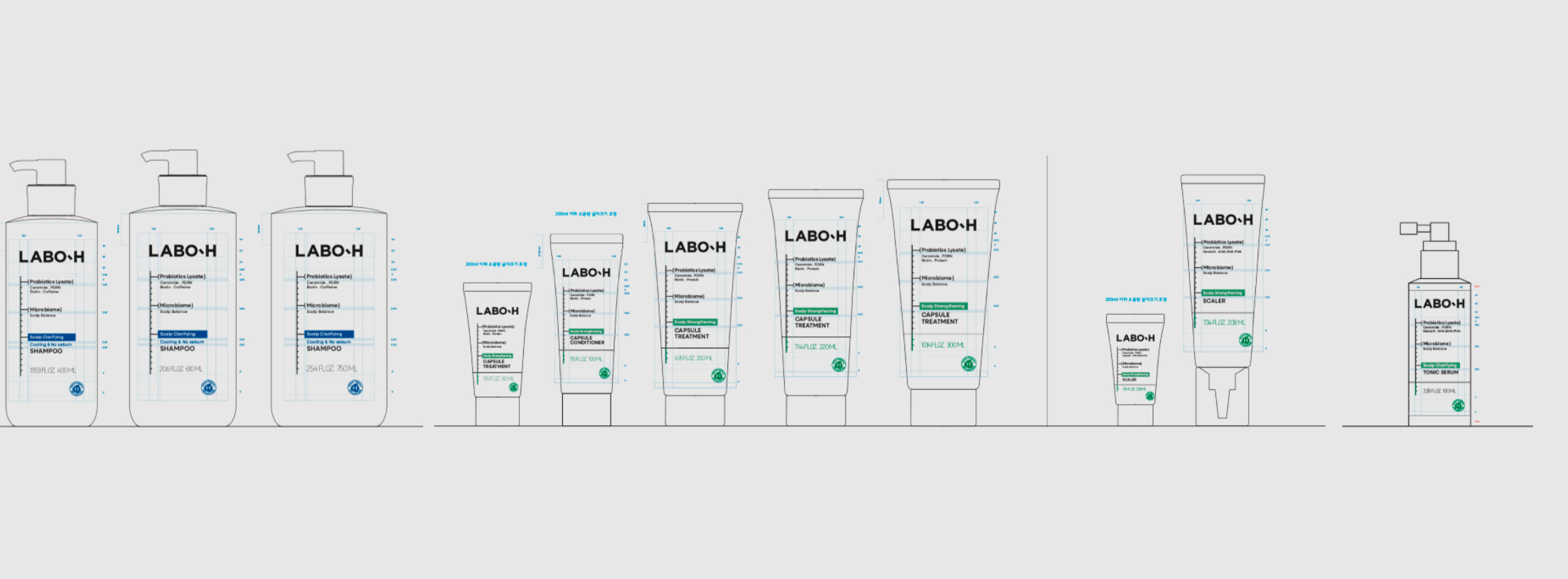
While retaining the existing structure that conveyed the brand’s distinctive character, the graphic rules—which had previously varied slightly across products—were unified into a single system.
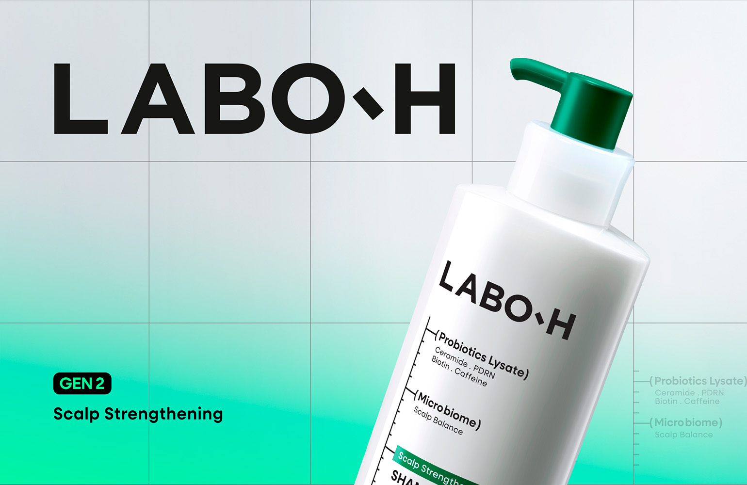
To strengthen brand recognition, the logo was enlarged to 110% of its previous size, and the roles of graphic elements such as brackets, measurement markings, color bars, and symbols were redefined according to a consistent set of principles.
The spacing between measurement markings was established as the system’s fundamental unit (X), allowing every graphic element and layer of information to expand within the same underlying framework.
Based on this principle, a graphic design guideline applicable across the entire product range was developed, creating a scalable system capable of delivering a consistent brand experience across diverse SKUs and global packaging environments.
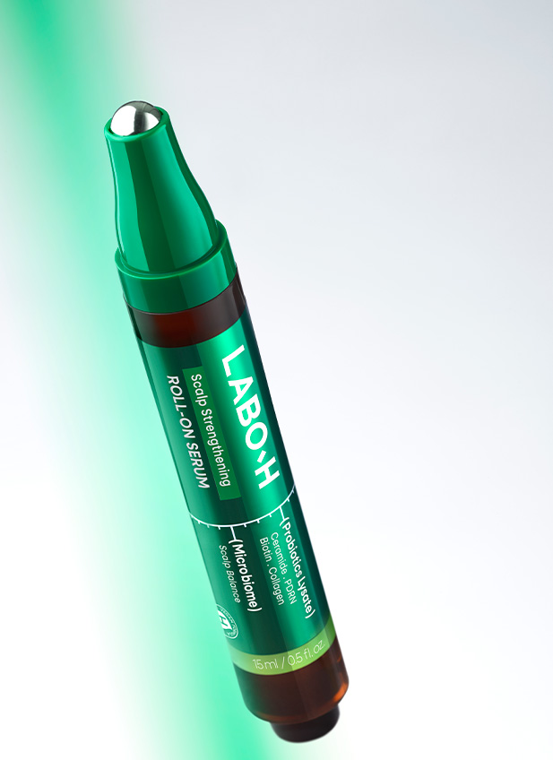
A new graphic logic was also introduced for the roll-on serum, taking into account its usability and storage conditions. Rather than applying the existing system uniformly, the information hierarchy and graphic elements were redesigned around the product’s specific characteristics, improving both usability and the overall user experience.
To strengthen brand recognition, the logo was enlarged to 110% of its previous size, and the roles of graphic elements such as brackets, measurement markings, color bars, and symbols were redefined according to a consistent set of principles.
The spacing between measurement markings was established as the system’s fundamental unit (X), allowing every graphic element and layer of information to expand within the same underlying framework.
Based on this principle, a graphic design guideline applicable across the entire product range was developed, creating a scalable system capable of delivering a consistent brand experience across diverse SKUs and global packaging environments.
A new graphic logic was also introduced for the roll-on serum, taking into account its usability and storage conditions. Rather than applying the existing system uniformly, the information hierarchy and graphic elements were redesigned around the product’s specific characteristics, improving both usability and the overall user experience.
Typography
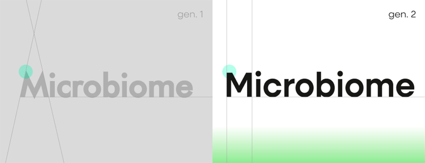
The typography was refined to reinforce the brand’s expertise and credibility by retaining its distinctive visual character while adopting a typeface with a more stable and structured appearance. In addition, a typeface with an extensive weight range and high scalability was introduced to ensure a consistent brand experience across diverse media and global markets.
Back Panel Design
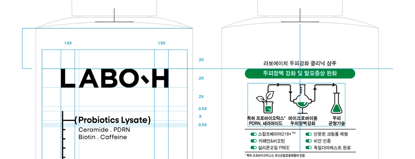
The back-panel graphic design was also carefully refined in alignment with the overall concept. A toggle-button motif was introduced to express the mechanical details inspired by laboratory equipment, while the visual balance between the existing icons and copy was reorganized to create a clearer and more structured information experience. This ensures that a consistent brand experience continues seamlessly from the front to the back of the product.
Set Package Design
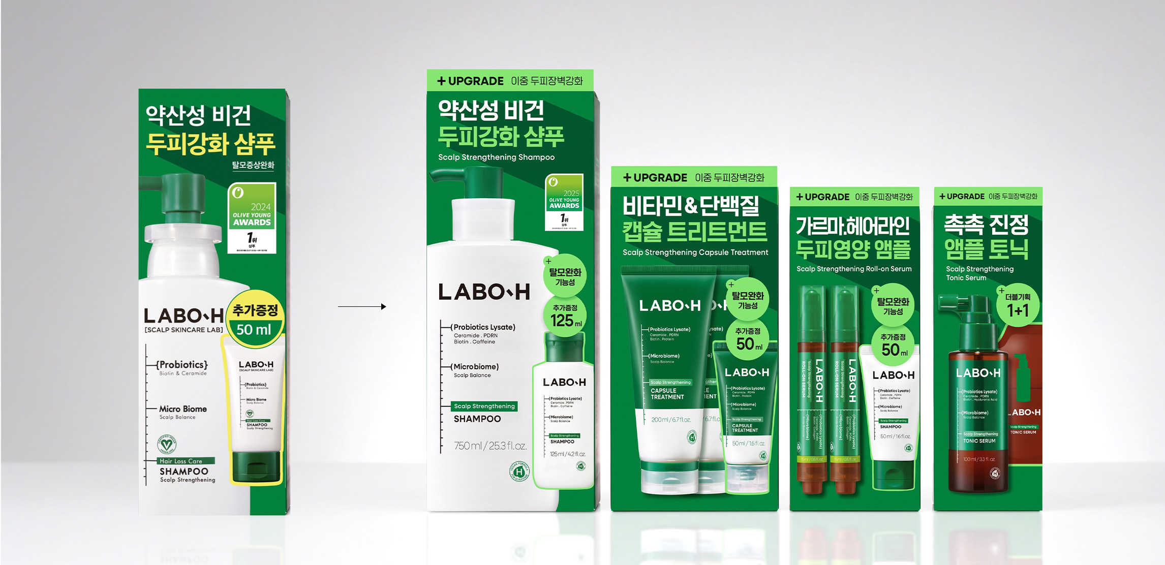
The package design also focused on evolving the brand into a more refined and systematic expression—one that preserves the brand assets and recognizable elements established by the existing packaging while responding to changing retail environments and consumer expectations.
As competition within H&B channels intensified, particular attention was given to the function-led merchandising environment of the hair care category. On shelves organized by product benefit, consumers often encounter function before brand, creating the need for a structure that communicates each product’s key benefit while ensuring clear brand recognition. Accordingly, consistency across the overall brand experience was prioritized over the individual expression of each product, establishing a design direction that allows the entire range to be perceived as one cohesive brand system.
As competition within H&B channels intensified, particular attention was given to the function-led merchandising environment of the hair care category. On shelves organized by product benefit, consumers often encounter function before brand, creating the need for a structure that communicates each product’s key benefit while ensuring clear brand recognition. Accordingly, consistency across the overall brand experience was prioritized over the individual expression of each product, establishing a design direction that allows the entire range to be perceived as one cohesive brand system.
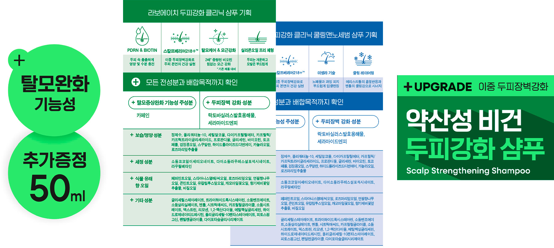
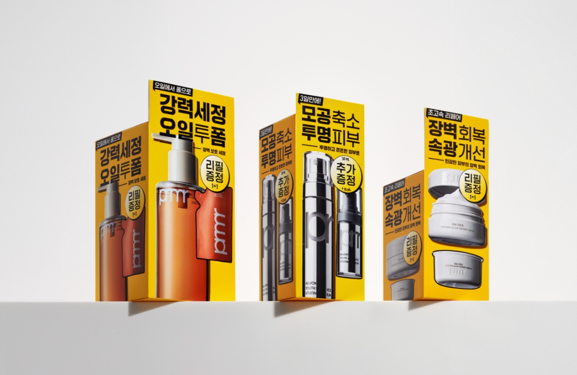
As the product line includes a wide variety of set configurations and package sizes, the design focused on enhancing the clarity of each package while ensuring that consumers experience a consistent brand identity regardless of which product they encounter. Existing benefit highlights were reorganized into a modular button system, allowing them to be applied consistently and scaled across packages with different messaging, proportions, and formats. A denser, more structured typeface was also introduced to create a stronger and more refined visual impression.
The informational content on the side and back panels was designed with a layout inspired by research reports. Rather than simply presenting complex information, the content is organized within a clear and systematic structure, allowing consumers to naturally experience the meticulousness and credibility of a research-based brand.
The newly introduced accent color draws inspiration from digital interfaces through a fluorescent palette, increasing shelf visibility within visually crowded retail environments while conveying a more contemporary and energetic brand image.
Through these refinements, consumers can enjoy a consistent brand experience regardless of product type or configuration, while naturally experiencing the credibility and precision that define LABO-H as a research-based brand throughout the entire packaging system.
The informational content on the side and back panels was designed with a layout inspired by research reports. Rather than simply presenting complex information, the content is organized within a clear and systematic structure, allowing consumers to naturally experience the meticulousness and credibility of a research-based brand.
The newly introduced accent color draws inspiration from digital interfaces through a fluorescent palette, increasing shelf visibility within visually crowded retail environments while conveying a more contemporary and energetic brand image.
Through these refinements, consumers can enjoy a consistent brand experience regardless of product type or configuration, while naturally experiencing the credibility and precision that define LABO-H as a research-based brand throughout the entire packaging system.
Visual Identity

The new visual identity was designed to allow consumers to intuitively experience the evolution of the LABO-H laboratory.
The newly defined LABO-H laboratory, Curious Scalp Skincare Lab, embodies the brand’s attitude of beginning with an endless curiosity about the scalp and relentlessly pursuing answers through careful observation and research. While the previous visual identity conveyed the authenticity of research through the character of a brilliant scientist, this renewal shifts its focus to the process of observation and research itself, visually expressing the brand’s spirit of exploration.
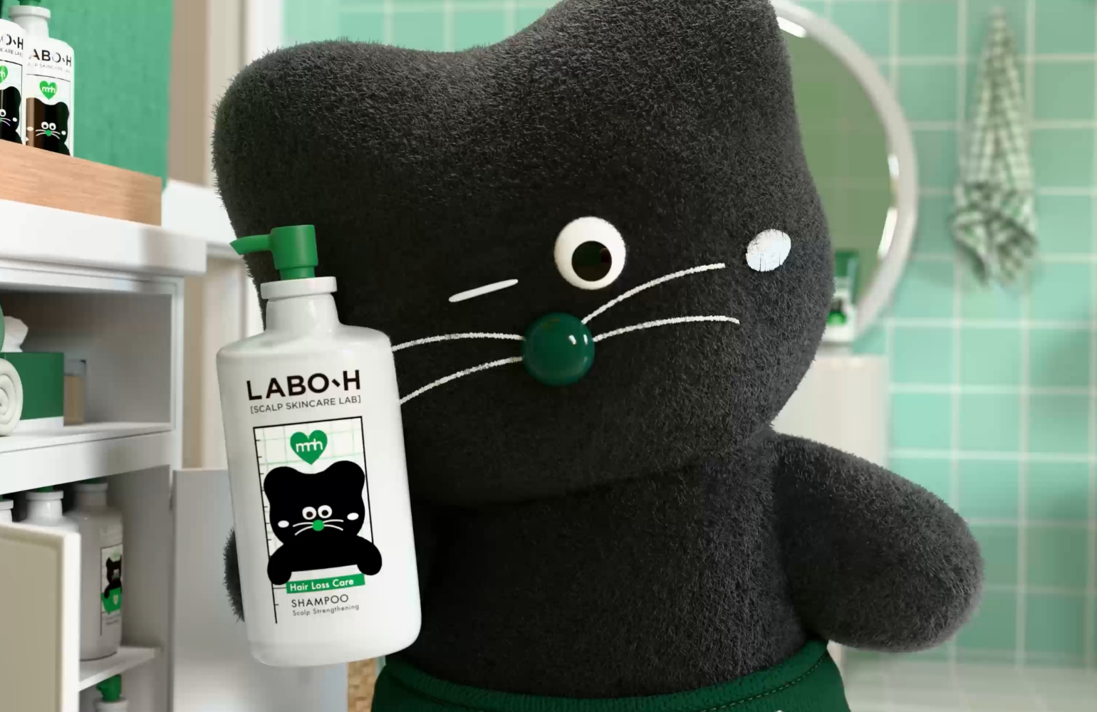
To bring this idea to life, the researcher’s perspective became the central visual motif. Close-up compositions and subtle perspective distortion were used to capture the act of closely examining the product, expressing the continuous process of questioning and exploration. Through immersive photographic direction, the visuals communicate the authenticity and dedication of a research-based brand.
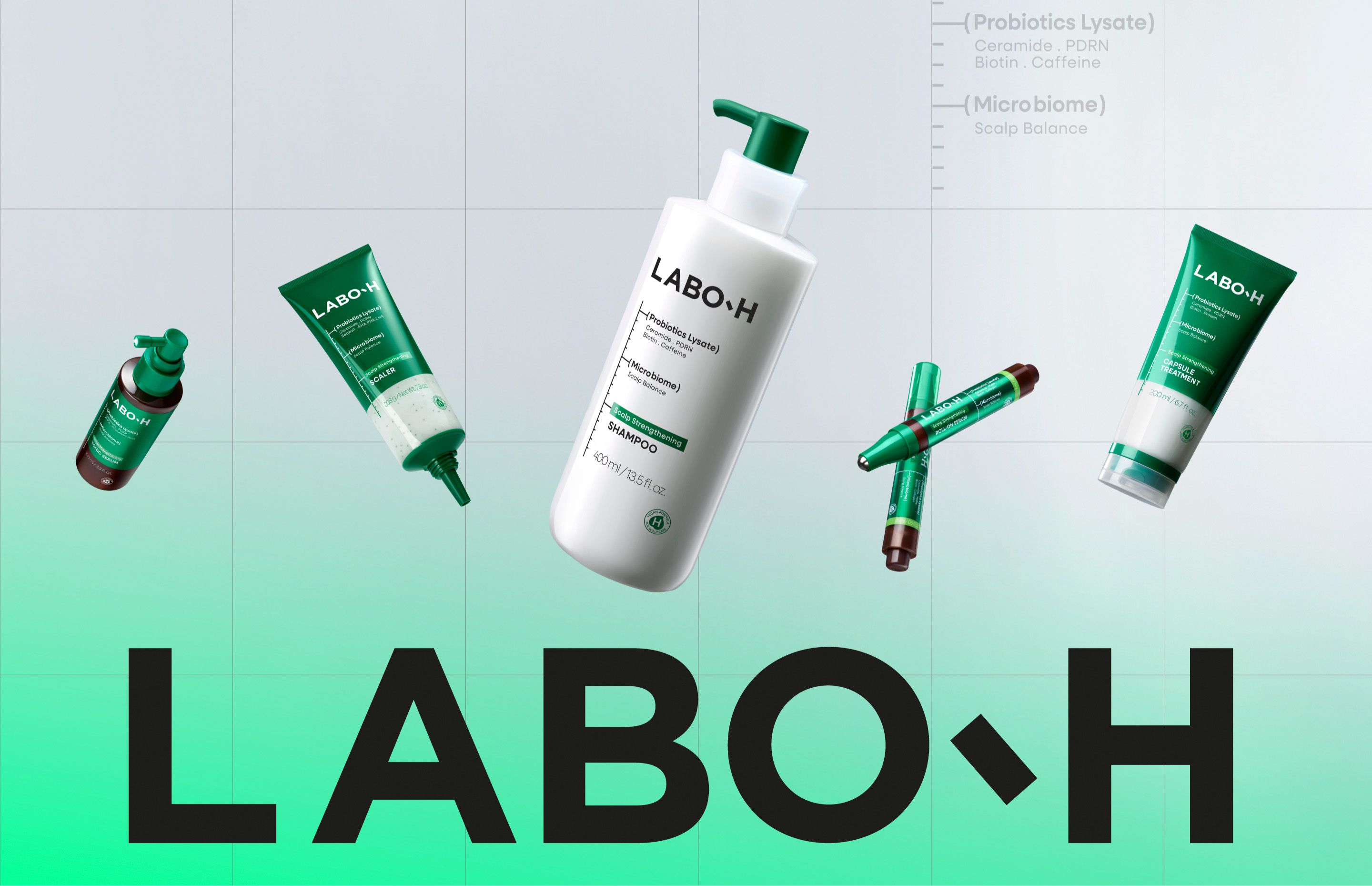
The evolution of both the upgraded formulation and the brand was further expressed through motion visuals. Using only light and spatial composition, a futuristic research environment was created, while typography and grid structures were employed to build LABO-H’s digitally evolved laboratory.
The newly defined LABO-H laboratory, Curious Scalp Skincare Lab, embodies the brand’s attitude of beginning with an endless curiosity about the scalp and relentlessly pursuing answers through careful observation and research. While the previous visual identity conveyed the authenticity of research through the character of a brilliant scientist, this renewal shifts its focus to the process of observation and research itself, visually expressing the brand’s spirit of exploration.
To bring this idea to life, the researcher’s perspective became the central visual motif. Close-up compositions and subtle perspective distortion were used to capture the act of closely examining the product, expressing the continuous process of questioning and exploration. Through immersive photographic direction, the visuals communicate the authenticity and dedication of a research-based brand.
The evolution of both the upgraded formulation and the brand was further expressed through motion visuals. Using only light and spatial composition, a futuristic research environment was created, while typography and grid structures were employed to build LABO-H’s digitally evolved laboratory.
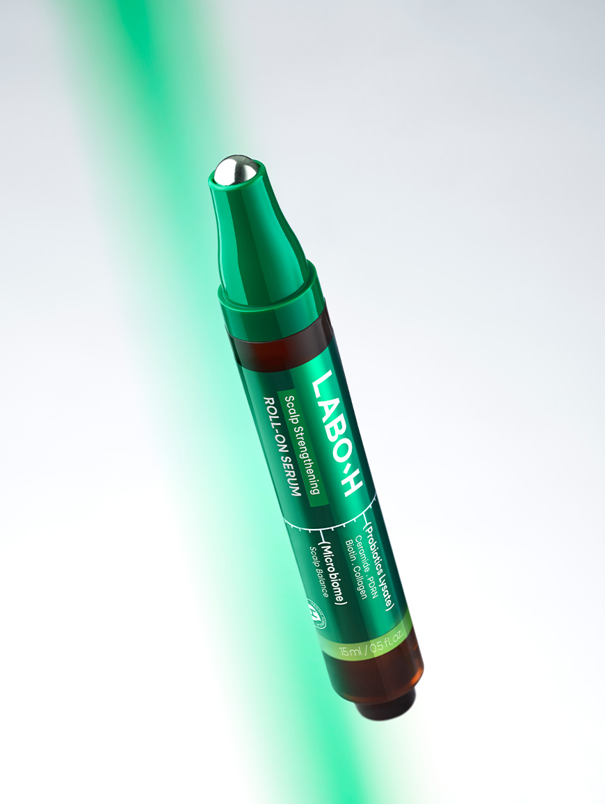
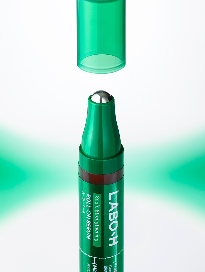
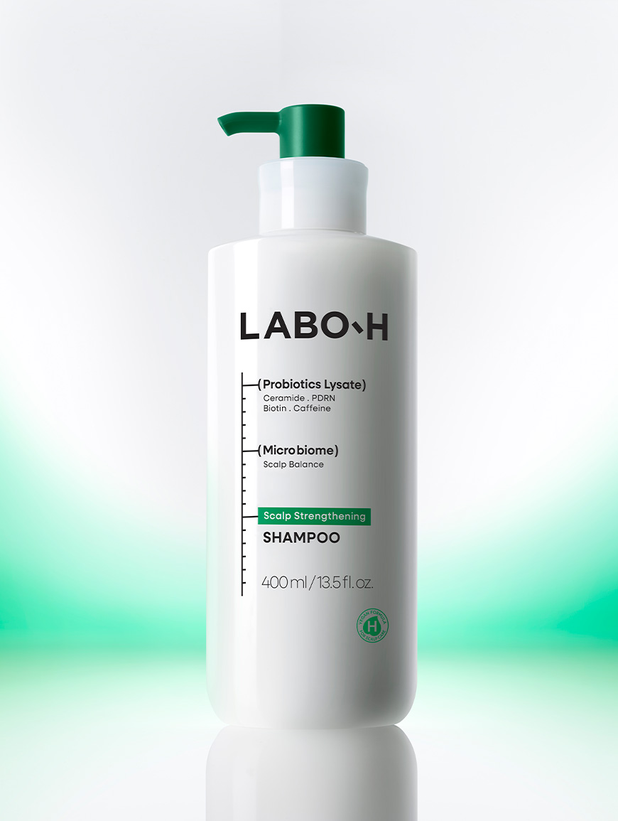
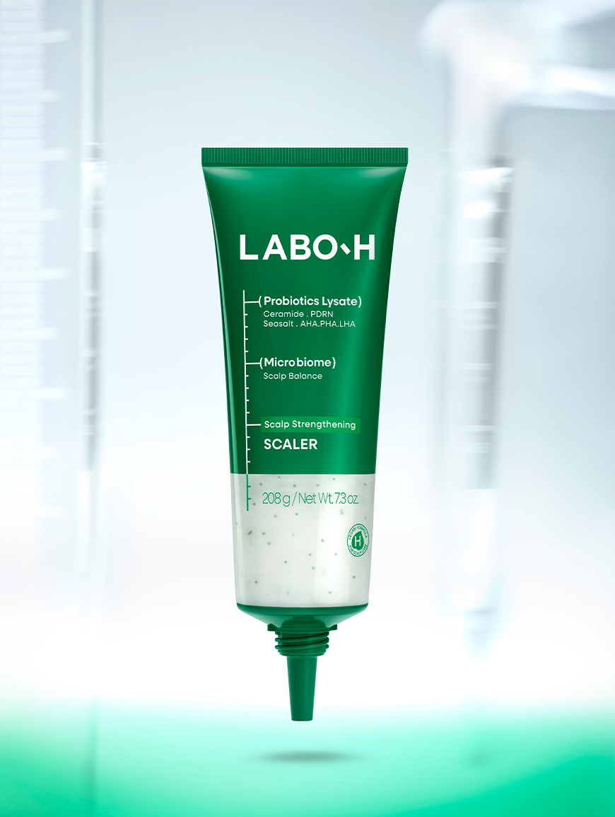
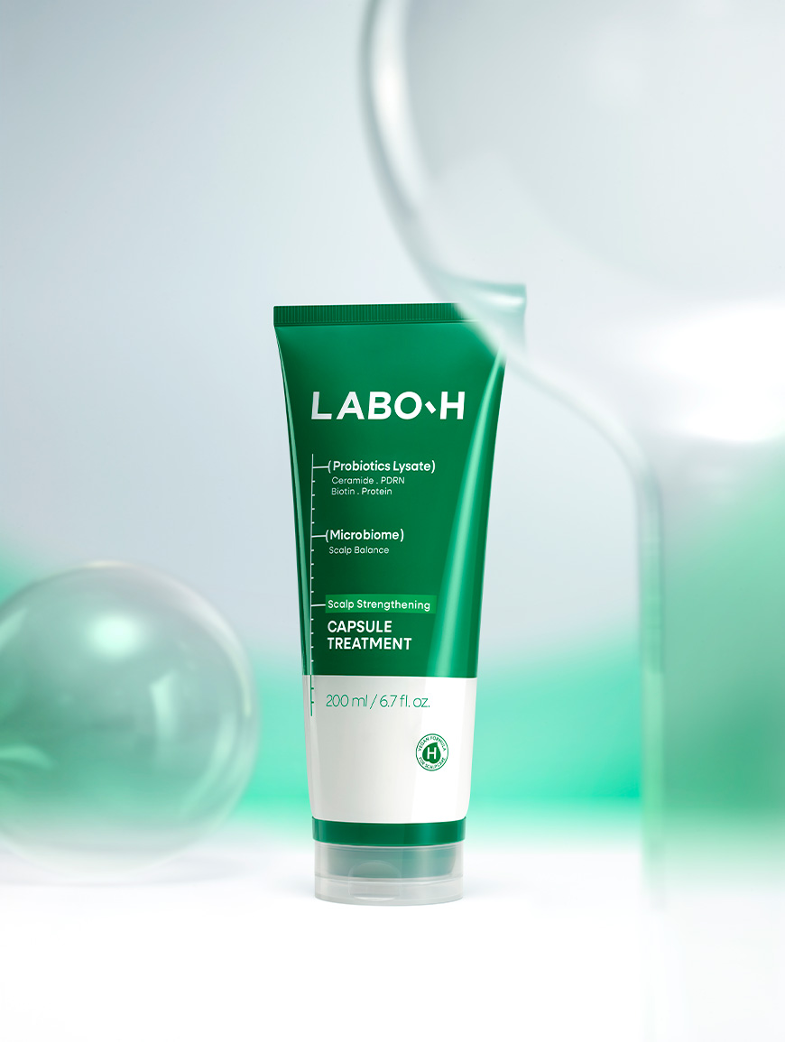
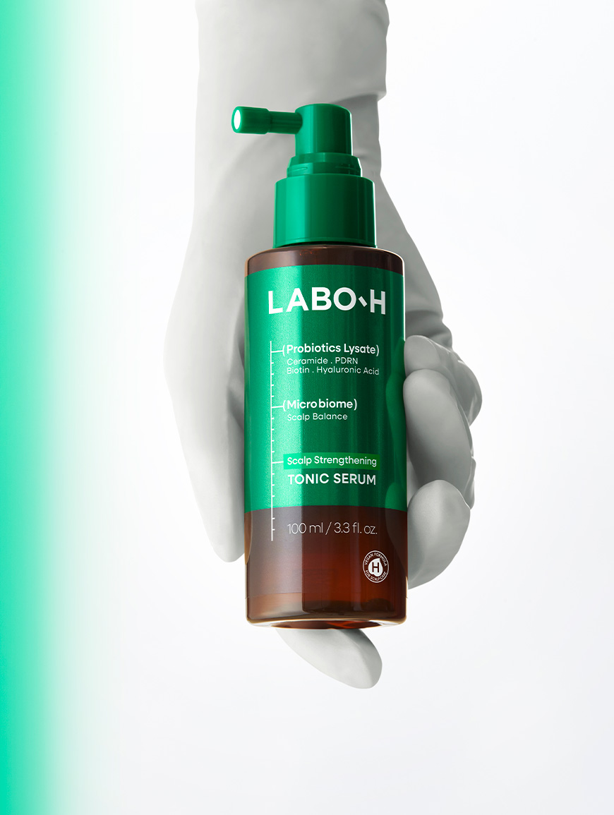
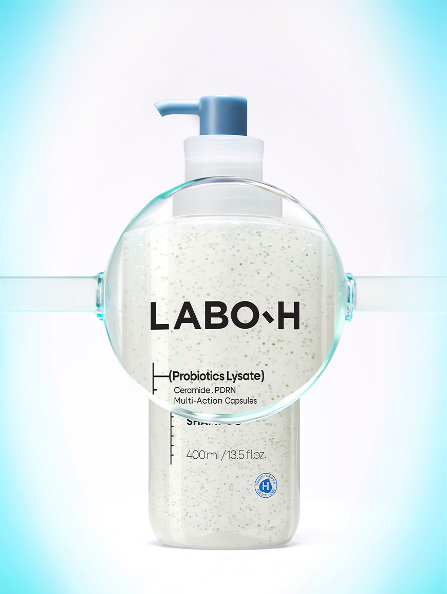
Rather than introducing new visual elements, this renewal focused on emphasizing the core of what the brand set out to communicate.
Instead of relying on excessive styling or decorative expression, meticulous attention was given to the product’s form, materiality, and lighting, allowing the product itself to take center stage. Through this approach, the upgraded formulation and the product’s refined quality are revealed naturally.
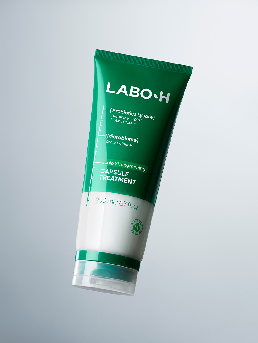
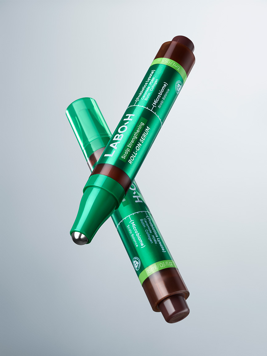
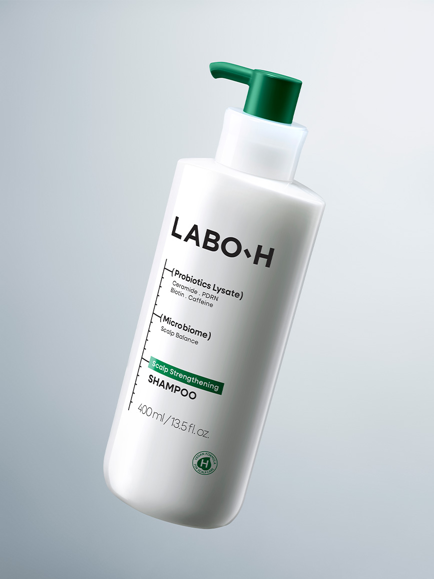
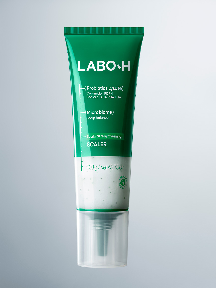
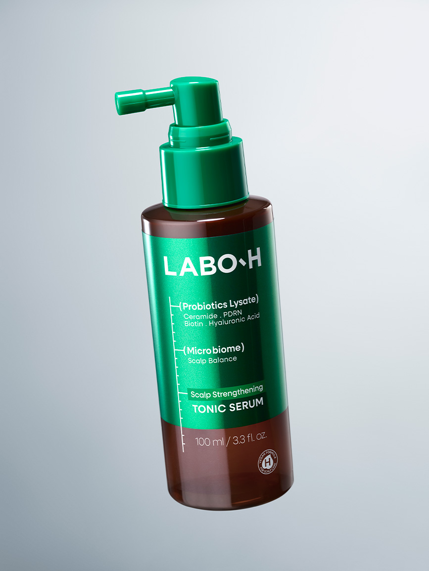
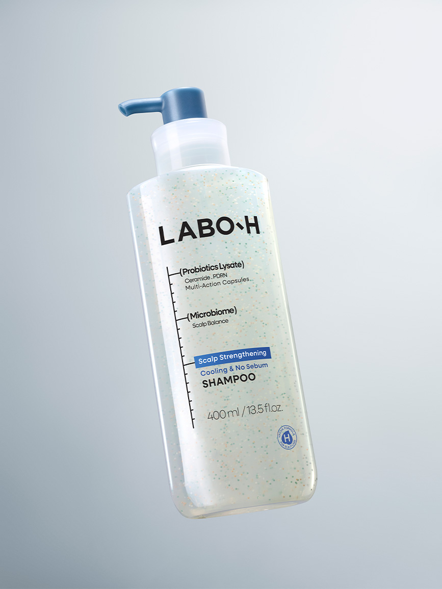
A motion key visual that intuitively captures the evolution of LABO-H.
During the visual development process, the creative team proactively proposed a motion-based key visual.
It was produced through a combination of live-action shooting, generative AI, and video post-production.
During the visual development process, the creative team proactively proposed a motion-based key visual.
It was produced through a combination of live-action shooting, generative AI, and video post-production.
PDP Design
The product detail page was regarded as the touchpoint where consumers engage most deeply with both the brand and its products, and where the brand experience established throughout the renewal is brought together into a single, cohesive experience. The design direction developed across product design, graphic design, packaging, and visual identity was consistently carried through to the product detail page, ensuring that consumers encounter the same LABO-H experience across every touchpoint.
Rather than creating an entirely new structure, the focus was on preserving the strengths of the existing product detail page while refining it with greater precision. The existing information architecture and visual assets were carefully analyzed to identify which elements should be retained and which required improvement, ultimately enhancing the overall quality of the brand experience.
While retaining the bold contrast and distinctive graphic assets that characterized the original product detail page, the accent colors, typography, and graphic elements introduced across the product and packaging design were consistently applied to strengthen continuity between brand touchpoints. As a result, each deliverable is experienced not as an independent asset, but as part of one cohesive brand experience.
Rather than creating an entirely new structure, the focus was on preserving the strengths of the existing product detail page while refining it with greater precision. The existing information architecture and visual assets were carefully analyzed to identify which elements should be retained and which required improvement, ultimately enhancing the overall quality of the brand experience.
While retaining the bold contrast and distinctive graphic assets that characterized the original product detail page, the accent colors, typography, and graphic elements introduced across the product and packaging design were consistently applied to strengthen continuity between brand touchpoints. As a result, each deliverable is experienced not as an independent asset, but as part of one cohesive brand experience.
Outro
This renewal was a process of evolving the brand assets that LABO-H has built over time into their next chapter. While the changes may appear subtle, the true intention of the project was to ensure that consumers could naturally experience those refinements at every moment they interact with the brand.
- Amorepacific Creatives
- Design Direction
- Baek Inwoo
- Product Design
- Hyun Eunjeong, Lee Sungyub
- Visual Directing
- Hyun Eunjeong, Lee Sungyub,
MOTIV Ideas - BM
- Kim Minyoung, Jeong Yunhwa
- Development
- Han Jinhyoung, Park Seunghun
- Photography
- Lee Hohyeon