PRIMERA OLIVE YOUNG SET PACKAGE & VMD DESIGN RENEWAL PROJECT
Summary
We are pleased to introduce the renewal of Primera’s Olive Young set package and VMD (Visual Merchandising Design). Olive Young is a key distribution channel for Primera,
both online and offline, contributing significantly to overall sales. The goal of this project was to strengthen Primera’s brand identity while effectively and clearly
communicating the product’s core message in any given context—ultimately contributing positively to sales performance. To achieve this, the design team conducted a
thorough analysis of the current situation and worked on improving visual elements such as the set structure, layout strategy, and image style to better align with the current market environment.
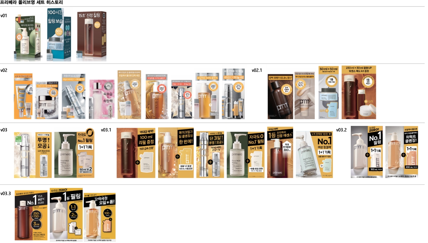
Current Status Analysis and Proposed Improvements
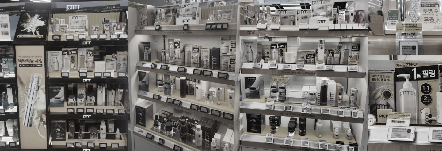
As Primera gradually shifts its sales channels from department stores to Olive Young, its set design strategy has focused more on emphasizing the unique characteristics
of each product rather than maintaining consistency. However, as the brand’s presence in Olive Young expands and the number of products increases, this strategy has begun
to present obstacles. To address this, we have diagnosed the specific issues that need improvement.
There was a lack of consistency among elements, and the readability and visibility of key messages were insufficient. There was no coherent
alignment between the product, packaging, visuals, and VMD, and no design planning that considered VMD placement. Therefore, we decided to
propose the following solutions: 1) unify the visual logic used across editorial cuts, products, and VMD, 2) establish consistent colors
and tones for products, unit boxes, promotional materials, and VMD to support each product line, 3) adjust design elements to prevent
visual clashes between VMD components and product designs, 4) suggest set designs that take into account the height and placement of VMD
displays, 5) standardize package sizes as much as possible, 6) ensure that the flow of attention toward key messages is not interrupted
7) incorporate easily replaceable designs and cost-effective VMD materials with maintenance in mind.
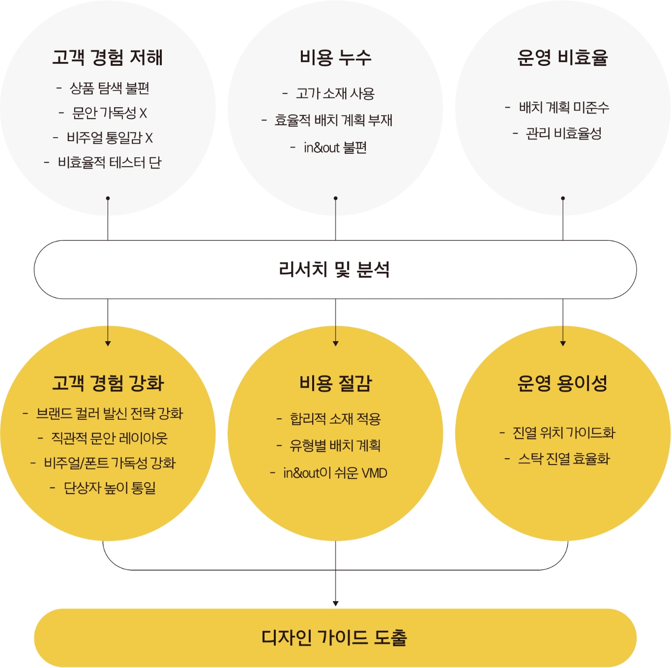
Based on the issues identified above, we proceeded with visual refinements to enhance clarity and consistency.
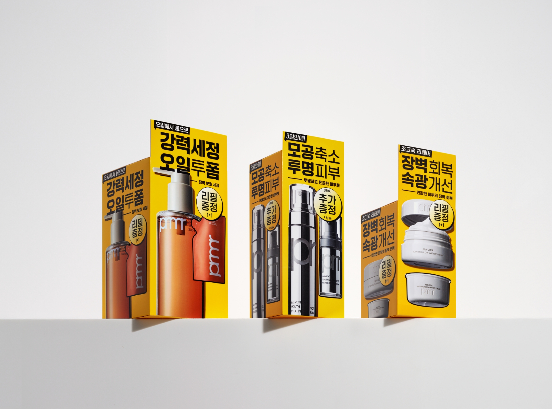
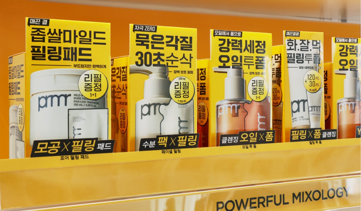
For the product packaging, 1)unified the product image style, eliminating distortion and decorative elements, 2) improved readability by minimizing
the use of decorations and colors 3) standardized the height of product packages to guide the viewer’s eye naturally toward the message when grouped,
4) aligned the layout format so that side placements appear as consistent as front-facing ones.
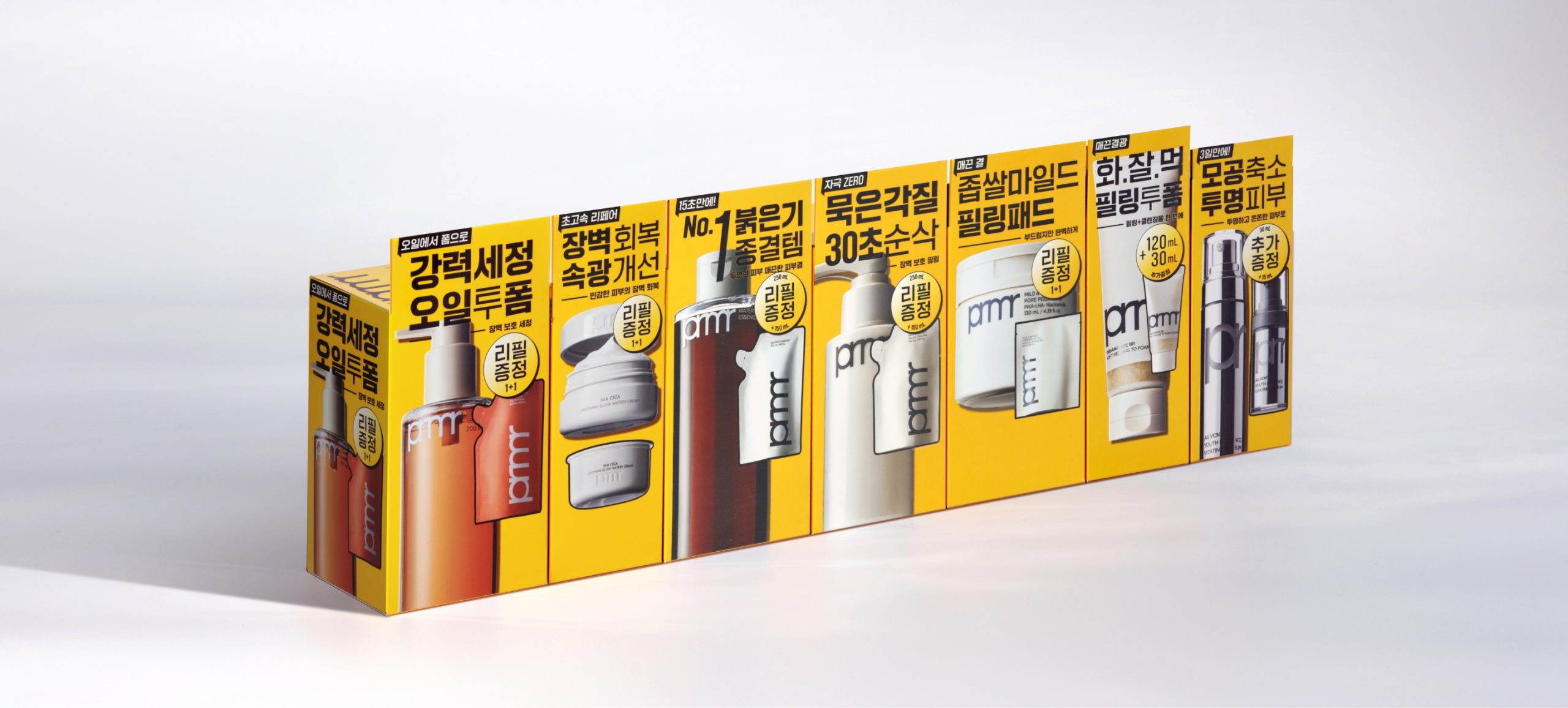
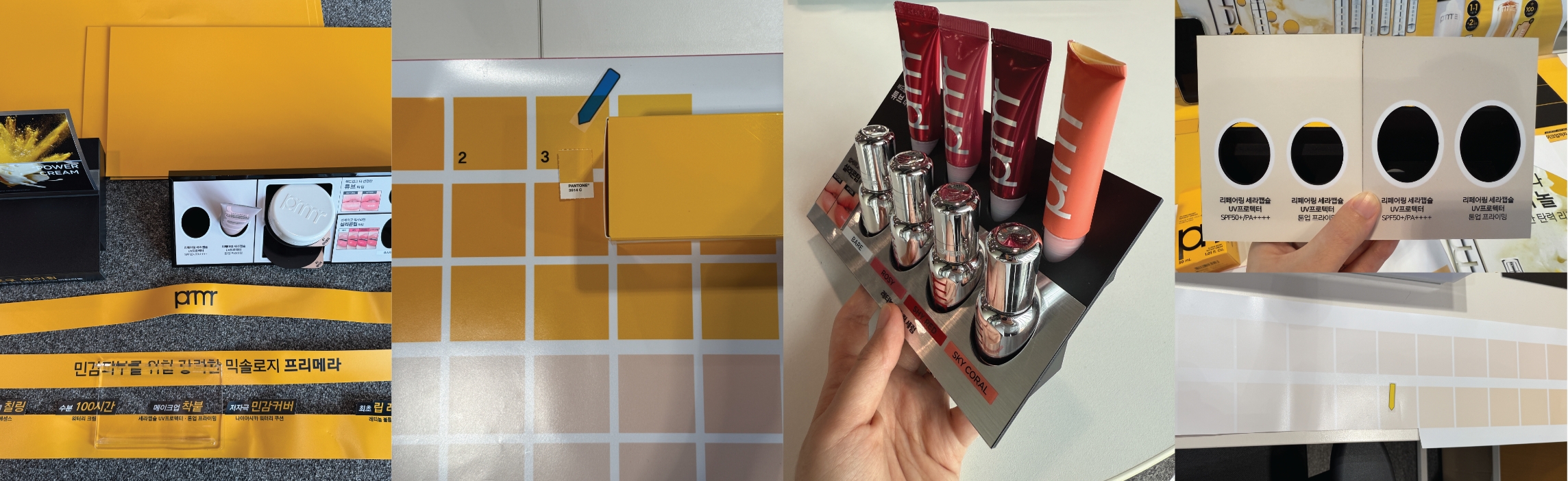
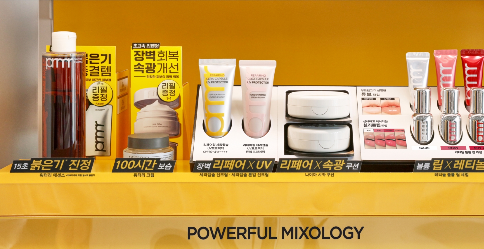
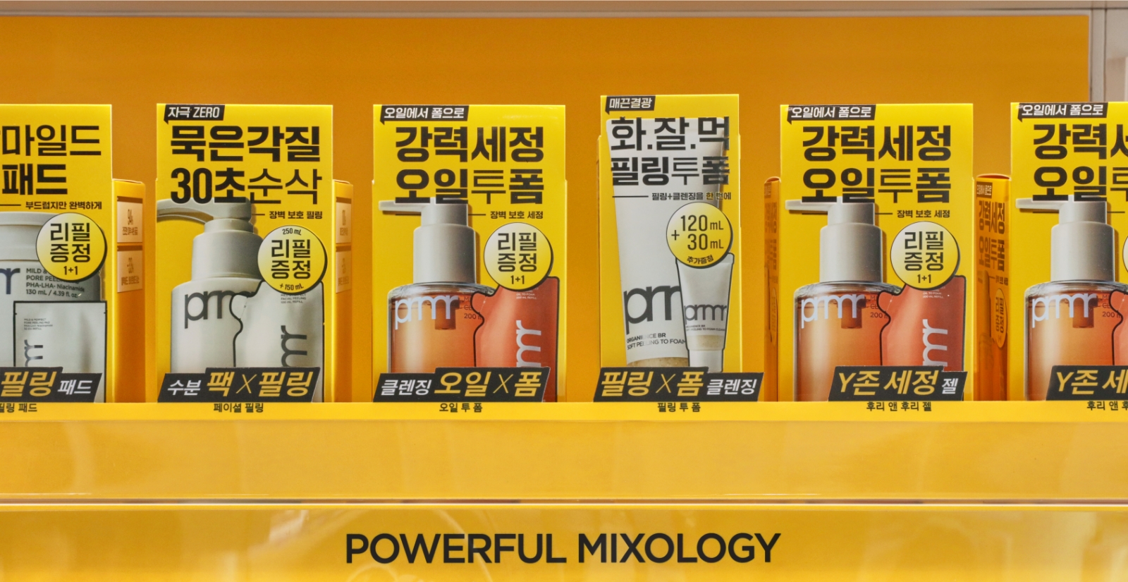
For the VMD, 1) actively utilized the brand color for stronger visual identity, 2) introduced protruding display units in promotional zones to highlight
key products and increase visibility, 3) simplified the messaging on belly bands to concise, one-point phrases, and replaced the previous method of inserting
individual sheets per product with a single unified sheet that also serves as a display guide, 4) removed unnecessary tester stands in zones where tester
products like cleansing items cannot be placed, 5) consolidated makeup product holders and applied modular, replaceable units for easier maintenance and updates.
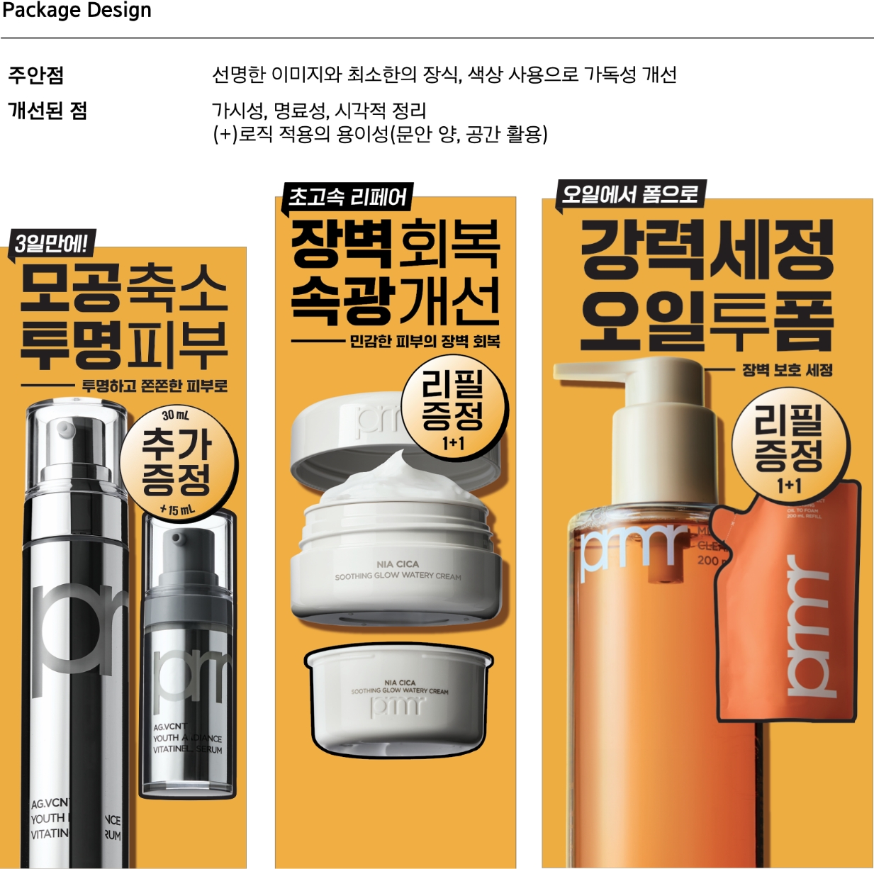
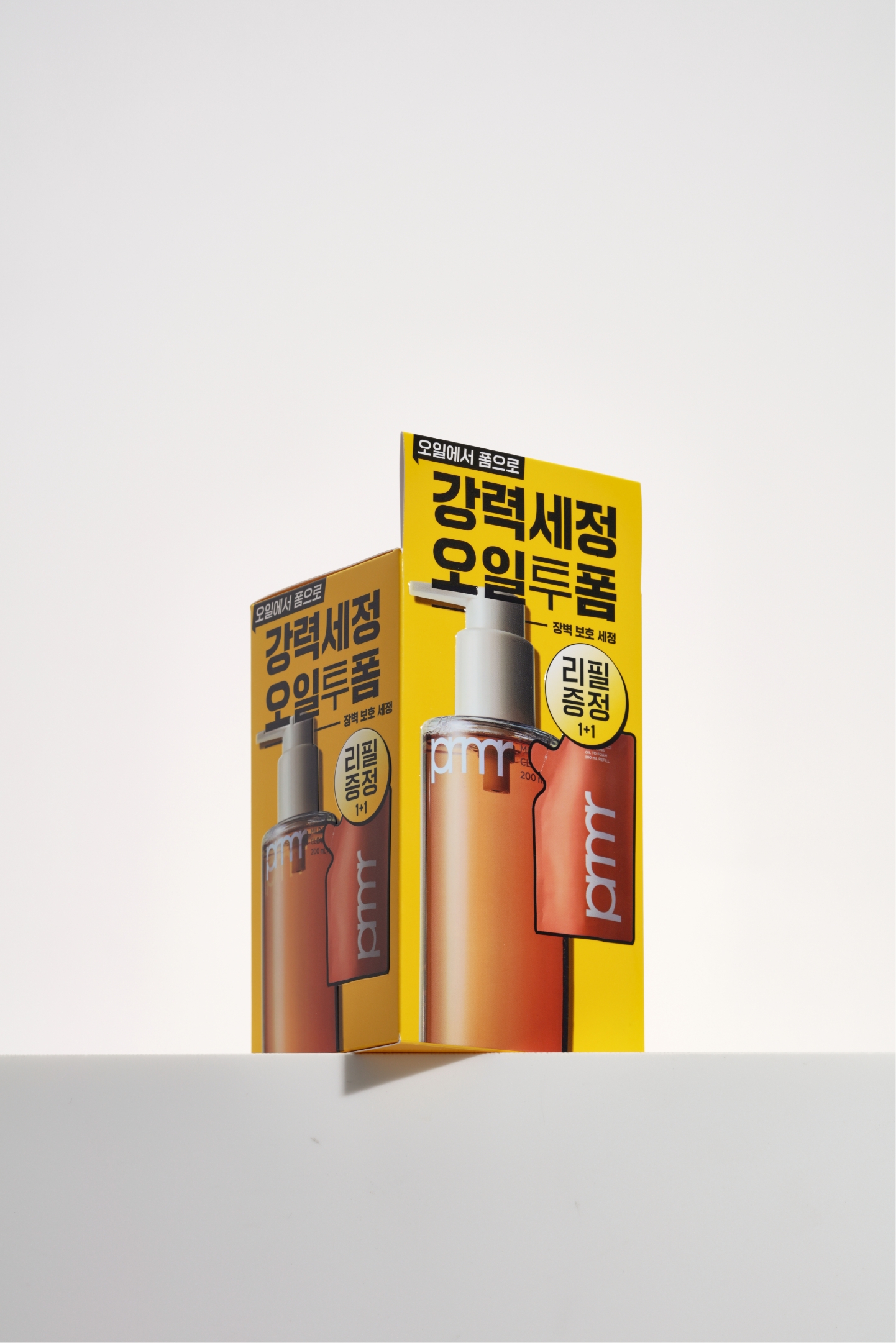
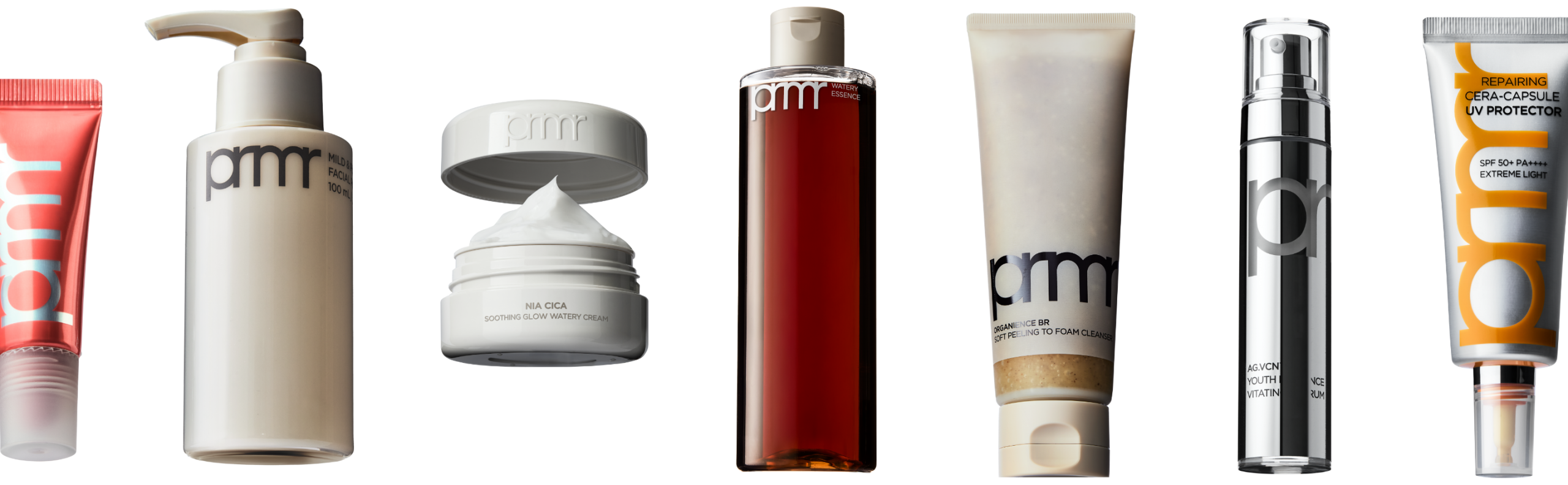
Product images applied to the packaging were photographed under consistent conditions to ensure maximum visual uniformity. Strong contrast
was used to clearly define the product silhouette, and a slight angle was applied to avoid distortion while maintaining a realistic,
three-dimensional appearance that closely resembles the actual product. In cases where testers are not available, the product image was
designed to clearly convey the product’s features at a glance.
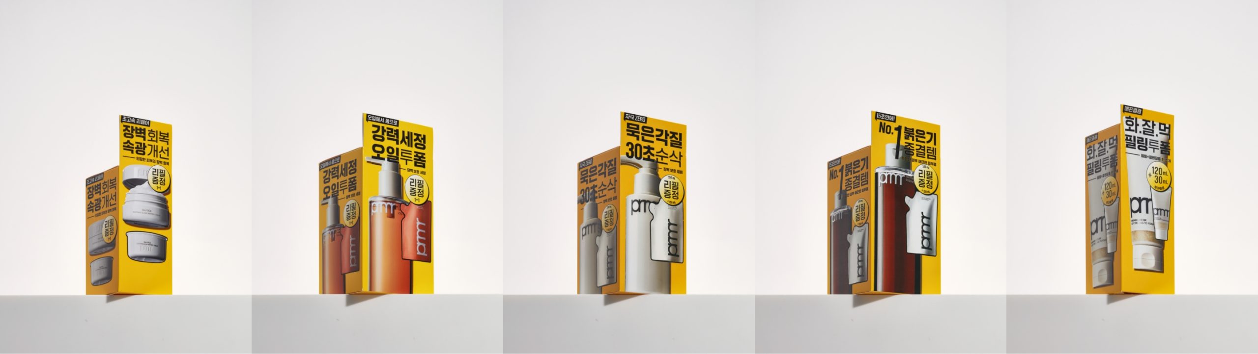
We standardized the height of unit boxes as much as possible to guide the viewer’s eye efficiently. Concise messages and product
images were placed at a consistent height, allowing users to quickly grasp key information at a glance.
Unit boxes with standardized heights help address display issues in offline environments, where products with lower packaging heights may be perceived
as missing. This approach also creates a more organized appearance and allows for a fuller, more impactful display effect when products are grouped together.
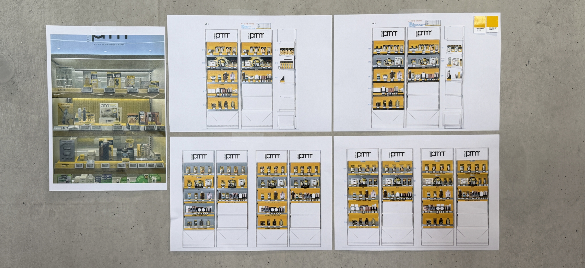
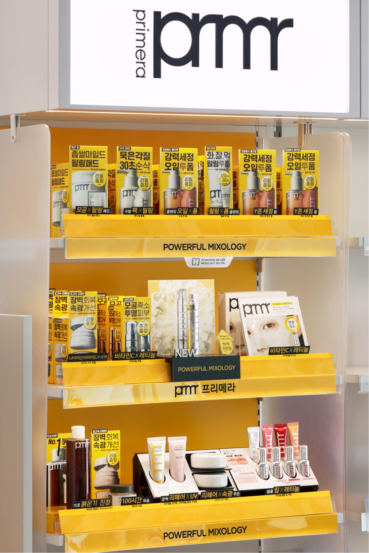
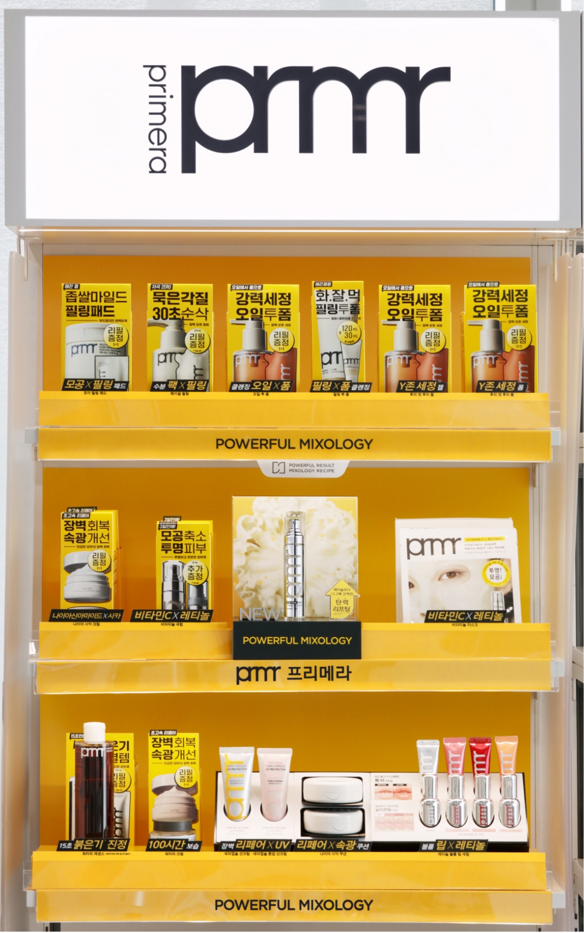
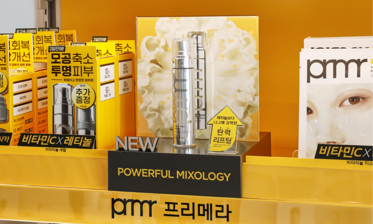
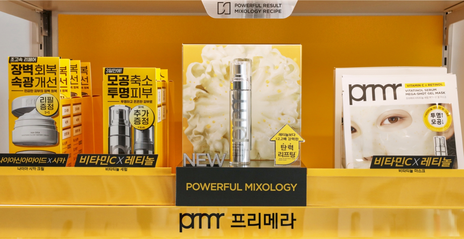
In an offline environment, we conducted various design mockups and studies within the VMD domain to highlight the new package design and product benefit,
while also reinforcing quick brand recognition. After numerous sampling processes, the final refined design is shown below.
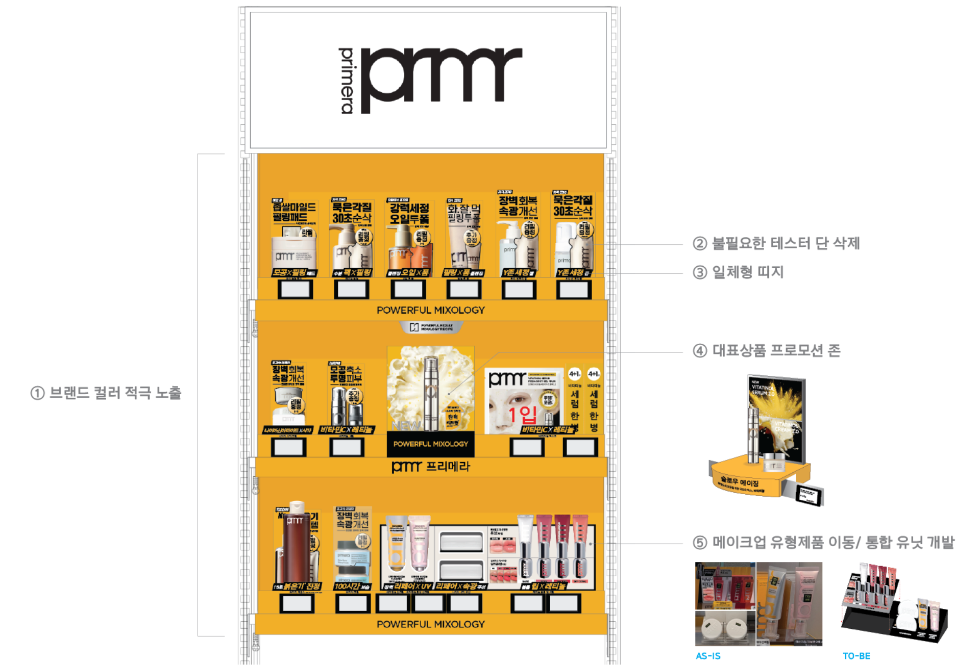
In the previous design, the brand’s main color (yellow) was mixed with the secondary color (silver). In the new design, we increased the visibility of the main yellow color to enhance brand recognition even from a distance. Additionally, by removing unnecessary tester shelves, we enabled the main product boxes to be displayed more prominently at the front.
For the cleansing line, eliminating the tester shelf made self-pickup easier, while the product itself now functions as a POP display, improving intuitive communication of product information.
To enhance the visibility of promotional sets, we introduced a belly band design that incorporates graphic motifs from the package design, ensuring a consistent visual language across both product and VMD. Instead of inserting separate bands for each product, we switched to an integrated band design to reduce the risk of individual components getting lost.
In the brand’s primary golden zone, we created a standout promotional area to highlight Primera’s hero product, the Vitatinol line. Additionally, makeup items that were previously scattered by line were restructured and unified into a cohesive makeup unit based on product type, improving organization and customer navigation.
Guide product navigation with clear and straightforward copy that directly communicates the MIX of ingredients(skincare), textures (cleansing), and formulation(makeup).
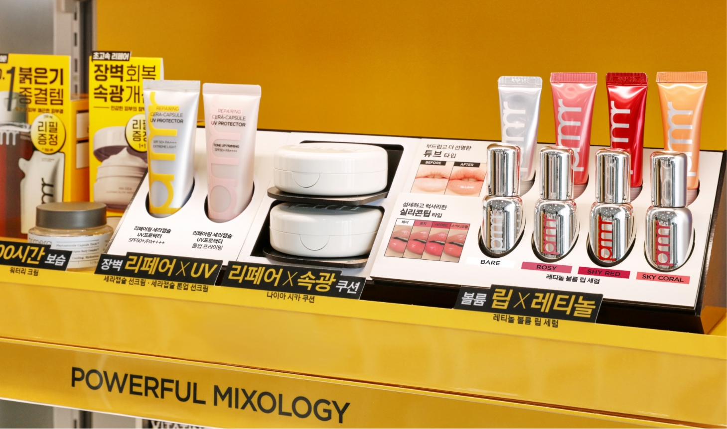
Compared to skincare products, makeup items are relatively smaller in size and often appear cluttered when displayed. To improve this, we designed
unit-type holders that allow makeup products to be presented alongside color chips, enhancing convenience for customers testing the products.
Additionally, considering IN&OUT operations, the display was developed as a modular structure that allows partial replacements at minimal cost.
- Amorepacific Creatives
- Design Directing
- Han Jeongmin
- Product Design
- Kim Bitnuri, Hong Damee
- VMD Design
- Ryu Mirim, Shim Mijung
- BM
- Park Sungyeon
- GTM
- Kim Hanna
- Development
- Byun Jiyoung
- Photography
- Shin Sangwoo