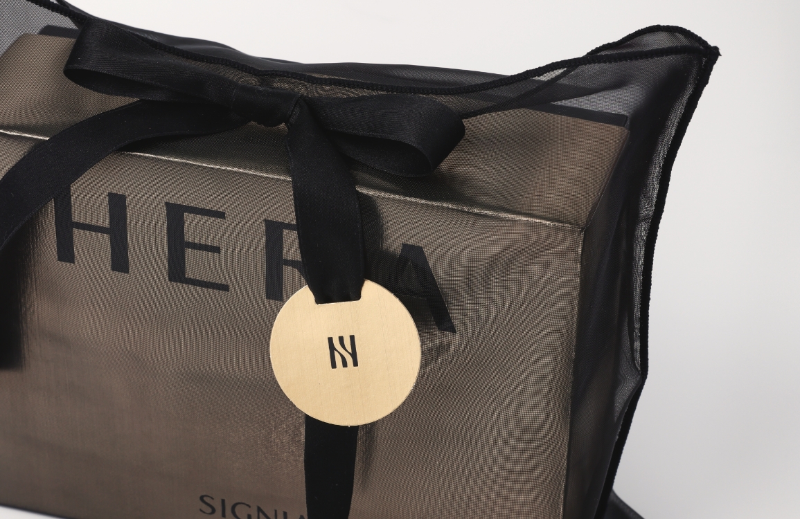
VITALBEAUTIE Signature Ampoule
Summary
Geukjindan is Korea’s first premium vitality recovery ampoule to fuse Eastern herbal wisdom with modern scientific innovation.
Designed to restore lost vitality amidst a weary daily routine, it helps rebalance the body and mind, restoring harmony to your Qi (energy), body, and spirit.
Based on the principles of traditional Gongjindan, it incorporates the latest energy-activation technology to deliver rapid absorption and vitality that is
both immediate and long-lasting. Experience a new level of energy recovery with just one simple shot a day. Geukjindan breathes life and strength back into your everyday routine.
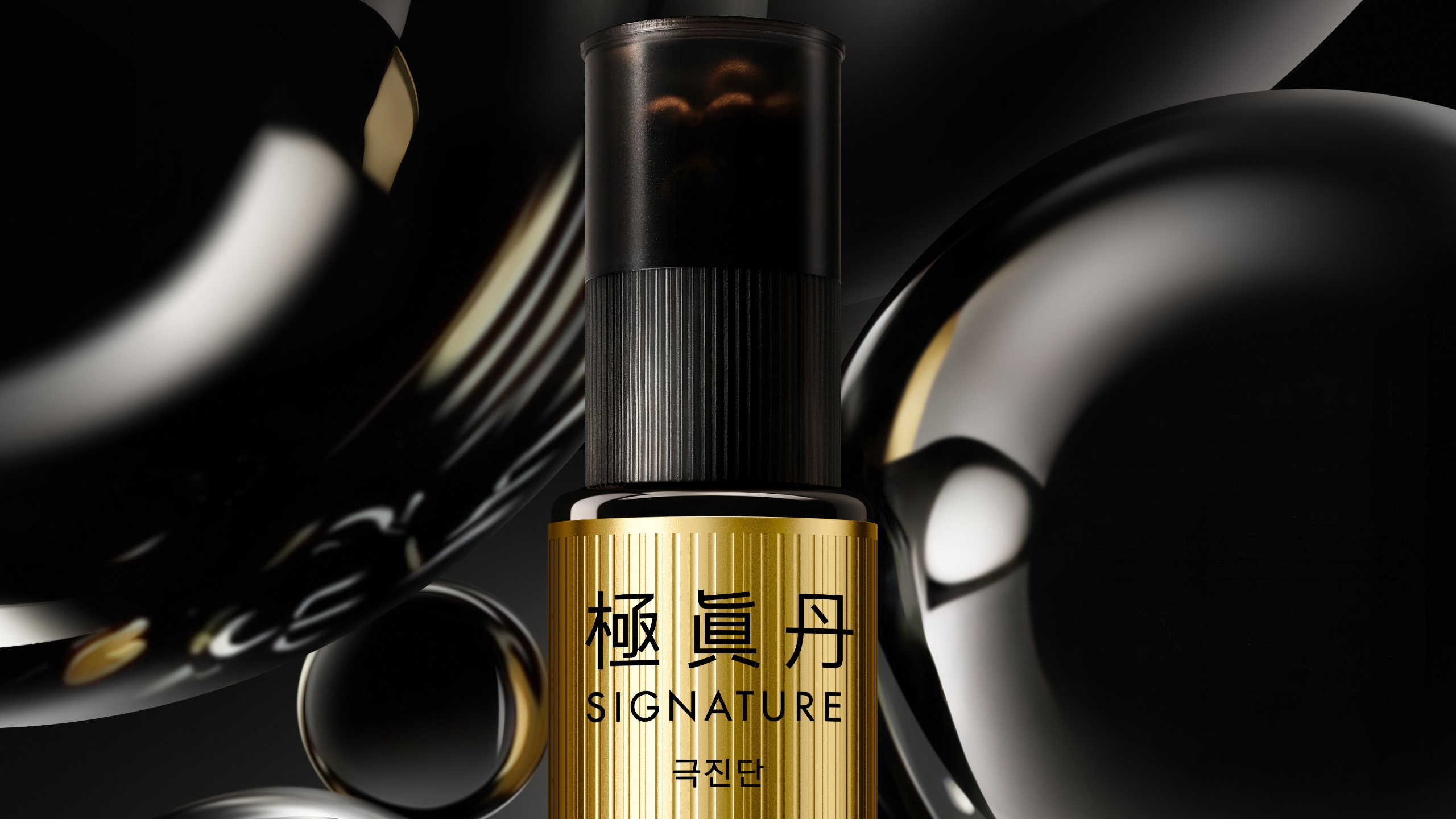
DESIGN CONCEPT
The design of Geukjindan breaks away from the conventional imagery of traditional herbal products, positioning itself as a high-end, high-efficacy anti-aging functional product.
It conveys technical reliability alongside a premium emotional sensibility.
By adding a sophisticated modern aesthetic to the depth of tradition, the design visualizes Geukjindan’s unique identity as a fusion of Eastern and Western energies.
The gold color symbolizes traditional values and the vital energy of life, visually highlighting the intersection where the spirit of Geukjindan meets the innovation of modern science.
This represents the perfect balance between Eastern herbal wisdom and modern precision.

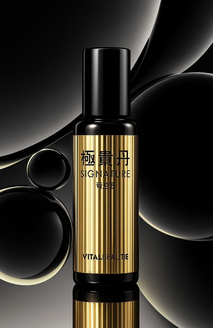
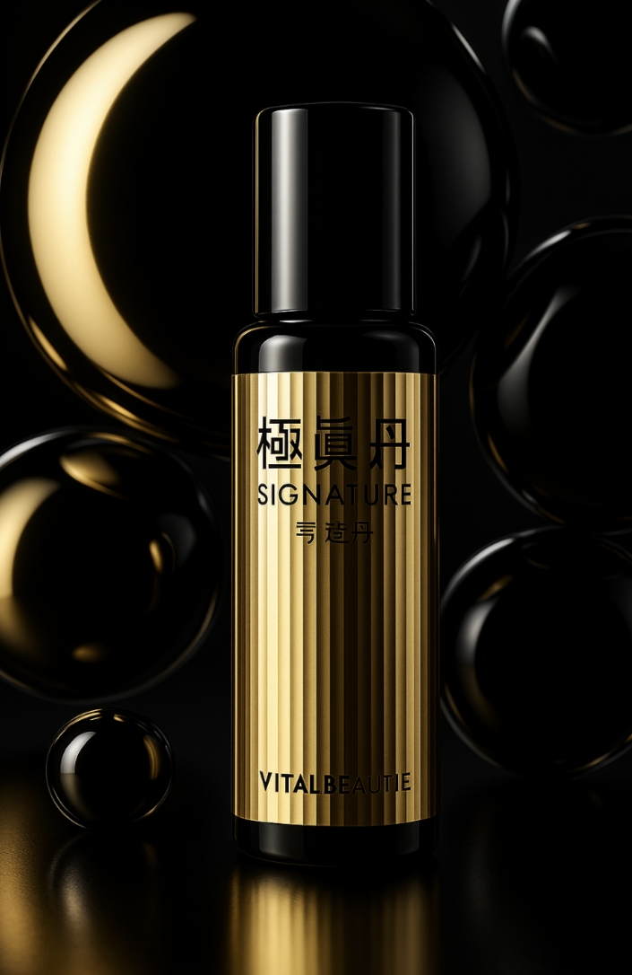
GRAPHIC MOTIF
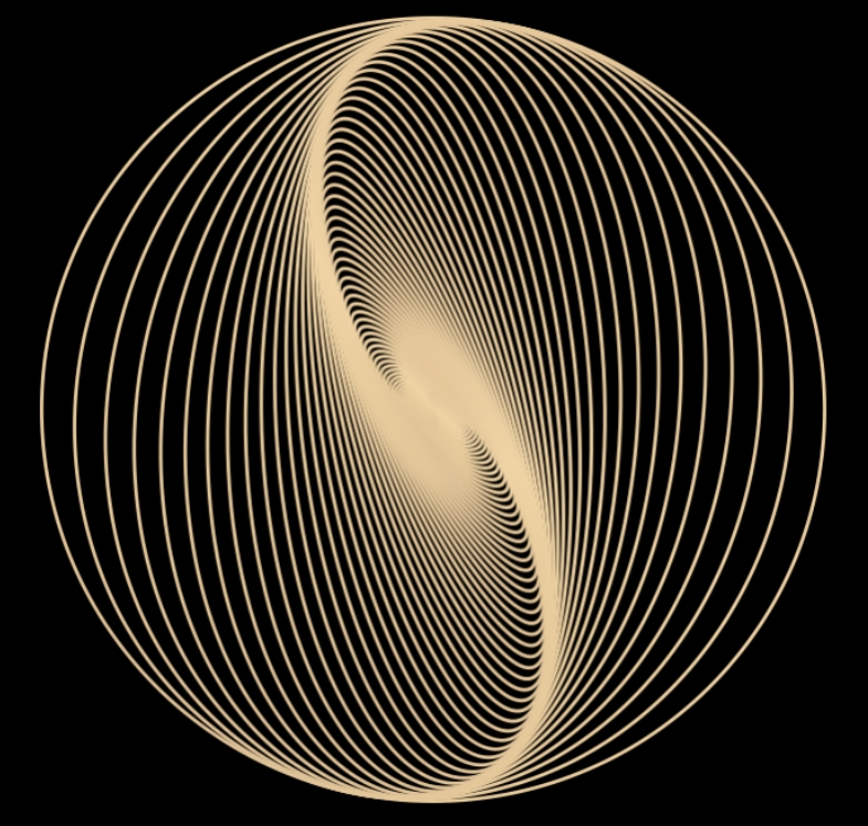
To visually express Geukjindan’s core value of ‘East-West fusion,’ we established two distinct design languages
within the graphics. We harmonized the meeting of these two worlds through a gold stripe pattern, capturing the
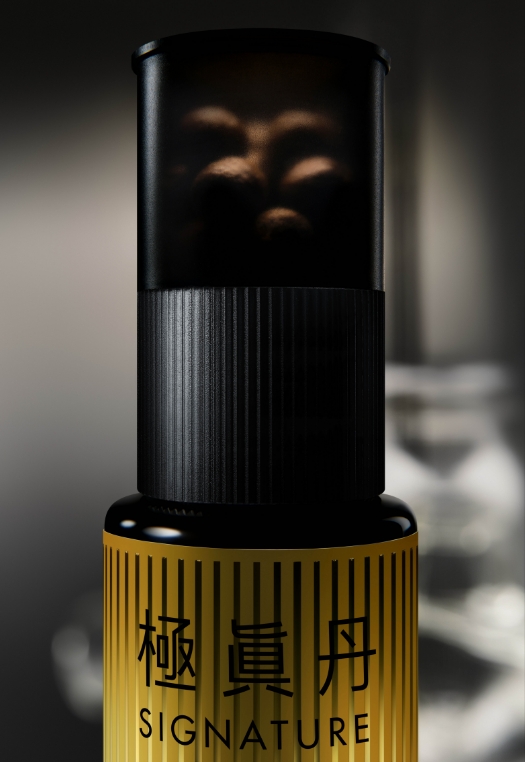
precise moment when the body’s energy begins to circulate and awaken once again. The black container
represents the depth of tradition and condensed vitality, while the gold symbolizes the act of that energy
awakening into light. Together, they demonstrate the intersection where Eastern spirit meets Western science.
within the graphics. We harmonized the meeting of these two worlds through a gold stripe pattern, capturing the
precise moment when the body’s energy begins to circulate and awaken once again. The black container
represents the depth of tradition and condensed vitality, while the gold symbolizes the act of that energy
awakening into light. Together, they demonstrate the intersection where Eastern spirit meets Western science.

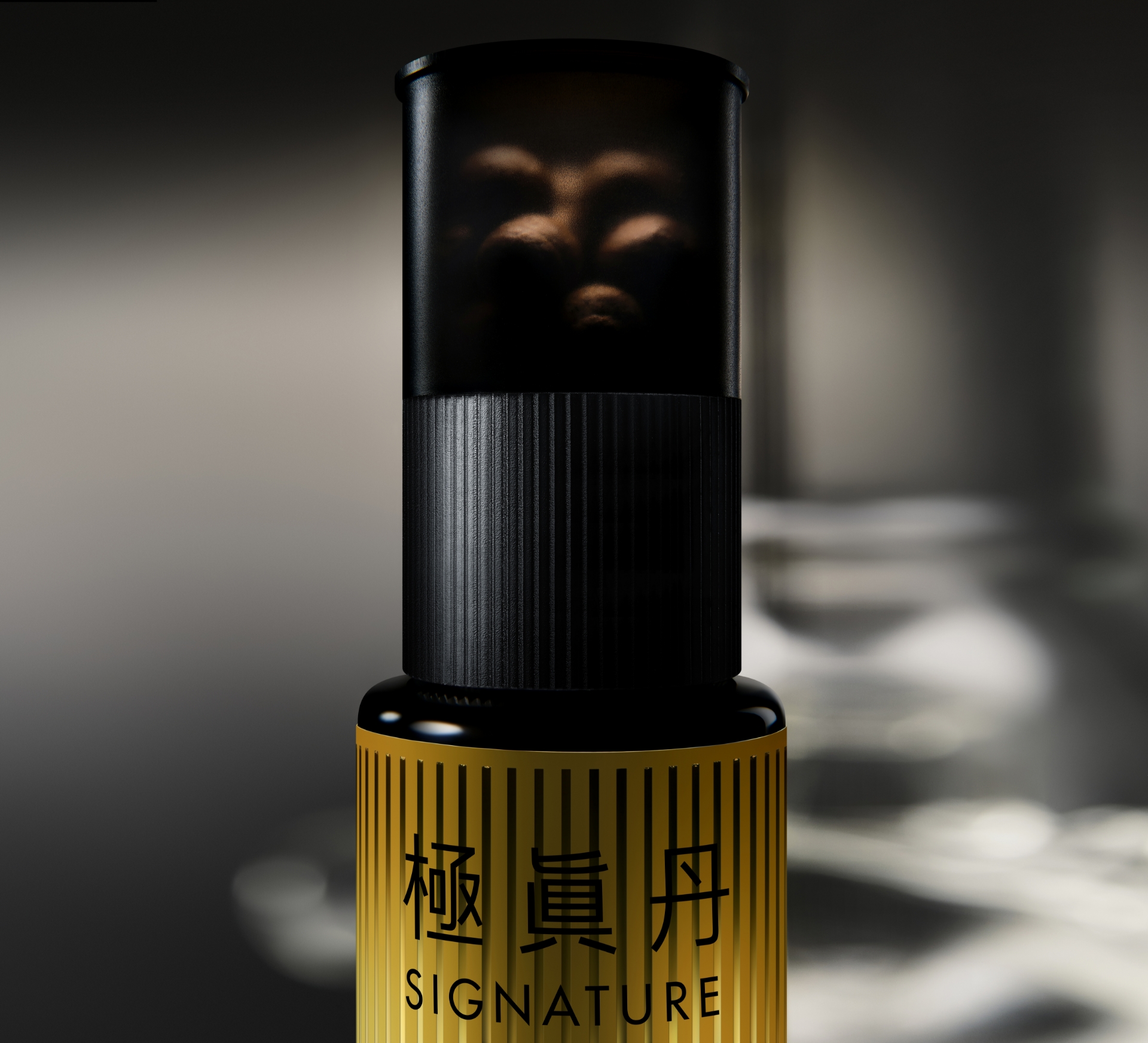
VISUAL CONTENTS
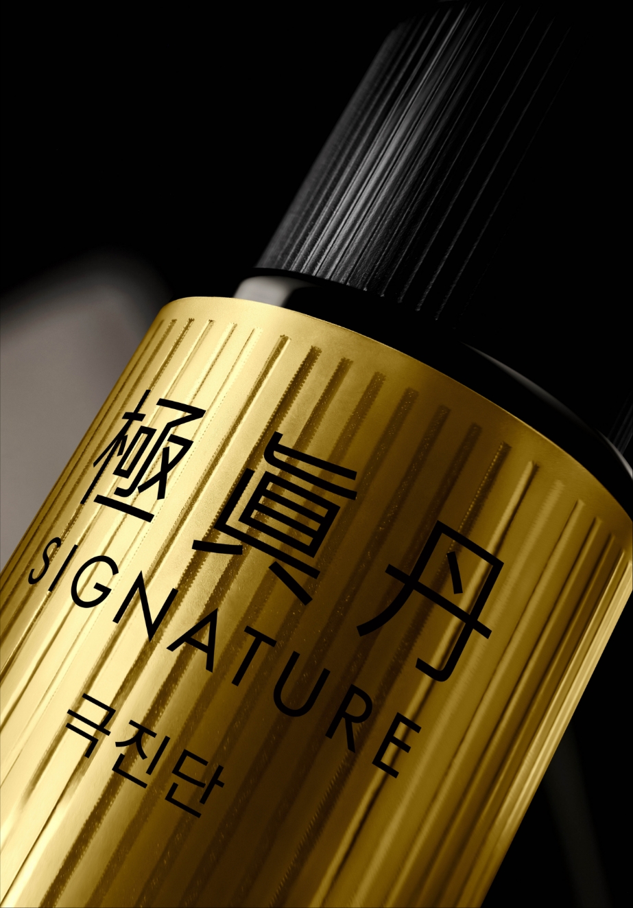
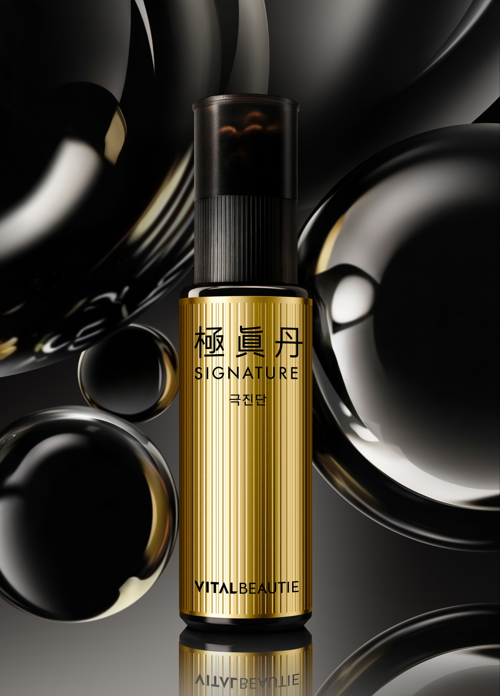
We aimed to convey a balanced sense of tradition-based reliability and modern sophistication through typography that combines the
Geukjindan Hanja (Chinese characters) with an English signature. Furthermore, we sought to create a strong visual impact through a
label structure that vividly highlights the metallic texture and the contrast between matte and glossy finishes.

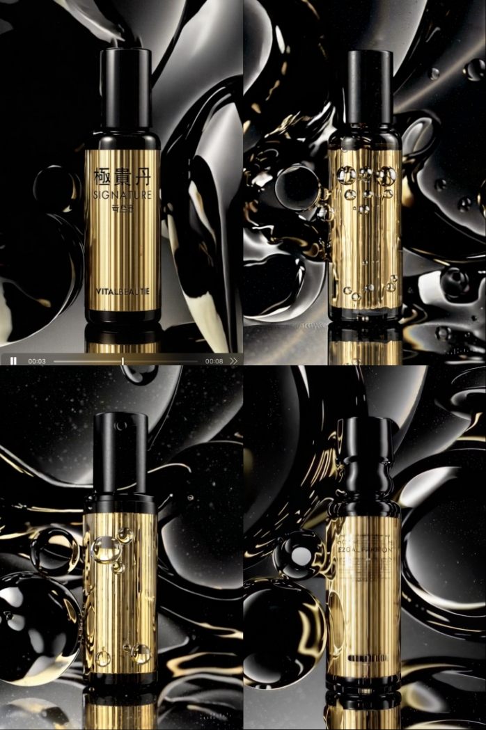
To scientifically visualize the product’s functional core—energy activation and biological flow—we utilized AI design tools and Runway to create dynamic key visuals.
These visuals reinterpret the moving liquid forms of droplets and the circular shape of Gongjindan.
By depicting scenes full of life flowing over high-gloss black curves and enveloping the product, we established a high-end image that radiates vitality from within.

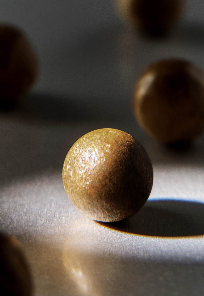
To clearly convey the formula, which contains both Geukjindan’s traditional herbal ingredients and modern science-based components,
we utilized close-up shots of the raw materials and the texture. This approach allows consumers to intuitively perceive the product’s functionality and reliability.

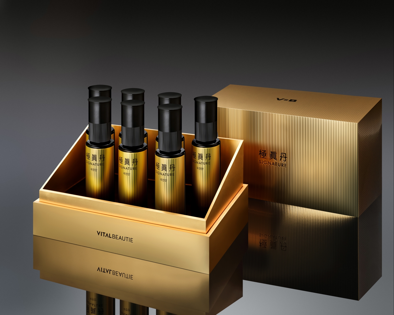
The overall graphics, typography, materials, and label structure work integrally to ensure a strong visual presence—even within the compact ampoule form—while clearly
establishing the product’s premium positioning. By systematizing a design language that encompasses both tradition and modernity into a consistent visual system,
we have perfected a design where Geukjindan’s brand identity and product attributes are communicated with absolute clarity.
- Amorepacific Creatives
- Design & Visual
- Rhee Yunjung, Koo Jaeun
- BM
- Lee Jangwook
- Development
- Jun Sangho, Kim Boram
- PHOTO
- STUDIO DOT