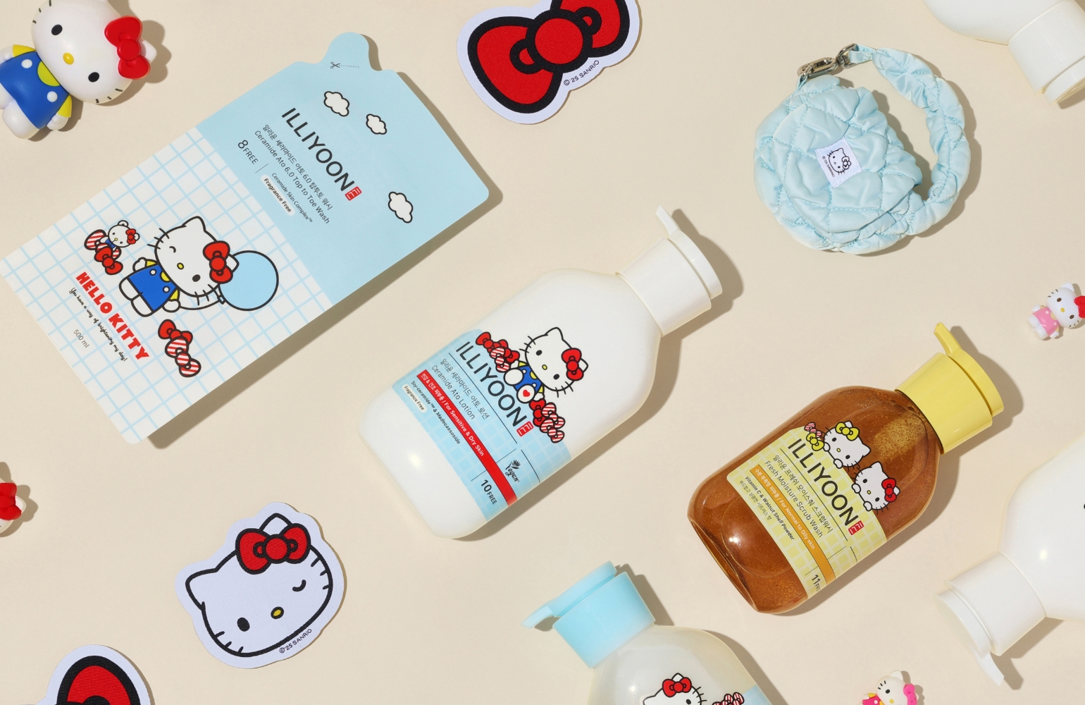
ILLIYOON brand design renewal
Summary
In February 2025, ILLIYOON embraced a bold transformation in preparation for its full-scale expansion into the global market. With a sleek and confident new logo,
a refined layout design, and a bold redefinition of its brand identity, ILLIYOON is stepping forward with a fresh new look. Let’s take a closer look at its renewed design.

Background
Ahead of its global expansion, ILLIYOON launched this brand advertising campaign to enhance the readability of
the brand name and improve visibility across offline shelves and online channels in diverse environments,
thereby amplifying its brand communication and global presence.
History
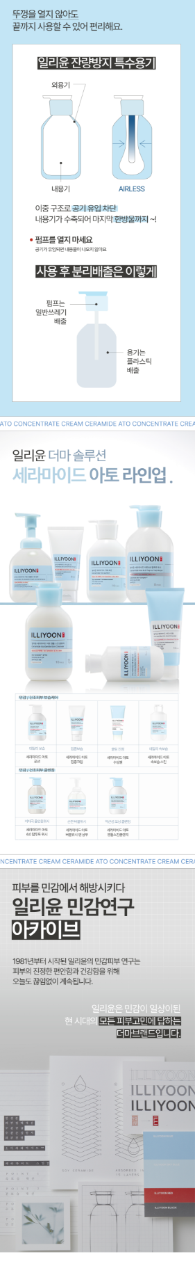
Originating as “ILLI,” a premium body moisturizing brand rooted in traditional Korean herbal ingredients, the brand gradually evolved into a derma-focused moisturizing brand through the launch of the Ceramide Ato line.
The early design emphasized the expression of traditional Korean beauty, drawing inspiration for its symbolic form and color palette from Korean heritage seals.
The English logotype of “ILLI” incorporated design motifs inspired by the Taegeukgi’s trigrams (Geon, Gon, Gam, Ri), firmly establishing its identity as a Korean herbal concept brand.
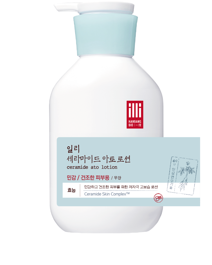
Around 2017, the brand transitioned from “ILLI” to “ILLIYOON,” accompanied by several BI (Brand Identity) design updates. The seal mark—ILLIYOON’s symbolic element—was simplified and modernized, while its core form and colors were retained to preserve brand heritage and continuity.
Around 2017, the brand transitioned from “ILLI” to “ILLIYOON,” accompanied by several BI (Brand Identity) design updates. The seal mark—ILLIYOON’s symbolic element—was simplified and modernized, while its core form and colors were retained to preserve brand heritage and continuity.


Brand Concept
Under the guiding phrase “Comfort Derma by Lab,” ILLIYOON redefined its vision based on four key pillars:
Professional, Research, High Function, and Mild Derma.
While inheriting its heritage as a low-irritation, high-moisture body care brand for sensitive skin, the new direction adds a more professional and functional tone.
The design strategy focused on strengthening brand readability and on-shelf visibility, ensuring a more powerful and confident brand expression.


ILLIYOON’s new persona tailored for
the ‘Young Adult’ target demographic aged 18–34.
the ‘Young Adult’ target demographic aged 18–34.
BI Design
The graphic motif in the new logo’s finishing elements draws inspiration from the index tab shapes of research charts.
The diagonal line symbolizes high functionality, rationality, and scientific research, while the soft, flowing curves that balance it represent ILLIYOON’s identity as a low-irritation derma brand that embodies gentle care.

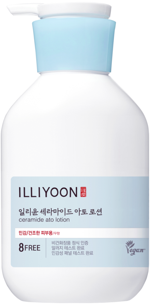
The stroke thickness of the logo has been increased by approximately 1.4 times compared to the previous version, reinforcing the logo’s solidity and reliability.
The seal symbol, once featuring Chinese characters, now incorporates the English name ILLIun, improving brand recognition in global markets.
This also helps foreign audiences pronounce “ILLI” and “YOON” more easily while maintaining the traditional seal-like form that reflects the brand’s heritage.
For typography, the Korean typeface Kim Jeongcheol Gothic was chosen to retain the long vertical strokes characteristic of the previous font while improving readability and evoking trust.
The English typeface Galvji, harmonizing with the Korean design, has a consistent stroke weight that conveys a clean and calm aesthetic.
Its restrained curves and clear linearity effectively express ILLIYOON’s professional and clinical image.


Design Motivation
To convey ILLIYOON’s professional research identity and sense of trust, inspiration was drawn from file index shapes commonly found in laboratory research documents.
The diagonal emphasis symbolizes functionality, logic, and technical precision, while the curved flow that neutralizes it represents ILLIYOON’s gentle, low-irritation derma philosophy.
This index motif not only serves as the core element of the new logo, but also extends across ILLIYOON’s visual communication system, appearing in packaging, retail design, and digital applications—creating a cohesive and identifiable design language.

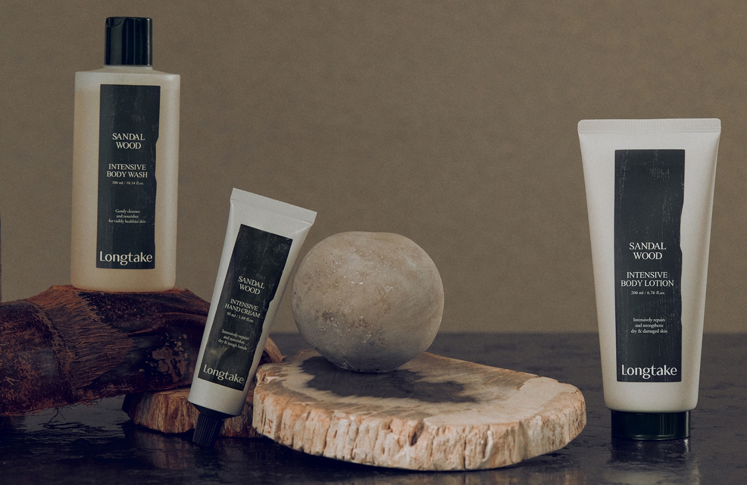
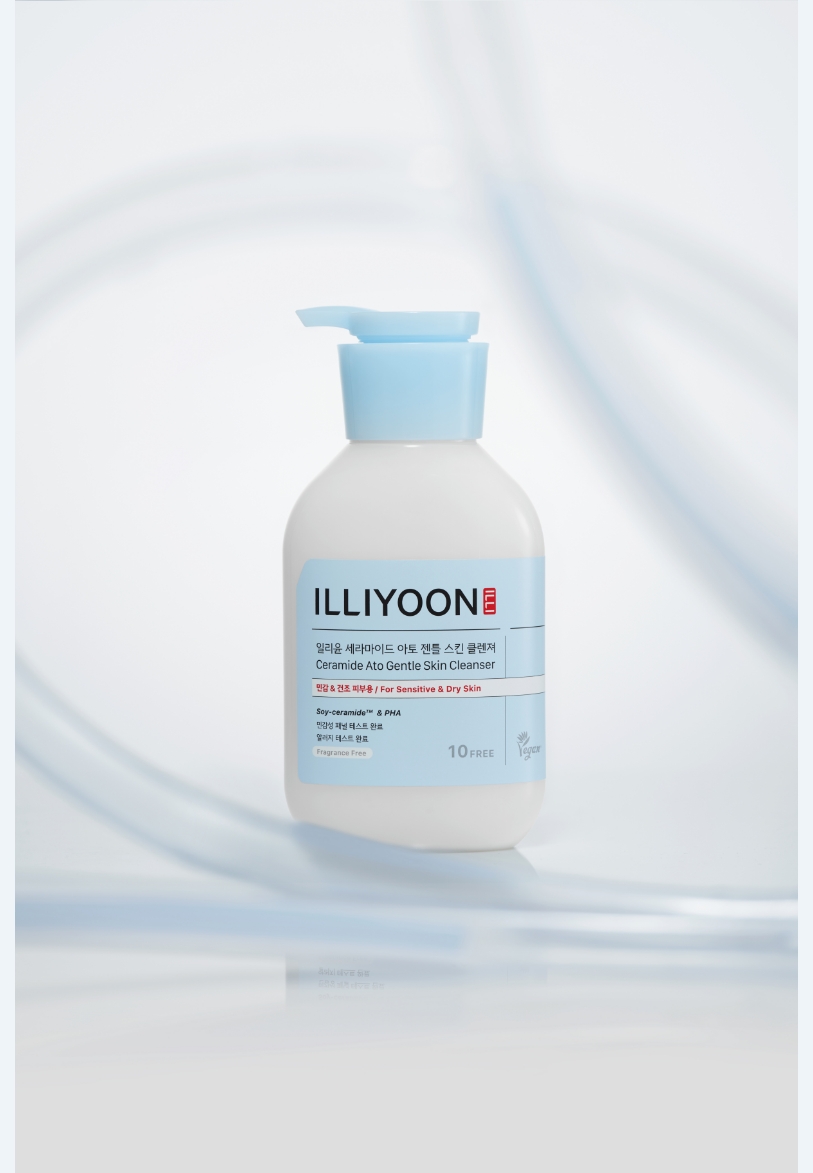
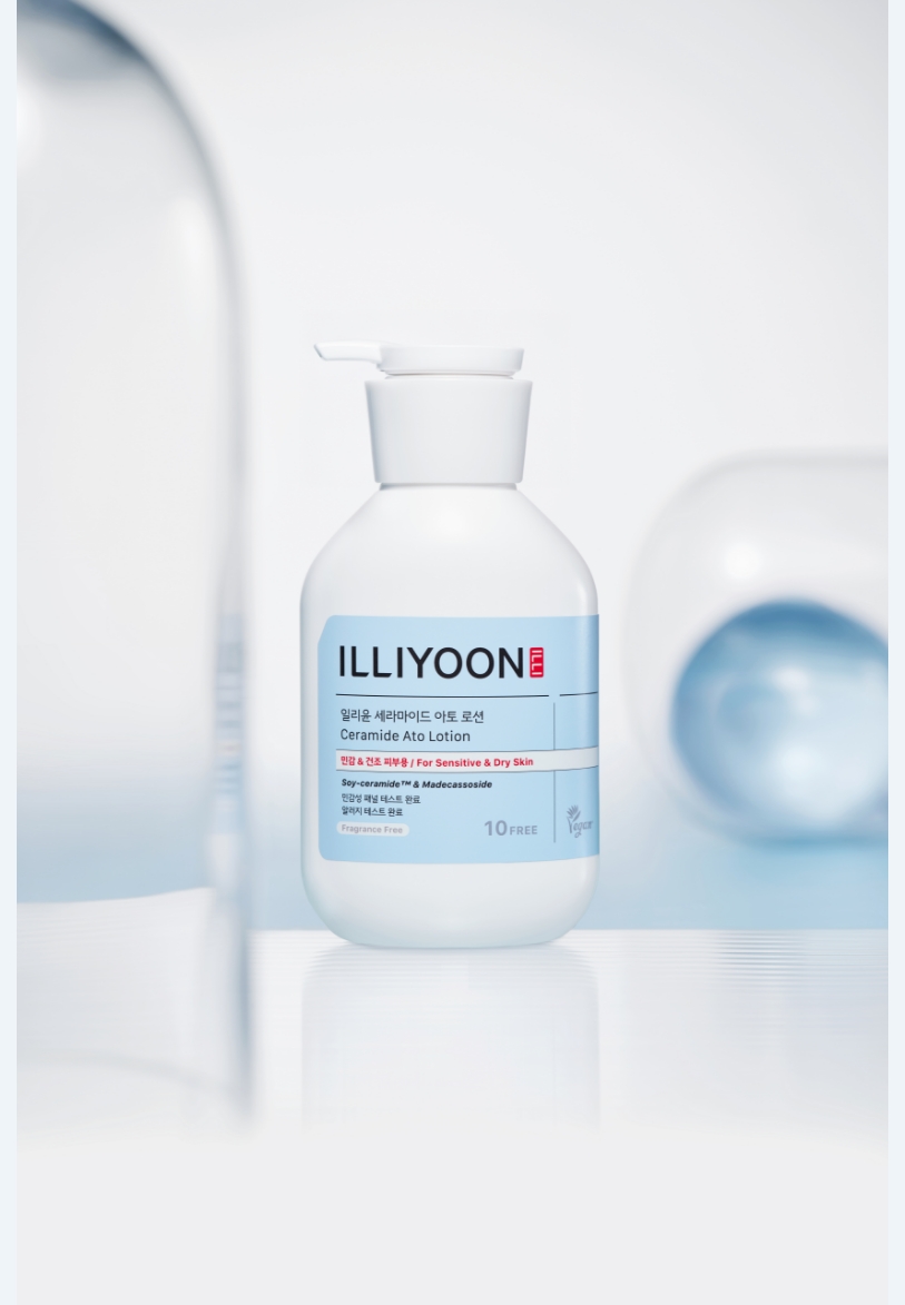
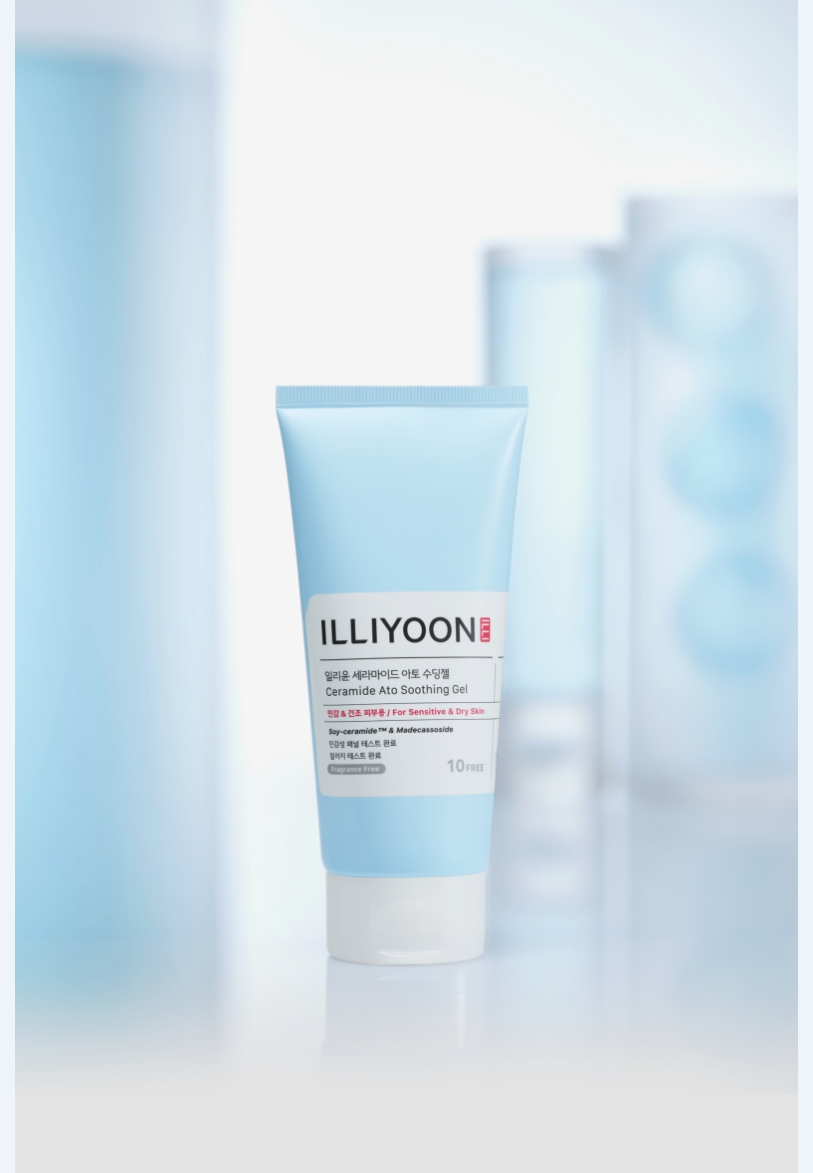
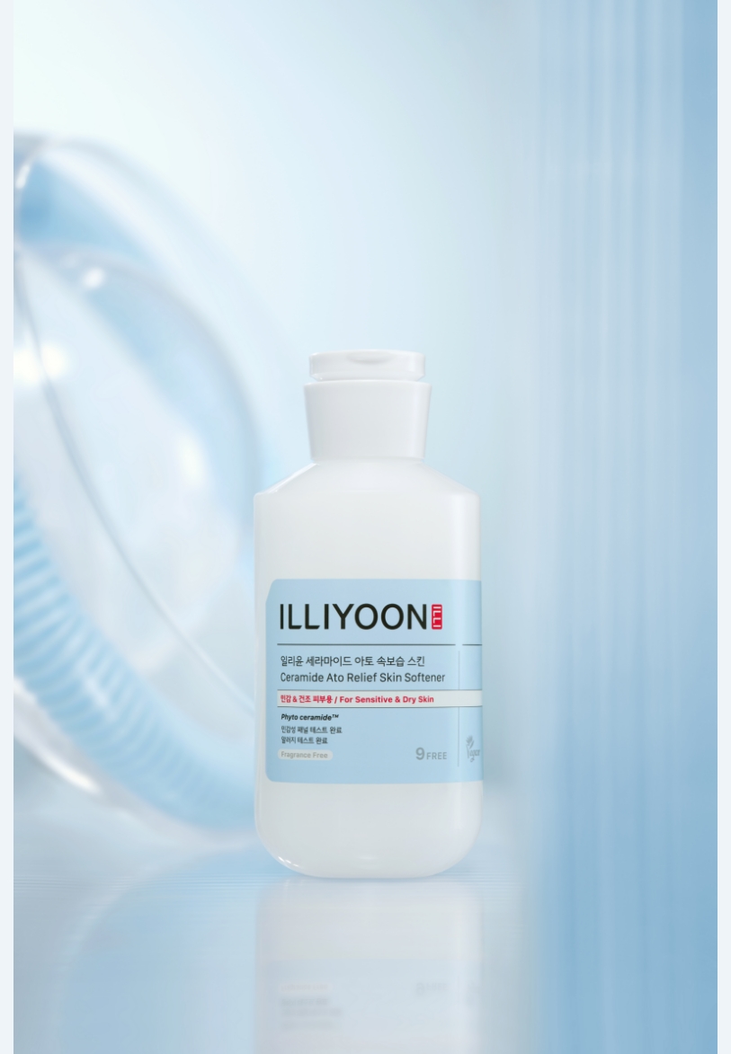
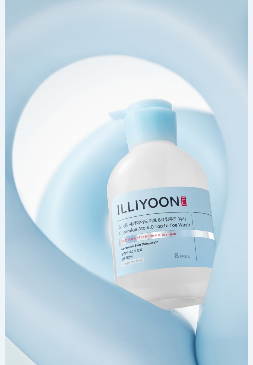
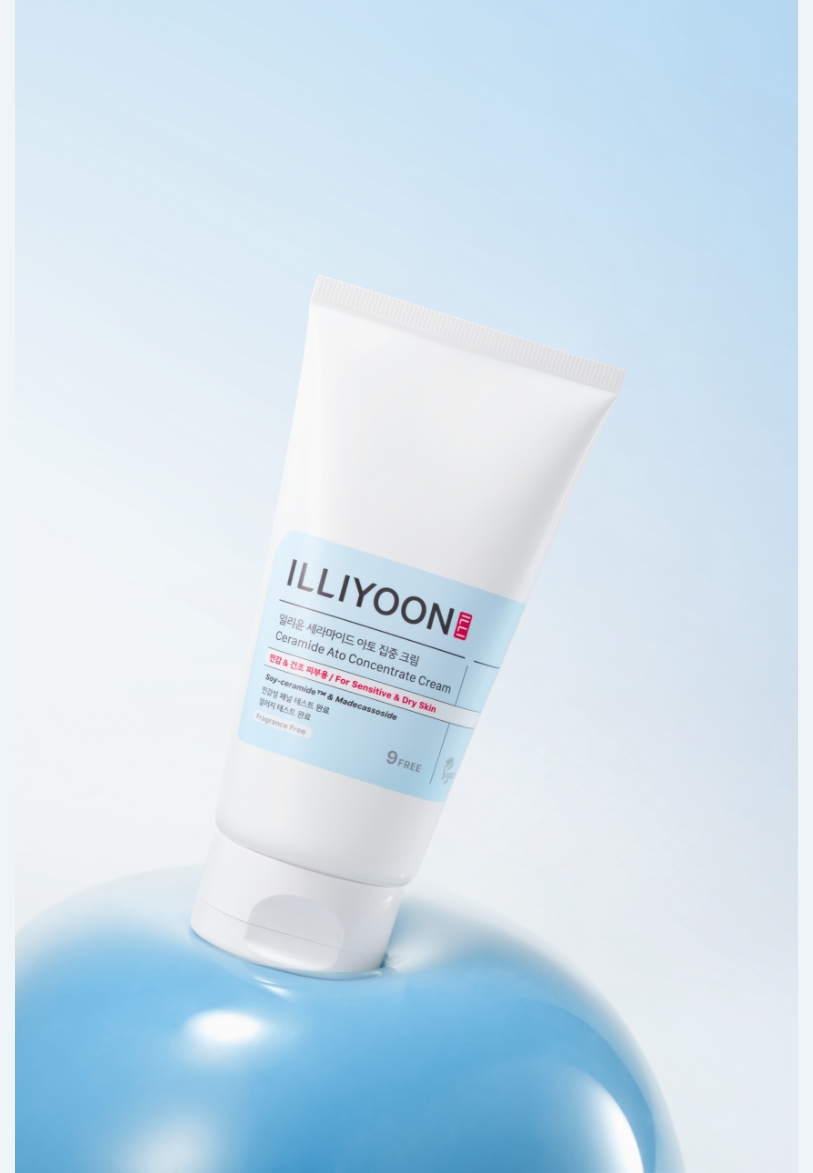
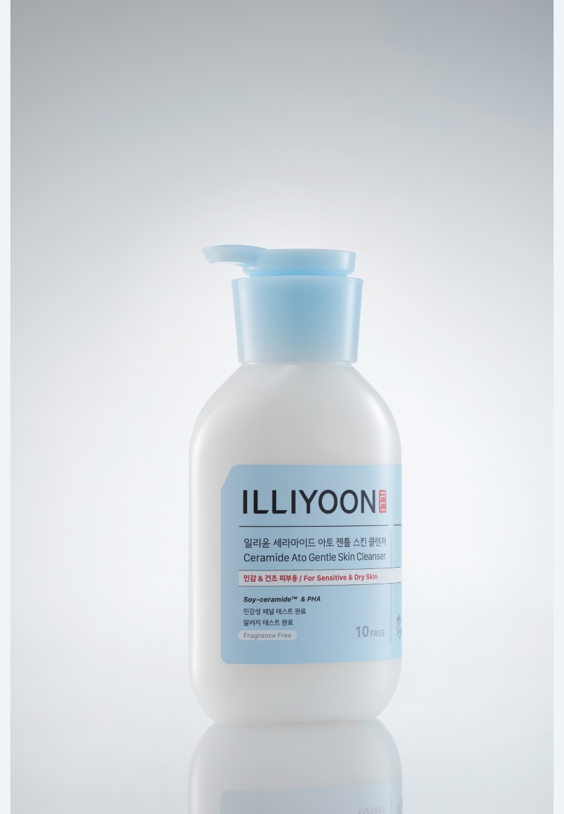
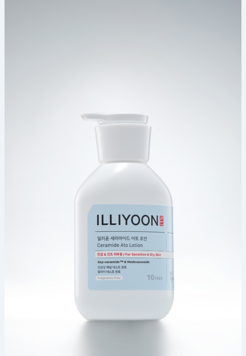
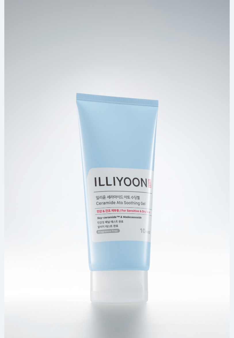
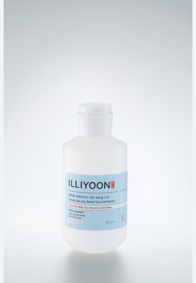
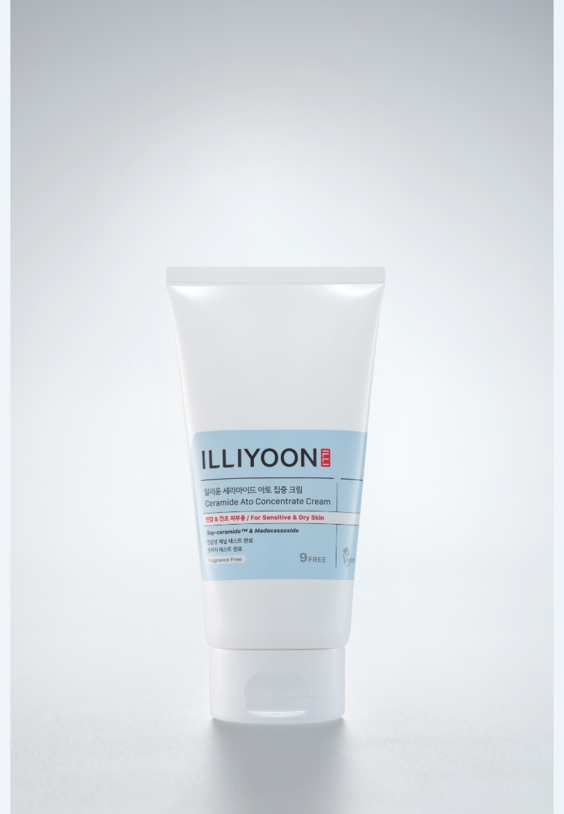
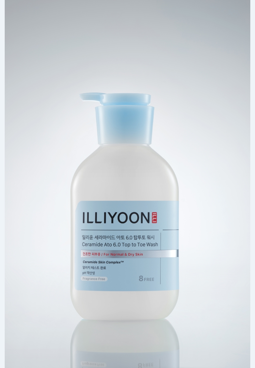
Package Design
The package design employs structured lines and a clean layout to evoke the professional tone of scientific charts used in laboratories.
The diagonal cut in the top-left corner incorporates the index motif, rooted in the “Comfort Derma Lab” concept.
Product information is presented bilingually (Korean and English) to enhance global accessibility.
Below the red skin-type label, key ingredients or technology names are written in italics, echoing the typographic nuance of scientific papers, where Latin terminology is italicized to emphasize technical credibility.
Compared to previous designs, the logo size has been enlarged for improved readability, and the label area expanded to reposition the logo toward the top for stronger visibility.
These refinements collectively allow the brand to stand out more prominently across diverse shelf and retail environments.
before

after

before

after


Visual Communication
For ILLIYOON, Derma is defined through the concept of “Comfort.” However, this comfort extends beyond the physical—it encompasses emotional comfort, representing the core philosophy of the brand.
Centered on its brand essence, ILLIYOON developed a visual theme that expresses “Soft Science,” a concept that visually conveys the research process behind both the physical comfort felt on the skin and the emotional ease it brings. The Soft Science theme translates the brand’s three key essences into three distinct visual languages: Soft Geometry – symbolizing gentle structure and balance, Luminosity – expressing purity and vitality through light, Balanced Flow – evoking calm, rhythmic movement. These elements are reflected respectively across key visuals, main visuals, and formula expressions, allowing ILLIYOON’s scientific professionalism and emotional warmth to coexist harmoniously in all visual communications.
Centered on its brand essence, ILLIYOON developed a visual theme that expresses “Soft Science,” a concept that visually conveys the research process behind both the physical comfort felt on the skin and the emotional ease it brings. The Soft Science theme translates the brand’s three key essences into three distinct visual languages: Soft Geometry – symbolizing gentle structure and balance, Luminosity – expressing purity and vitality through light, Balanced Flow – evoking calm, rhythmic movement. These elements are reflected respectively across key visuals, main visuals, and formula expressions, allowing ILLIYOON’s scientific professionalism and emotional warmth to coexist harmoniously in all visual communications.
The key visual represents the image of Comfort Lab through objects with smooth materials and gently curved surfaces, encapsulating the soft and fluid essence of Soft Science.
Unlike traditional lab expressions that often appear sharp and cold, this visual seeks to portray ILLIYOON’s uniquely comfortable and uplifting lab atmosphere through balanced composition and the harmonious arrangement of objects, creating a sense of calm precision and approachable professionalism.
The main visual evokes the image of a clean, sterile laboratory environment through soft, subdued reflections within a limitless, boundary-free space.
Designed to highlight the product’s presence—particularly in PDPs, thumbnails, and key digital placements—it uses light alone as the expressive medium.
Through this, the visual conveys the product’s gentle stability, honest functionality, and pure, understated beauty, aligning with ILLIYOON’s refined derma identity.

The formulation cut focuses on showcasing the balanced characteristics of the seven distinct product formulas, presenting them authentically and without embellishment to communicate a sense of trust, transparency, and safety in the products.
PDP Design
ILLIYOON’s recent design renewal extended beyond offline retail displays to embrace digital platforms as well.
Since the product detail page (PDP) is often the first point of contact for customers online, every element was carefully crafted to allow visitors to feel the brand’s authenticity and expertise with every scroll.
Through soft yet subtly professional visual cuts, the design conveys trust and calm authority, while the graphic concept—“A Ceramide Research Artisan’s Notebook”—evokes the impression of browsing through real research materials.
To address the monotony of previous PDP layouts that felt long and repetitive due to uniform tone and design, typography hierarchy was introduced to emphasize key messages.
Clinical data were visualized with intuitive diagrams and graphs, allowing users to grasp essential information at a glance.
Video content explaining new technologies and ingredients was placed prominently at the beginning, maintaining engagement and ensuring a smooth, scrollable experience.
Through these improvements, ILLIYOON reinforced its credibility as a trustworthy derma brand, providing deep yet approachable information.
True to its slogan, “Sensitive to Sensitivity,” the newly refined PDP reflects ILLIYOON’s dedication to detail, emphasizing both brand sincerity and scientific professionalism.


3D contents
A core technology video for the Ceramide line was produced to visually communicate how ceramide nanoparticles penetrate deep into the skin, enhancing moisture retention and barrier strength.
Positioned at the start of the PDP, this 3D motion content captures attention immediately, encouraging users to continue scrolling without losing interest.
Set Design
In Olive Young’s retail environment, ILLIYOON products are displayed alongside various other brands without dedicated VMD or brand zones.
Therefore, the planning pack design was approached not as an aesthetic showcase, but as a communication tool—prioritizing visual impact, clarity, and information delivery.
This strategy ensures that even in a crowded multi-brand setting, ILLIYOON’s products maintain strong visibility and instant recognizability.

01. In the POP design area, quantified history information is displayed, and key product features and type information are prioritized at the top, enabling customers to quickly grasp the product’s value.
02. Even when a tester is not placed, the left-side silhouette of the container is intentionally exposed to allow clear recognition of the logo and product identity.
03. Each product line is assigned a distinct representative color, creating a strong visual clustering effect when arranged on the shelf.


- Amorepacific Creatives
- Design
- Kwon Miyeon, Kim Taeeun, Lee Donggi,
- Lee Hyungwoo, Hyun Eunjeong,
- BI design with ohSeven
- Kwon Miyeon, Kim Taeeun,
- Lee Donggi, Lee Hyungwoo,
- Hyun Eunjeong,
- BI design with ohSeven
- Photography
- Lee Yunjin, dnmt
- Visual Directing (product)
- Kim Taeeun, Hyun Eunjeong
- Visual Directing (model)
- Kim Haerin
- BM
- Kim Gayoung, Kim Minkyung, Kim Minyoung,
- Kim Youngshin, Seong Jimin
- Kim Gayoung, Kim Minkyung,
- Kim Minyoung, Kim Youngshin,
- Seong Jimin
- Development
- Song Hyekang