HAPPY BATH Perfume Boutique
해피바스 퍼퓸부티크 라인
Summary
해피바스는 브랜드의 이름에서부터 ‘행복’이라는 감정의 단어를 담고 있습니다. 그래서 ‘행복한 샤워’ 경험을 어떻게 제공할 수 있을지가 늘 프로젝트의 출발점입니다.
최근 런칭한 해피바스의 퍼퓸부티크 라인도 ‘향 감성’을 ‘행복한 샤워’에 더하는 고민에서부터 시작했습니다.
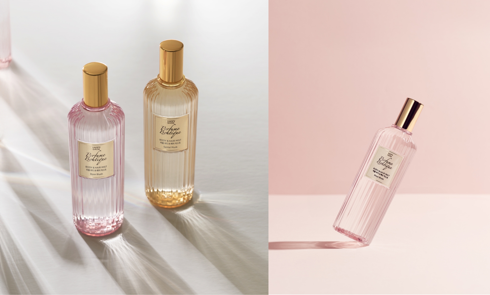
해피바스 퍼퓸부티크 라인은 ‘남프랑스 그라스의 향’ 감성의 제품으로 오일 바디워시를 메인으로 바디로션과 바디 & 헤어 미스트까지 총 3가지 유형으로 출시되었습니다. 프리미엄 향 감성을 담아내기 위하여 용기의 형상과 컬러 무드, 그리고 라벨 텍스처까지 초기 단계에서 방향성을 고민하여 디자인에 녹여낸 프로젝트입니다.
해피바스 퍼퓸부티크 라인은 ‘남프랑스 그라스의 향’ 감성의 제품으로 오일 바디워시를 메인으로 바디로션과 바디 & 헤어 미스트까지 총 3가지 유형으로 출시되었습니다. 프리미엄 향 감성을 담아내기 위하여 용기의 형상과 컬러 무드, 그리고 라벨 텍스처까지 초기 단계에서 방향성을 고민하여 디자인에 녹여낸 프로젝트입니다.
This article has been translated by an AI.
From its name alone, Happy Bath encapsulates the emotion of happiness. Therefore, the starting point for any project is always how to provide a happy shower experience. The recently launched Perfume Boutique line by Happy Bath also began with the thought of adding fragrance sensitivity to a happy shower.
Happy Bath Perfume Boutique line features products inspired by the fragrance of Grasse in southern France, with an oil body wash as the main product and extending to body lotion and body & hair mist, totaling three types. To capture the premium fragrance essence, thorough consideration was given to the form and color mood of the containers and the texture of the labels from the initial stages, integrating these directions into the design of the project.

Scent of Grasse
남프랑스 그라스 지역이 ‘향’의 본고장이라 불리는 만큼 그라스 지역의 특징을 최대한 살려보고 싶었습니다. 프로방스의 부티크 공간, 담겨있는 다양한 오브제들,
그리고 ‘향’을 경험할 때 느낄 수 있는 감정 등을 통해 모티브로 활용할 수 있는 요소들을 추출하였고, 이를 통해 오래된 부티크를 연상케 하는 향수병의
형상과 스크립트 서체를 위주로 ‘앤티크’한 무드를 보여주고자 합니다.
Given that the Grasse region in southern France is renowned as the homeland of fragrance, we wanted to capture the
essence of this area to the fullest. We extracted elements that could be used as motifs from boutique spaces in
Provence, various contained objects, and the emotions felt when experiencing fragrance. Through these inspirations,
we aimed to showcase an antique mood, primarily featuring the shape of perfume bottles that evoke memories of old
boutiques and script typography.

Bottle Shape
용기의 형상은 전반적으로 ‘앤티크 향수의 모던화’에 기반하여 아이디어를 발전시키고 향수를 판매하는 부티크의 인테리어 무드와 유리 오브제에서 느껴지는
조형적인 요소들을 반영했습니다. 특히 세로형 물결 패턴은 ‘부드러운 피부의 결’을 만들어주는 제품의 핵심 기능을 연상시킵니다. 이렇게
퍼퓸부티크의 형상은 모던하면서 유려한 라인으로 ‘퍼퓸스러운’ 제품의 아이덴티티를 구축하려 했습니다.
The shape of the containers was developed based on the concept of modernizing antique perfumes. We reflected the
aesthetic elements found in the interiors of boutiques selling perfumes and the sculptural aspects perceived in
glass objects. Particularly, the vertical wave patterns evoke the core function of the product, which is to create
smooth skin texture. In this way, the form of the Perfume Boutique line established a perfume-like product identity
with modern and elegant lines.
Label Texture
라벨에서 가장 중점적으로 고민했던 부분은 프리미엄 향수에서 느껴지는 종이 텍스처를 구현하는 것입니다. 하지만 ‘워시’라는 제품의 사용 환경 때문에 물에 젖는
지류 라벨 사용이 불가하여 ‘종이 질감인 듯한’ 효과를 낼 수 있는 새로운 물성이 필요하다고 생각했습니다. 다양한 시도를 통해 라벨을 실제로 만졌을 때 텍스처감이
느껴질 수 있도록 매트한 후가공에 패턴을 이중으로 구현하여 입체화했습니다.
The primary focus for the label was to replicate the paper texture felt from premium perfumes. However, due to the
usage environment of a ‘wash’ product, paper labels that could get wet were not feasible. We realized that a new
material that could create a ‘paper-like texture’ effect was necessary. Through various attempts, we implemented
a double-layered pattern with a matte finish to provide a tactile texture that can be felt when touching the
label, giving it a three-dimensional application.


Antique mood
제품명의 서체는 ‘Perfume Boutique’ 그 자체의 감성을 충분히 담아내려 했습니다. 사선
방향으로 적어낸 듯한 스크립트 서체를 적용하였으며, 이는 제품의 중심에서 가장 핵심적으로 컨셉을 드러내는 역할을 합니다.
The font used for the product name was chosen to fully capture the essence of ‘Perfume Boutique’
itself. A slant script font was applied, which appears to have been written diagonally. This
choice plays a pivotal role in expressing the core concept of the product.
Visual Experience
온라인 환경에서도 퍼퓸부티크의 ‘향’ 감성을 충분히 느낄 수 있도록
로즈 블러쉬, 라 플레르, 상탈 머스크 각각의 ‘향’에 부합하는 실제 원물을 배치하여 직관적으로 표현하였고
컬러의 밀도감을 높여 적극적으로 무드를 반영하고 있습니다.
또한 내용물의 특징적인 요소인 ‘펄’감이 매력적으로 보여질 수 있도록 쉬머리한 요소를 추가했습니다.
로즈 블러쉬, 라 플레르, 상탈 머스크 각각의 ‘향’에 부합하는 실제 원물을 배치하여 직관적으로 표현하였고
컬러의 밀도감을 높여 적극적으로 무드를 반영하고 있습니다.
또한 내용물의 특징적인 요소인 ‘펄’감이 매력적으로 보여질 수 있도록 쉬머리한 요소를 추가했습니다.
To ensure that the fragrance essence of Perfume Boutique could be fully experienced online, we concurrently worked on visualizations.
For each scent – Rose Blush, La Fleur, and Santal Musk –we intuitively represented them by arranging actual materials that correspond to each fragrance.
We heightened the color density to actively reflect the mood.
Additionally, we added shimmery elements to prominently display the ‘pearl’ characteristic, a distinctive feature of the product contents, making it more appealing.


Perfume Boutique Series
퍼퓸부티크는 유형마다의 특징을 살리면서 시리즈에서 느껴지는 통일감으로 함께 소장하였을 때 매력도를 극대화하고자 합니다. 바디로션은 크리미한 컬러를 적용하여 제품의 보습감을 표현했고,
바디 & 헤어 미스트는 향수 초자 용기를 연상시키는 디자인으로 제품의 투명감을 강조합니다.
Perfume Boutique was designed to maximize its appeal when collected as a series, while still highlighting the unique features of each type.
For the body lotion, we applied a creamy color to express the moisturizing quality of the product. The body & hair mist was designed to
resemble a perfume glass container, emphasizing the transparency of the product.

퍼퓸부티크 라인은 이러한 과정을 통해 ‘향’에 대한 진정성을 담고자 했습니다.
직관적으로 제품의 장점을 소구해야하는 데일리뷰티 판매 환경과 프리미엄 향수들의 미니멀한 요소 사이의 균형을 찾고 싶었습니다.
그 결과, 독특한 용기 형태와 새로운 라벨 텍스처를 제품에 반영할 수 있었던 것이 제품 크리에이티브 담당자에게는 의미 있는 부분이었습니다.
해피바스 브랜드의 ‘행복한 샤워’를 향한 마음이 여러 고객들에게 닿기를 기원하며.
직관적으로 제품의 장점을 소구해야하는 데일리뷰티 판매 환경과 프리미엄 향수들의 미니멀한 요소 사이의 균형을 찾고 싶었습니다.
그 결과, 독특한 용기 형태와 새로운 라벨 텍스처를 제품에 반영할 수 있었던 것이 제품 크리에이티브 담당자에게는 의미 있는 부분이었습니다.
해피바스 브랜드의 ‘행복한 샤워’를 향한 마음이 여러 고객들에게 닿기를 기원하며.
The Perfume Boutique line aimed to encapsulate the authenticity of ‘scent’ through this process.
We sought to find a balance between the daily beauty sales environment, where we need to intuitively emphasize the product’s advantages,
and the minimalistic elements of premium perfumes.
As a result, it was a meaningful aspect for the product creative manager to reflect the unique container shape and new label texture in the products.
We hope the Happy Bath brand’s ‘happy shower’ sentiment reaches many customers.


- Amorepacific Creatives
- Product Design
- 구자은
- BM
- 조아라
- Development
- 최재용
- Photography
- 신상우 / 장인범 스튜디오