RYO ROOT:GEN Anti-aging care line
Summary
RYO is a specialized hair care brand that focuses on reclaiming the natural beauty of the scalp through Root Care. RYO has
launched the new ROOT:ZEN anti-aging care line exclusively for the New Commerce channel. RYO ROOT:ZEN leads the way in
anti-aging care with its technology Ginsen Panax™ and delicate vegan herb therapy. The line has been newly reimagined
with rich colors and delicate graphics, capturing the essence of a youthful, premium sensibility.

Concept
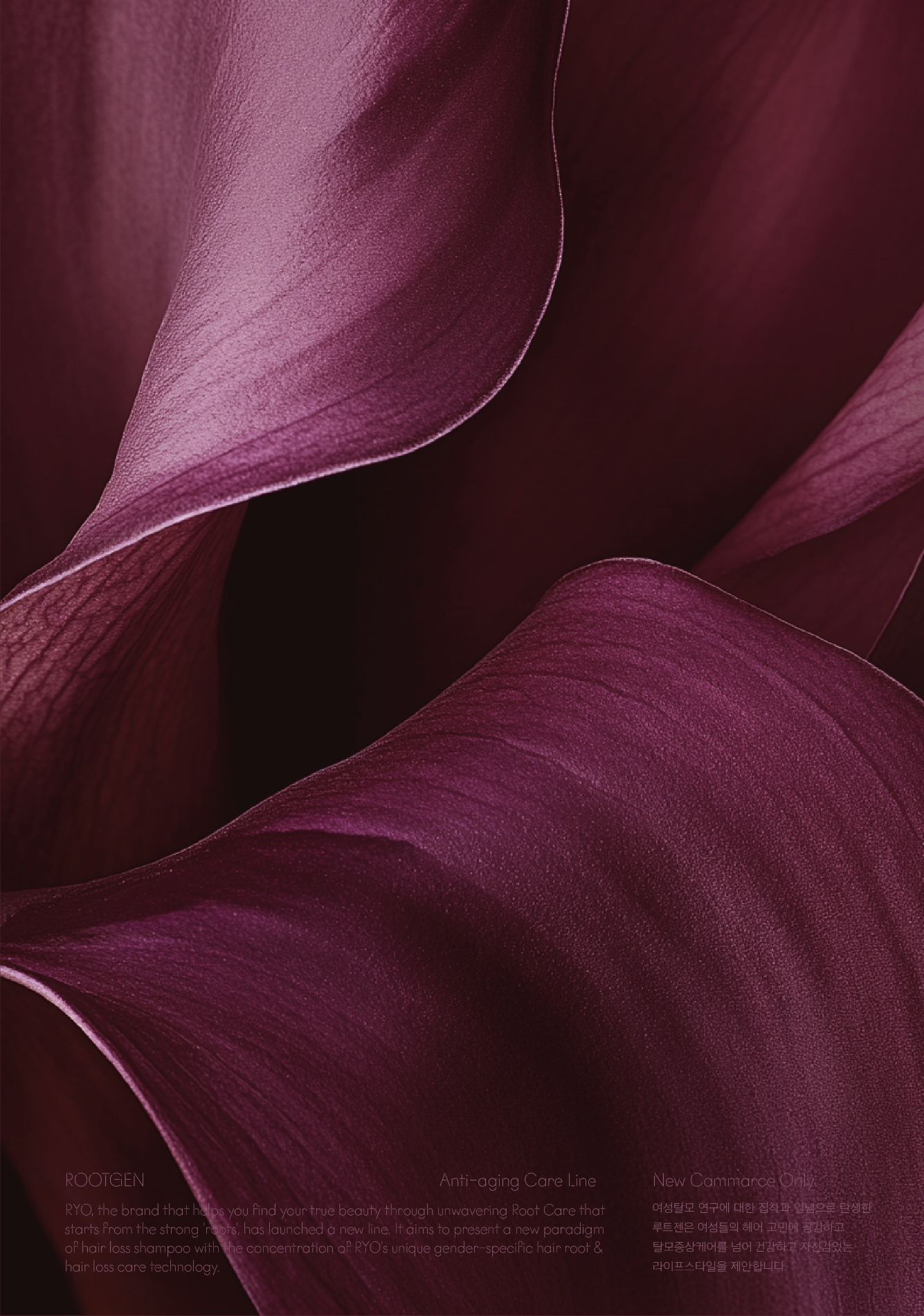
The anti-aging function is expressed through elegant color tones, while the ginseng root cell ingredient is visualized with delicate, refined imagery, embodying the identity of the Ryo Rootgen Anti-Aging Care Line.
The main red-wine hue symbolizes modernized ritual luxury, evolving to suit a young premium sensibility.
It visually conveys the vital, radiant energy of women, highlighting the product’s sophisticated elegance.


While maintaining the premium logotype and grid label layout from the existing Rootgen line, we refined the visual hierarchy and introduced Korean product naming to enhance readability.
Through this, we differentiated the new Young Premium line from the existing Rootgen series and proposed design scalability aligned with future product roadmap expansions.


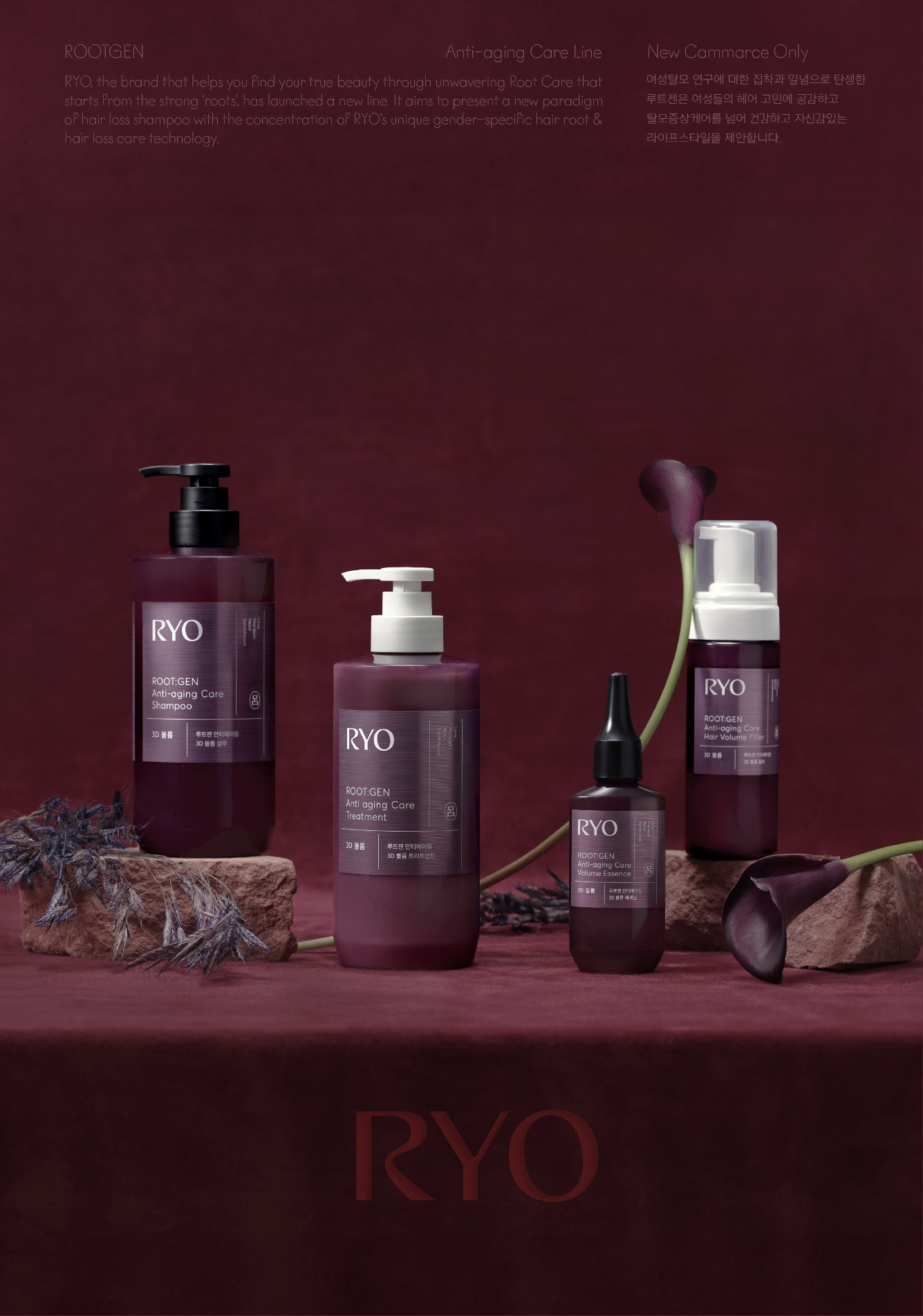
The Ryo Rootgen Anti-Aging Care Line includes four 4sku—shampoo, treatment, essence, and filler—supporting scalp rejuvenation through diverse formulations and application methods.
Each package applies a consistent grid layout and texture graphic aligned with the product label visuals, reinforcing a unified impression of Asian Phyto Science across the line.
AI Graphic Study and Application


During the set packaging development process, generative AI (Midjourney) was used to rapidly generate a wide range of textures symbolizing Rootgen’s powerful efficacy.
These AI-generated visuals were applied to design concepts to explore richer creative directions.
Additionally, specialized post-processing techniques were incorporated into the packaging to deliver a luxurious, multi-sensory experience—one that communicates exclusivity through both visual and tactile expression unique to the dedicated channel product.


For product photography, composition and props were carefully selected to fully convey the mood of the product and packaging.
In the key visual, a red-textured background was harmoniously paired with floral elements to maximize elegance and refinement, resulting in a serene yet richly atmospheric image. This visual direction accentuates the deep efficacy of anti-aging care, while elevating the product’s overall aesthetic allure.
In the key visual, a red-textured background was harmoniously paired with floral elements to maximize elegance and refinement, resulting in a serene yet richly atmospheric image. This visual direction accentuates the deep efficacy of anti-aging care, while elevating the product’s overall aesthetic allure.

- Amorepacific Creatives
- Product Design
- Sung Yujin, Oh Gaeun
- Visual Directing
- Oh Gaeun
- BM
- Hong Sungchul
- Development
- Park Seunghun