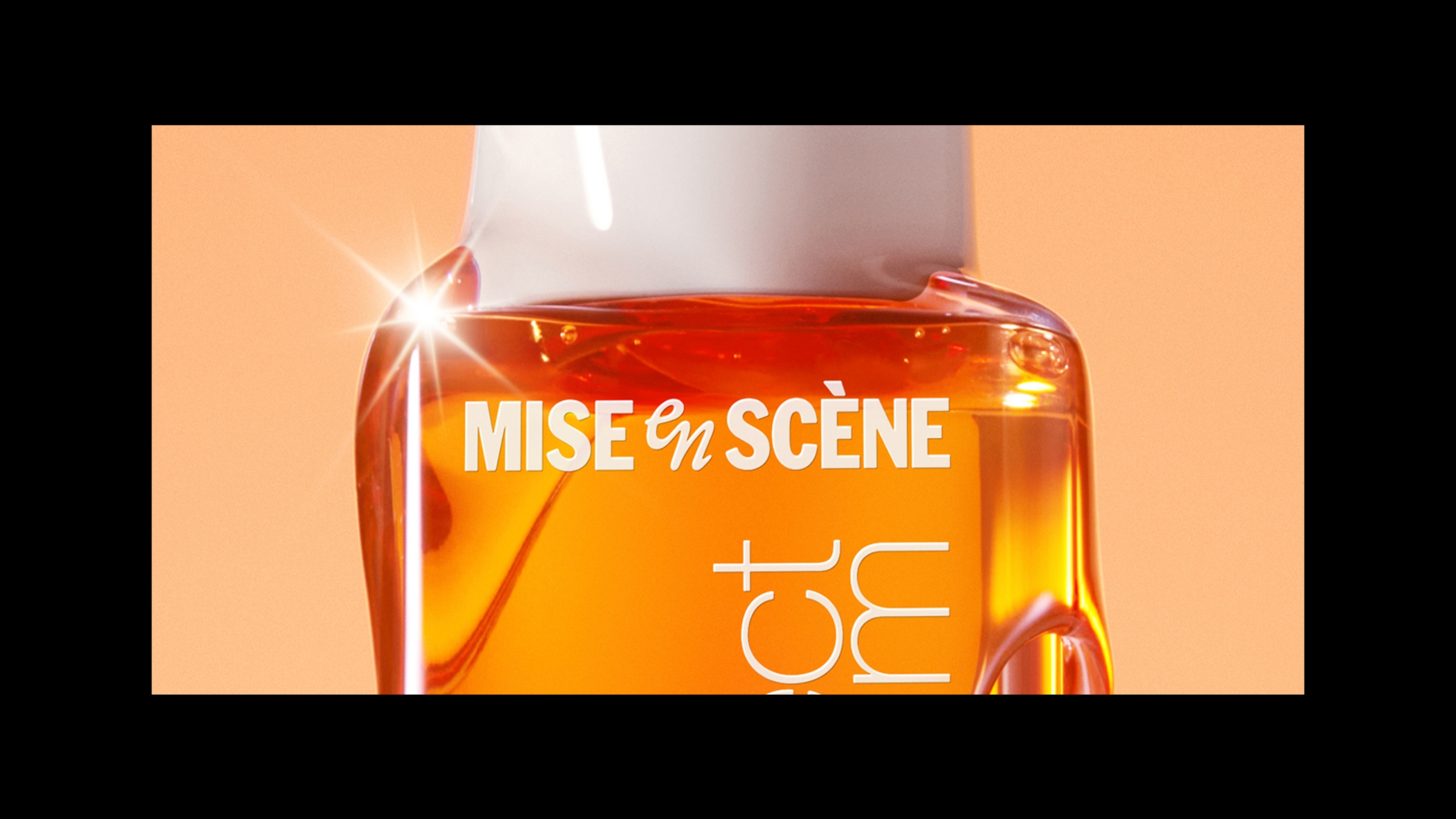
Mise-en-Scène New BI - Mise-en-scène Perfect Serum Update
미쟝센 New BI - 미쟝센 퍼펙트세럼 디자인 업데이트
Summary
미쟝센은 새로운 워드마크와 심볼을 중심으로 BI를 재정비하며, 글로벌 브랜딩을 한층 정교하게 다듬는 전환점을 맞았다. (미쟝센 New BI 개발스토리 : 링크) 그 첫 적용은 대표 라인업인 퍼펙트세럼으로,
단순한 로고 교체 작업을 넘어 서브 브랜드의 자산은 유지하면서 마스터 브랜드의 인지도를 강화하는 것이 핵심 과제였다. 새로운 워드마크와 심볼을 중심으로 구축된 BI 구조는 리브온, 워시오프, 세정, 양모
등 총 75종의 제품군에 반영되었고, 다양한 금형과 용량, 용기 형태, 패키지 구조 전반에서 일관된 브랜드 룩을 구현하고자 했다.
이 프로젝트는 BI 리뉴얼의 톤과 구조를 퍼펙트세럼 전 라인에 정교하게 녹여내며, 브랜드 통합과 제품 차별화 사이에서 균형을 이루는 것을 목표로 했다.
This article has been translated by an AI.
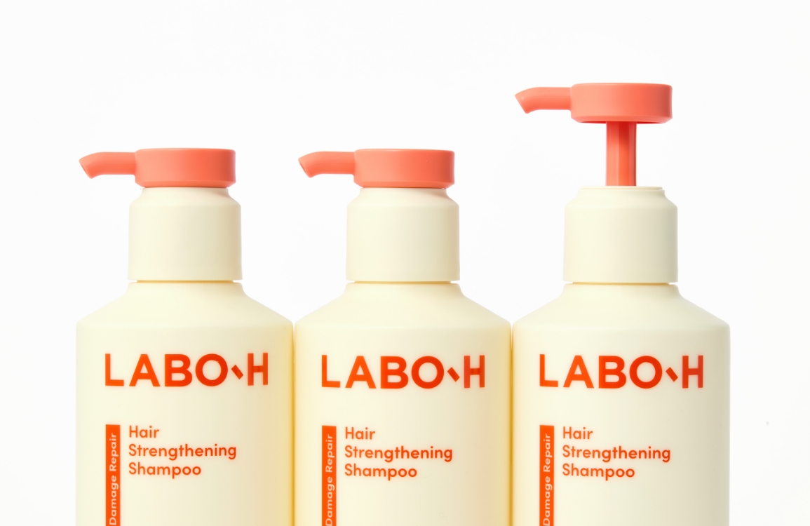
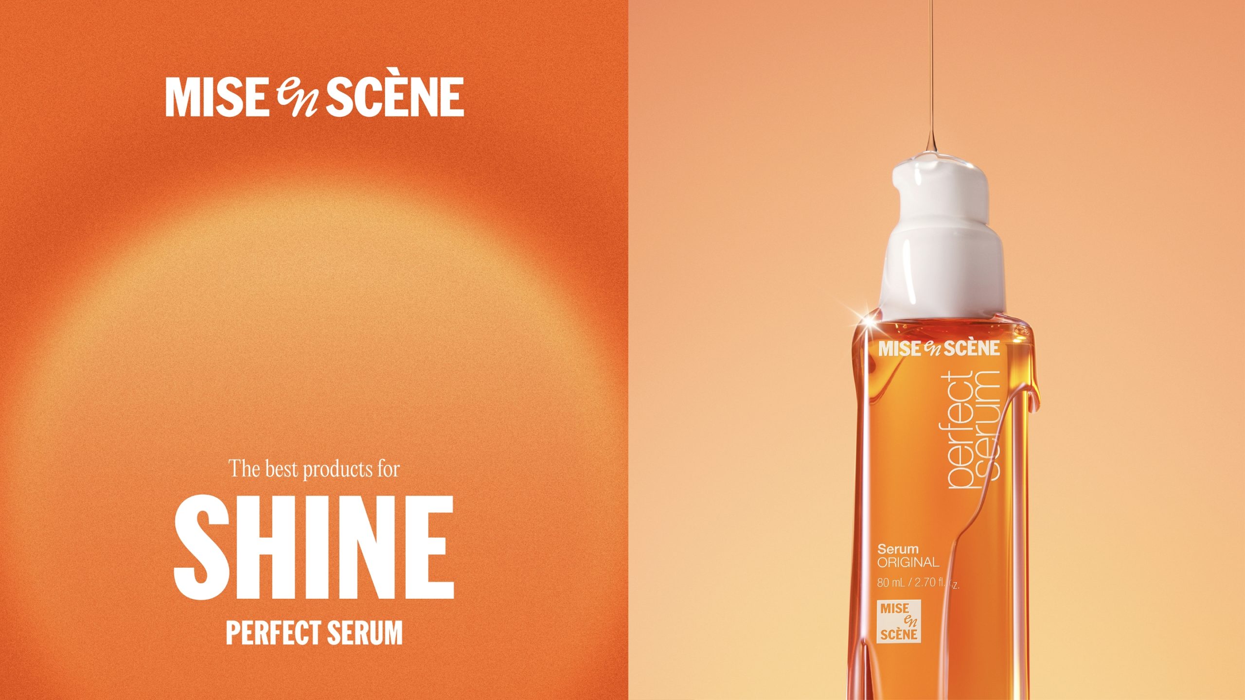
Mise-en-scène has reached a pivotal moment in refining its global branding by restructuring its brand identity system, centered on a new wordmark and symbol. (Mise-en-scène New BI development story: link) The first implementation of this renewed BI system was applied to the brand’s flagship lineup, Perfect Serum. More than just a logo replacement, the project aimed to maintain the equity of the sub-brand while reinforcing the visibility and recognition of the master brand, Mise-en-scène. Built around the new wordmark and symbol, the BI structure was applied across all 75 SKUs—including leave-on, wash-off, cleansing, and hair-loss care types—spanning a wide range of molds, volumes, packaging formats, and product structures. The project sought to meticulously embed the tone and structure of the renewed BI throughout the entire Perfect Serum line, striking a balance between brand unification and product differentiation.
Mise-en-scène has reached a pivotal moment in refining its global branding by restructuring its brand identity system, centered on a new wordmark and symbol. (Mise-en-scène New BI development story: link) The first implementation of this renewed BI system was applied to the brand’s flagship lineup, Perfect Serum. More than just a logo replacement, the project aimed to maintain the equity of the sub-brand while reinforcing the visibility and recognition of the master brand, Mise-en-scène. Built around the new wordmark and symbol, the BI structure was applied across all 75 SKUs—including leave-on, wash-off, cleansing, and hair-loss care types—spanning a wide range of molds, volumes, packaging formats, and product structures. The project sought to meticulously embed the tone and structure of the renewed BI throughout the entire Perfect Serum line, striking a balance between brand unification and product differentiation.
History
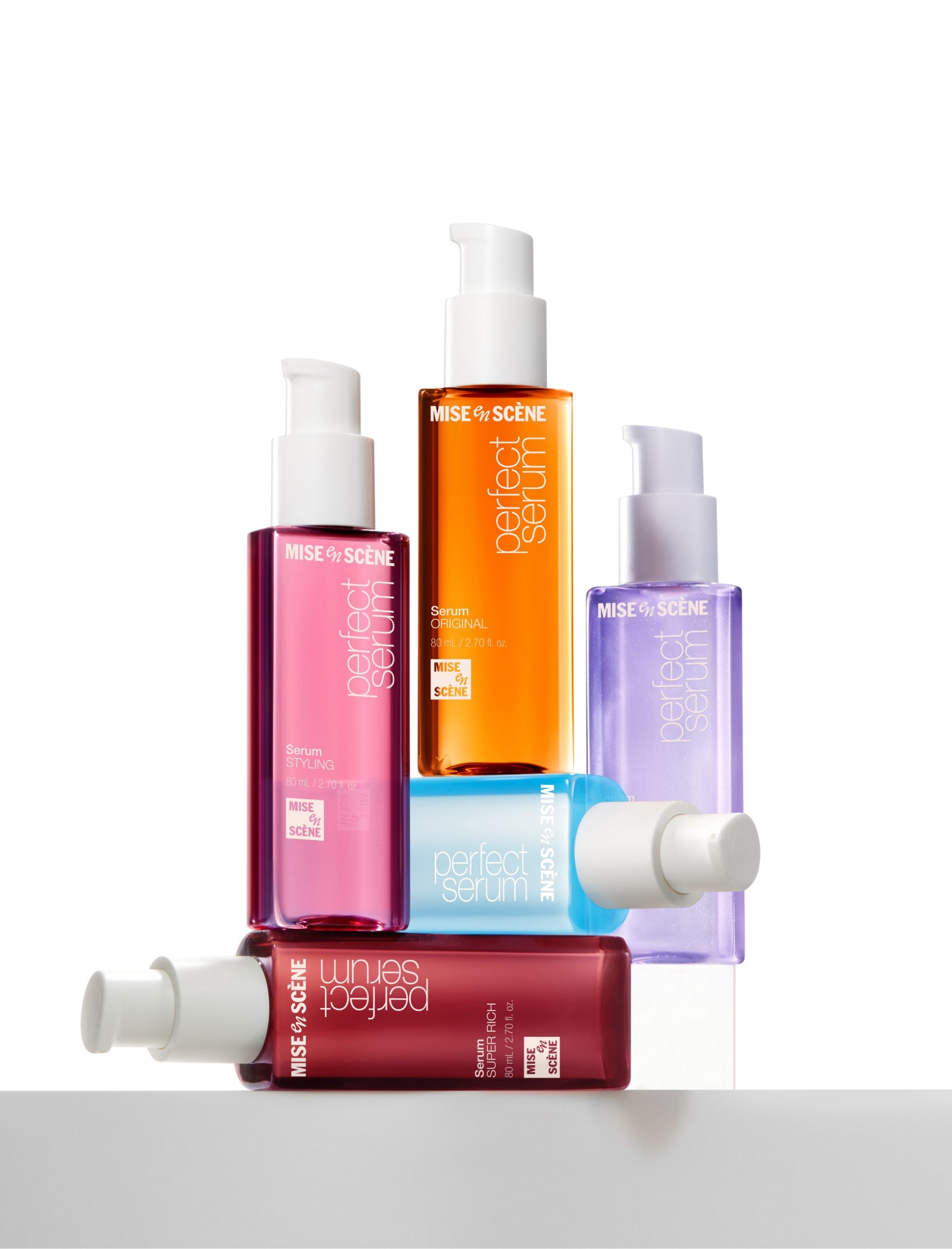
Perfect Serum
2000
2004
2014
2016
2022 –
Background
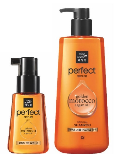
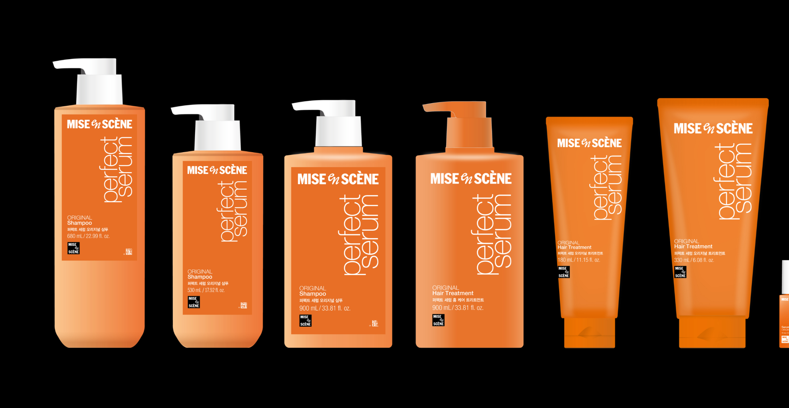
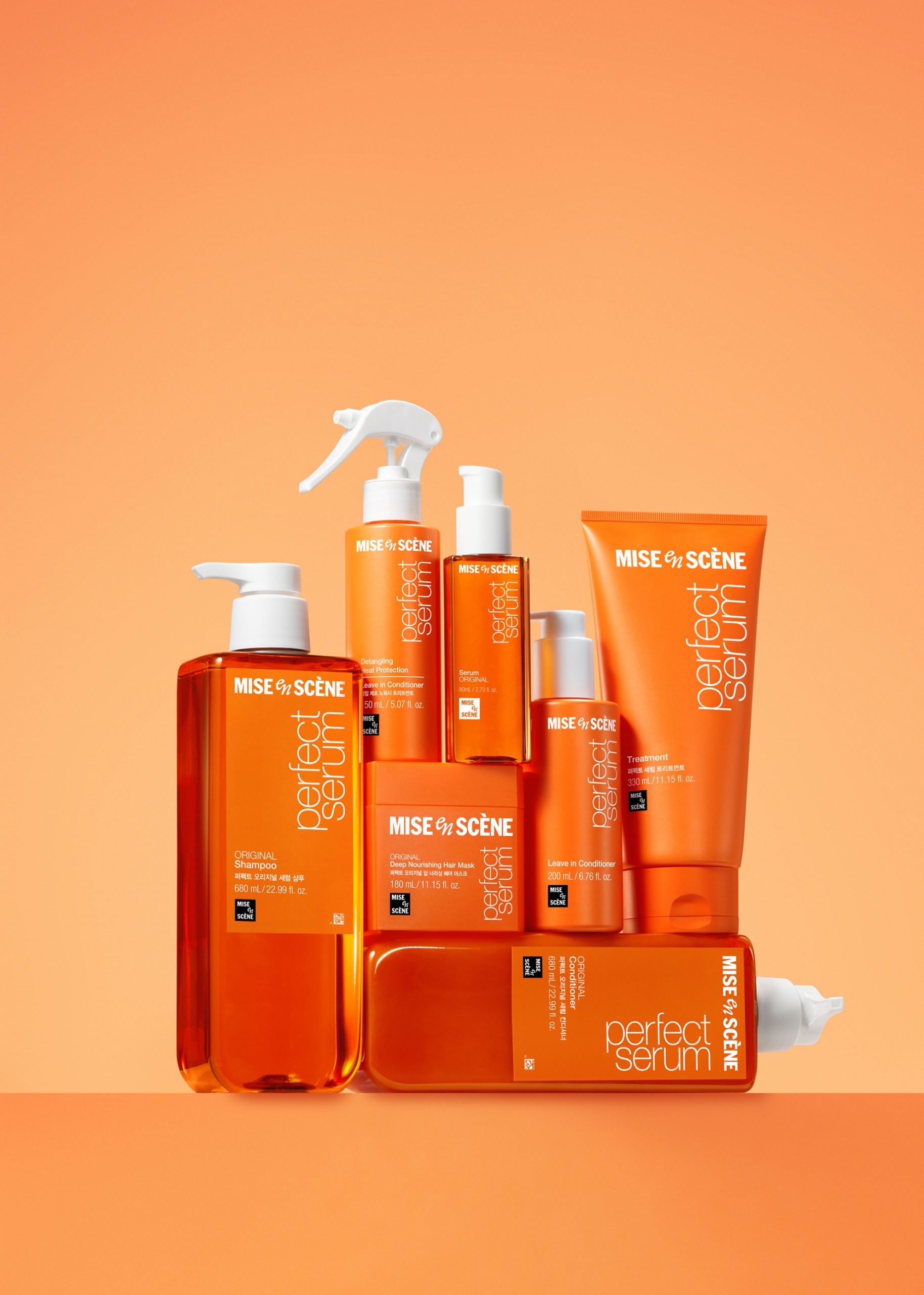
퍼펙트세럼은 미쟝센을 대표하는 스테디셀러 라인으로, 헤어세럼을 넘어 세정, 워시오프 양모, 리브온 양모 등 다양한 제품군을 포함한다. 특히 3ml부터 990ml까지 폭넓은 용량과 다양한 용기 형태로 구성되어 있어, 브랜드 디자인 시스템이 쉽게 무너질 수 있는 구조다.
2025년 기준, 누적 판매 1억 병을 앞두고 있는 상황에서 기존 사용자에게 낯설지 않으면서도 새로운 BI를 적용해 브랜드 전체의 인지 구조를 재정비하는 것이 필요했다.
2025년 기준, 누적 판매 1억 병을 앞두고 있는 상황에서 기존 사용자에게 낯설지 않으면서도 새로운 BI를 적용해 브랜드 전체의 인지 구조를 재정비하는 것이 필요했다.
Perfect Serum is a signature steady-seller line for Mise-en-scène, expanding beyond hair serums to include cleansing, wash-off treatments, and leave-on haircare products.
The line spans a wide range of volumes—from 3ml to 990ml—and diverse container types, making it especially vulnerable to inconsistencies in brand design application.
As of 2025, with cumulative sales approaching 100 million bottles, it was essential to apply the new BI in a way that reorganizes the brand’s recognition structure while maintaining familiarity for long-time users.
2024
New BI Applied
Design Approach
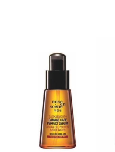
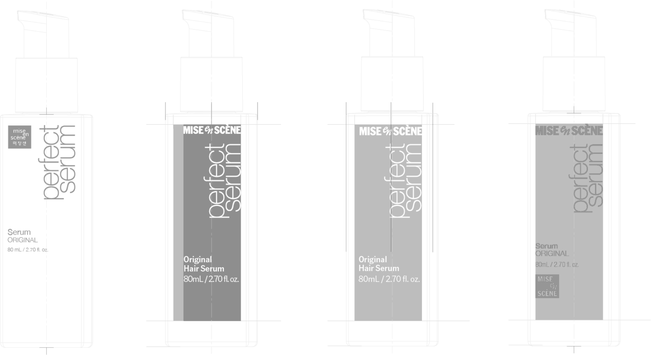
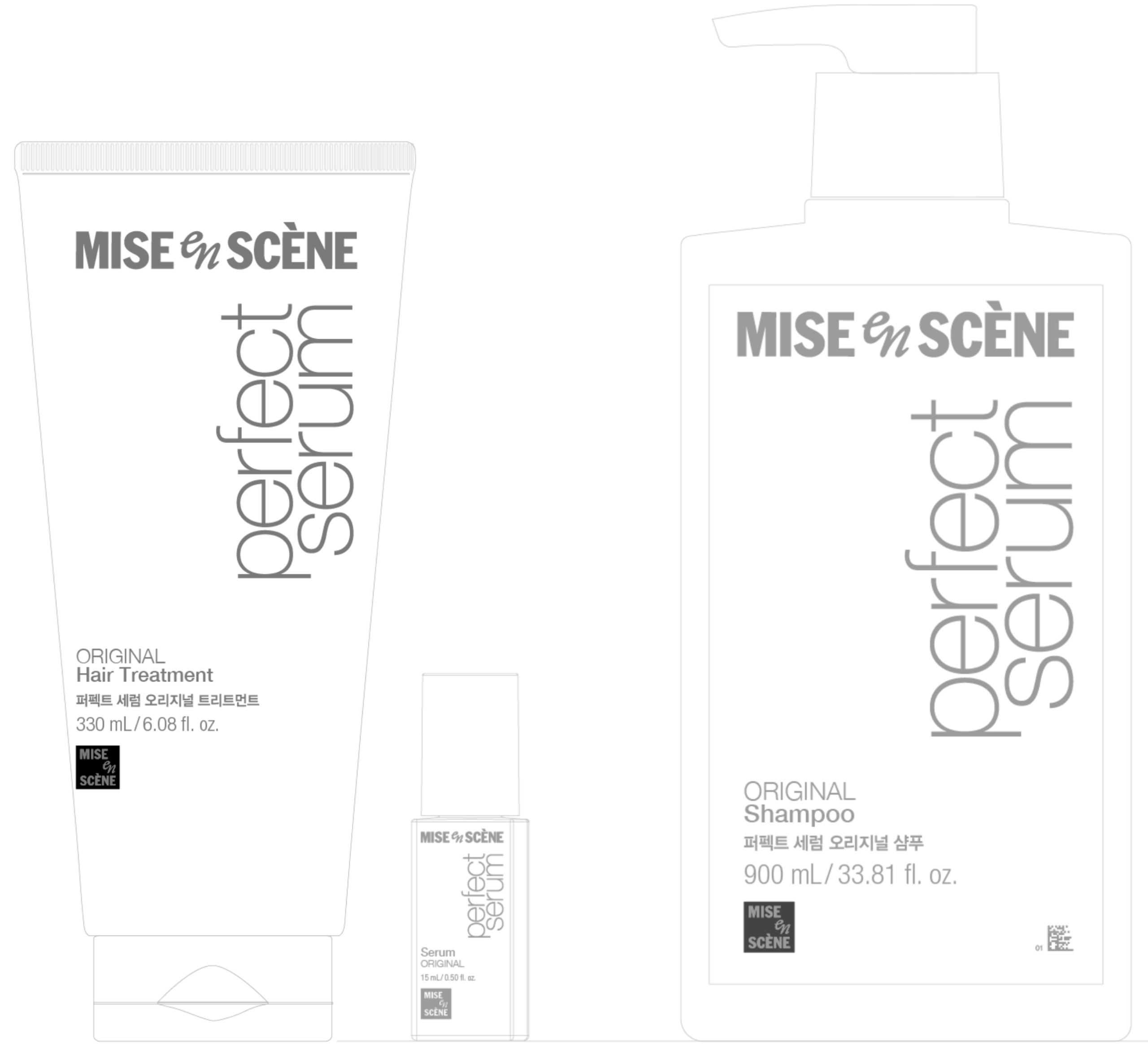
퍼펙트세럼은 기존 Helvetica 기반의 타이포그래피와 사각 로고 조합으로 아이코닉한 인상으로 브랜드를 유지해왔다.
하지만 정방형 BI는 가독성과 활용성 측면에서 한계를 드러냈고, 특히 글로벌 커뮤니케이션에서 제약이 컸다.
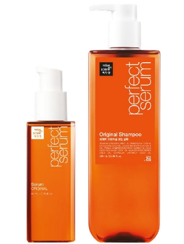
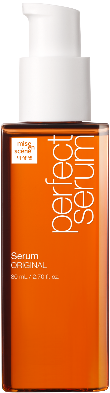
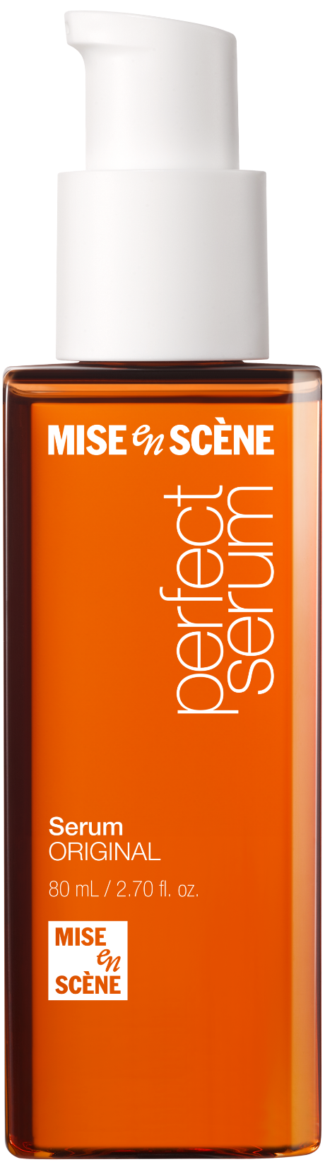
이에 따라 수평형 워드마크와 사각형 구조의 심볼을 조합해, BI는 정제된 상단 워드마크 – 하단 심볼 구조로 개편하였다.
이 구조는 기존의 시각적 자산을 존중하면서도 글로벌 확장성과 매대환경 내 군집력 확보라는 두 가지 과제를 동시에 해결한다.
퍼펙트세럼의 디자인을 유지하면서 개편한 BI를 적용하는 방향으로 디자인이 전개되었다.
하지만 정방형 BI는 가독성과 활용성 측면에서 한계를 드러냈고, 특히 글로벌 커뮤니케이션에서 제약이 컸다.
이에 따라 수평형 워드마크와 사각형 구조의 심볼을 조합해, BI는 정제된 상단 워드마크 – 하단 심볼 구조로 개편하였다.
이 구조는 기존의 시각적 자산을 존중하면서도 글로벌 확장성과 매대환경 내 군집력 확보라는 두 가지 과제를 동시에 해결한다.
퍼펙트세럼의 디자인을 유지하면서 개편한 BI를 적용하는 방향으로 디자인이 전개되었다.
Perfect Serum had long maintained an iconic brand presence through its Helvetica-based typography and square logo combination.
However, the square BI format showed limitations in readability and versatility, particularly in global communication.
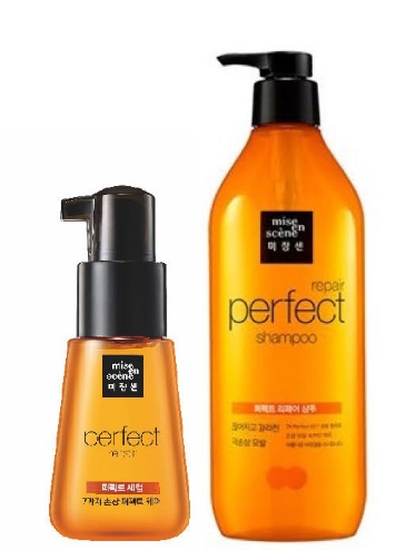
In response, the new BI was restructured using a horizontal wordmark paired with a square symbol, forming a refined “top wordmark – bottom symbol” composition.
This structure respects the existing visual equity while simultaneously addressing two major challenges: global adaptability and strong shelf presence.
The design approach was to retain the familiar impression of Perfect Serum while incorporating the newly rebranded BI structure.
Mise en Scéne BI design principle
미쟝센의 새로운 BI를 패키지에 적용하기 앞서, 퍼펙트세럼 뿐만아니라 미쟝센의 모든 제품에 적용되어 한 브랜드로 묶을 수 있도록 가이드가 필요했다. 브랜드 전체 제품에 적용될 수 있도록 가이드를 정하고 디자인을 진행하였다.
Before applying the new BI to Perfect Serum, it was crucial to establish a brand-wide design guide that could be extended to all Mise-en-scène products.
A unified application strategy was created and used as the foundation for redesign.
Mise en Scène BI Design Principle
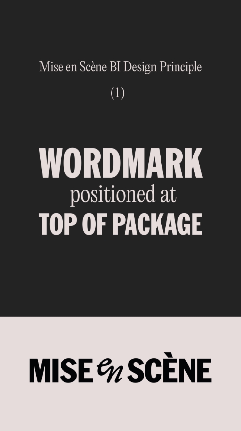
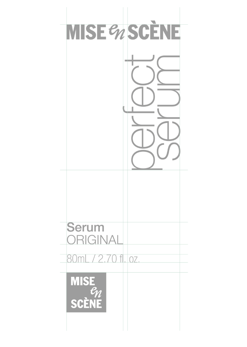
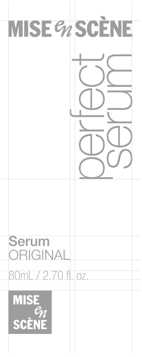
1. 미쟝센 워드마크 로고는 패키지 상단에 배치한다.
1. The Mise-en-Scène wordmark is positioned at top of package.
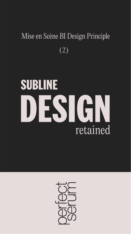
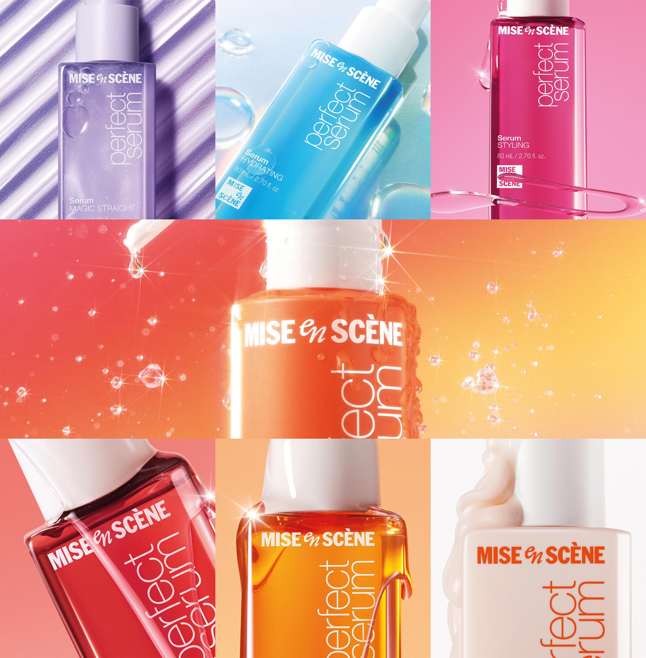
2. 서브라인 제품 디자인의 개성을 유지한다.
2. The unique design identity of each sub-line is retained.
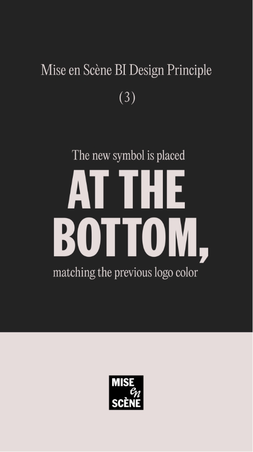
3. 미쟝센심볼은 하단에 위치하며, 기존 제품 디자인에 적용된 로고 색상을 따른다.
3. The Mise-en-Scène symbol is positioned at the bottom, matching the previous logo color
위 원칙을 기반으로 전 제품에 걸쳐 일관된 구조를 설계했다.
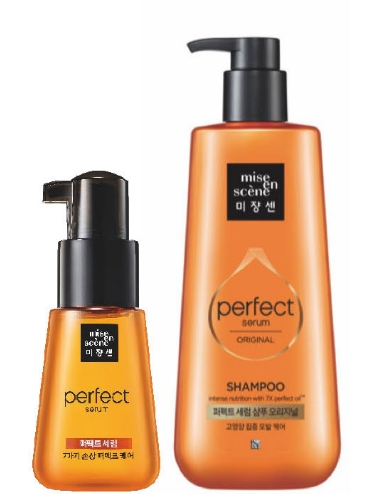
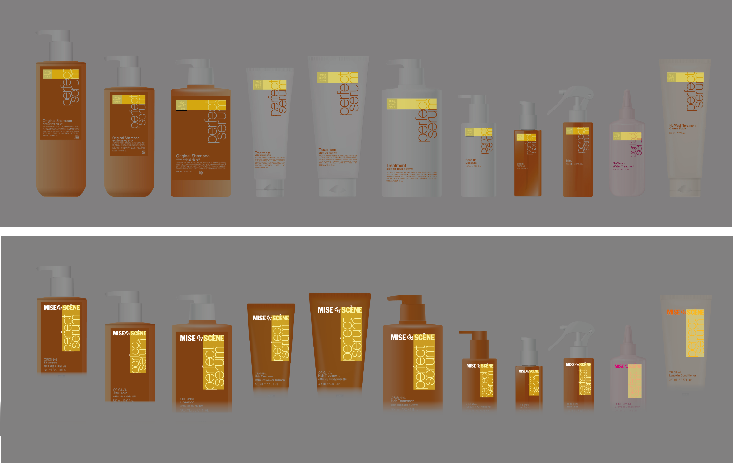
기존의 ‘perfect serum’ 타이포그래피와의 비율을 조정해 워드마크와 서브라인 디자인이 시각적으로 하나의 흐름 안에서 작동하도록 구성하였고,
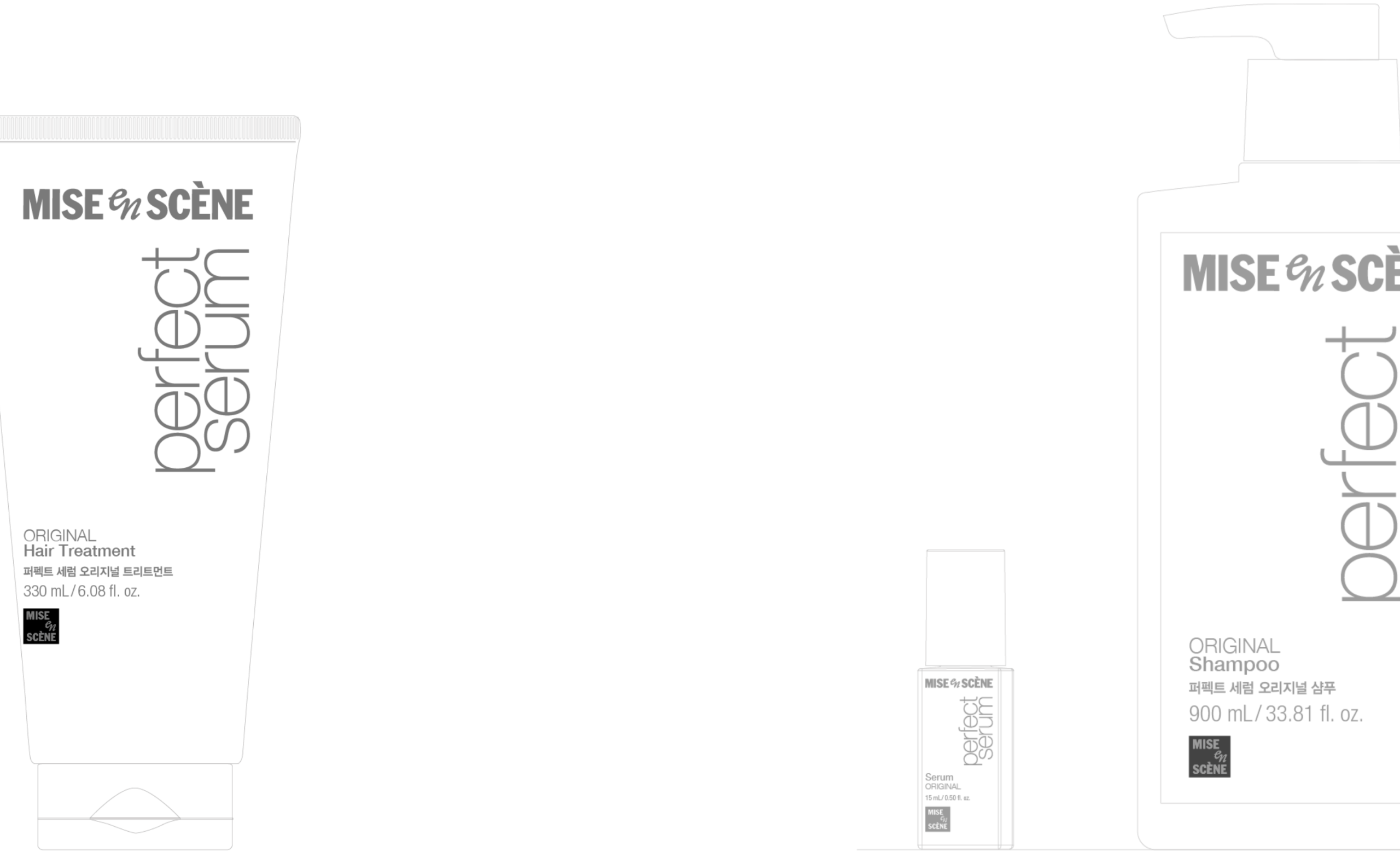
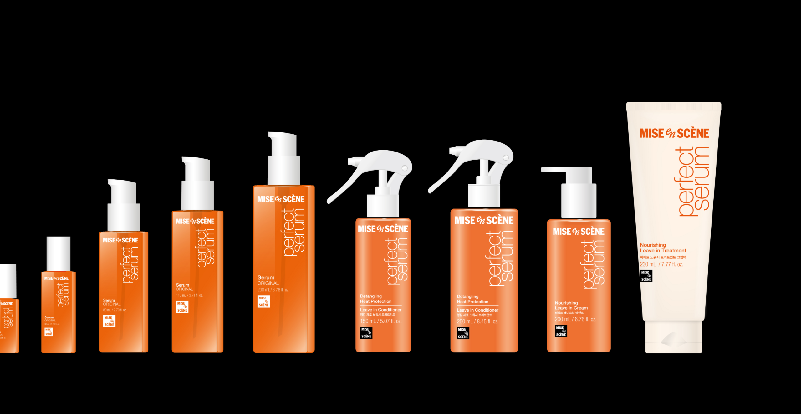
15ml부터 990ml까지 다양한 용기 형태에도 동일한 시각 균형이 유지되도록 비례 체계를 정교하게 조율했다.
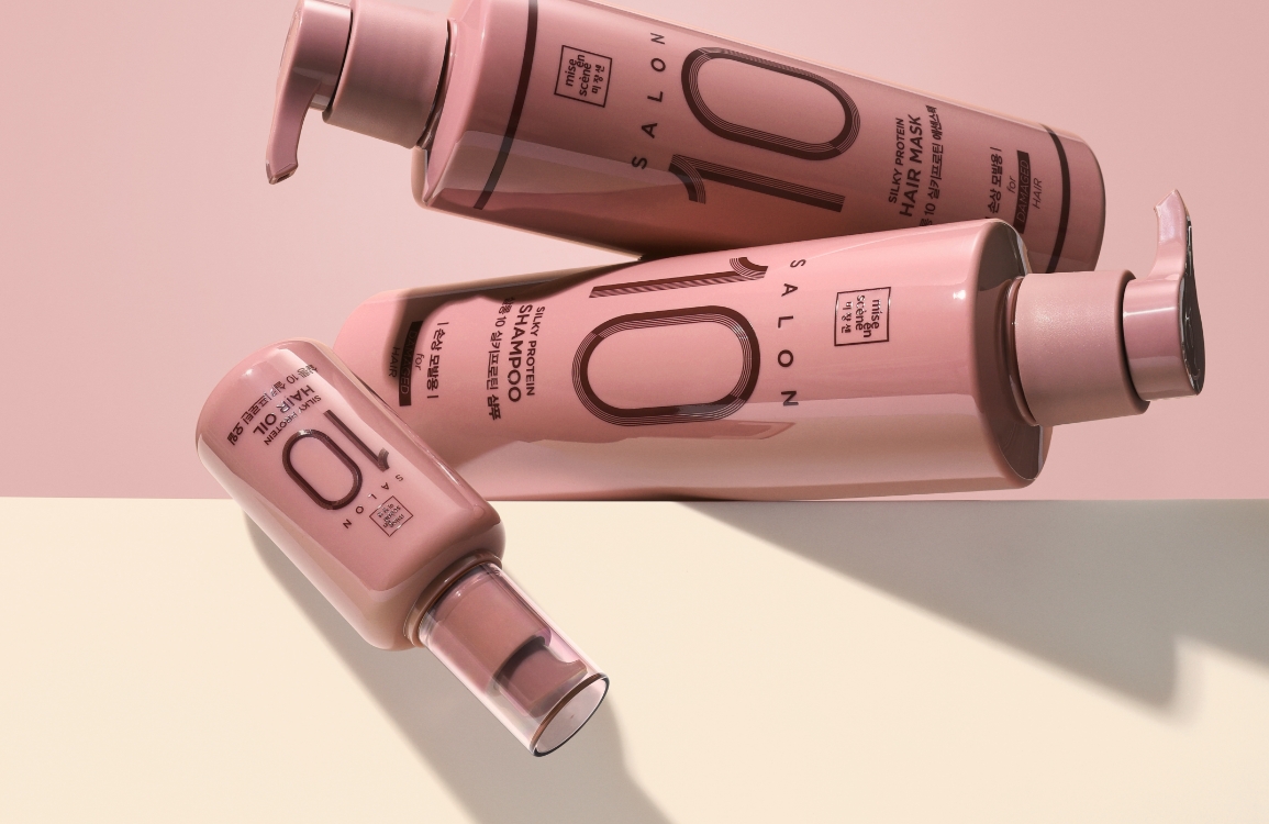
또한, 트리트먼트 제품군은 기존의 흰색 패키지 컬러를 펄 오렌지로 변경하여, 퍼펙트세럼 라인의 대표 제품인 헤어세럼과의 시각적 연계를 강화했다.
Based on these principles, a consistent structural system was designed across all SKUs.
The proportion between the new wordmark and the existing ‘perfect serum’ typography was adjusted to form a cohesive visual flow.
This proportional system was finely tuned to ensure balanced visual weight across container sizes ranging from 15ml to 990ml.
Additionally, the treatment product group, which had previously used white packaging, was updated to a
pearl-orange tone to visually align with the line’s flagship product, the hair serum.
Layout & System Structure
패키지 전면에는 ‘제품 타입(베네핏) – 제품 유형 – (국문 제품명) – 용량 – 심볼’로 이어지는 정보 로직이 공통적으로 적용되었다.
이 문안 구성은 제품 인지 흐름을 명확히 하면서도 브랜드 요소들이 과도하게 주목받지 않도록 균형 있게 설계되었다.
글로벌 확장을 고려하여, 국내외 포장재를 하나의 디자인으로 통합했고, 각국의 법적 표기 기준을 반영한 범용 레이아웃을 구현했다.
글로벌 확장을 고려하여, 국내외 포장재를 하나의 디자인으로 통합했고, 각국의 법적 표기 기준을 반영한 범용 레이아웃을 구현했다.
The front layout of all packaging followed a unified information structure:
“Product benefit – Product type – (Korean product name) – Volume – Symbol.”
This hierarchy was designed to clarify product recognition while maintaining balance so that brand elements do not overpower the overall composition.
In consideration of global distribution, domestic and export packaging were unified under a single design layout. The layout incorporates legal labeling requirements from various countries, creating a flexible and compliant global standard.
In consideration of global distribution, domestic and export packaging were unified under a single design layout. The layout incorporates legal labeling requirements from various countries, creating a flexible and compliant global standard.
Design Execution
제품디자인을 양산으로 이어가는 과정에서 수평형 워드마크는 퍼펙트세럼 용기의 비대칭 전면 엣지 구조와 충돌 가능성이 드러났다. 이를 해결하기 위해 용기의 인쇄 범위를 고려한 시각적
중심점을 새롭게 설정하고, 워드마크와 타이포그래피 간의 비율, 행간, 그리고 네거티브 스페이스까지 세밀하게 조정했다. 그 결과로 인쇄 면적이 작은 15ml 샘플부터 990ml 대용량 펌핑형까지 모두 일관된 인상을 유지할 수 있었다.
총 75종(1차·2차 패키지 포함)의 라인업에 적용된 이 구조는 퍼펙트세럼 제품 전반을 아우르는 락업 형태의 BI로, 범용 디자인 시스템으로 기능한다.
총 75종(1차·2차 패키지 포함)의 라인업에 적용된 이 구조는 퍼펙트세럼 제품 전반을 아우르는 락업 형태의 BI로, 범용 디자인 시스템으로 기능한다.
During mass production adaptation, challenges arose with the horizontal wordmark’s alignment against the asymmetric front edge of Perfect Serum containers.
To resolve this, a new visual center was defined based on the container’s print area. Proportions, spacing, and negative space between the wordmark and
product typography were carefully recalibrated.
This allowed a consistent impression to be maintained across all sizes—from small 15ml samples to large 990ml pump bottles.
The new structure was applied to a total of 75 items across both primary and secondary packaging. It now functions as a flexible lock-up system that supports the full Perfect Serum range, serving as a scalable and cohesive design solution for the brand.
The new structure was applied to a total of 75 items across both primary and secondary packaging. It now functions as a flexible lock-up system that supports the full Perfect Serum range, serving as a scalable and cohesive design solution for the brand.
- Amorepacific Creatives
- Design
- 강민희, 백인우, 이성엽
- BM
- 변종욱, 유인훈, 이윤주
- Development
- 이성현
- Visual
- Motiv Ideas, 강민희, 이성엽
- Photography
- 신상우, 배성윤스튜디오