RYO ROOT:GEN scalp core reinforcement line
려 루트젠 두피코어강화 라인 제품 & 패키지 디자인
Summary
두피 본연의 아름다움을 추구하는 브랜드 려는 보다 근본적인 두피 솔루션을 담은 ‘루트젠 두피 코어 강화’ 라인을 새롭게 선보입니다. 2023년 출시 이후 꾸준한 사랑을 받으며 대표 여성 탈모증상 전문 케어 라인으로 자리 잡은 ‘려 루트젠’의 후속 라인업으로, 본격적인 여름철 두피 시장 공략한 제품입니다. 제품의 쿨링감을 직관적으로 담아낸 컬러와 더욱 정교해진 라벨 디자인은 여름철, 두피의 청결·진정·쿨링 니즈를 효과적으로 충족시키며, 루트젠만의 프리미엄 감성과 우아한 미감을 완성합니다.
This article has been translated by an AI.
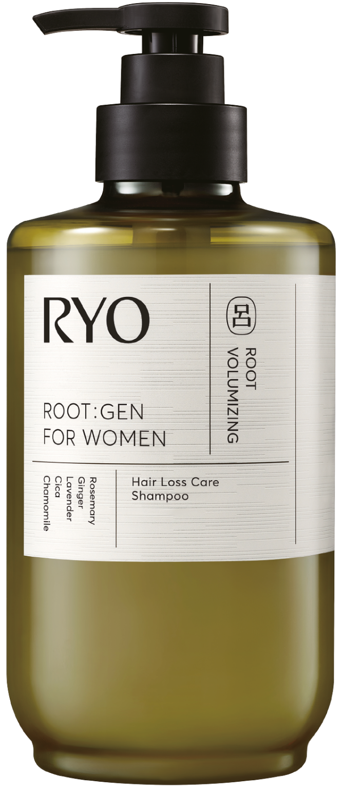
RYO, which pursues the natural beauty of the scalp, introduces a new ‘ROOT:GEN scalp core reinforcement’ line containing a more fundamental scalp solution. It is a follow-up line-up of RYO ROOT:GEN, which has been loved steadily since its launch in 2023 and has established itself as a representative care line for female hair loss symptoms, targeting the scalp market in earnest in the summer. The color that intuitively captures the cooling feeling of the product and the more sophisticated label design effectively meets the needs of the scalp’s cleanliness, soothing and cooling, especially in summer, and completes ROOT:GEN’s own premium sensibility and elegant aesthetics.
RYO, which pursues the natural beauty of the scalp, introduces a new ‘ROOT:GEN scalp core reinforcement’ line containing a more fundamental scalp solution. It is a follow-up line-up of RYO ROOT:GEN, which has been loved steadily since its launch in 2023 and has established itself as a representative care line for female hair loss symptoms, targeting the scalp market in earnest in the summer. The color that intuitively captures the cooling feeling of the product and the more sophisticated label design effectively meets the needs of the scalp’s cleanliness, soothing and cooling, especially in summer, and completes ROOT:GEN’s own premium sensibility and elegant aesthetics.
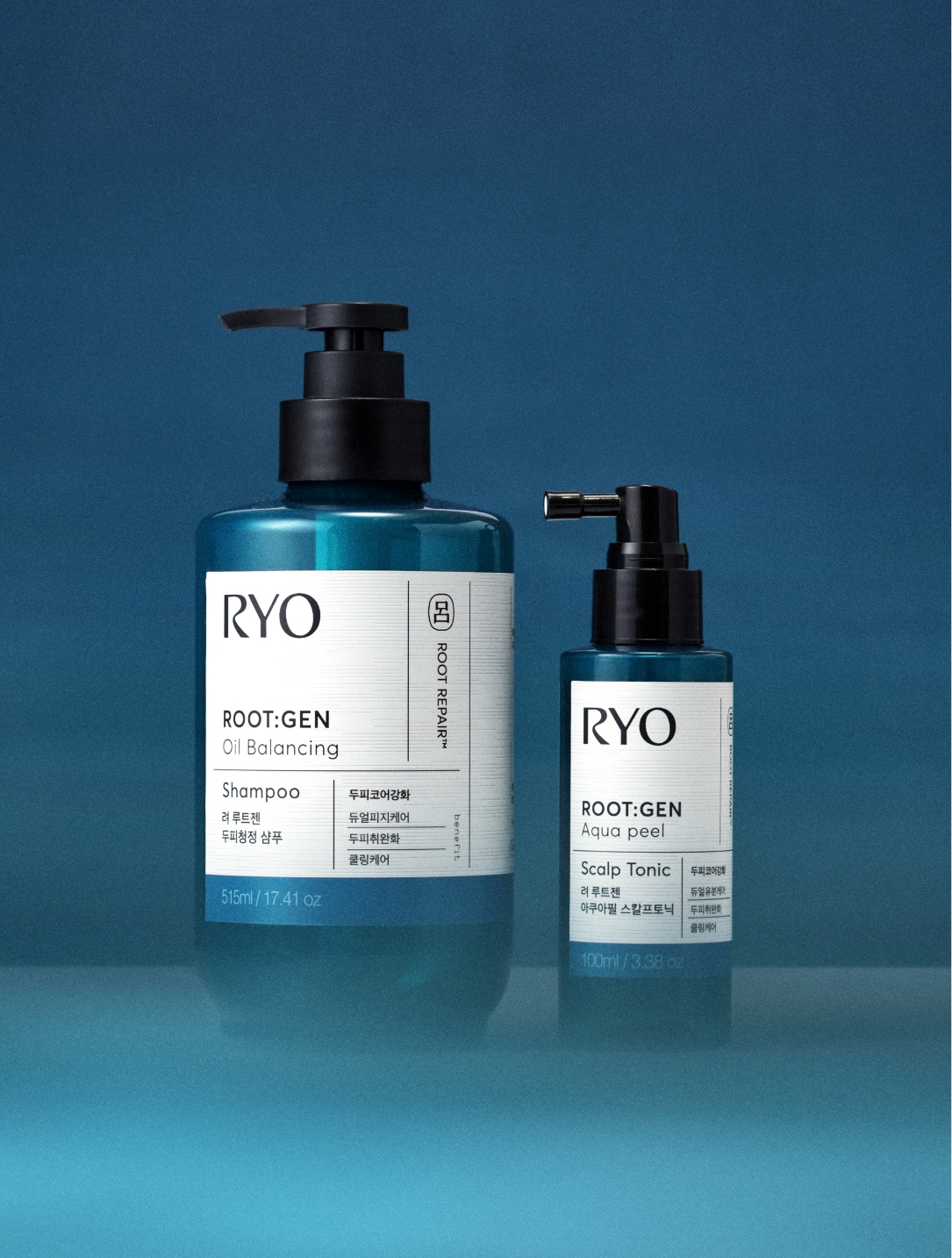
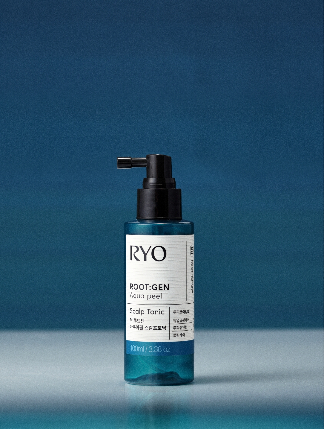
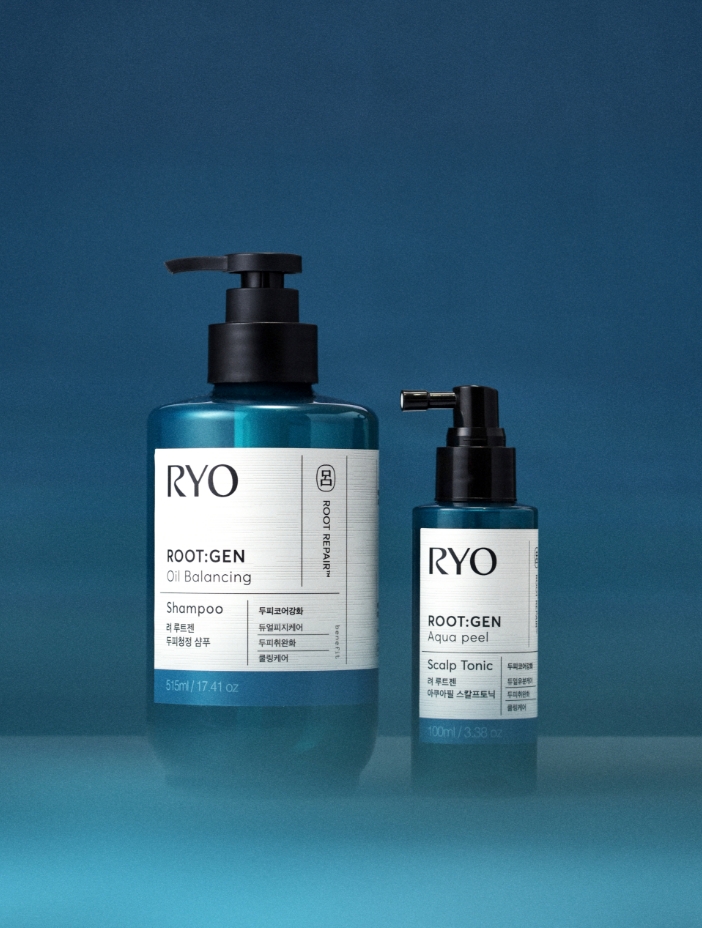
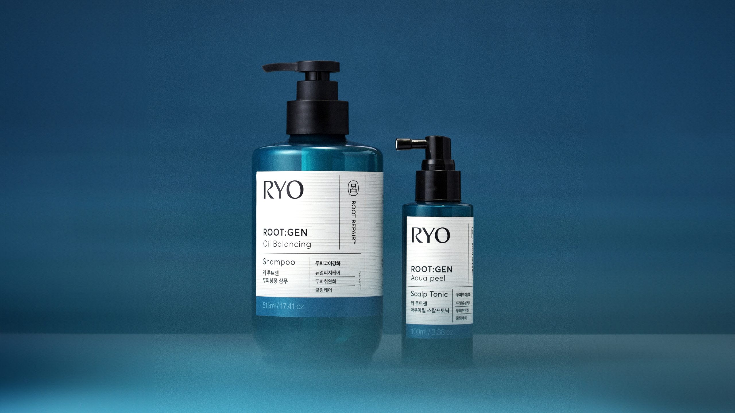
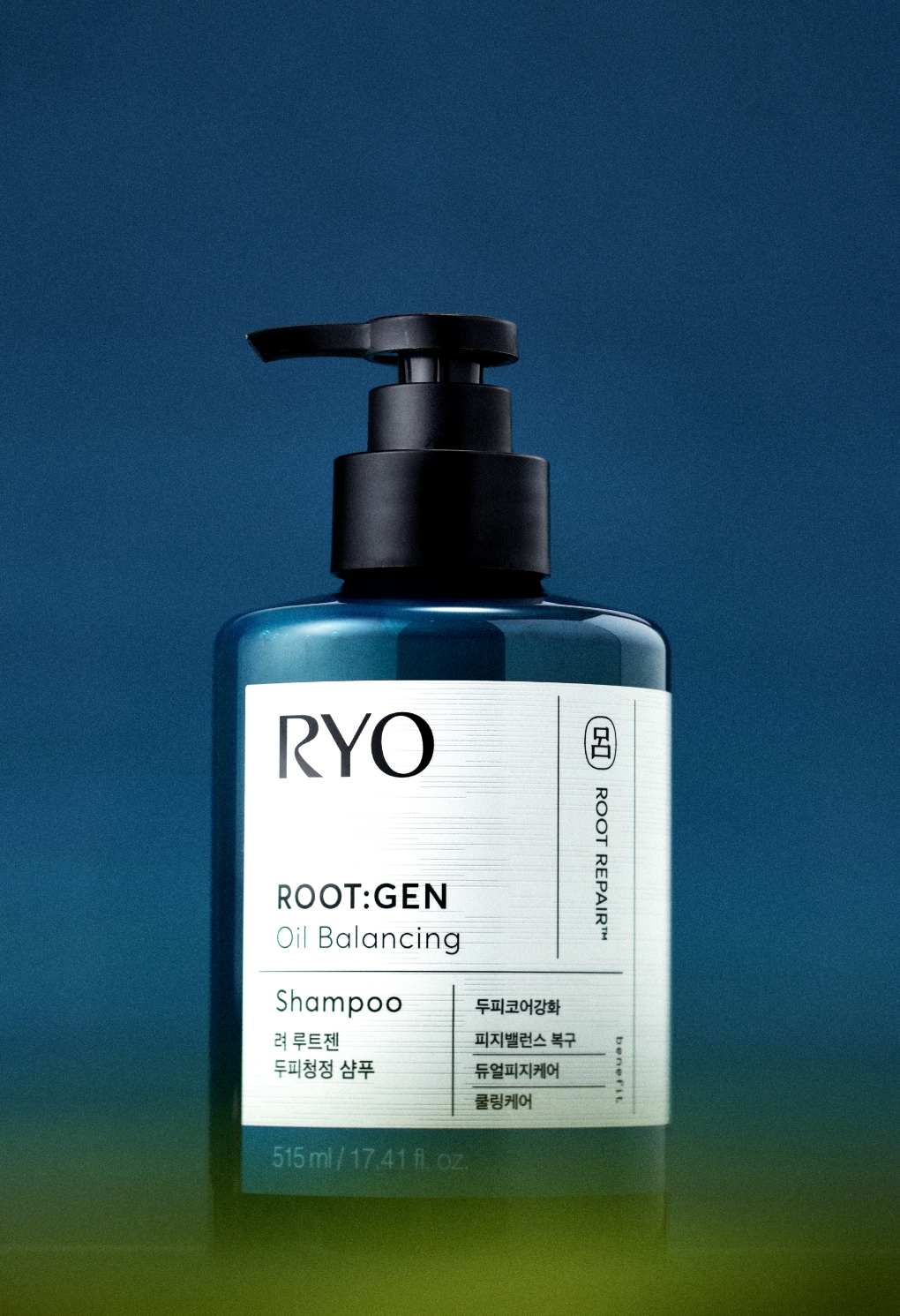
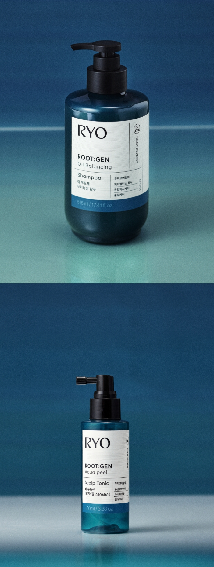
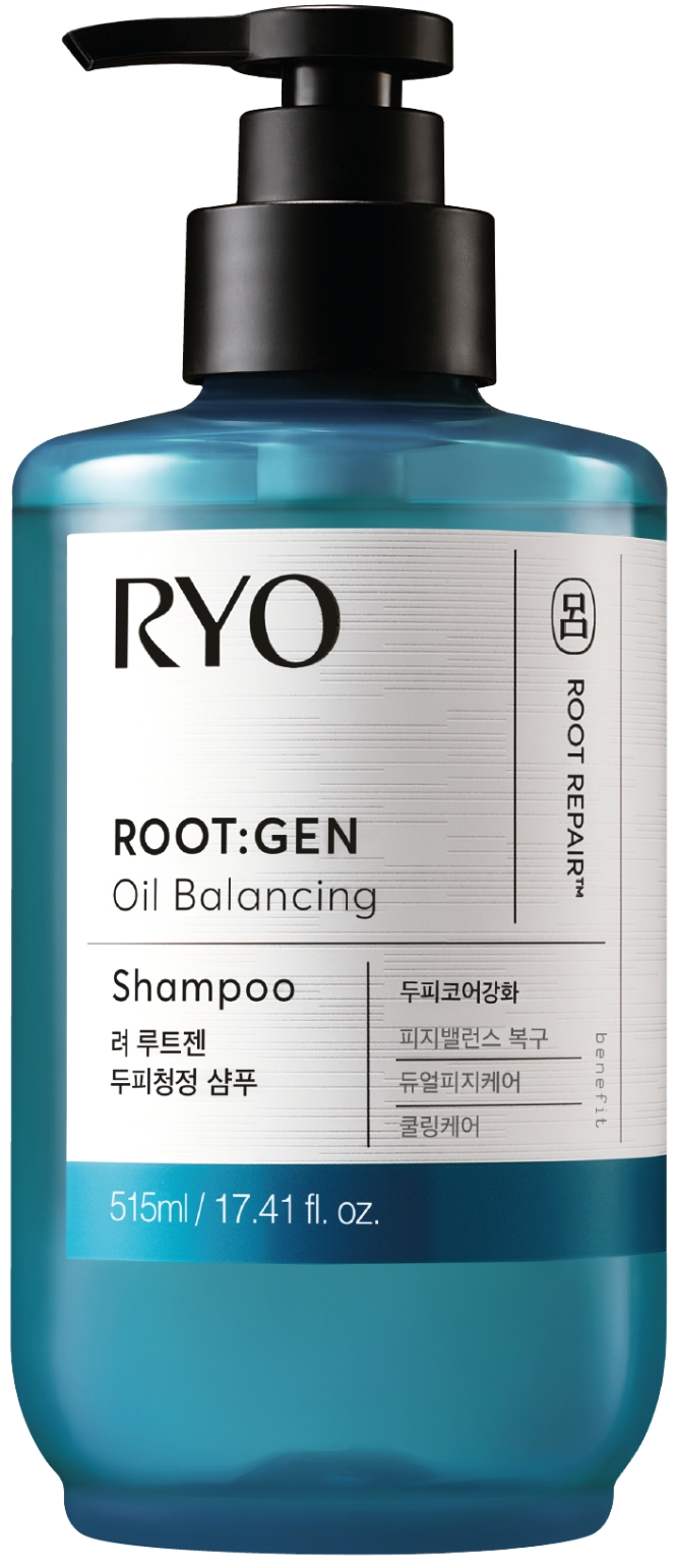
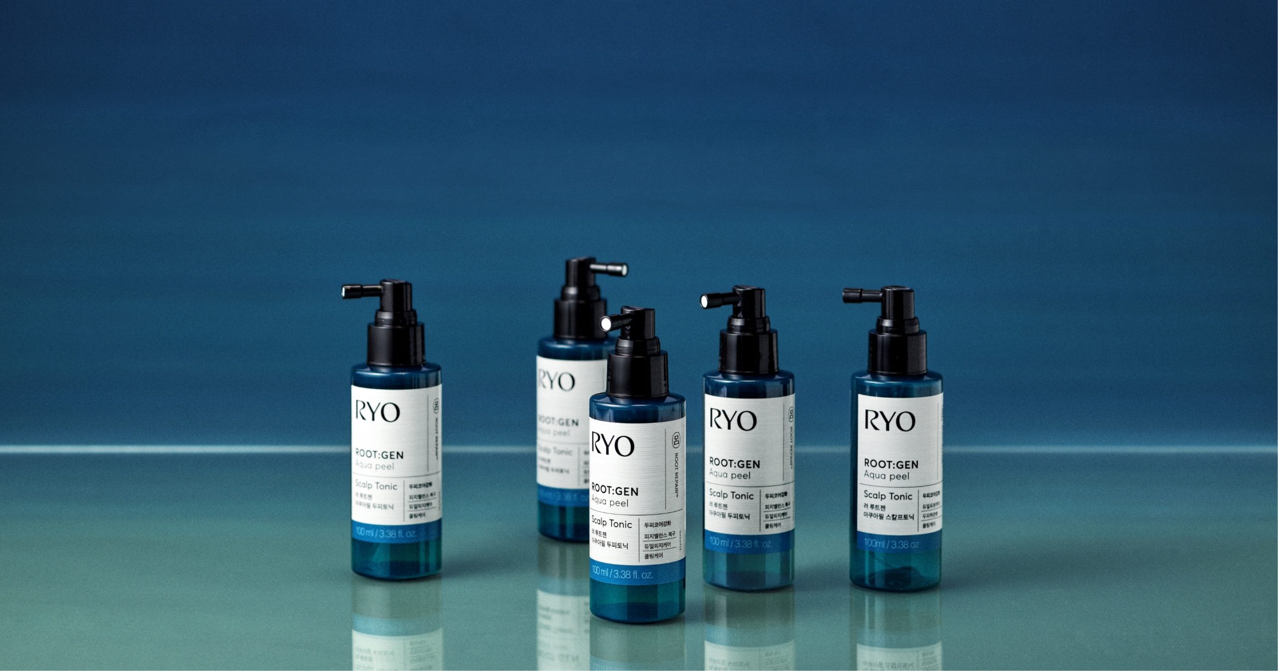
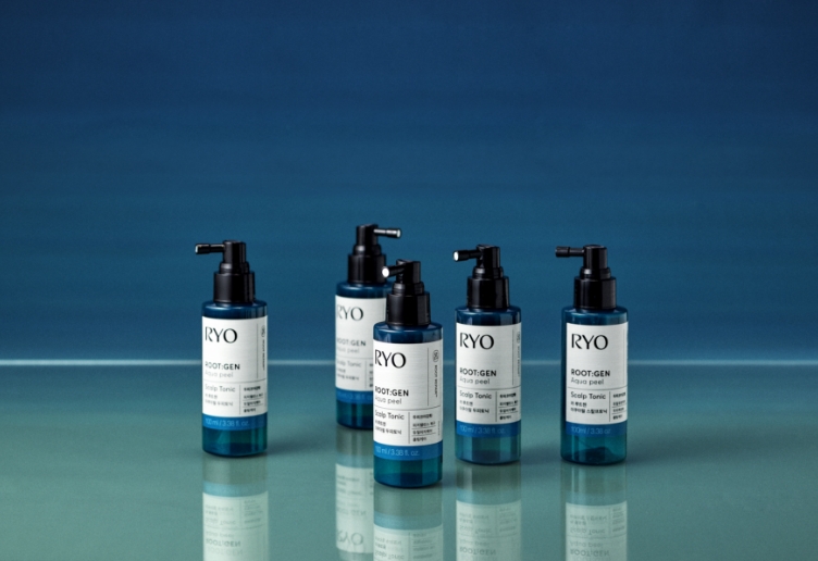
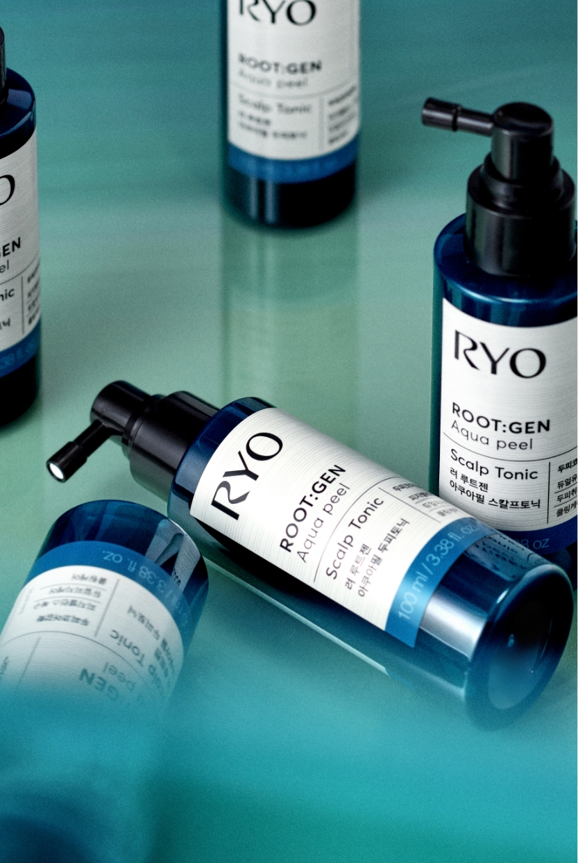
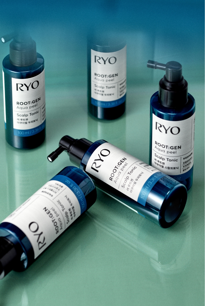
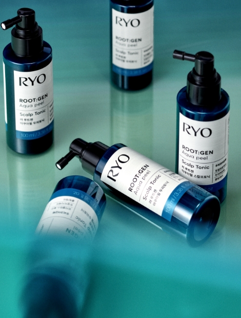
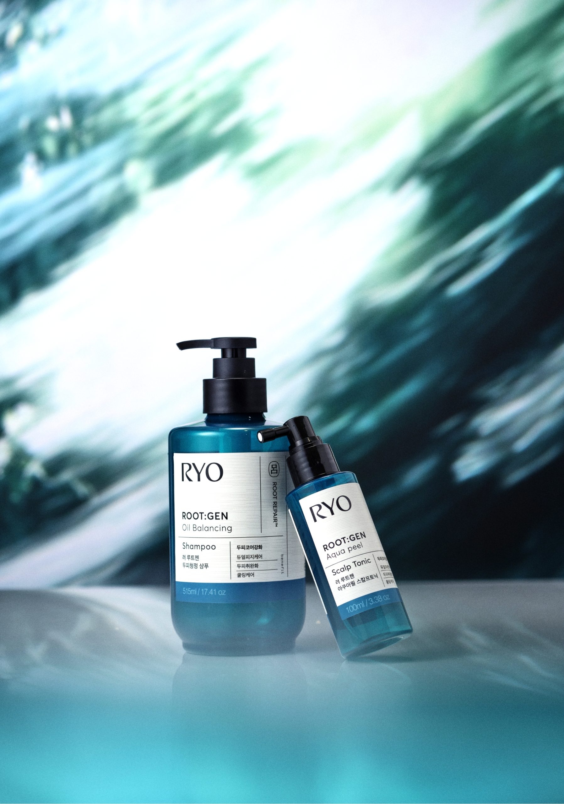
려 루트젠 두피 코어 강화 라인은 샴푸와 토닉 2종으로 출시되어 피지 밸런스를 맞추고 두피의 자생력을 강화하는 데 중점을 두고 있습니다.
루트젠 라인의 처방전 라벨 디자인을 이어받아, 두피코어강화 라인 역시 일관되게 ASIAN PHYTO SCIENCE의 이미지를 전달합니다.
루트젠 라인의 처방전 라벨 디자인을 이어받아, 두피코어강화 라인 역시 일관되게 ASIAN PHYTO SCIENCE의 이미지를 전달합니다.
The RYO ROOT:GEN scalp core reinforcement line comes in two types: shampoo and tonic, focusing on balancing sebum and strengthening scalp self-sustainability. Taking over ROOT:GEN Line’s prescription label design, scalp core reinforcement lines also consistently deliver images of ASIAN PHYTO SCIENCE.
Color
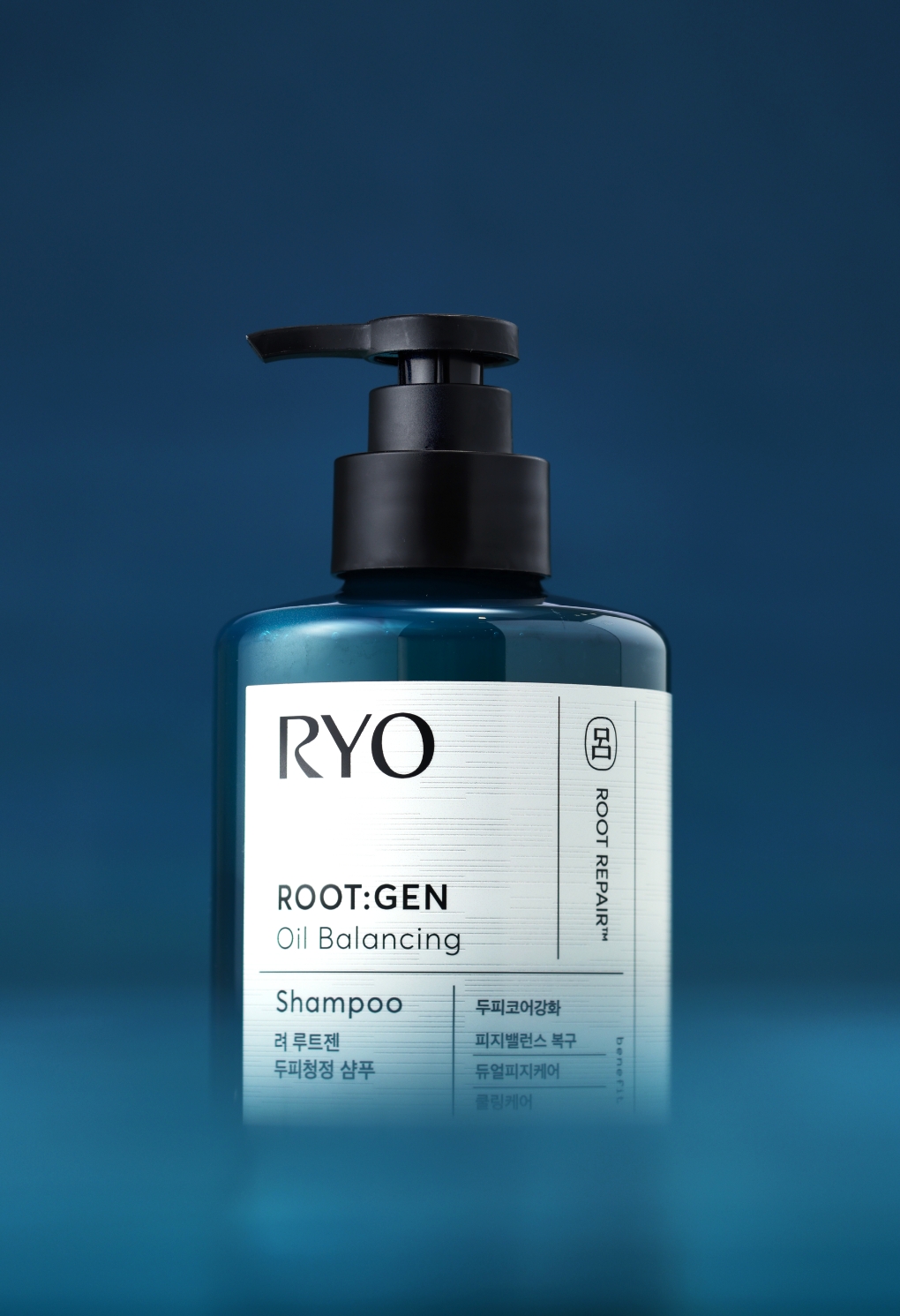
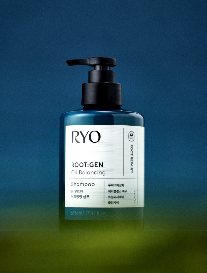
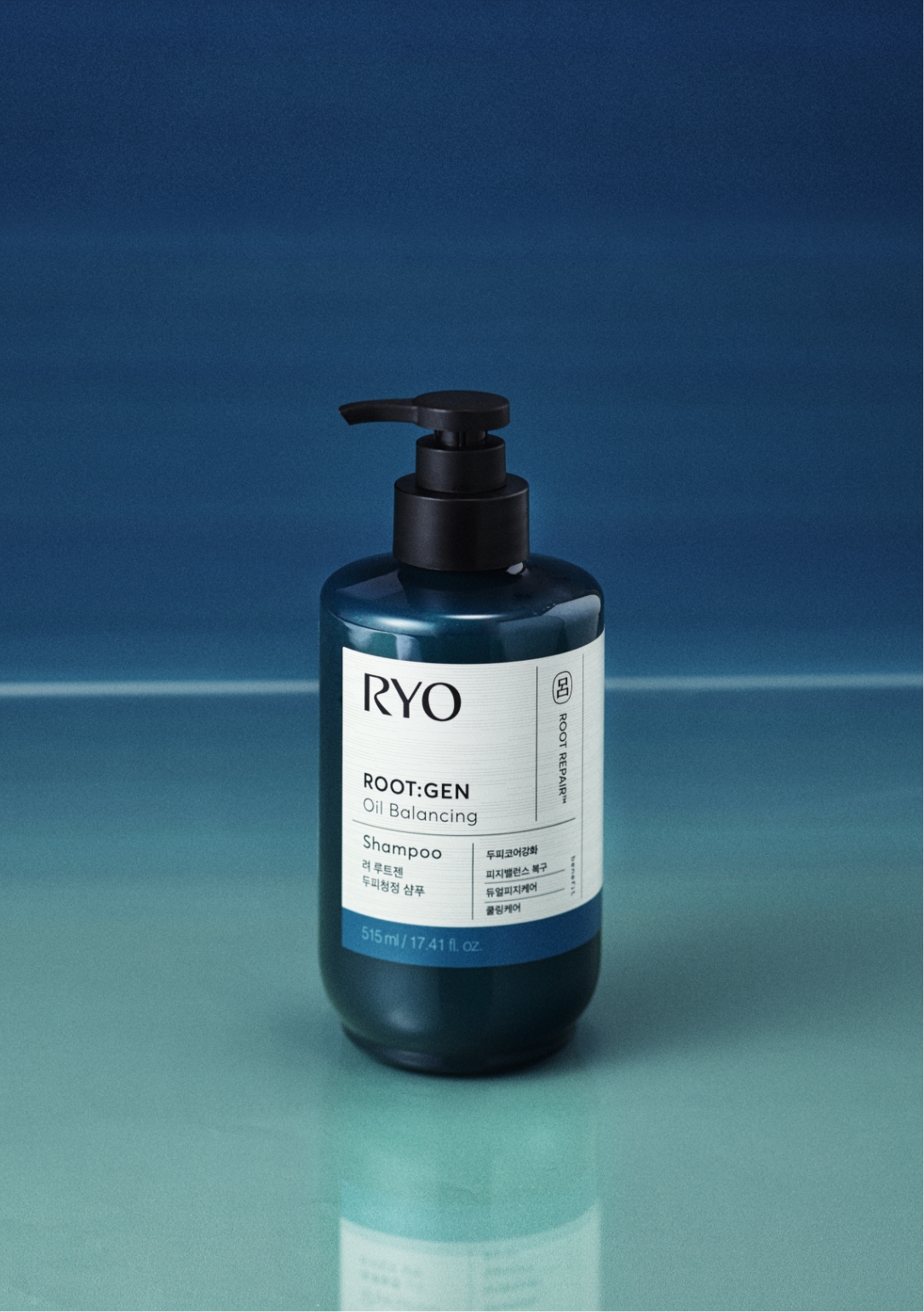
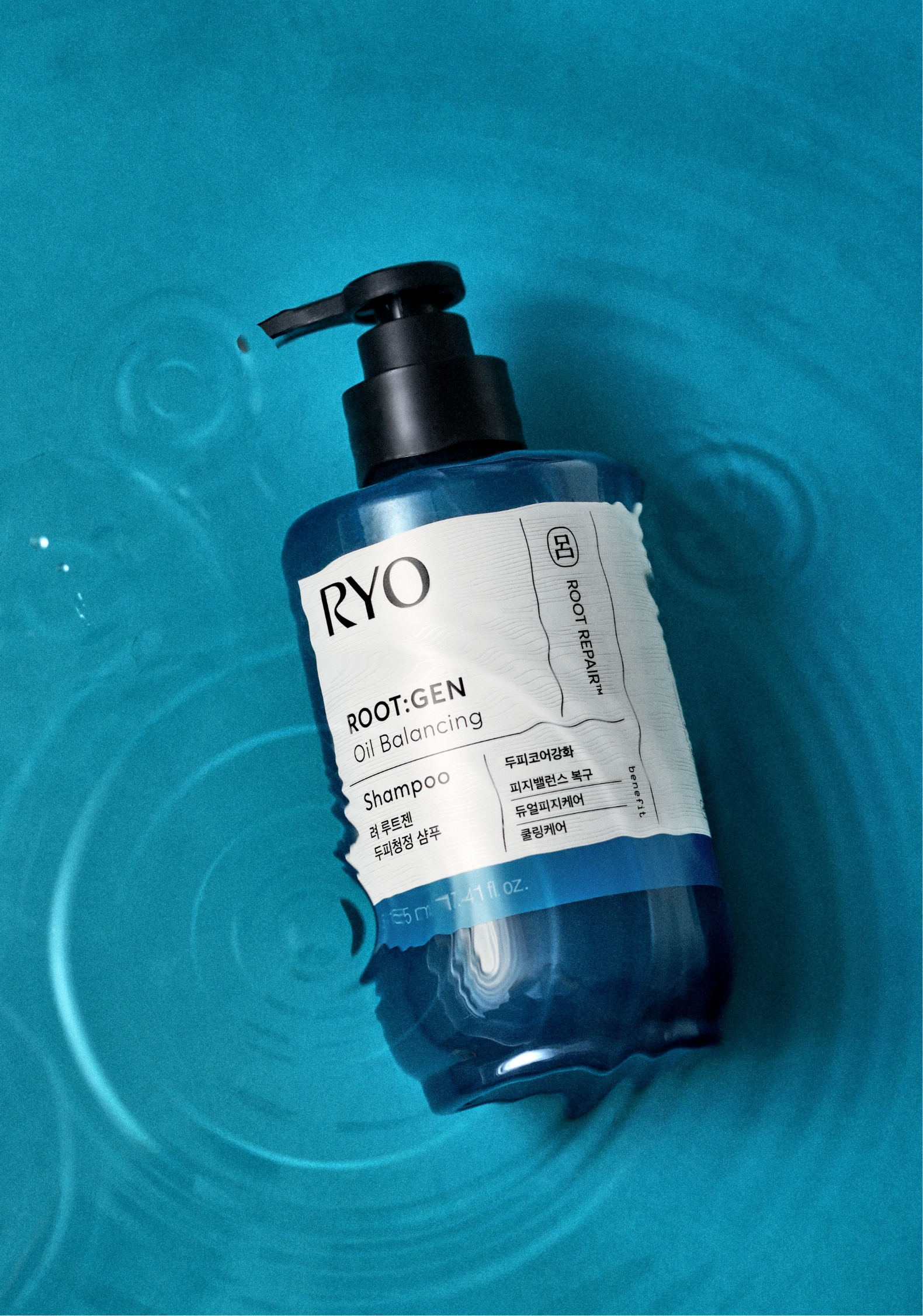
제품 디자인을 진행하는데 있어 가장 주력한 점은 제품 컬러를 선정하는 것이었습니다. 기존 루트젠의 올리브 컬러와 잘 어울리면서도 무더운 날씨 속에서도 두피를 시원하고 상쾌하게 유지할 수 있는 제품 속성을 전달하기 위해, 직관적인 딥블루 컬러를 적용했습니다. 새벽 하늘을 닮은 이 딥블루 컬러는 사용 직후 두피 온도를 -9도 낮추는 쿨링 효과를 시각적으로 표현하며, 제품의 핵심 기능을 직관적으로 전달합니다. 절제된 톤의 색감은 편안함과 깊은 신뢰감을 주며, 디자인 전반에 프리미엄 감성을 더합니다. 특히, 두피 코어를 강화해 근본적인 개선을 이끌어낸다는 점에서 깊이감 있는 블루컬러는 본질적인 케어의 가치를 강조합니다.
When it comes to designing the product, the main focus was to select the color of the product. Intuitive deep blue color was applied to deliver the product properties that go well with the olive color of ROOT:GEN and can keep the scalp cool and fresh in hot weather. This deep blue color, which resembles a dawn sky, visually expresses the cooling effect of lowering the scalp temperature by -9 degrees right after use and intuitively conveys the core functions of the product. The understated tone of color gives comfort and deep trust, adding premium sensibility to the overall design. In particular, the deep blue color emphasizes the value of essential care, as it strengthens the scalp core to lead to fundamental improvement.
Layout
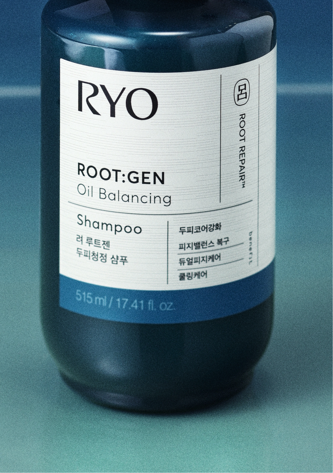
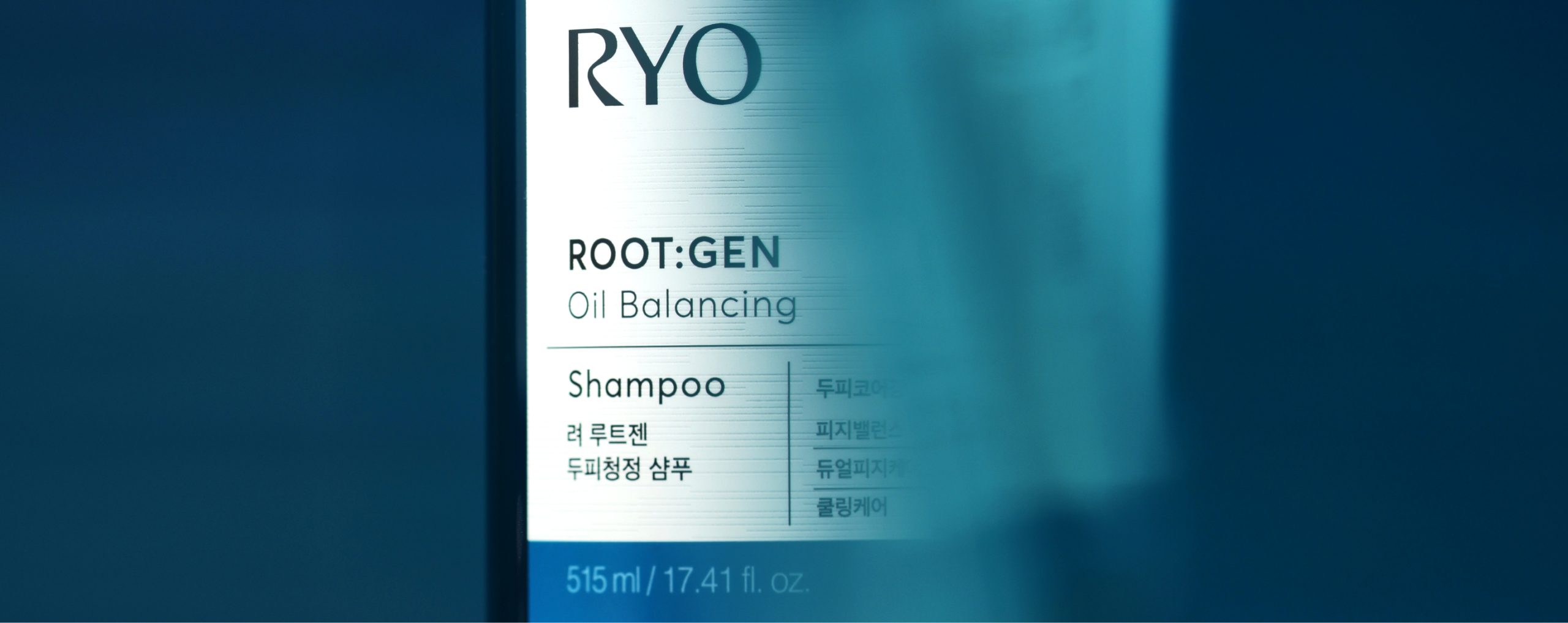
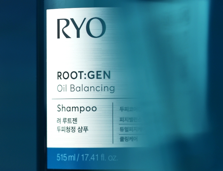
ROOT:GEN 라인의 처방 라벨 디자인과 그리드 구조는 유지하면서, Hierarchy를 재정립하고 한글의 비중을 확대하여 가독성을 높였습니다.
라인명인 ROOT:GEN은 더욱 볼드하게 처리해 루트젠 라인의 확장성과 브랜드 아이덴티티를 강화하였으며,
제품명과 주요 효능은 한글로 명확하게 표기해 각 제품의 기능과 특징을 한눈에 인지할 수 있도록 설계했습니다.
또한, 글로벌 용량 표기에 따라 라벨이 길어 보이지 않도록 하단에 용기컬러와 동일한 컬러바를 넣어,
기존 ROOT:GEN 라인과의 디자인 연속성을 유지했습니다.
라인명인 ROOT:GEN은 더욱 볼드하게 처리해 루트젠 라인의 확장성과 브랜드 아이덴티티를 강화하였으며,
제품명과 주요 효능은 한글로 명확하게 표기해 각 제품의 기능과 특징을 한눈에 인지할 수 있도록 설계했습니다.
또한, 글로벌 용량 표기에 따라 라벨이 길어 보이지 않도록 하단에 용기컬러와 동일한 컬러바를 넣어,
기존 ROOT:GEN 라인과의 디자인 연속성을 유지했습니다.
While maintaining the prescription label design and grid structure of the existing ROOT:GEN line,
Hierarchy was re-established and the weight of Hangeul(Korean alphabet) was expanded to increase readability.
The line name ROOT:GEN has been bolder to enhance the scalability and brand identity of the ROOT:GEN line,
The product name and main efficacy are clearly marked in Korean so that the functions and characteristics of each product can be recognized at a glance. Also, put the same color bar as the container color at the bottom so that the label does not look long according to the global capacity mark, Design continuity with the existing ROOT:GEN line was maintained.
려 루트젠
탈모전문케어 여성샴푸
탈모전문케어 여성샴푸
려 루트젠
두피코어강화 두피청정샴푸
두피코어강화 두피청정샴푸
Visual
자연의 힘을 바탕으로 두피의 근원을 복구하고 이상적인 상태로 회복시키는 자연적 치유 과정을
차분하면서도 리프레시한 무드가 돋보이는 화면을 연출했습니다.
차분하면서도 리프레시한 무드가 돋보이는 화면을 연출했습니다.
Based on the power of nature, the natural healing process of restoring the root of the scalp and restoring it to an ideal state created a calm and refreshing mood.
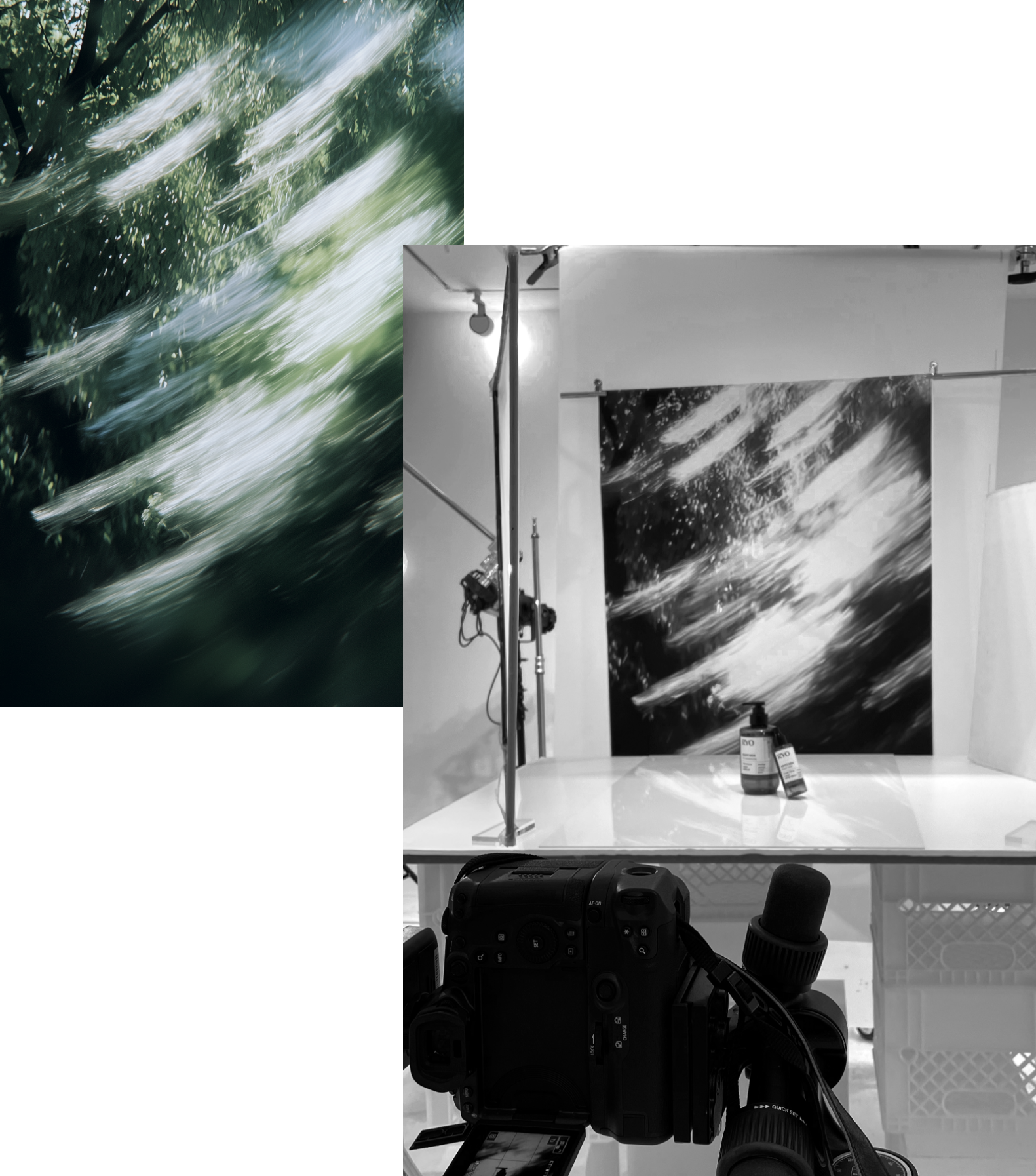
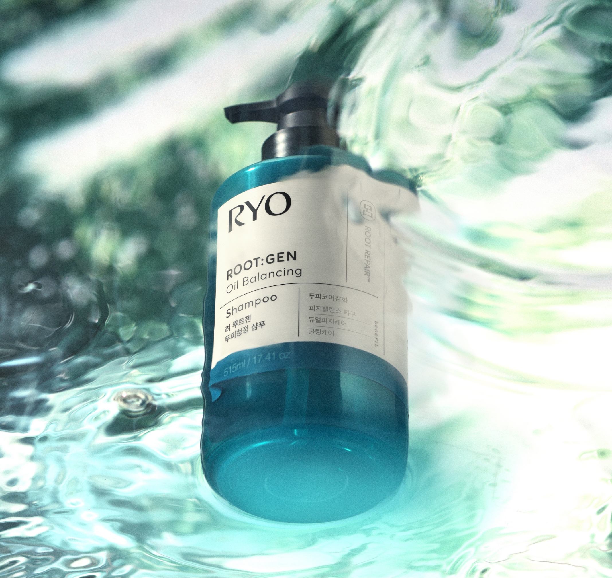
자연의 회복 매커니즘을 모티브로,
비주얼 컨셉은 물 위에 비친 숲, 그 몽환적인 순간에서 시작됐습니다.
시원한 바람과 차가운 공기가 느껴지는 숲의 청량한 인상을 생성형 AI로 구현하였고, 이를 촬영 배경으로 활용해 시각적 깊이를 더했습니다. 또한 투명한 물결 형태와 반사 효과를 통해 쿨링 케어의 효능을 강조하고, 제품의 매력도를 강조하였습니다.
비주얼 컨셉은 물 위에 비친 숲, 그 몽환적인 순간에서 시작됐습니다.
시원한 바람과 차가운 공기가 느껴지는 숲의 청량한 인상을 생성형 AI로 구현하였고, 이를 촬영 배경으로 활용해 시각적 깊이를 더했습니다. 또한 투명한 물결 형태와 반사 효과를 통해 쿨링 케어의 효능을 강조하고, 제품의 매력도를 강조하였습니다.
With the motif of the natural recovery mechanism, the visual concept began with the forest reflected on the water, the dreamy moment. The refreshing impression of the forest where you can feel the cool wind and cold air is implemented in a Generative AI, and it was used as a filming background to add visual depth. It also emphasized the effectiveness of cooling care and the attractiveness of the product through the transparent wave shape and reflection effect.
- Amorepacific Creatives
- Product Design
- 성유진
- Visual Directing
- 성유진
- BM
- 정현주
- Development
- 박승훈
- Photography
- 신상우