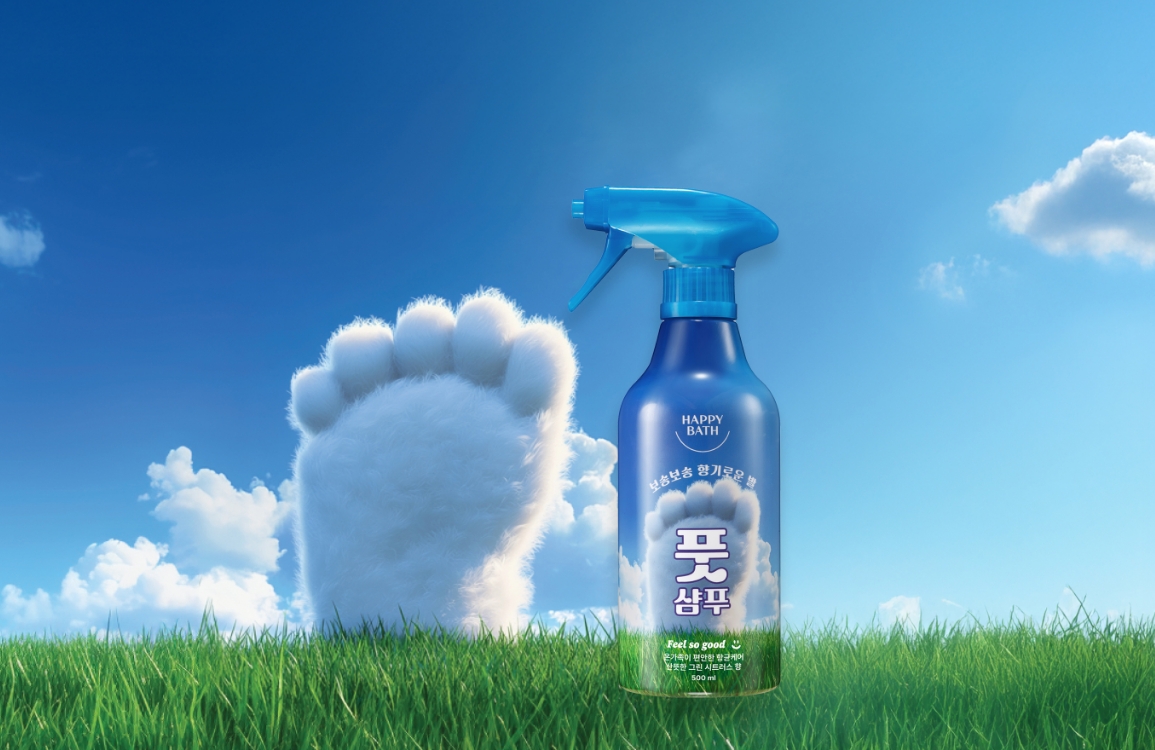
HAPPY BATH_FEEL SO GOOD
해피바스 필쏘굿
해피바스는 브랜드 이름에서부터 ‘행복’이라는 감정을 담고 있습니다.
그래서 ‘행복한 샤워’ 경험을 어떻게 시각적으로 표현할 수 있을지가 늘 프로젝트의 출발점이 됩니다.
새롭게 선보인 Feel so good 라인은 화사한 색감, 직관적인 구성, 그리고 작지만 섬세한 그래픽 디테일을 통해 행복한 샤워를 표현하고자 했습니다.
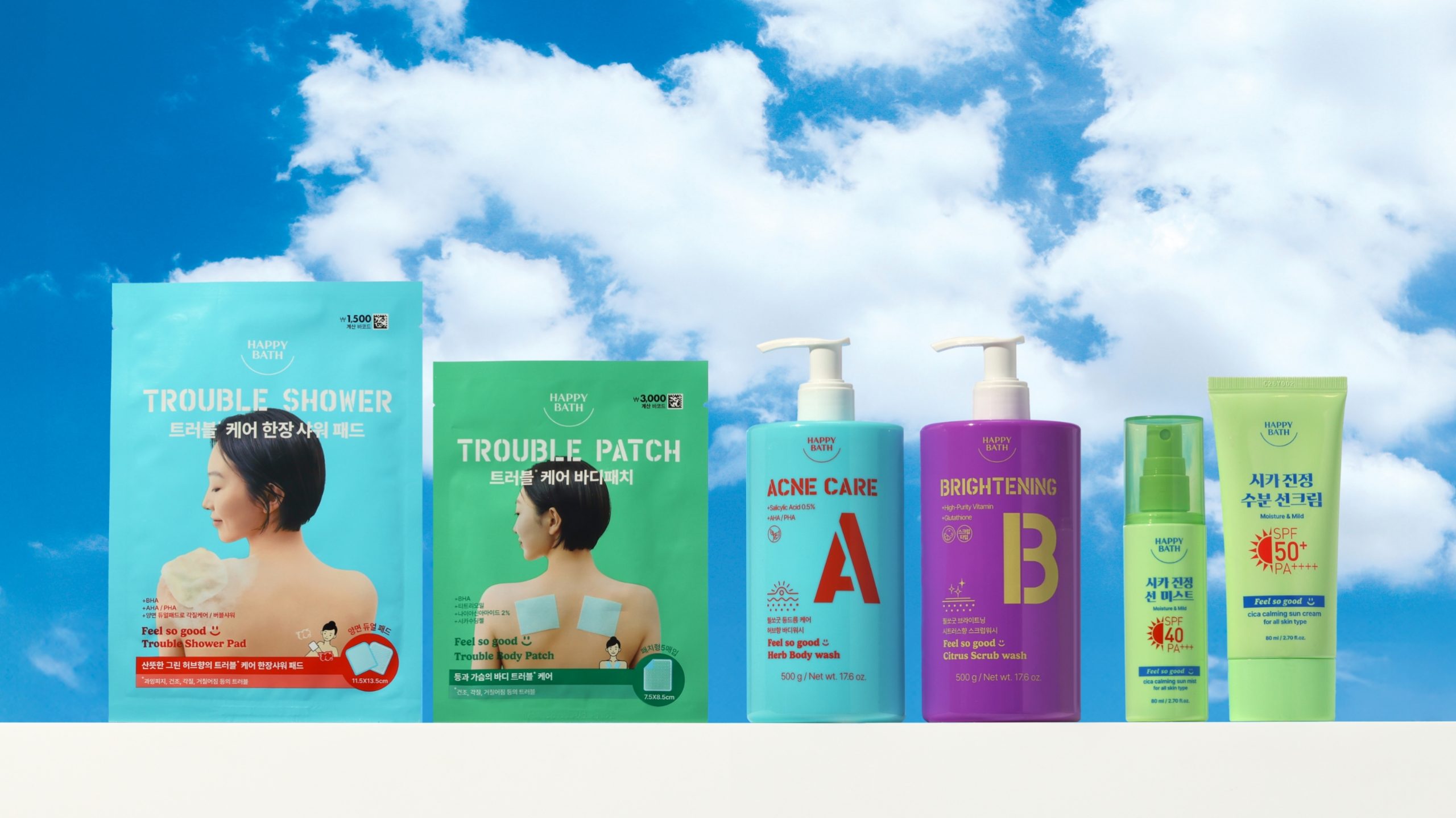
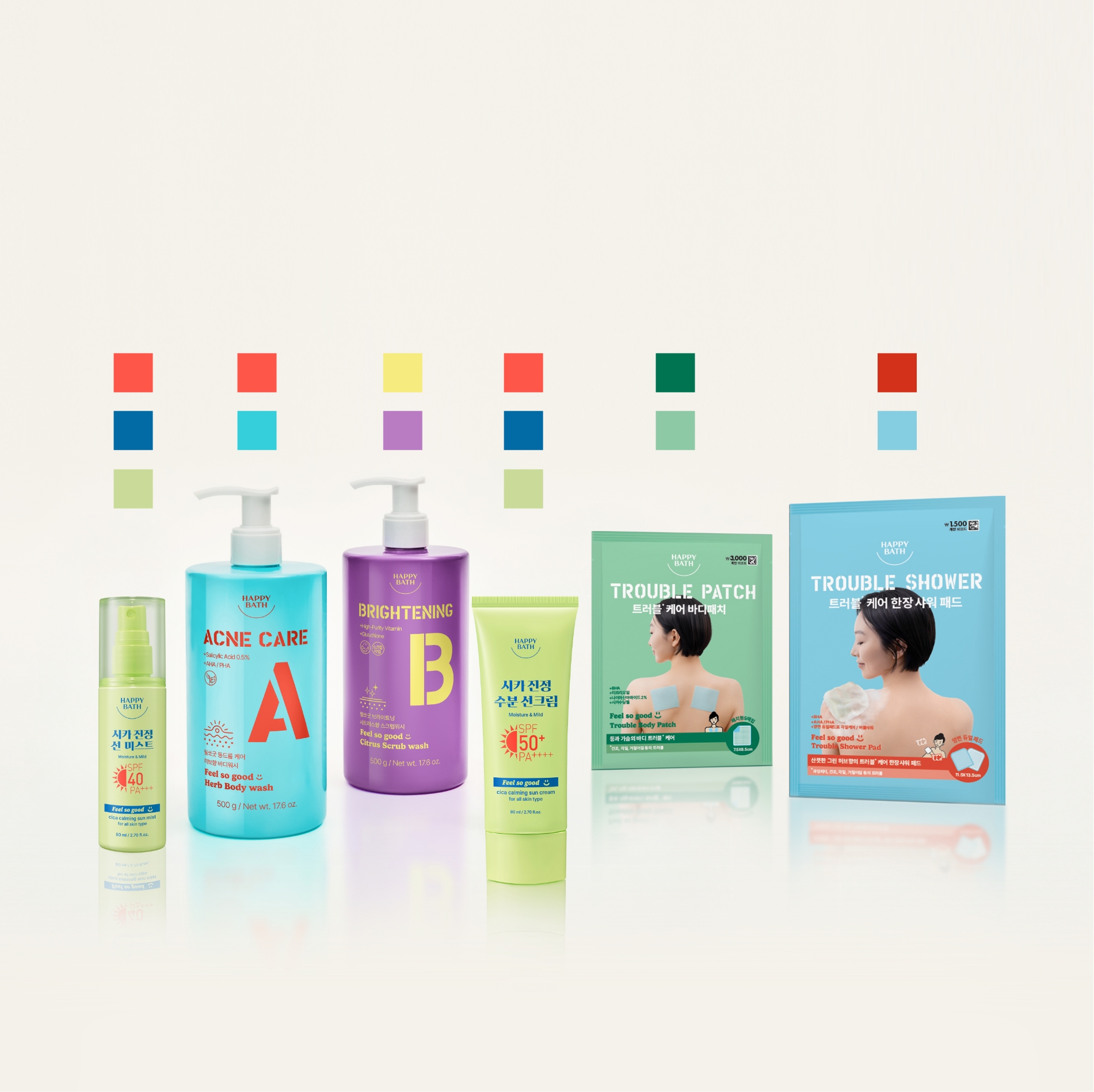
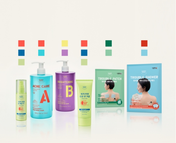
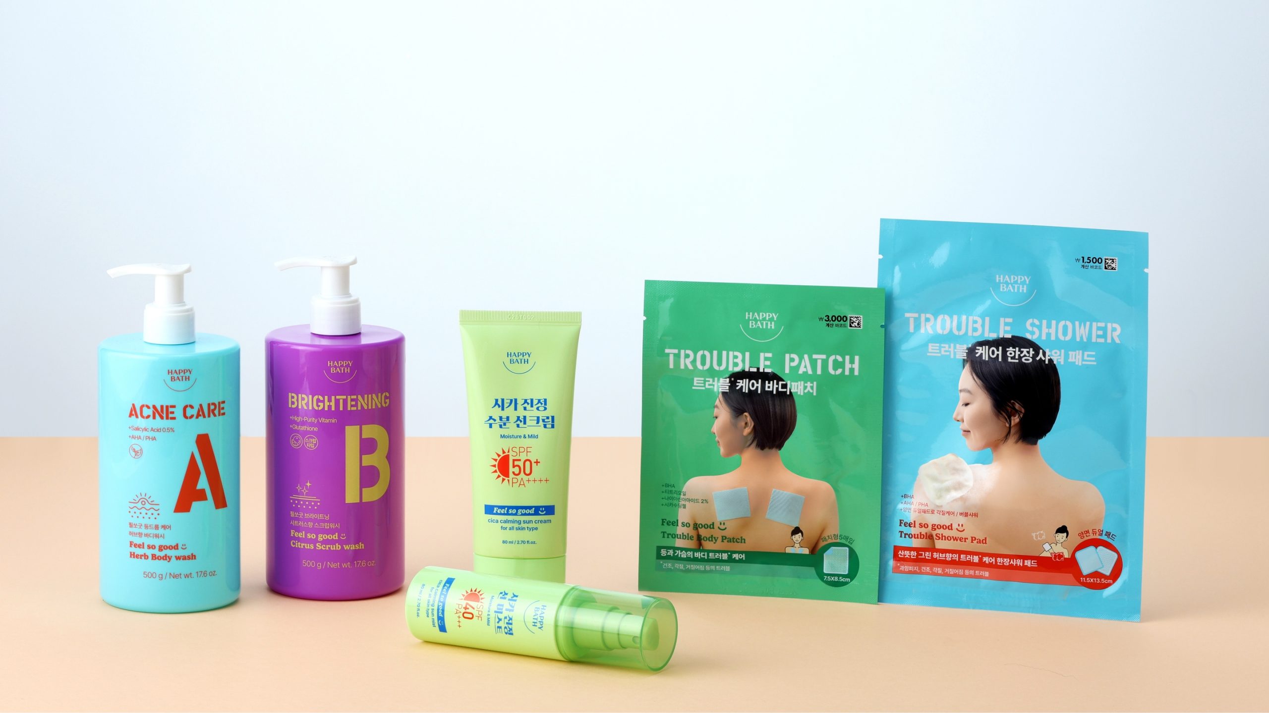
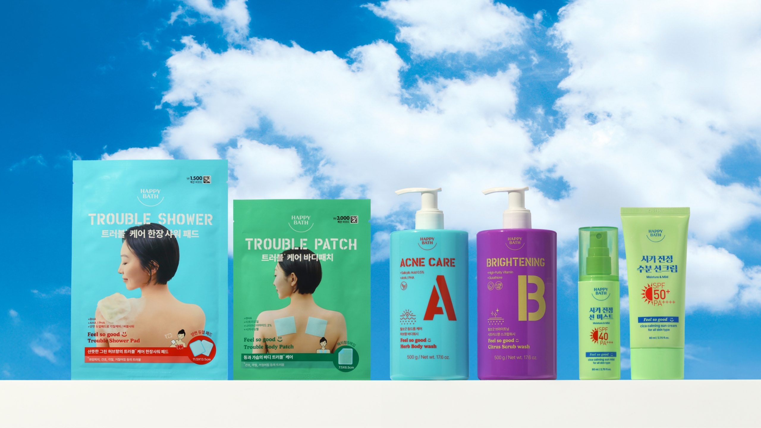
Feel so good 라인은 해피바스의 대표 제품군인 바디워시 이외에도 자외선 케어, 트러블 케어 패치, 샤워 패드 등 다양한 아이템으로 확장되어 있습니다.
제품군의 다양성을 생기 있고 캐주얼한 무드로 풀어내는 동시에, 샤워가 하나의 ‘기분 좋은 휴식’이 되도록 팝한 컬러의 용기와 타이포그래피의 컬러 포인트를 활용해 ‘보는 순간 기분이 환해지는’ 디자인을 완성하고자 했습니다.
그래서 ‘행복한 샤워’ 경험을 어떻게 시각적으로 표현할 수 있을지가 늘 프로젝트의 출발점이 됩니다.
새롭게 선보인 Feel so good 라인은 화사한 색감, 직관적인 구성, 그리고 작지만 섬세한 그래픽 디테일을 통해 행복한 샤워를 표현하고자 했습니다.
Feel so good 라인은 해피바스의 대표 제품군인 바디워시 이외에도 자외선 케어, 트러블 케어 패치, 샤워 패드 등 다양한 아이템으로 확장되어 있습니다.
제품군의 다양성을 생기 있고 캐주얼한 무드로 풀어내는 동시에, 샤워가 하나의 ‘기분 좋은 휴식’이 되도록 팝한 컬러의 용기와 타이포그래피의 컬러 포인트를 활용해 ‘보는 순간 기분이 환해지는’ 디자인을 완성하고자 했습니다.
This article has been translated by an AI.
Happy Bath, true to its name, embraces the feeling of happiness.
Our projects always begin with one key question: How can we translate the experience of a “happy shower” into design?
The newly launched Feel So Good line was created with this idea at its core.
Through vibrant colors, intuitive layouts, and subtle graphic details, the line aims to bring small moments of joy into everyday life.
Centered around our signature body wash, the range extends to include UV care, trouble care patches, and single-use shower pads—each offering a unique solution to everyday skin needs.
We translated this product diversity into a cheerful and casual visual language, combining pop-colored bottles with bold, color-accented typography to create packaging that lifts the mood at a glance.
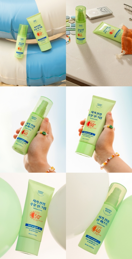
Design Study_1. Sun care
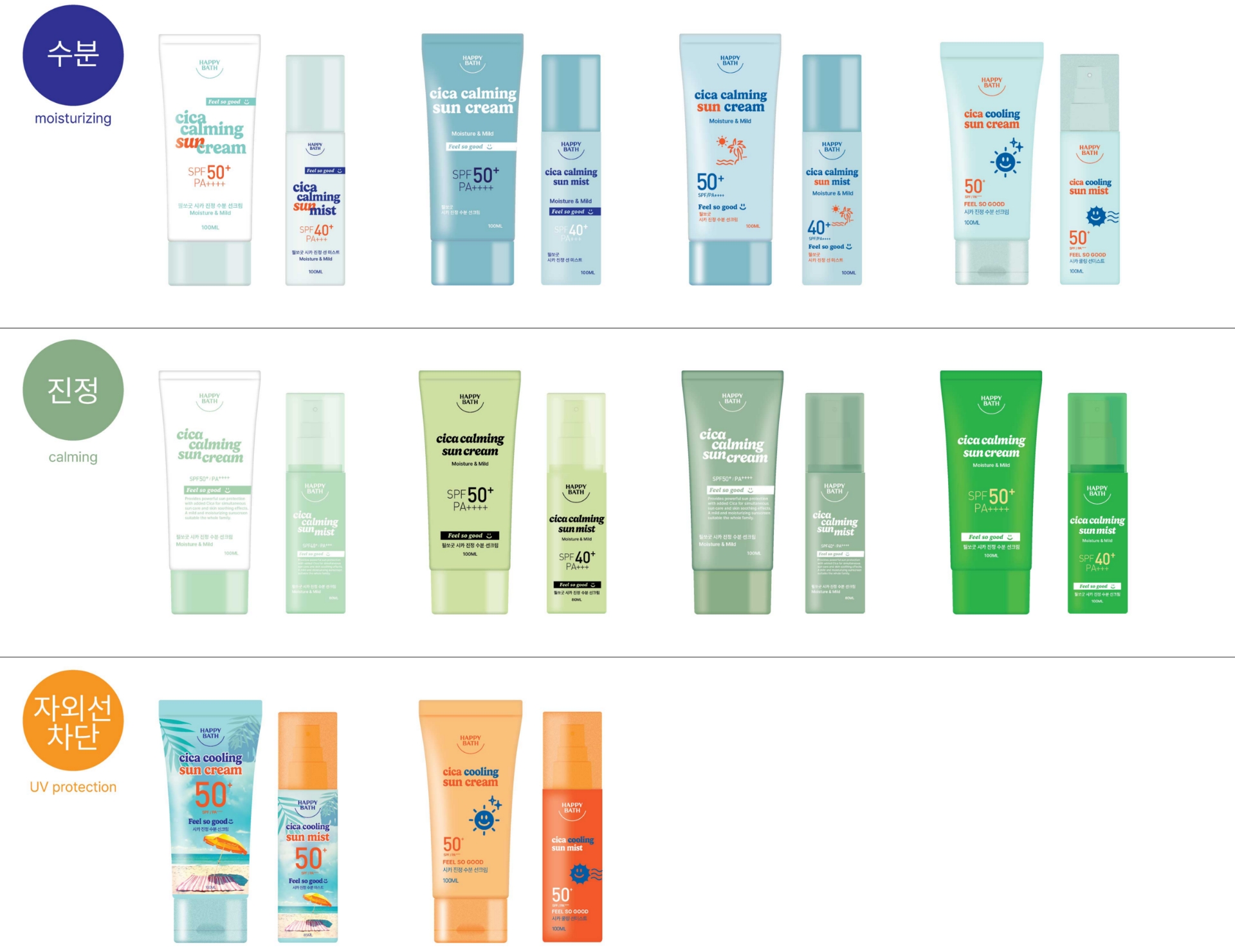
선케어 제품군은 소비자 인식 안에 뚜렷한 컬러 공식이 존재합니다.
수분 케어 = 블루 / 진정 케어 = 그린
/ 톤업 = 핑크 / 자외선 차단 = 오렌지
따라서 어떤 컬러를 메인으로 사용할지 결정하는 것이 디자인 과정의 핵심이었습니다. 해피바스 선케어는 개발 초기 단계에서 명확한 RTB(Reason To Buy)가 설정되지 않은 상태였기 때문에, 여러 컬러군을 시도해보며 가장 설득력 있게 기능을 전달할 수 있는 색 조합을 구체화해 나가는 과정을 거쳤습니다.
수분 케어 = 블루 / 진정 케어 = 그린
/ 톤업 = 핑크 / 자외선 차단 = 오렌지
따라서 어떤 컬러를 메인으로 사용할지 결정하는 것이 디자인 과정의 핵심이었습니다. 해피바스 선케어는 개발 초기 단계에서 명확한 RTB(Reason To Buy)가 설정되지 않은 상태였기 때문에, 여러 컬러군을 시도해보며 가장 설득력 있게 기능을 전달할 수 있는 색 조합을 구체화해 나가는 과정을 거쳤습니다.
When it comes to sun care, consumers already associate specific colors with key functions:
Blue for moisture care / Green for soothing / Pink for tone-up / Orange for UV protection
Choosing the right main color was therefore a crucial part of the design process.
Since the product was still in development and a clear RTB (Reason to Buy) had not yet been finalized, we explored a range of color directions to find the most persuasive and visually effective combination for communicating the product’s benefits.
Design Study_2. Body wash
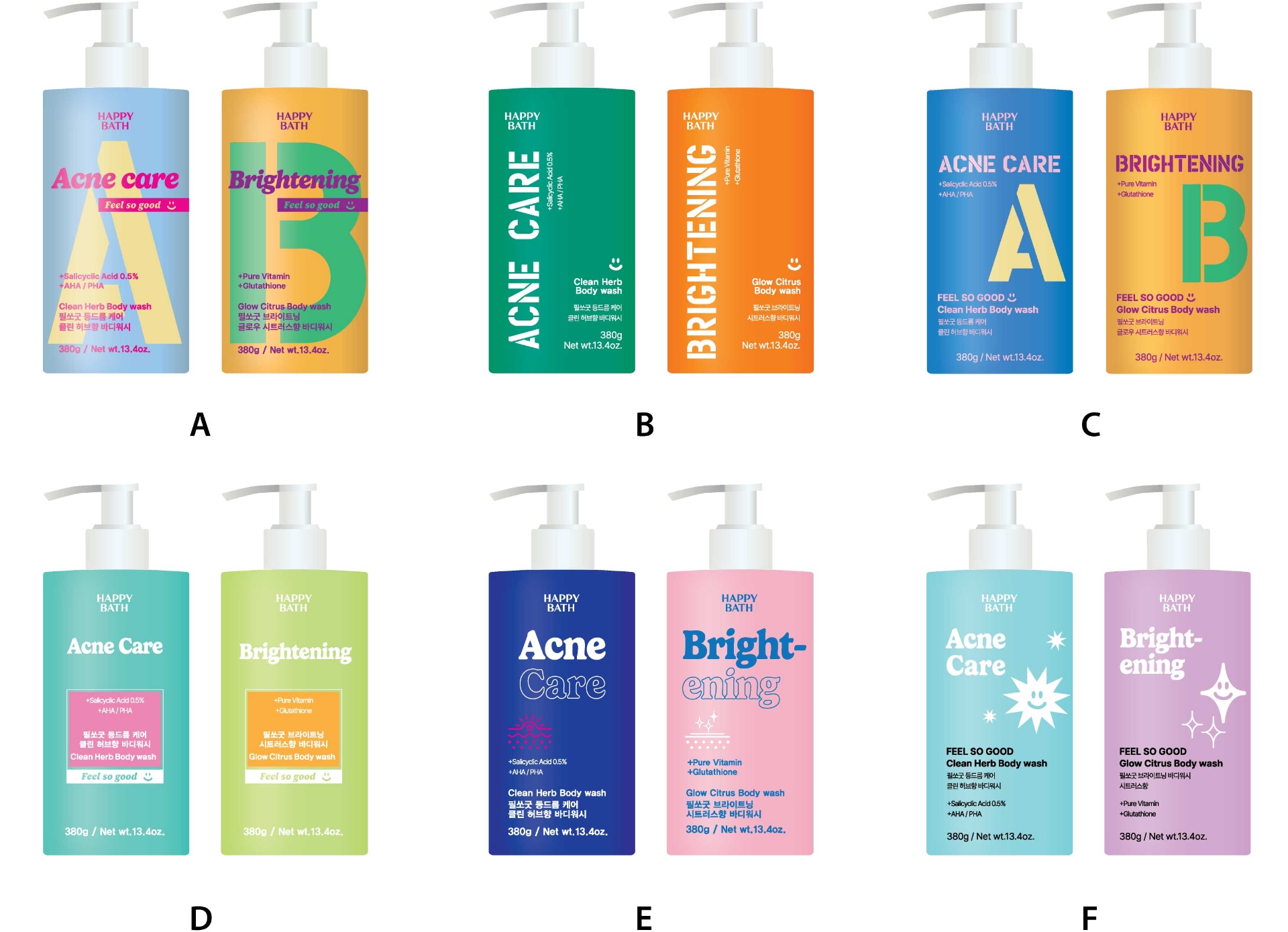
선케어가 기능에 따른 컬러 적용을 고민 했다면 필쏘굿 바디워시는 다이소 전용 제품으로 다이소의 판매 환경을 이해 하는 것이 중요했습니다.
마일드한 컬러보다는 대비가 명확한 컬러들이 매대에서 주목받을 수 있는 환경이어서 채도가 높은 용기 컬러 위주로 시안을 전개하고 제품에 적용될 타이포그래피요소들도 사이즈를 키워 한눈에 들어 올 수 있도록했습니다.
마일드한 컬러보다는 대비가 명확한 컬러들이 매대에서 주목받을 수 있는 환경이어서 채도가 높은 용기 컬러 위주로 시안을 전개하고 제품에 적용될 타이포그래피요소들도 사이즈를 키워 한눈에 들어 올 수 있도록했습니다.
This body wash was designed exclusively for DAISO, which meant understanding the unique in-store display and shopper behavior was ess-ential.
Mild colors tend to blend into the background on Daiso shelves, so we opted for high-saturation bottle colors that would stand out more prom-inently.
We also enlarged key typography on the packaging to ensure quick readability and strong visual impact even in a crowded retail setting.
Mild colors tend to blend into the background on Daiso shelves, so we opted for high-saturation bottle colors that would stand out more prom-inently.
We also enlarged key typography on the packaging to ensure quick readability and strong visual impact even in a crowded retail setting.
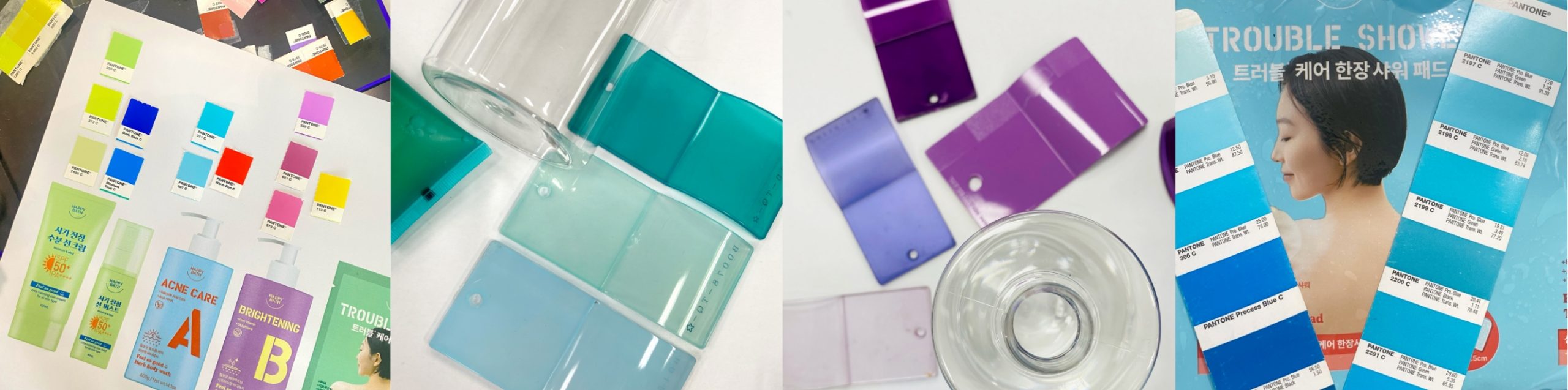
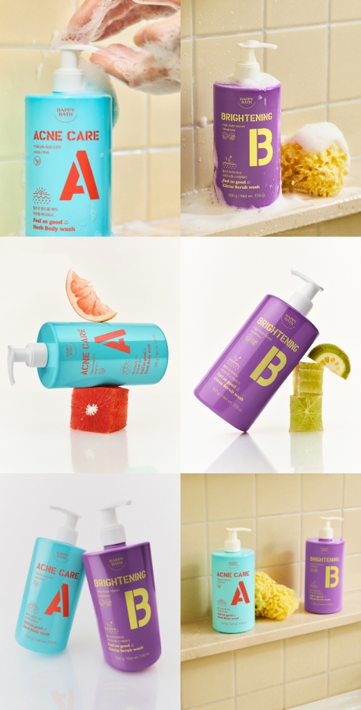
각기 다른 기능을 가진 제품들이 각각의 매력을 살릴 수 있도록 컬러를 적용하면서도, 함께 있을때 조화롭게 어우러질 수 있는 컬러를 찾는 데 중점을 두고 디자인을 진행했습니다.
We focused on selecting colors that not only highlight the unique charm of each product’s function individually,
but also harmonize well when displayed together as a complete lineup.
but also harmonize well when displayed together as a complete lineup.
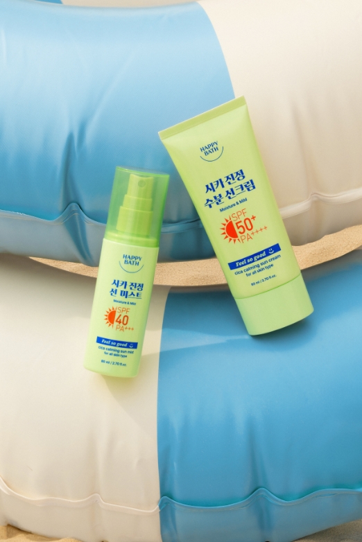
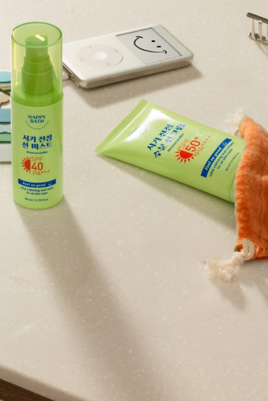
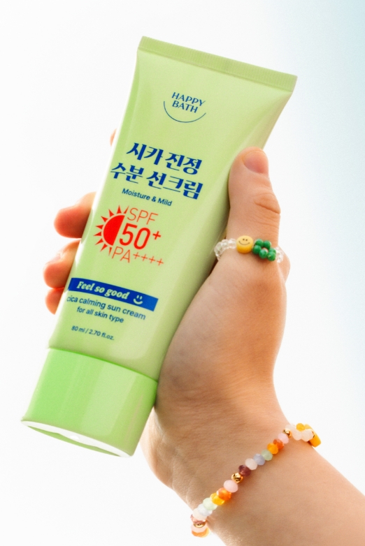
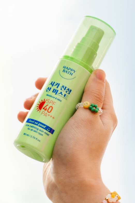
FEEL SO GOOD_Final Design
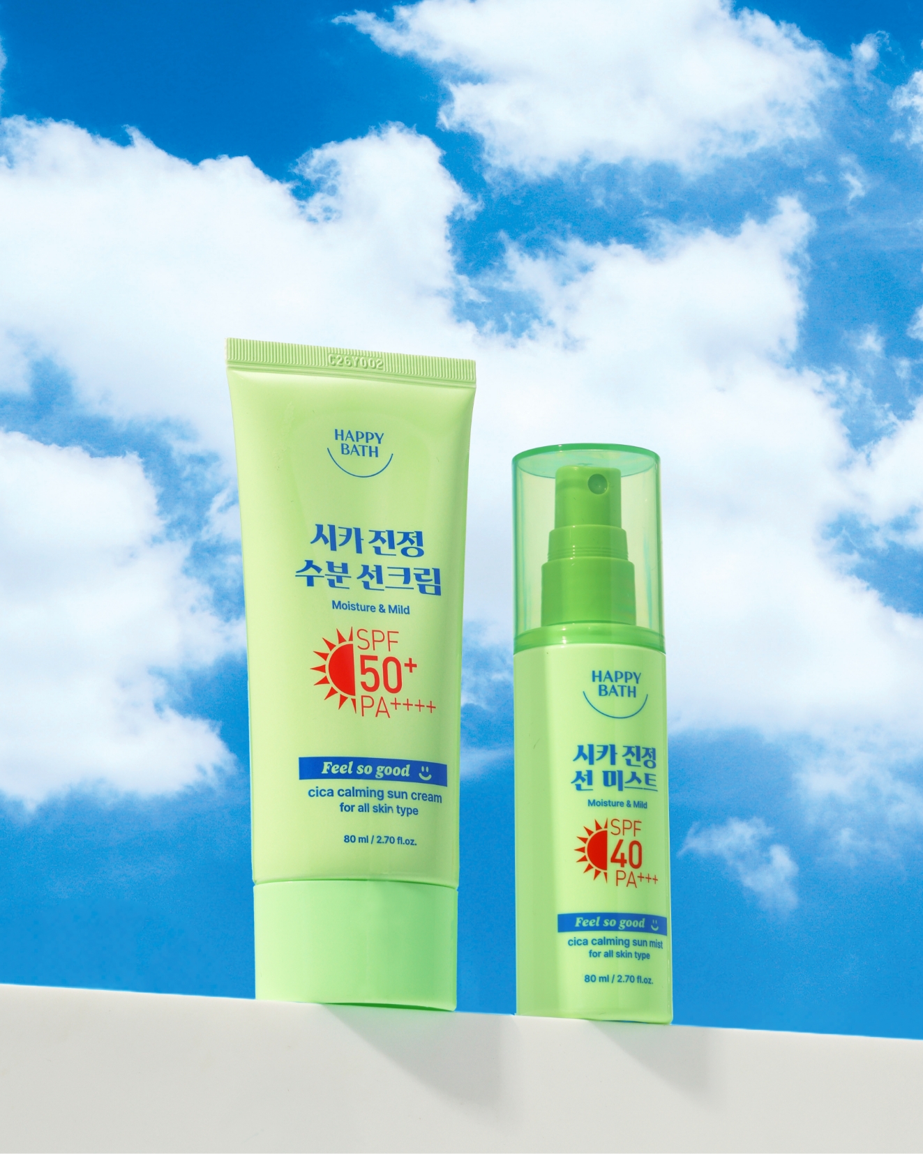
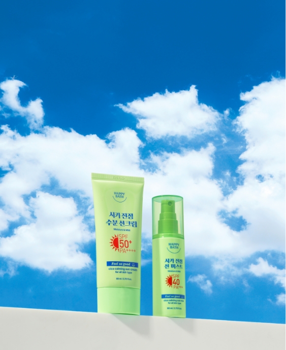
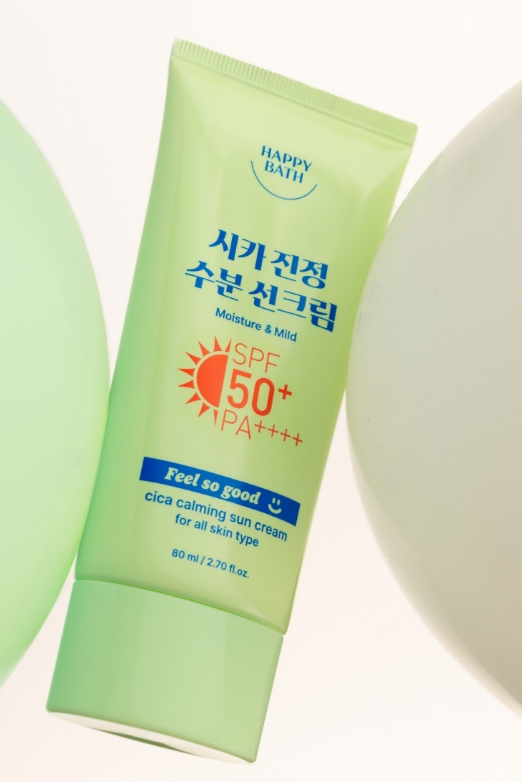
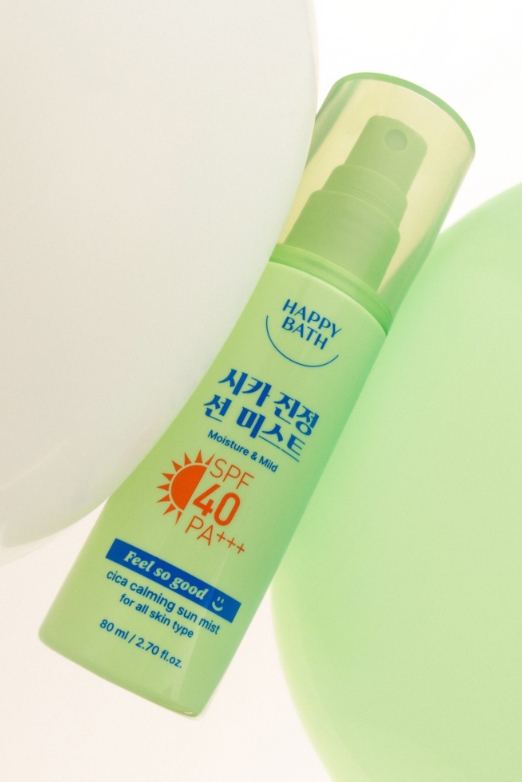
필쏘굿 시카 진정 수분 선크림&시카 진정 선 미스트
FEEL SO GOOD CICA CALMING SUN CREAM
& CICA CALMING SUN MIST
& CICA CALMING SUN MIST
필쏘굿 선크림과 선 미스트는 그린 계열 중에서도 진정 기능이 느껴지도록,
짙은 녹색보다는 부드럽고 크리미한 톤의 그린 컬러를 메인으로 사용했습니다.
또한, 채도 높은 블루 컬러를 타이포그래피의 포인트로 활용하여,
제품의 수분 케어 기능을 시각적으로 표현하고자 했습니다.
짙은 녹색보다는 부드럽고 크리미한 톤의 그린 컬러를 메인으로 사용했습니다.
또한, 채도 높은 블루 컬러를 타이포그래피의 포인트로 활용하여,
제품의 수분 케어 기능을 시각적으로 표현하고자 했습니다.
For the Feel So Good sun cream and sun mist,
we chose a soft, creamy green as the main color—rather than a deep shade— to visually convey the product’s soothing properties.
To emphasize its hydrating benefits, we applied a vivid blue accent to the typography as a color point.
we chose a soft, creamy green as the main color—rather than a deep shade— to visually convey the product’s soothing properties.
To emphasize its hydrating benefits, we applied a vivid blue accent to the typography as a color point.
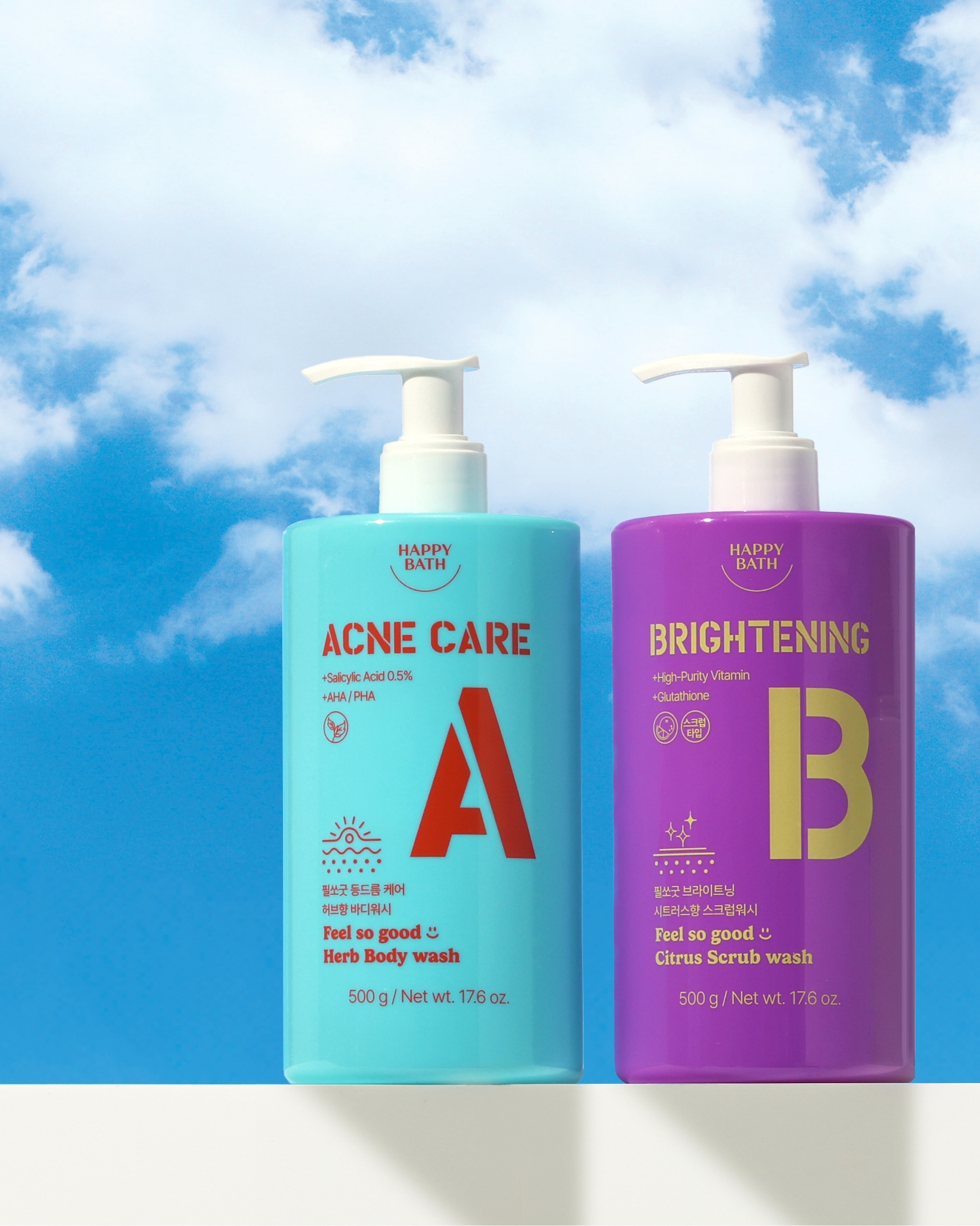
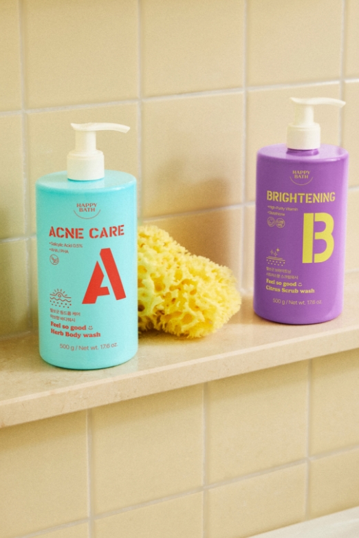
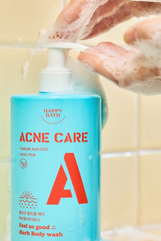
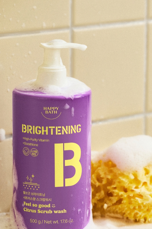
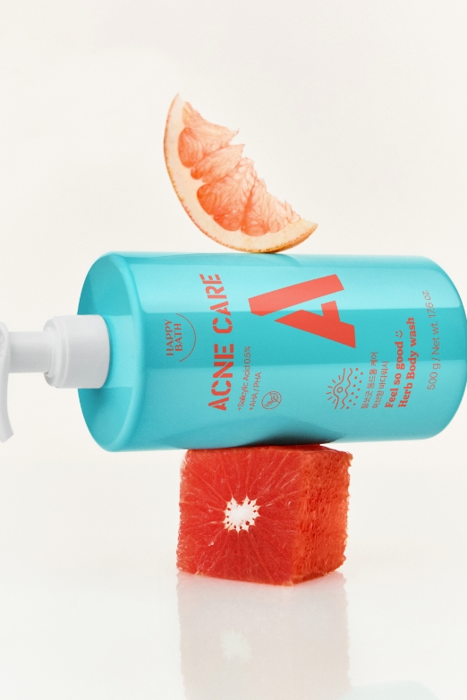
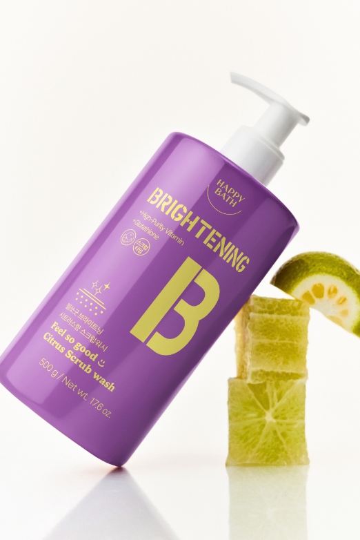
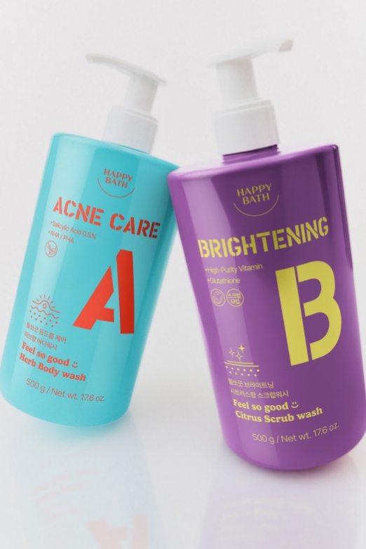
필쏘굿 아크네 케어 바디워시&브라이트닝 바디워시
FEEL SO GOOD ACNE CARE BODY WASH
& BRIGHTENING BODY WASH
& BRIGHTENING BODY WASH
팝한 컬러감의 용기와 대조적인 색감의 타이포그래피로 보는 순간 기분이 좋아지는 시각적 활력을 주고자 했습니다. ‘A’, ‘B’ 등의 심플하고 굵은 알파벳 요소는 기능에 따라 제품을
구분할 수 있게 하면서도, 젊고 캐주얼한 감성을 담고 있습니다.
각 제품의 성분과 기능을 표현한 아이콘들로 디테일을 살려 패키지디자인의 밀도를 높이고자 했습니다.
구분할 수 있게 하면서도, 젊고 캐주얼한 감성을 담고 있습니다.
각 제품의 성분과 기능을 표현한 아이콘들로 디테일을 살려 패키지디자인의 밀도를 높이고자 했습니다.
We aimed to deliver an instant boost of visual energy
by combining pop-colored containers with contrasting typography that brightens your mood at first glance.
Simple, bold letter elements like A and B not only help clearly distinguish each product’s function,but also convey a youthful and casual tone throughout the lineup.
by combining pop-colored containers with contrasting typography that brightens your mood at first glance.
Simple, bold letter elements like A and B not only help clearly distinguish each product’s function,but also convey a youthful and casual tone throughout the lineup.
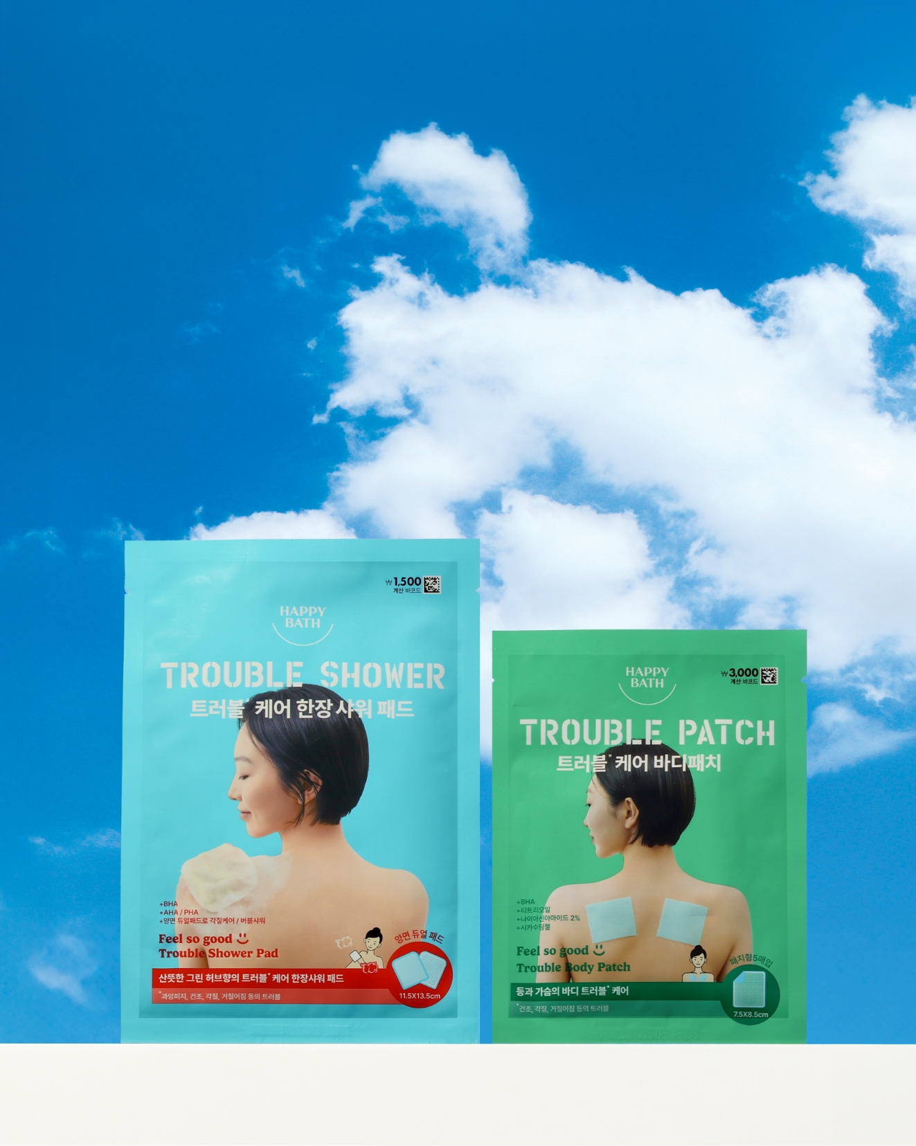
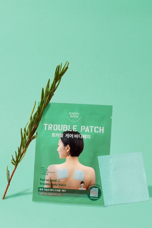
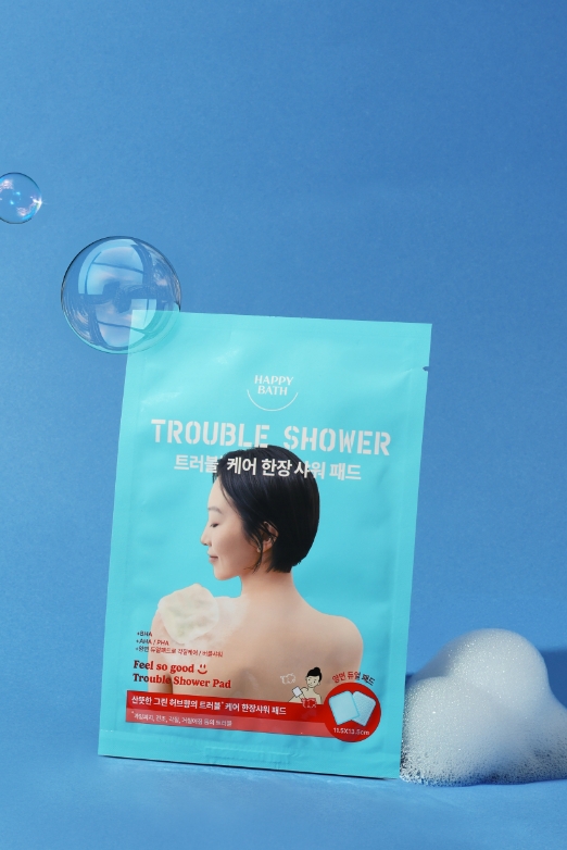
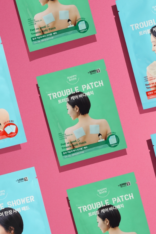
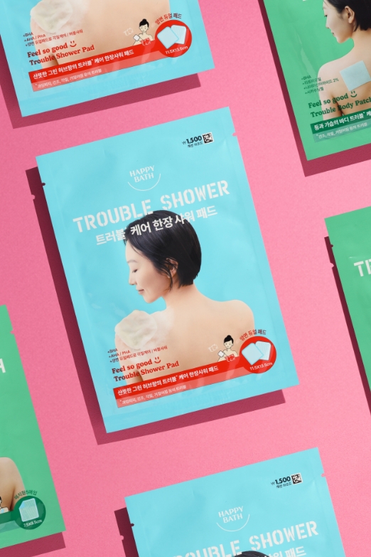
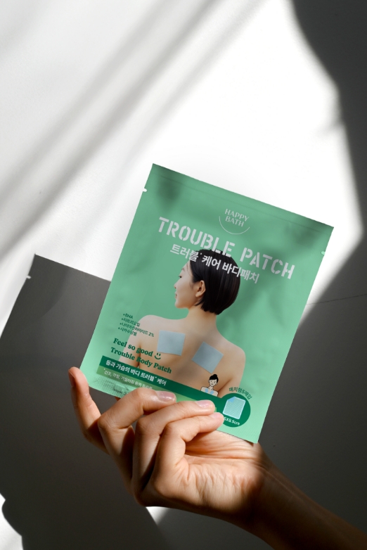
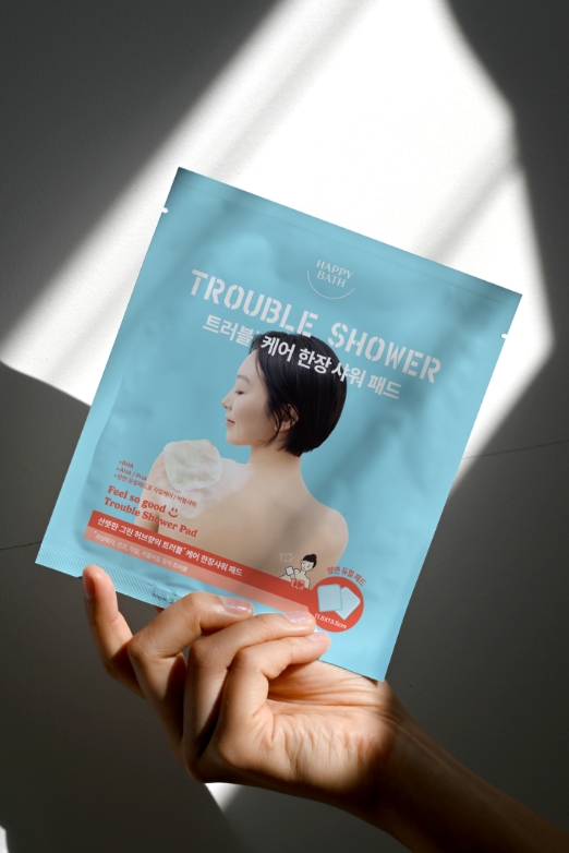
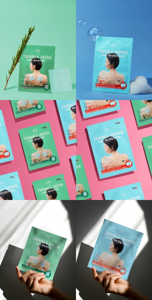
필쏘굿 트러블케어 한장샤워&트러블케어 바디패치
FEEL SO GOOD TROUBLE SHOWER PAD
& TROUBLE BODY PATCH
& TROUBLE BODY PATCH
트러블 케어 한장 샤워 패드와 바디패치는 필쏘굿 제품들의 팝한 컬러를 유지하면서도 사용방법을 전달하는데에 중점을 두었습니다. 고객에게 생소할 수 있는 제품인 만큼 사용컷을 크게 강조함으로써 사용방법을 알리는데에 패지키의 공간을 할애하였습니다.
The Feel So Good Trouble Care Shower Pad and Body Patch were designed to maintain the line’s signature pop colors,
while placing a strong focus on communicating how to use the product.
Since these items may be unfamiliar to some customers,
we dedicated ample space on the packaging to clearly display usage visuals,
making the instructions more intuitive and approachable.
while placing a strong focus on communicating how to use the product.
Since these items may be unfamiliar to some customers,
we dedicated ample space on the packaging to clearly display usage visuals,
making the instructions more intuitive and approachable.
FEEL SO GOOD LINE UP
- Amorepacific Creatives
- Design
- 김유정
- Photography
- 김유정, 신상우, 우시아
- BM
- 위홍저